When my sister Lea (I have 3 sisters) and her partner were getting ready to move into the Eco Village in our town, I helped her choose finishes, colours, and lighting.
Greg wanted wood-stained cabinets (not white) and Lea really didn’t mind either way, so I specified a light maple, along with medium brown engineered wood flooring.
Lighting was a challenge because we had a strict budget. Lea kept sending me light fixtures that I kept vetoing.
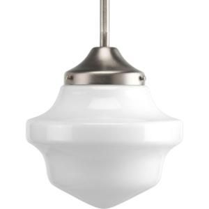
Then I’d send her a light that was in the budget, like this one, and she would say NO:
Then I found this image (below) and sent it to her. The pendants were inexpensive, but when arranged like this, they were so whimsical and reflected her personality.
She loved them!

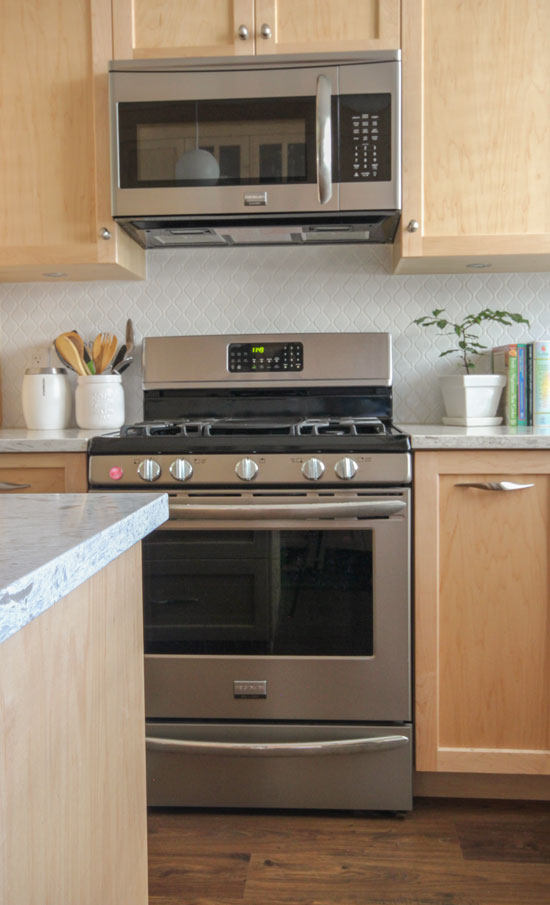
And here’s everything installed in her own kitchen:
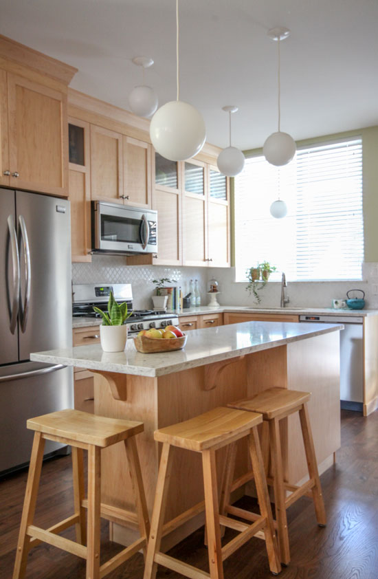
There’s an entire pantry wall on the other side of her kitchen (not shown).
The cabinet maker had a special price on one style of quartz only (from China, I don’t have the name for you it was discontinued) if anyone in the Village wanted an upgrade from laminate. When Lea showed it to me, I decided it was neutral enough and not overly busy.
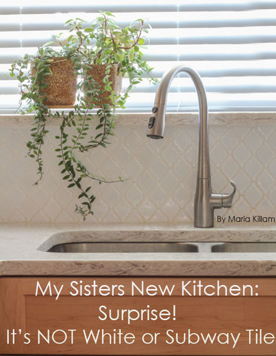
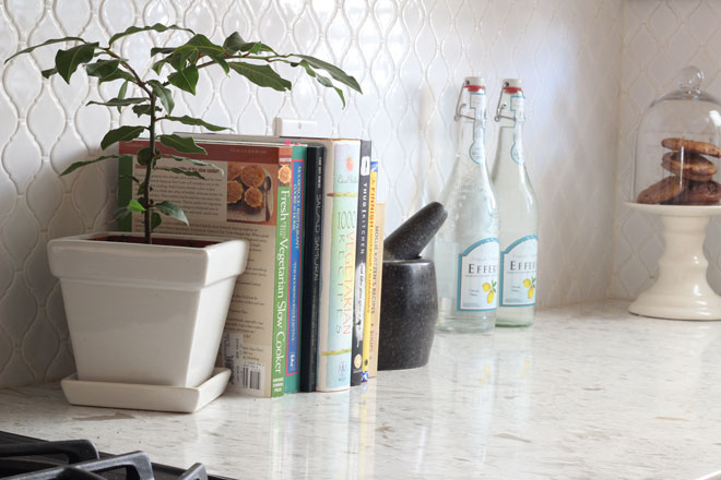
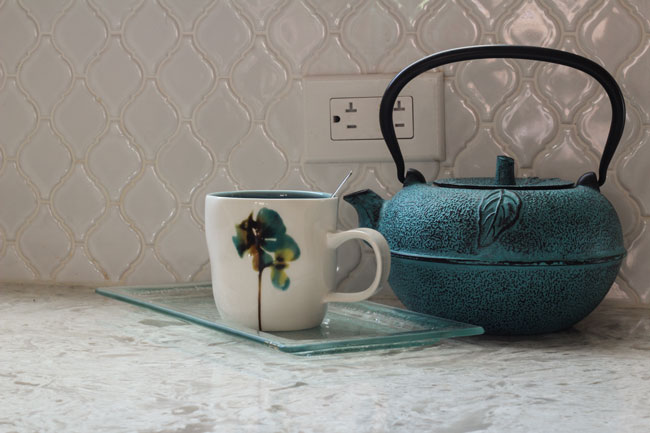
She did NOT want subway tile because she thinks it’s boring (clearly not brainwashed enough by reading my blog, sigh), but agreed that we would stay away from accent tile and keep it off-white to coordinate with the quartz. We settled on this moroccan pattern.
It’s smaller in scale than I would have liked, but the tile supplier to the Eco Village had only this size. It works with white grout, but definitely would have been too busy in a contrasting colour.
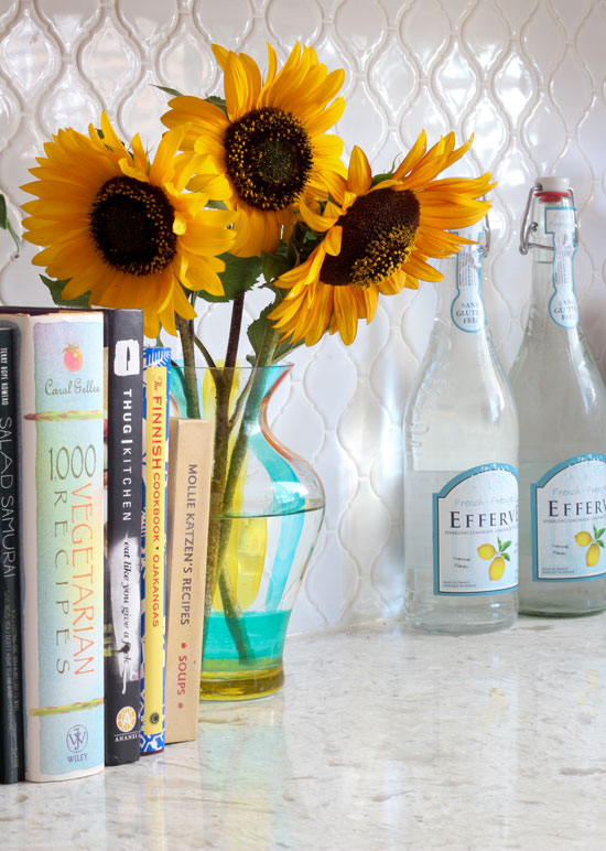
A sample of Lea’s vegetarian cookbooks (above). I also introduced her to the concept of buying vessels for herbs and potted plants in her house instead of simply plunking them down on a china tea plate. She now has about ten in varying sizes. I love the square one she chose for her bay leaf plant.
Lea did not end up with the knobs and pulls I specified. She chose the twisty pulls on her own (above). She said they were so expensive she had to compromise and go with cheaper knobs.
I’m just happy she went with a knob and a pull that look better (and more like a designer was here) instead of the exact same pull on every door and drawer.
The floor is a medium brown laminate. Just the right timeless colour.
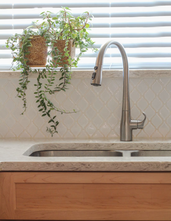
Greg chose the Kohler faucet (above). I love how simple and sleek it is.
In a perfect world (where everyone listens to every single piece of my advice), I would specify a solid countertop with this style of backsplash. Even though it’s white and there’s no contrast, this tile is definitely busier than regular subway tile and should be the feature of the kitchen.
I added the sunflowers at the end of the photo shoot!
Are you shocked? NOT a white kitchen and NOT subway tile.
I bet you thought I was just a one-trick pony ; ) ; )
We would love to help you choose colours, select the right combination of hard finishes or create a plan to pull your kitchen together. You can find our fabulous e-design consultation packages here.
Related posts:
Ask Maria: Help! I Don’t Want the Same Kitchen as Everyone Else







Maria this kitchen is a testament to your talent! Working within tight budget parameters and with limited choices, it ended up still being a thing of beauty. It’s unique, pretty in its simplicity, and honors their tastes and personalities. Perfect!
As Cathy Gibson says above, you are so talented. And your sister is so lucky! I just finished painting my kitchen cabinets (SW Dover White) and love them, but these maple ones are so pretty I had to pin to my kitchen Pinterest board. Then I scrolled down and saw that I have the same appliances and the exact same kitchen faucet (love it’s simplicity) and very similar brown flooring. Guess that’s why I love this kitchen so! Thanks for your wonderful blog posts; the best of the best! (PS I have subway tile backsplash!)
Thank you, Maria, for sharing these kitchen pics. It shows that a kitchen can be done creatively, on a budget, with style and still meet a client’s wishes (and not be all white!).
And wooden cabinetry! Maria! Can this be you? ;-D
I know right 🙂 Maple would definitely be my first choice in this department, it still keeps the kitchen feeling fresh and light.
Maria, I think it’s close enough to white to still be timeless! And if I was going to have wood cabinets, the light maple would be my choice too because it won’t get too dark. I agree with the elements you’d have done differently, but as the other comments said, it shows what can be done with limited choices and budget!
I love that it’s on budget, customer happy and totally their personality. Looks wonderful and I’d love to know where the kettle is from, I love it.
Another great job. You listened to your “clients” but at the same time gave them more than they could have expected. You rock.
Love her back splash tile! It is definitely timeless. I remember this being in our bathroom as a child except it was aqua blue, which I loved.
What color wall paint did you use, Maria? Great job! So helpful for those whose husbands won’t go for white cabinets!
It’s BM Guildford Green.
Nicely done! Can’t imagine a single one of your readers thinking you are a one trick pony!!
love the lighting, so fun….. I think the moroccan pattern could be considered timeless…… happy client with help from a designer is a happy client, the end… x well done to you all (loving the faucet too)
I can still see your timeless style allover Maria. Even though sometimes your sister went against your wishes, I can tell she is “your sister” :). Beautifully done!
I really like it. Very warm space. Maple is my favorite of all the light woods. I love how the top cabinets are part glass. And pendants are so cool and cute.
(that’s the same exact faucet I am about to specify for my kitchen. At first I pointed at a different one, but a saleslady told me then it was 1200 bucks. For a faucet. So I fainted for a moment, came to my senses again, and choose this Kohler one. So it’s sort of reassuring you find this faucet sleek..))
You took a wood tone that is usually seen in dated kitchens and made the whole thing current.
I do like the backsplash.
I like the splash, too. That shape has been around longer than subway.
Super cute! Love the personality you infused throughout, especially the lights. Way to make the client happy while steering her in a way that she’ll love for years to come! 🙂
I’m inspired.
Presently redoing kitchen and have used a Venetian
Gold granite countertop , browns, golds , beige varied in it . Thinking about using subway backsplash picking up one of the light colors in the granite . Have Merillat Classic Sommerton Hill Maple Hazelnut cabinets and am using the light over sink that you show – love it . Do you think the subway will be too busy for my granite ?
Definitely no. Subway tile is your ONLY option. Maria
Great job! We are considering buying a house with cabinets similar to this. The walls are currently a dark gray and the particular shade looks wrong with the cabinets. But Guildford Green might make them more livable to me. Of course I want to paint the cabinets white (brainwashed!), but wall paint would be a lot easier.
The fun pendants are great and do lighten up the look.
Lovely, happy space! Thanks for sharing!
What’s the “rule” on the 4″ backsplash of the countertop material? If you don’t use a tile backsplash, is that when you use the 4″ countertop material on the wall? Thx!
Love everything about this kitchen! Can you tell me where to find the light fixtures?
Truthfully Connie, they look way better in the photo than they do arranged this way in real life. And it could be because I’m just not this whimsical or maybe the lights should have cost a little more. Here’s one I found on Etsy that closer represents the inspiration pic: https://www.etsy.com/ca/listing/97248681/winterport-milk-glass-pendant-lighting?ref=market
Maria
You are so honest, Maria, LOL,–and so real–that is one of the reasons we love your blogs! The kitchen is beautiful and classic and elegant in its simplicity. I love the idea, especially in a small kitchen, of putting the glass up high on the cabinet doors, where you can show- case pretty pieces without sacrificing the ever-important storage space in the “valuable easy-to-reach real-estate” down below! The maple looks so gorgeous and the room so light-filled, though the pendants are off–did you bring in lots of studio lights to achieve this look? Just curious!
If I couldn’t do white, this would be my compromise. It looks fresh. And I actually think the lights are adorable! It made me look at my recessed lights & think about replacing them.
The only thing I would have done different would be to paint the bars tools a fresh green that works with the wall color. But that’s just me because I love color.
Great idea! I love green in the kitchen (well, anywhere), too.
Lea’s light maple kitchen is so well done, you might have to work extra hard to bring readers back into the “white cabinet” herd! I love the lighting..brilliant. To me, the kitchen has a clean, “green”, timeless appeal. This is one of my favorites to date!
YESSSSSSSSSSSS!!! franki
Maria, the laminate floors are not maple like the cabinets. Do you have any rules about using different wood for floors and cabinets? I think it looks very fresh. However I’m not a big fan of mini blinds for the window
Hi Maria, I’m curious, you said the knobs and pulls your sister used were not the ones you recommended…do you have a photo of the ones you specified?
Ah! Was I surprised….no subway tile !
However , this is a pleasing kitchen and while I like subway tiles . A person just kinda stops looking because that’s the expectation …I enjoyed this and everyone is right you’re good no matter what ! The lights made me smile ! Good job ! I love that your sister isn’t afraid of her own taste and this was a great collaboration kudos to both !
Great job, Maria!
I love that kitchen. It still looks fresh and airy, and like a Maria Killam kitchen, which I associate with elegant simplicity.
Not that she would ever want to, but maple cabinets are lots easier to paint than say, oak or cherry. Personal experience.
When the maple yellows over time they may want to paint. Just sayin
I love it and the tile is so pretty!
good job! the light fixtures are genius. you’ve started a new trend. i’m familiar with those pulls. they aren’t for everyone, but they do fit the hand precisely. very well designed, actually. guilford green is the BM color of the year, btw. this is a real kitchen and not a fantasy set design. refreshing to see real-world problems and solutions instead of pinterest-posed (not you — others) set pieces.
Maria,
that is a great-looking kitchen! In my market area (central MA), wood cabinetry still dominates, and buyers or homeowners continue to install trendy backsplash. I do mention your name when we get on the topic of kitchens finishes! Have always liked moroccan tile – thanks for sharing your creativity.
Maria, I really like this Moroccan Tile. Although it wouldn’t be suitable in my current kitchen – it’s a lovely, simple alternative to subway tile.
It’s an ideal kitchen. Lots of natural light, perfectly sized (not too big, not too small). Great work!
I love these photos. I have a luna bae granite counter top purchased for a bathroom rebuild. I have been thinking about putting down a maple wood look sheet vinyl Armstrong floor and the maple cabinets your sister has makes me think it could look good. I realize it will not look married but will keep the bathroom light. We have purchased white cabinets.
The kitchen is light and bright without being white; it totally works. I’m amused at the light fixtures as I had them in my 1980 built home. I figured they were simple enough to be timeless. They look good because anything else in that number would be too busy. Love the kitchen – it’s so fresh and clean looking!
Love, love, love the way this kitchen looks! Must admit I was shocked you went along with the maple! My kitchen is somewhat similar but I have Verde Peacock Granite. Maria, do you think the Guilford Green would look good with this dark color?
Thx!
Must admit I was shocked you went along with the maple! My kitchen is somewhat similar but I have Verde Peacock Granite. Maria, do you think the Guilford Green would look good with this dark color?
Great job!
Maria, Always love your posts and all of the comments. You are so brilliant because giving a client what THEY want is not always so easy. Sometimes you just have to grin and bear it! As everyone has said you pulled off an exceptional looking kitchen on a tight budget. I am sure your sister must love it. She is lucky to have a sister like you with such good taste. (I also have three sisters).
So we’ll done and I am going to post it on Pintrest.
Clients! Even family members can be so fickle! That is exactly why they need a designer, someone who will help moderate their own personality enough so that they themselves will like the result!
I adore this kitchen! Light maple has always been my cabinet hue of choice (sorry, Maria) and I love the fresh combination of colors your sister and you chose. I’m not crazy about the Moroccan backsplash, but the twisty cabinet pull is perfection! Looks great with her stainless appliances.
Your sisters are very lucky have you as a sister! A great collaboration and wonderful result! xo Leslie
With a tagline like “If you would like your home to fill you with happiness every time you walk in” that seems obviously fulfilled in every room you do for every client, how could anyone think you’re a one-trick pony, Maria??? No need for an unrelated red chair in the middle of a blue & green room a la Bunny Williams or screaming tree art a la David Bromstad on Color Splash or zebra pillows on the couch in a costal cottage because the designer likes them and tells the clients who don’t that’s why they’re paying her a la HGTV. You listen to your client and what wonderful results. Even though I’m going for painted white cabinets in my kitchen, Lea’s kitchen is absolutely delightful, warm and inviting, and there’s lots of inspiration there — the Pinterest pic doesn’t hold a candle!
Is this a counter depth fridge? I have a similarly small kitchen and am looking for a counter depth french door fridge. How does it function with the island right near it? Does she like it?
I’m glad to hear you admire that faucet because I have it too! Though I had it installed with the handle in the middle instead of to one side because I find that more convenient.
For your sister, and anyone else who has this faucet, I have two tidbits of info:
1) After two and a half years, the sprayer button failed and wouldn’t hold a spray. They may have fixed this problem since (mine is 6 years old), but if anyone has this happen, I was able to order a new sprayer head for about $40 and install it myself. I don’t think I even needed tools, I think it just screwed on and off. The replacement head is still good after more than 3 years.
2) My window washers found the faucet height got in the way of removing my kitchen window to wash the exterior side of it. They had to wash that window outside on a ladder until one of them figured out just this year that the faucet pops right off! See the line about a third of the way above the counter, above the faucet handle? The whole arched part just pulls right off at that point, and pops right back on when you’re done. Hope this helps someone.
I think this kitchen looks fantastic. And applause to your sister for not always agreeing with the designer, even though the designer is related to her! I myself am not a huge fan of subway tile, because I think it is old hat and overrated and belongs in the subway. But that is just me, I suppose. I really like this particular tile.
Looks great anyway! Sporting of you to poke fun at your white cabinets/subway tile obsession. Alas, clients and relatives don’t always do what we want, even though we think we know best. But, it’s their house, and their money, so ultimately, their decisions.
Another fabulous job,Maria- Kudos to Greg for saying what he wanted in his kitchen,also. It takes guts to stand up to such a gaggle of women in your family, including one ace designer, YOU -LOL- It fits in with that Eco village concept also-Looks very fresh & I am sure they will love it for years to come.I love everything about it!
I actually love natural maple cabinets! Well second to white ones. Very helpful post for those who do not want a white kitchen! Great job as always
White cabinets are always my preference, but sometimes a pretty, light to medium wood can be just right for a house, such as the arts and crafts house my sister and her family hope to buy in the Boston area. White in a house like that would not look right.
I agree.
I didn’t choose wood stained cabinets for my new house just because i’m not in a light wood phase(I was for many years)..I love medium wood these days, but it’s already a flooring color..the kitchen is small, really small, and all medium tone wood would be overkill. So I went with painted (not white though, but light hue). We’ll see how it goes-I never had painted cabinets before. But the house itself-theoretically speaking- would be very happy with wood stained cabinets, because it would work with its style.
The kitchen is well done, Lea has an amazing decorator/sister! Good job.
I really like this kitchen! The tiles have a lot more personality than plain subway and I think upgrade the maple cupboards to something far more interesting than they would be with plain subway. It would veer awfully close to Ikea, imo, with the subway. The granite might like more busy in real life but in the photos it really comes across as having more life than a plain Corian, for example. The lighting is such a clever solution to a budget problem, even though I think that an upgrade to a more expensive version would be worth it down the road. The inspiration picture is really gorgeous. All in all, I think this kitchen shows a more sophisticated version of your standard kitchen and just how you can apply the basic principals of your design philosophy to something beyond a template. Bravo!
Hi Maria,
I have a new construction home with pretty much of an open concept layout. My entire floor will be a maple hardwood floor – the colour is Clay by Appalachian Flooring. I like Greige for the walls with a little more grey (Martha Stewart Nimbus Cloub) for example. I can’t decide on a cabinet colour. I thought I wanted crisp white but it scares me when the island and one wall of cabinets will be stained a couple tones deeper then the floor. Also, really white cabinets makes it hard to a choose granite. I will have a lot of trims, as all the archways and openings will be trimmed in craftman’s style trim. I would like the cabinets and trim to be the same colour. I have looked at all the whites. Thought I would chose Martha Stewart Picket Fence…but now I’m on the fence looking at Martha Stewart Tailor’s Chaulk or Cloud White. I only have plywood on the floor and it’s so hard to make a choice. Can you help me please?
Yes DO NOT Under any circumstances choose your white without choosing your countertop first. That makes no sense. Then my white ebook will give you the answer to which white works with the countertop you choose. If you don’t know which countertop, than you might need my on-line training Renovate with Confidence which has an entire segment dedicated to choosing finishes for new builds. If you choose a white before you choose your hard finishes then this means you have no idea which one to choose and this means you will choose something when someone forces you to make a decision and you will be unhappy with the final result. Maria
Hi Maria,
Thanks Maria for your answer. I would like to use Silver Pearl/ Steel Grey granite probably in a leather finish. I think I read some where on your blog that you like white cabinets with a glaze. How about white white cabinets with a grey brushed glaze or should the doors be less white and more off white with a dry brushed glazed. Do you have any photos of white cabinets with a glaze?
Maria it’s lovely! I’m not usually a fan of brown cabinets in the kitchen, but you’ve done a wonderful job here and the space looks fresh and clean. Love the Moroccan tile and I am a huge fan of subway tile, well done.
Love what you did with your sister’s kitchen. And I am laughing that of course, you are not a one-trick pony…and that your sister isn’t “brainwashed” yet! Too funny! It’s beautiful and I love the moroccan tile. I’ve lusted after it for some time and if I could get rid of the granite countertops and matching granite backsplash in this house, I would be very tempted to use it too! You are always a miracle worker, even when people don’t always go with your perfect choices. It still turns out great with your help and styling!
Wow! This is definitely a deviation from your “normal” style. Still looks great though! I think a testament of a good designer is one who can work within a client’s likes and dislikes rather than trying to turn everything into carbon copies of their own personal taste. Well done working with family as well (I’m told that can be very difficult).
Hi Maria. I remodeled my kitchen two years ago and stressed over the fact that I was constantly being told that the dark brown cabinets I wanted would date my kitchen and white was the way to go. I am so happy that I didn’t listen. I love how my kitchen turned out and feel it stands out among all those white kitchens. Trends come and go and eventually someone will look at all these white kitchens and say ” I know exactly when these were done. White was such a trend in 2015″ I’m really tired of reading that my choice was somehow wrong because designers have decided that dark cabinets are dated.
Very nice. Perhaps you can post more about the rest of her house and what makes it part of an eco community.
I do wonder at the developer’s choice of standard countertops though. Just how eco it is to ship something as heavy as quartz countertop material from China? Embodied energy is the energy it takes to harvest the raw materials, transport it, manufacture or process it, ship it and install it. The farther you transport something the more embodied energy it uses. It may be worth it for a unique piece, but quartz countertops are manufactured from common materials, so it may have been greener in the long run to have bought something manufactured nearby. Of course Vancouver is a shipping hub, so the difference may not be that great.
Similarly, the greenest housing option may not be in a new build, but in renovating an existing home, especially one built long ago of local materials and old growth timber. Historic renovation also use less material and create more jobs than building from scratch.
Hi Kathy,
You bring up a good point and I just guessed it came from China (I didn’t ask) because they only had a limited amount.
Personally, I think the greenest form of renovating is installing classic colours that the next homeowner can use without wanting to rip it out creating more garbage for landfills. Most of the new homeowners in this eco village simply ‘used what they loved’ without any clue to what looked good together and there were some really bad combinations in the other suites I viewed.
Maria
I love those sweet bubbly pendants and the pale maple. This kitchen is very appealing to me.
I am in the process of picking out cabinets. I love these light maple cabinets. I like it because I don’t want painted cabinets nor do I want dark wood. The only thing I decided before this is I wanted white counters and backsplash. My next dilemma is hardware , I am thinking about something other than a silver tone. Maybe a gold tone ? Any advice?
Nothing wrong with gold hardware, it’s easy to switch out. Maria
I love the simplicity of this kitchen! I’m being challenged by a budget and a husband that also prefers wood grain vs. painted cabinets. After years of swearing I was going to paint my bland natural toned maple cabinets I’m leaning towards a light or natural stain he has compromised with a painted Island…shall it be blue, shall it be white, perhaps grey? I just want classic when we’re done and not too trendy. I think you’ve done a perfect job of giving your sister a kitchen that will last a lifetime of changing trends! Beautifully done!
OMG! I LOVE this kitchen! We are trying to work with our maple shaker cabinets and make our kitchen into something I love, and this is just the inspiration I was searching for! I know this was years ago, but do you know what color paint is on the walls? I have been trying to figure out a green that would tone down the orange in the honey cabinet stain, and I see there is green paint on the walls of your sister’s kitchen.
Thanks so much for the inspiration!
It was guildford green 🙂 Maria
Do you remember what countertop your sister used here?
It was a quartz from China so nothing you could buy anywhere else. Maria
Maria,
I adore your designs and information and have finally found a photo of a kitchen with maple cabinets I can show my husband who is gutting one or our rental apartments. We decided maple kitchen cabinets would be best.
I am especially interested to see a better photo of the laminate flooring you used. We like the idea of medium brown luxury vinyl plank (not laminate) flooring throughout the open area of kitchen/dining/living room as well as the utility room.
Sincerely,
Debra Wilkins
My wife and I love this kitchen and the Moroccan pattern tile you used but can’t seem to find that specific design anywhere (lots of similar ones but they all look too angular or too round). Can you tell us where you got the tile or the brand/model of the tile? Thank you!
What kind and color where the floors, please?
Hello! I love the backsplash. Where can I order it from? Thanks!
I LOVE it, Maria!!
Looks great, where are the cabinets from?
They were custom made by a local manufacturer. Maria
Where could I find this gorgeous Moroccan tile? a brand and color name would be so helpful because its perfect! Yes I’m sick of subway too so unoriginal!
How do I know when a white kitchen countertops is appropriate with honey maple cabinets? My home is traditional style with raised panel cabinets . I was thinking more off white or cream quartz, but what I keep reading it seems like a true white is best and not off white or cream.