One of the best books on Interior Design I have ever read is “Style by Saladino” by John Saladino, a New York designer.
I first saw him speak at the Seattle Design Show about 3 years ago where he was also promoting his new book which I snapped up immediately. I have never read a coffee table design book from cover to cover before or since and the most fascinating part of this book is the chapter where he distinguishes scale:
“Insensitivity to scale, is in my opinion, what is wrong with much contemporary architecture and design. What are called ‘living’ rooms are really more like lobbies with 14-foot-long sofas and coffee tables that have to be delivered by cranes. Understandably, people march right by them. Any sofa more than 8 feet in length prevents people from feeling at ease.
The breakfast table is often where most of us like to linger longest; this is because the scale is human and therefore comfortable. If there is more than 7 feet between you and another person, you need a megaphone to converse”
Saladino defined scale in three ways: Monumental, residential and human. He illustrates this with the following image from his book; the entrance hall at Syon House, near London, designed in the mid-eighteenth century by Robert Adam:
The room is organized in horizontal layers using these three scales. Monumental scale is evident in the huge crown molding, or frieze, that encircles the room and appears to support the coffered ceiling.
A third of the way down the walls from the ceiling is a lower, less imposing, cornice, which represents the residential scale and makes this vast room more easily assimilated. Finally the smallest of the scales is used in the doorways, which relate to human proportions. Introducing this last scale enables the occupants to ‘move’ through the three layers without feeling overwhelmed.
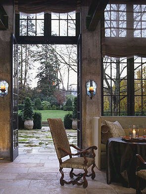
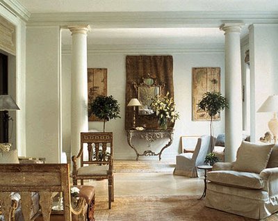
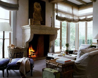
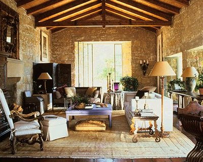
Here are some of his classical, European inspired interiors:
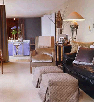
Saladino’s ‘signature’ colour is periwinkle blue:
This is an excerpt of what he says about colour:
“Relying on paint chips is unsatisfactory. Color multiplies in intensity when the square footage increases. What appears an acceptable color on a small chip can become very aggressive when enlarged. It is often wiser not to leap to what seems, at first, like an obvious choice. Rather than settling immediately for the color that you think you want, my advice would be to select a color a few shades lighter; that way the color of the finished, painted space will often have the effect that you thought you would get from a small sample.”
Saladino also insists that a colour be tested and viewed at all lights of the day before deciding to paint the entire room. I totally agree. There is no other way to know whether you like the colour until you paint a minimum of 5 ft x 5 ft colour sample on the wall. Any smaller–and if the colour is anything but white–you are then visually comparing the existing wall colour to the sample you have painted directly on the wall.
I disagree with the advice to automatically go lighter because I have about 50, painted 11 x 17 samples in addition to all the Benjamin Moore colours when I conduct a consultation. Having the samples painted in a larger format is all you need when trying to determine which shade or intensity you should go with.
Landscape Design
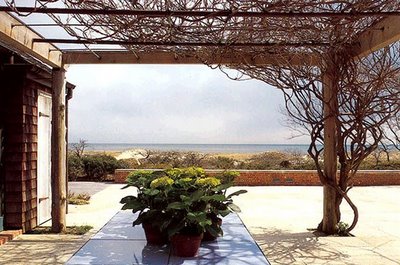
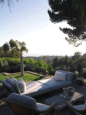
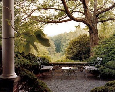
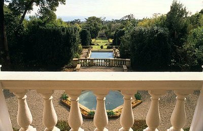
Saladino also does landscape design and this is what he says about scale outside: “It is as important to have a variety of vertical scales outside the house as it is to have them inside. A flat garden is a boring one. If you have tall, mature trees, you are fortunate in that monumental scale will already have been established.
If not, plant the largest you can afford. The middle scale can be represented by ornamental trees, large shrubs or manmade features such as a pergola or gazebo; and the smallest might include tall flowers, such as plume poppies or delphiniums, or decorative pots and urns.”
“The Landscape is a created reality, an improvement on the real world. The garden then, may become a quest or seeking of paradise. We transform nature so that we may spiritually embrace it.” John Saladino
Insider Secrets to Testing & Selecting Paint Colours
While you’re here, subscribe to this feed so you don’t miss out!
If you would like your home to fill you with happiness every time you walk in, contact us! We would love to help you choose colours, select the right combination of hard finishes or create a plan to pull your room together. You can find our fabulous e-design consultation packages here.
If you would like to transform the way you see colour, become a True Colour Expert.





OMGosh…I was also at the talk in Seattle. I have long been a fan of his. Great pictures you have shown!!
PS Glad you got your comment working.
I loved that book too! Took lots of notes. We moved from a house that was on a very big scale. Although it was impressive, it never felt comfortable to me. My best friend told me after we moved that it “felt like a museum”!!! We ended up with a smaller, older home since we were downsizing. It has normal ceiling heights, some small rooms, and some big ones. The front faces north with the small rooms that are used mostly at night, and the back faces south where the family room and kitchen are. So, the light is functional and cheerful during the day. The whole house makes more sense than our previous one. It was so “out there” that some people felt awed and intimidated when visiting. That’s not how I want my guests to feel! Cozy and human scale is better.
He had me up to “…landscape is an improvement on the rral world.” Lost all credibility on that one.
In the periwinkle pgoto, I saw three unrelated undertones, and mix of clean and dirty. Interesting that “big name” designers get that wrong. I wonder if they ever get.to a point where they go back and look at what they have done and laugh.
Thanks for a great post!