So basically my kitchen is finished except for this corner. I have been so busy I haven’t had time to finalize which fabric I wanted, etc. I have finally selected the fabric for my roman shades but it’s too late to get my workroom to make them for me before Christmas. Sigh.
However, my banquette will be ready before then.
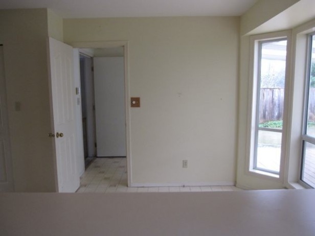
Before
Here is the kitchen dining area before (above). You can see the linoleum we took out and the pink laminate countertops.
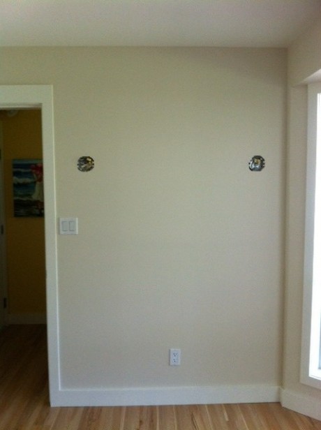
This is what this corner has looked like for months now and it’s driving me crazy!! See the light switches? Well I want the back of the bench to be high because I didn’t want to install a piece of art in between the sconces.
Last week my electrician arrived and moved them to the other side of the wall into the laundry room so they won’t be in the way.
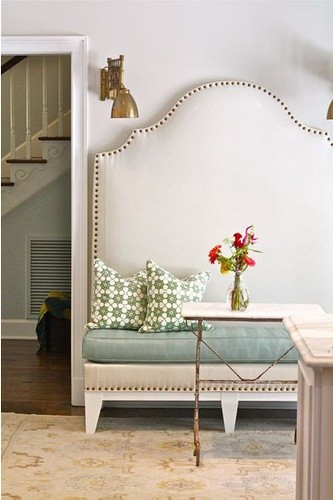
And here’s the banquette I am going to get custom made:
I’m doing it in white faux leather with silver nail heads. Then I need to find two sconces as well.
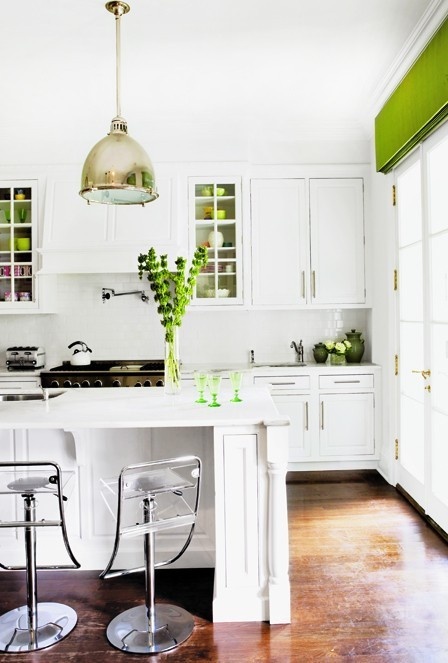
Sorry the big reveal is slow! I’m doing roman shades in the bay window and the window above the kitchen sink. The fabric will be this colour (below), I just love green!
It’s starting to feel like the holidays are approaching, can’t wait!
Have a great week my lovelies!
ps. If you are in Vancouver or the Lower Mainland, you have only two more weeks to enter the “I hate my closet’ Contest! Hurry up!
Related posts:
The Before Pictures of my House
I Hate my Closet Contest and Maria’s New Closets
If you would like your home to fill you with happiness every time you walk in, contact me.
Download my eBook, How to Choose Paint Colours: It’s All in the Undertones to learn how to get colour to do what you want.
To make sure the undertones in your home are right, get some large samples!
If you would like to learn to how choose the right colours for your home or for your clients, become a True Colour Expert.







That banquette is going to be drop dead gorgeous!
Good for you for getting the upper hand on those light switches, and hiring someone to move them. Most people would have let them have their way, settled on a compromise and been less than satisfied with their furniture arrangement. You knew what you wanted and went for it. That’s an example for us to follow.
oh my, oh my, oh my I so love that banquette in the picture!… amazing!
so looking forward to the after pictures, have a good week.
NO. Look at the top of the banquette in relation to the door. The ratio looks odd to me. Looks like a standard 8 ft. ceiling and a 7 ft door. It makes the space look small. If you had a 10 ft. ceiling and 9 ft doorway then maybe it would look ok. The sconces don’t fit this space. Better to have artwork, or some kind of interest on the walls. (I love china or artwork or both, but that is a personal taste)
I know based upon reading so many of her posts that Maria spent many many hours of consideration on this project so this feedback seems a bit harsh. Considering that she is an established designer with a huge following and is well respected within our industry as a professional interior designer let’s just trust she as a client loves it. That is what truly matters.
Love all your plans my dear! It’s going to be gorgeous! 🙂
My dear?
I am loving the green and the banquette . Looking forward to seeing the finale.
Love it. That intense green really packs a punch!
Hi Maria, I was looking at my latest copy of Saltscapes magazine and saw your laundry room pictured. As I didn’t see a credit on the picture, I wondered if you knew it was in the magazine.
Love the plans for the kitchen corner!
That banquette will make such a great statement! I look forward to seeing the whole kitchen. Are you finding the white kitchen pretty easy to keep clean? Some people say they white cabinetry shows everything, so I was just wondering about that.
Love your blog, thanks for sharing all you do. I’m sure you know this but just in case. So often I have noticed photos of custom built banquettes made too high. I am assuming the carpenters do not take into account the 4-6″ cushion to be added to the base. You will not be comfortable with your feet dangling.
Love the green, for me it is almost a neutral. The banquette…….If I could, I would!
Anxiously waiting the final reveal.
Love it so much!
I just could echo Carol Anne’s emotion here! I have always wanted a banquette! Designed a bunch (on paper), but never got to have them built. I love the image of yours! Ever notice how EVERYONE wants the booth at a restaurant? It’s going to be perfect!
xo, Paula.
I love the banquette you choose, it sounds just like the materials I used in my guest headboard.
Dear Santa~
I hope you had a good 2012. I’ve been a good girl. Please, oh please, can I see Maria’s kitchen for Christmas?
Thanks,
Sara
😉
The vivid green with all the white looks FRESH. Love it!
Love the green, it’s my neutral. I was just thinking, will we ever see Maria’s kitchen, and here is another corner! I’m loving it.
Fantastic! I would LOVE that. My kitchen nook is similar in that it has angled windows like that, but the windows are wider and there is little wall space. Hoping I can do a banquette in front of the windows.
Can’t wait to see your completed kitchen, but in the meantime can you please post more now that your countertops are installed? Or did I miss that reveal? Thanks.
This banquette is the perfect marriage of elegance and comfort. glad you got rid of the pesky light switch…ugggh visual clutter. Good thing they’re still near at hand; I move some in my kitchen out of view, but now they’re pain to access, as in one step too far.
I found space to put another set and I’m going to do it someday soon. I find it’s those little everyday things that ultimately make or break a space.CTD
I do too love the pops of green. I have loved seeing the transformation. I have been incorporating many of your design principles in the building of our new house. Thank you!! But I am stumped. Do you have a recommendation for choosing between agreeable gray or anew gray? I too just finished a white kitchen and the builder needs a paint color but I am torn! I can’t decide if anew gray will be too dark. But I have all white trim and a gray wood tile. Thanks again for all
The green you chose is awesome and like the idea of the banquette though am wondering will its only function be for seating? (Think I would have been tempted to integrate some sort of storage into its seat, but that is just me.) Also to be truthful am concerned about the positioning of the lighting but know you will be selective in choosing their style. It is going to be marvelous darlin!
-Brenda-