I’ve been blogging for a little over 8 years. My blog was on blogspot for the first 3 years. Just a free site and I did EVERYTHING myself. If you have the patience to read and follow basic instructions, it was pretty easy to insert all the widgets to get your sidebar looking good, etc.
This was the first logo on my first website which cost $6000 (including the photography of my interiors which was $2000 of this total), eight years ago. I wish I had some screen shots of my first website to show you.
This was the header on my first blog, designed by Guylaine Rondeau. I already had the drawing of the woman leaning on the ottoman from another designer but Guylaine cleaned it up and made it look clean and colourful!
I loved the whimsical, colourful and friendly feel this header conveyed. When I switched over to my new WordPress blog, I was going to keep the whimsical line drawing (above).
Until a reader sent me almost the identical image on the top of a jewelry box at HomeGoods. That’s when I realized it was just clip art and not as original as I thought.
So my new website was born without her. This site was a lot more expensive. The shopping cart alone was $10,000 (There are waaaaay cheaper options now) but I needed one for my eBooks, colour boards, webinars and live courses. And by the time I paid for the photographer, design and building, that was another $15,000. Now I had everything inside one website, instead of a portfolio website with a blog over on another platform.
Guylaine also designed my second logo on the site below:
I had this website for a little over five years. Two years ago, I started looking for an agency to design my new website.
Web design had changed a lot and I wanted the new format with widescreen images, etc.
My brand has grown a lot in the last 8 years and I needed my new website to reflect that.
And my Understanding Undertones system had finally come full circle from being in the colour industry for almost 20 years and going through the cycle of both the beige trend and the grey trend.
The first agency I hired, pointed out that I did not have a graphic or any kind of drawing that really illustrated my system. That’s when I started thinking about designing a colour wheel.
But they kept sending me design boards filled with trendy geometric patterns that I did not like at all (I know you’re SHOCKED). So we parted ways.
The next agency seemed very strong on the marketing side but I was worried that I would not get BEAUTIFUL. And that was at the top of my list of requirements. So I kept looking.
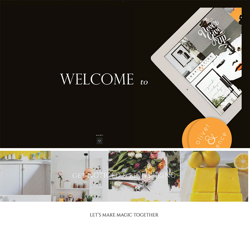
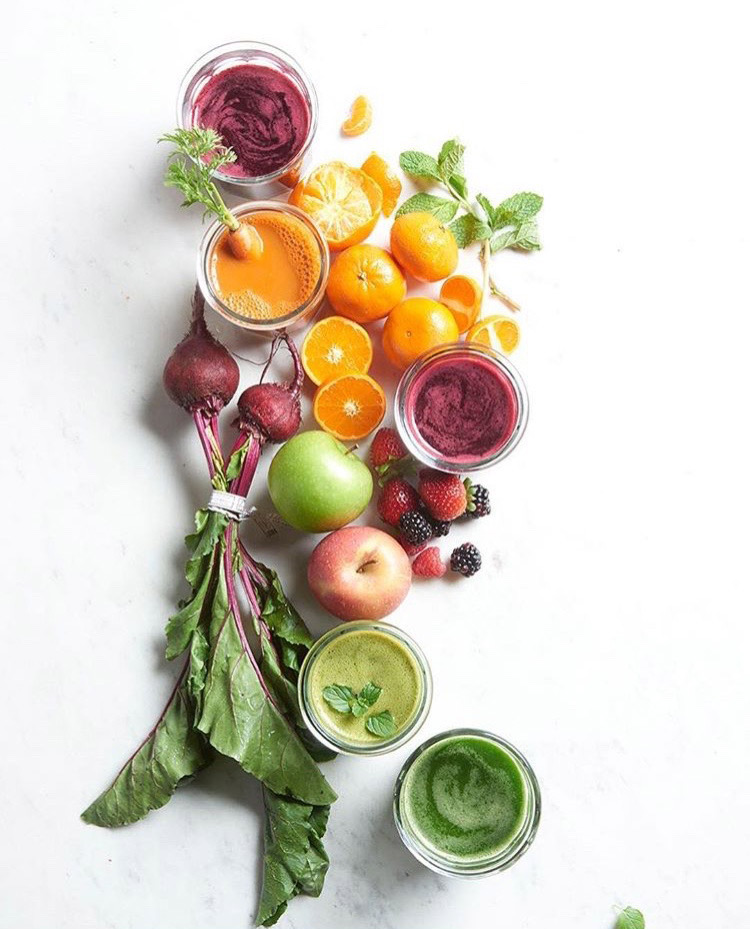
It was when I hit this website (above) of a talented food stylist in Vancouver that I knew I’d found someone with my aesthetic.
And the person who designed her website was Kim at Oliver & Spence. I loved the look and feel of Kim’s site too, so I hired them.
I started working with Kim and her team in February last year.
I presented my Understanding Undertones system to Kim and her staff and they started by designing my fabulous new colour wheel because that was the beginning of the new website. One of her staff confided that she wanted to re-paint her house after I had given my presentation, via Skype to her team.
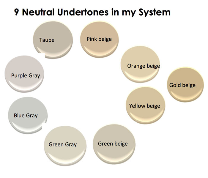
This is how my colour wheel looked before:
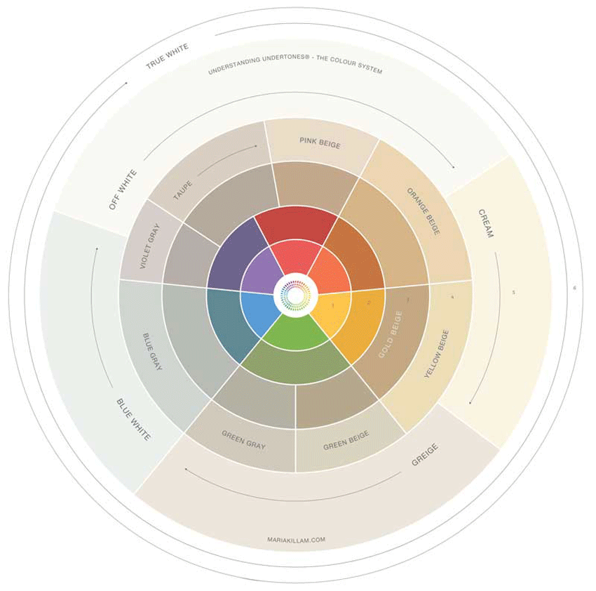
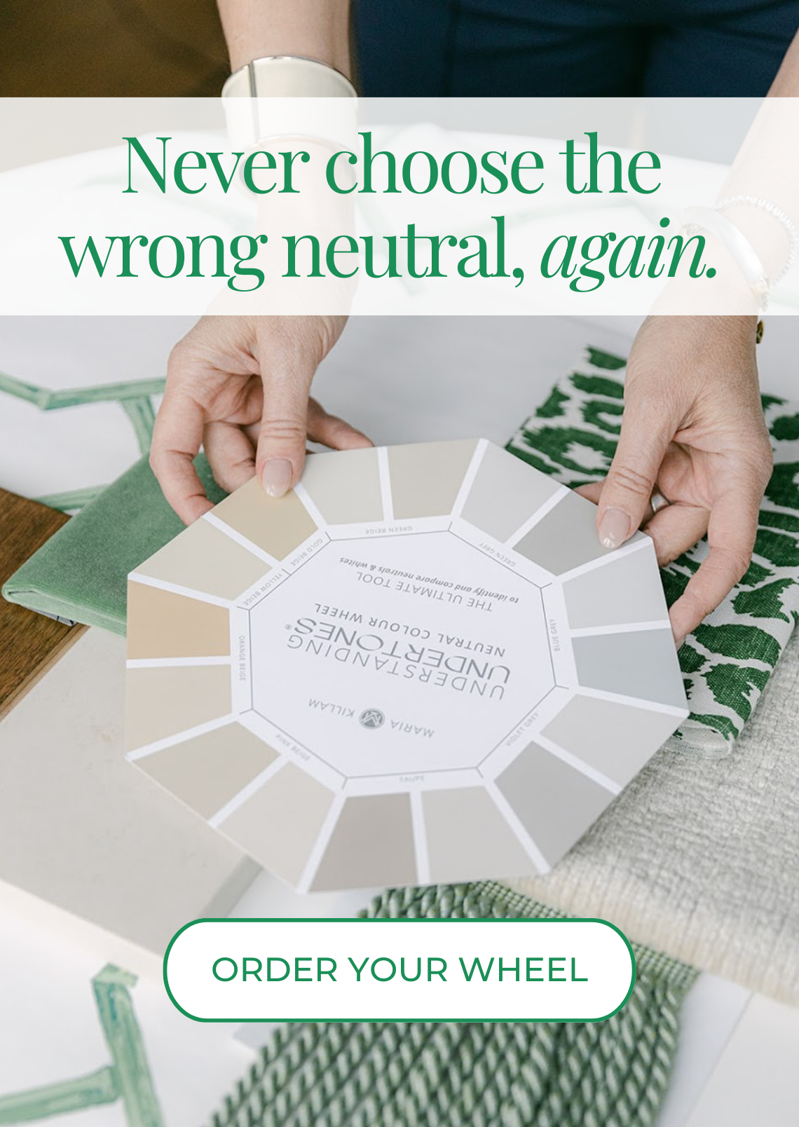
And this was the finished result. As many of you have already seen.
Understanding Undertones – The System
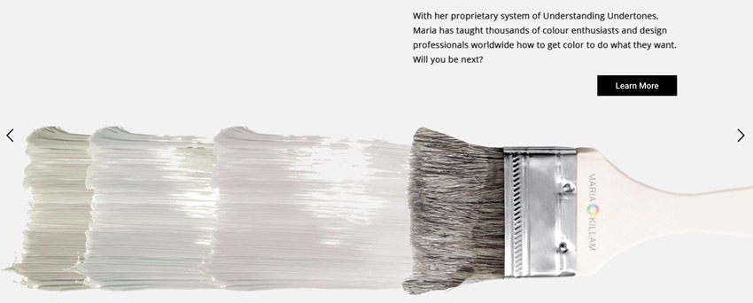
I also loved this inspired design Kim dreamed up of the paintbrush showing the three undertones of grey which is a rotating image on the home page. Follow Kim on Instagram here.
Then in June, I flew Kim and her photographer out for a photoshoot. Kim’s art direction and the photos were fabulous but I was cranky when I received the photos because I was heavier than I wanted to be.
Shortly after that, my sister Elizabeth (she’s here on Instagram) introduced me to the juice cleanse I mentioned a few months ago and I lost 10 pounds in 12 days.
My sister, Mom and Terreeia had similar awesome results and Terreeia told me a story about a couple she is good friends with who party hard occasionally and then they juice if necessary. And they are always gorgeous and slim.
I realized that’s how celebrities do it too. If they gain some weight because Christmas happened or they went to Tuscany for a few weeks, well they just do a cleanse to get their weight back on track.
via BHG
To be clear, do you have to eat like someone who weighs 10 pounds less? Yes of course you do. The reason any weight loss plan fails is because afterwards, most people continue to eat like they were eating BEFORE the plan. Any successful change in your life requires creating new habits. It would be way more fun if we could keep eating the same way but sadly, as you know, it doesn’t work.
I know how to eat 10 pounds lighter, but it was definitely more motivating to do that AFTER such fast results.
Now before you start posting comments about how bad ‘crash dieting’ is, for the record, you should know that drinking green juice will cure you of all kinds of ailments. It gives your body a much needed rest so it can focus on something other than digesting your food. Dieting on plans like ‘Lose 5 pounds by eating only cheese and cabbage for a week’ is probably not awesome.
And doing a juice diet was easier for me because I was almost born with a glass of freshly squeezed carrot juice in my hand. My Mom and Dad have been health freaks forever! But don’t believe me, watch this video. And you can download this 7 pounds in 7 days ap on your phone. It gives you a shopping list of exactly what to buy and pings you when it’s time to make your next juice. So great. I’ll be doing it again shortly after I get home from Palm Desert at the end of this month (It’s hard to eat salad during the holidays, and I gained 6 pounds).
My new photos were taken by Angie Wolfe who happens to be my next door neighbour! She is truly gifted at getting a natural smile out of her clients!
My headshot for my bio page and this photo (below) with my colour boards were also by Angie.
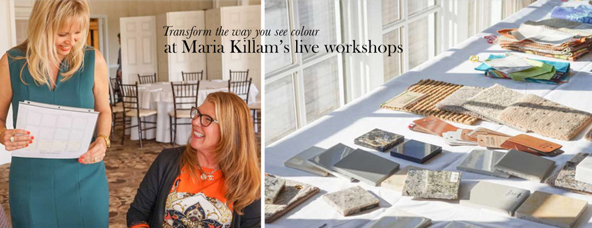
I also wanted better photos of me and my classes taken on-site during one of my workshops. Melissa Bolinger was one of the designers who attended my New Jersey course last Spring. She brought her camera and took some great pictures in the class. Then she volunteered at my Los Angeles course in September and took some more amazing pictures.
So I flew her out to my Charlotte and New Jersey Class from Seattle so that I could add some more photos to my Workshop landing page, here. She did a great job, it’s not easy to get a candid photo out of me. She’s a designer, True Colour Expert, AND a photographer!
Photos by Melissa Bolinger
After my website design was complete, it needed to be built. Since my CMS (customer management system) system is Infusion Soft and Kim’s team was not familiar with that platform, I hired Terrence Murtagh to build the site for me.
For the record, I am NOT an easy client to work with when it comes to graphic design. Just like I can take one look at a room and know immediately what’s wrong with it, why it’s bugging you and tell you exactly how to fix it. Well, I’m the same with creative on print.
Once I have decorated and styled a room, my clients don’t move anything. If I drop in a year later, everything is exactly where I placed it when I was there last (unless it was moved by the the kids or the housekeeper).
Anyway, when I get sent creative for my review, I know instantly if it’s not right, but sometimes I don’t know what to suggest to fix it because graphic design is obviously not my area of expertise.
And a website that is about me? That has to represent WHO I AM? Did I mention, this did not make me an easy client?
What I’m ALWAYS waiting to see, is something I would not have thought of myself. After all, that’s what I do for my clients every day. That’s what a good professional does. Otherwise, why am I paying you, if I have to tell you exactly what to do and exactly what I want? I don’t always know what’s best in an area where I’m not the expert. I was thrilled with the final look and feel of my website thanks to Oliver & Spence.
Then, when I hired Terrence to build my site back in late September, I had the unrealistic expectation that this should happen in two weeks! Well with the size of my website and my eye for detail, it took more like three months. Terrence was totally calm in the face of my list of endless changes and we’re still working on all the glitches that are bound to happen when migrating a site with over 1400 blog posts.
I’m not sure I ever want to do this again. Right now I need a featured image on every single post on the blog recap page. My assistant suddenly has a forever and until-the-end-of-time project to keep her busy in between other tasks. And this website will probably end up costing $40,000 in the end if I include EVERYTHING. Branding, design, photography, flights, expenses, building and development of the site, the shopping cart, migrating 8 years of content and images, change after change and fixing the blog. Much bigger than the average website for sure.
The reason I’m giving you an idea of what each website cost in the 8 years that I’ve been doing this, is because I had dinner with two designers when I was in Paris at Maison & Objet last Fall and when the subject turned to website design, one said she had just launched a new website. She confided to us that she spent $4,000 and asked if we thought she paid too much?
Well now you know the answer to that question. Without any bells and whistles, shopping carts, landing pages and blog posts to migrate that seems to be the basic price of the average website.
I want to thank every professional who I’ve worked with and mentioned in this post. Without them, I would not have this beautiful new website and I am truly grateful.
Thank you to all of my readers, without you, I would not have needed an updated website!
Related posts:
Learn to be Bossy Yet Charming















… and it looks fantastic – IT’S TOTALLY YOU!!! xoxo
I had no idea of the expense….
The new website looks great . . . and so do you! 🙂
I love the new website! It’s so clean, modern, and fresh looking … it’s just perfect! And you look great in the photos! Thanks for telling us about the journey getting there.
Every time someone tells me I’m difficult, perfectionistic, and demanding, I am going to think back to this post. Genius often requires it — you’re proof, LOL!
I admire your tenacity. After kissing a lot of frogs, you did not settle. The proof is in front of me and I look forward to the future. You rock, Sister.
See you didn’t need me after all. You look perfect in the photos and your makeup and hair is exactly you 🙂
However, if you ever want to experiment, try something different, try a different style for hair and makeup and photography – I’d love to play around with it for you. Xo S
Scarlett, I totally did, but you are very busy and important and I did not book you far enough in advance! Next time! x Maria
I just love reading your website, Maria, whether you had changed it or not. I love to read about aesthetics in a home. Each time I open my inbox I am hoping to find a posting from you. For me, it is like opening a gift which brings me joy. Your enthusiasm amazes me. Please keep posting!
Tina, you’re the best! Thanks for your lovely comment! x Maria
And we feel exactly the same way about designing our homes as you did about designing your website!
Haha, so true! x Maria
Beautiful site, Maria! Congratulations!
I am an internet marketing specialist (aka website builder), and it’s true that most people are either marketers or website designers, not both. I can build a website really quick, and most people can, but it’s the content that is hard. Someone who can write great content that really draws in the visitors is key! Good pictures are great, but a good photographer can do that for you. If you need a website for your business, don’t necessarily be too wowed by an expensive agency and their portfolio. Many cost a lot of money and the pages are barely readable or interesting. There are those of us who are small in the business, but we write great content and our projects succeed as a result. So, yes, it can cost a lot, but it doesn’t necessarily have to if you search out a small proprietor who values your business and shares your dream. I interview my potential clients to get a feel for their dream so that I can incorporate it into the site. It’s not MY site–it’s theirs, so it should have their personality!
Good grief! I had no idea.
Great work, everyone. In the pre dot com bust in NYC, we hired a firm that had done another large firm’s site. We hired the experienced team–we thought–that was located in Soho after meeting with them 3 times, signing docs after verifying we’d be working with them and that we were chosen them over their competitors because they’d done that other site. Then the start date for the kickoff arrived and we had a team from Boston. I wanted to throw them out since they were not the people 2 miles away in Soho who had done the work for the other firm. But my boss who was the owner wanted to give them a chance. Nothing good came from that very contentious relationship. Long way of saying even when you think you’ve done every thing you can to hire the right team, communication and fit are everything. I did learn about Google from one of those Boston kids, though. LOL!
Maria, the site looks like a MILLION BUCKS ….. and I absolutely am crazy about that paintbrush thingee, I think it’s GENIUS — it communicates _so much information_ and looks cool. May you continue to grow from strength to strength…..
And, did I say how much I LOVED your November Color Training in New Jersey???!!!!???!!!
It’s beautiful, Maria. Congratulations!
Any plans to produce a hard copy of your color wheel?
Linda
I’d order one in a heartbeat!
It’s in the works as we speak! thanks Linda! you will be the first to know! x Maria
Maria, as someone who has helped corporate America manage hundreds of websites, I can tell you that it is absolutely not easy, and $40k for a site of your magnitude, complexity and depth is reasonable. Don’t beat yourself up at all. You get what you pay for. And, this is magnificent!
OMG, I had no idea a professional site cost so much! This was a very informative post. I have a little Blogger blog that’s free and nothing special (I’m not selling anything), so that was my paradigm for the internet. It is lovely and your new colour wheel really resonates with me. They’ve done a great job under your watchful eye!
I juice occasionally, but have never done it as a weight loss method, just a healthy eating thing for when I’m not in the mood to cook. I may have to give your method a try, as I’ve packed on some weight during my latest renovation (and losing my workout space).
Maria, You have been through so much! I just don’t know how you handle all that you do. The journey to this new website has been long and tedious but well worth it. It puts you heads and shoulders above almost any top designers that I know. I think that this is just a spring board for what is to come to you! Hopefully fame and fortune. Needles to say we are all so proud of your accomplishments and wish you every success that you deserve! Your are one CLASSY lady!! Love you!
Lucy, I love and adore you, thank you for your never-ending comments and support! I love my readers truly! x Maria
Maria, thanks for sharing the information about your website design. I also use Infusionsoft for my CRM and WordPress for my website. I know there are many stock template real estate websites, but I want to be different and also own my own site. I do know these things can be expensive and cost a lot more than 4000.00 to get a professional custom site. I have been thinking about updating my site, so thanks for sharing the people you hired to work on your site. Anyone who understands how Infusionsoft works as well as WordPress is a great contact.
Wow, I didn’t realize a professional site costs so much. I loved the old site and new, it’s the words and advice that matter, and you are one of the best bloggers b/c you are interactive, give concrete practical advice, and you keep it coming. That’s what keeps me coming back! Thanks for all your efforts, it is very helpful for decorating advice, and just plain fun to get engaged!
I liked your old website, and the new one. But I do think that the body type was easier to read in the old version. Thanks for sharing what it takes to keep a blog like this going. I have learned a lot about color from you and appreciate your can-do attitude.
Maria, this was just fascinating. I had no idea. I love the various pics of you–they look completely natural, yet show you at your best. Your site is beautiful. Love the paintbrush thingy, and am eagerly awaiting the color wheel.
My husband and I are a little overweight–at 10 pounds less I would look good, and slim if I lost 20. I love good food, hate dieting, hate juicing, really like cooking. So we have begun the two day a week calorie limitation plan, where you limit your intake to 600 calories two days and eat what you want the rest of the time. (We’re doing 700 during the winter because it’s so cold where we live.). It’s a lifetime plan, not temporary. We’ve only done it for a couple of weeks, and we do get really hungry, but I like it because it’s a semi fast and quite simple. My husband has to eat a little more on tennis days, because otherwise he runs out of energy. You can actually have a good dinner on fast days, such as a big bowl of bean and vegetable soup, or fish or chicken breast with lots of vegetables. We have both lost the few pounds of holiday weight we gained, and after we’ve been on this for a couple of months we’ll evaluate to see if we’ve lost enough weight to make it worthwhile for the long term.
Wow, that’s a lot of work and expense. But the finished product was well worth it.
CONGRATS on the new site! It’s lovely and (said in my best Billy Crystal voice) “You look marvelous”. The green juice cleanse…well…maybe. In the meantime, I have my second set of large samples boards out on appointments and hope to see you pretty face in person at a training this year.
Maria- congratulations, first of all for long suffering in the same direction!
BRAVO! You are in the stratosphere now!
I just attended the International Kitchen & Bath Show in Orlando, and had a hot flash just walking PAST the internet technology section ( a city block large!) But , I have to brag on my husband…. he just completed our 2nd website ( we are selling our development) & he made it, not without hours of agony, all by himself!
http://www.fallingwatersnc.com. Check it out!
You just continue to amaze me and truly, I wish I could attend every one of your classes all over again, just to hear all the new insights& see & laugh with you again.
Now you’re “A Big Sparkle” ?
?Paula
Love the new look and feel, it definitely matches “you”!
I just have one comment that I wanted to share with you although maybe you’ll want to punch me in the face but I notice it every time. The image with you throwing up your fabulous color boards in the air…because you are so fair and the background is so light, I swear my eyes zero in on the seams of your crotch. Maybe it’s the awesome yellow shows that draw my eyes down, I just don’t know. 🙂
Is that weird? Probably so!!
No my graphic designer called it a ‘crotch shot’ as well, she didn’t love it. . .but I just like that picture, it’s playful, so I kept it 🙂
Want to see how your website used to look? Try this:
http://archive.org/web/
🙂
Beautiful site, I loved!!!