Annie Elliott is the blogger/designer behind the colour blog, Bossy Color. And she is bossy, but in a charming way (as I always say when my friends call me bossy :).
I almost think that trait is part of being a designer as we are paid for our opinion!
Annie is based out of Washington D.C. and is another colourist and designer that you cannot live without. I am excited to add her to my fabulous list of colour expert interviews:
[MK] What colour would you like to see banished from all paint decks?
[AE] That muddy khaki/olive/taupe color. It’s so dreary!
[MK] What was the moment when you knew, colour was your passion?
[AE] When I was about 11, I was “helping” my mother redecorate the house we’d just moved into. We were choosing furniture for the living room, and I remember explaining to a store rep. why dark green was the wrong choice for our wingback chairs; we needed a softer color, like cocoa.
That person offered me a job on the spot. She was kidding, of course, but it was my second job offer of the day. I remember thinking I might be onto something.
[AE] Early on, I made the classic mistake of encouraging a client who “loved color!” (her words) to paint each room in her house a different, bold, primary color. It was very, how shall I say…circusy.
[MK] What is the most important colour lesson you’ve learned?
[AE] When in doubt, go lighter. Clients who are ready for color sometimes look at a swatch and think it doesn’t seem strong enough. They’ve decided to go beyond neutrals, and they want a BIG change! But color generally intensifies when it covers an entire wall (or room). So if you’re torn between two shades of a color, remember that the lighter will probably give you the effect you’re looking for without being overwhelming.
[MK] When it comes to colour, what’s hot?
[AE] Pantone just declared “turquoise” their color of the year for 2010, and I should have seen it coming! Lighter, warmer blues – anything called aqua, Robin’s egg, even light teal – have been gaining momentum for months.
[MK] Which one do you think is timeless and which colour trend would you love to see disappear?
[AE] I think there will always be a place for tone-on-tone layering: think beige and off-white living rooms, or white and light grey contemporary spaces. That can be a very elegant look.
As far as trends marked for extinction, I hope will all of my heart that “earth tones” are on their way out. I’m referring to warm, murky colors such as khaki and deep greeny grey, not colors that may be classified as “global” or “eco-friendly,” such as clearer brown, persimmon, and teal.
[MK] What do you think is one of the biggest mistakes homeowners make with colour?
[AE] Thinking they should do a different color in each room. You can’t underestimate flow: moving from one room to another shouldn’t be a jarring experience. Too many dramatic color shifts can be unsettling.
[MK] Why did you become a color professional?
[AE] I know this sounds hokey, but I really wanted to help people love where they live. As a museum professional (and former art historian), I was in the business of bringing beautiful and/or intriguing objects to the public. But I wanted more immediacy.
Color has such a direct impact on a space. When a client says to me, “I never thought this house could look so good,” “I love this room now,” or We’ve never spent time here before; now we don’t want to leave,” I feel fantastic. And I know I’m in the right business.
[MK] What are the 5 things in life you cannot live without?
[AE] My twin daughters and husband (I’ll count that as one: family!) 2. my English grandmother’s writing desk, 3. allergy pills; 4. The second movement of Tchaikovsky’s Symphony #4
Another nice interview Maria. I am a fan of fellow DC designer Annie Elliot and was glad you added her as on of the fabulous folks you have interviewed. Cheers, Kate
Great interview! I love reading about people thinking process and design point of view. Also, I really enjoyed reading your New year resolutions post, you exudes such energy….. Your house looks great, great style, great garden and fabulous views…
Great interview, Maria! Love Annie to pieces. And Annie, think my 11-year old is going to follow your footsteps. Same traits and automatic "no, that's not going to work" ability 🙂
I just adore Annie and her blog; what a wonderful, talented, unique voice she adds to the world of color design. Thanks so much for introducing her to your readers!
Great interview questions: All interview questions should be this pure. You do get a good feeling from these interviews. Everything is getting a bit more colorful and happy around here great start for a new decade.
Great Interview… I have to agree with loving the color yellow. The exterior of our home is yellow and even on a cloudy, drizzly day it's an inviting, happy place to be!
another great interview, maria…and annie! and i can so relate to your answer as to why you became a color professional. It's not hokey at all, annie! there really is no greater reward than knowing you've changed the way people experience their home – and their lives – simply through color and design. keep colorin'!
It was a really interesting interview. I really agree with the idea of flow and not having too many wall colors in your home. So that made me feel good!
I love colour and people who love colour. Although turquoise makes me want to scream and pull my hair out. It hurts my eyes! I think those muddy kahki.green/grey tones should be called dirt tones, not earth tones.

 Interior by Bossy Color
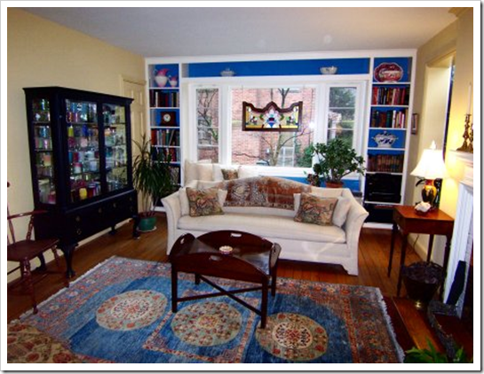 Interior by Bossy Color
 Interior by Bossy Color
 Kitchen by Bossy Color
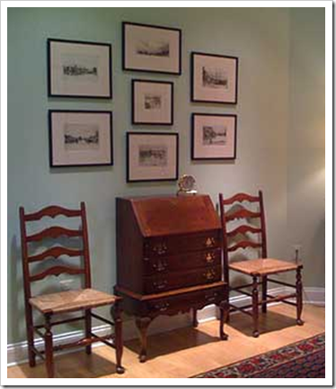 Interior by Bossy Color
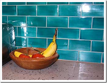 Kitchen by Bossy Color


Another nice interview Maria. I am a fan of fellow DC designer Annie Elliot and was glad you added her as on of the fabulous folks you have interviewed. Cheers, Kate
Maria, thank you so much for the interview – it's an honor to be in such esteemed company! (And Kate, thanks for the kind words – right back atcha!)
Here's to a colorful and rewarding 2010 for all of us! xox
It s sounding like yellow will remain a big color, as well as the other ones mentioned!
Hi Maria,
I found Annie interesting as I do you. I love your blog. Keep up the good work.
Another wonderful post. I have so much to learn about color and your blog is the first place I go to become informed and inspired. Thanks!
Great interview! I love reading about people thinking process and design point of view. Also, I really enjoyed reading your New year resolutions post, you exudes such energy….. Your house looks great, great style, great garden and fabulous views…
Great interview, Maria! Love Annie to pieces. And Annie, think my 11-year old is going to follow your footsteps. Same traits and automatic "no, that's not going to work" ability 🙂
Excellent advice and the perfect questions for such an expert! Thank you!!
Wonderful interview!
and Yay for Turquoise: My favorite color!!
xoxo
Thanks for the interview, Maria. I just spent an hour on her blog, it's great !
Yay for turqoise too !
Great interview. I've visited Bossy Color's blog a few times and received some useful tips!
I just adore Annie and her blog; what a wonderful, talented, unique voice she adds to the world of color design. Thanks so much for introducing her to your readers!
Maria,
Great interview questions: All interview questions should be this pure. You do get a good feeling from these interviews. Everything is getting a bit more colorful and happy around here great start for a new decade.
Bette
Great Interview… I have to agree with loving the color yellow. The exterior of our home is yellow and even on a cloudy, drizzly day it's an inviting, happy place to be!
another great interview, maria…and annie! and i can so relate to your answer as to why you became a color professional. It's not hokey at all, annie! there really is no greater reward than knowing you've changed the way people experience their home – and their lives – simply through color and design. keep colorin'!
Really enjoyed this post – Annie's great & you are as well for featuring her ideas in you expert series
It was a really interesting interview. I really agree with the idea of flow and not having too many wall colors in your home. So that made me feel good!
Thanks for yet another great post.
Cheers!
Thanks for the kind words, everyone! And thank you again, Maria, for including me in this series. Happy blogging – and designing!
Cool, cool, cool!
Good interview and all the substance…
Thanks!
XX
Victoria
I love colour and people who love colour. Although turquoise makes me want to scream and pull my hair out. It hurts my eyes! I think those muddy kahki.green/grey tones should be called dirt tones, not earth tones.
Of course I'm never one to be consistent. I like turquoise if it is glass.
It's interesting that I wear the same colors that I use in my home but my sister is totally opposite.
I bought a home that has taupe trim and in the rooms I did over in white trim I am happier and feel better. Color and light does affect your mood.
Annie is so darn terrific! Her eye for color has transformed my life (and my living room, dining room and kitchen).