


You know how referral business is always the best because if you have a great client, then it’s likely that their friends will be great too?
Well I have decided my readers/clients (that’s you) are all fabulous! It’s like I get the best referrals on the planet from those of you that read this blog and I am so grateful!
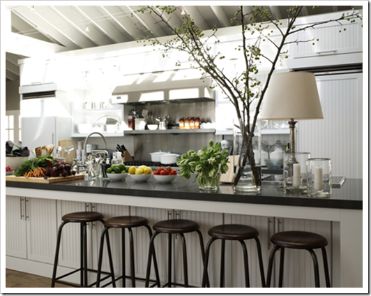
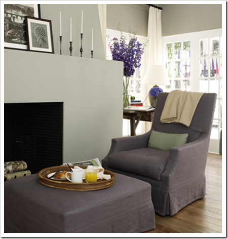
I was on the phone doing an on-line consultation this evening and my client said she was copying House Beautiful’s 2009 Kitchen of the year (above). So I thought I’d post it to show you!
Yesterday I was at an in-home consultation with a lovely couple in Steveston. She led me into her kitchen and said “What do I do with these 80s cabinets?” Their renovation budget was being spent updating the entry and basement first so the kitchen would have to wait.
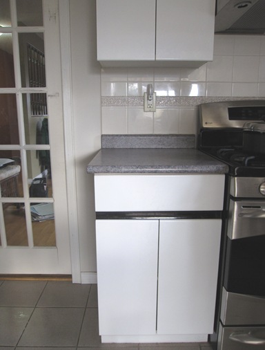
The only thing that was being replaced was the gray 12 x 12 80’s tile by the light wood flooring throughout the rest of the house.
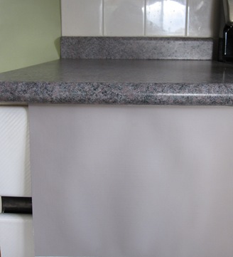
You can see the black stripe in between the drawer and the cabinets (it had to go because it didn’t relate to anything in the kitchen) and of course the pink and green speckled arborite countertops.
She asked if she should paint the counters. That can be done but I would only recommend it as a last resort. I told her she might be surprised how pretty her kitchen could be with just the right colours and suggested purple for the bottom cabinets.
Annie (my client) looked skeptical until I pulled out (BM) 2109-50 Elephant Gray and held it underneath the countertops! I recommended that we paint the lower cabinets and keep the uppers white. And which green would look the best with white? Why a fresh one of course! We chose HC-115 Georgian Green (BM).
And I love green and purple together! Since most greens go together (just like in nature) even though the green in the countertops was more of an 80’s teal, I could still specify a fresher green and have it relate to the counter (going back to yesterday’s post). That always looks the best and would be my first suggestion.
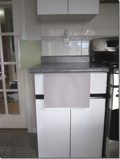
Here is a better picture so you can get the idea! See my piles of large samples through the glass in the pocket door? Can’t specify colour properly without them!
 Purple is in! From House Beautiful
Annie was thrilled because until I showed her this purple/gray colour, she saw her counters as pink and green! Remember how I wrote in this post how I have saved many a “OMG I hate this kitchen/bathroom” from an immediate renovation? Well here’s another example of the power of colour!
What do you have in your house that is 80’s and has got to go?
We would love to help you choose colours, select the right combination of hard finishes or create a plan to pull your room together. You can find our fabulous email consultation packages here.
The only way to choose the right colour every time is to combine my system of understanding undertones with the most indispensable colour tool available. You can purchase your own set of my curated large colour board collections here.
If you would like to transform the way you see colour, become a True Colour Expert.
Related posts:
10 Ways to Save money Now by Creating a Focal Point
How to pick the Right colours for your Kitchen
If you are new to this blog, click here to see the Best of Colour Me Happy
While you’re here, subscribe to this feed so you don’t miss out!

excellent Maria! I use guilford green quite a bit. I also loke wythe blue. all bm. of course all depends on what you are painting but I find I have a few colors that are my faves! Great post!! We use canvasses for our paint samples. They are thin ones that are about 10×12 I guess. Not to pricey and hold up pretty well. What do you use?
excellent post.. what an easy transformation !
Great choices. Another example of why you are the expert!
Show us when you are done?
pve
no nothing from the 80's in this house, cept maybe my DH's hairstyle!!! I hope your client shows up what she ends up doing, I'd love to see that idea come to fruition!
Maria, I confess I almost passed out when you suggested to your client to paint the lower cabinets the color purple! But, when you showed the sample of the color you had in mind I had to gasp! What an awesome choice–so sophisticated, stylish, unexpected, & fresh–wow! and with green walls that kitchen will be incredible. Without a doubt, you so deserve the title of color expert :]
Sindy
Good save, Maria!
I do a fair amount of kitchen cabinet rehabs and it always is such a dramatic transformation.
Love the gray and dusty purple/green combo.
I had to laugh when you shared her reaction to "purple". What's funny is that a lot of people really like purples, but the word triggers them. Purple must mean grape purple, right?
Often I'll say to a client, let me show you something and see what you think. I tell them later that I won't use the color name because they can be biased about it without even seeing it!
Great color choices. She is lucky to have white cabinets from the 80s. White-washed cabinets are challenging if you don't want to refinish.
Please do share after photos!
I would definitely react the same way as your client, if you suggested purple cabinets to me. However, I can see how well that colour would go and I love the green. Great post. I hope we get to see after photos.
I love how that Elephant Gray works so well with the countertops, Maria. I hope she is going for your suggestion.
Your posts always have the best information with pictures to back it up! Fabulous as always 🙂
YES– I agree!! If you can, please show the "after" pictures!! I have u-g-l-y forest green counter tops in my kitchen. Would just love to see the final result of the purple/green combo… if she goes with it.
Hi Details,
I paint up my samples on poster board so I get 4 to a board, see this post where I photographed how I painted them http://tinyurl.com/yjngxw9 They are lighter and easier to carry around then anything else.
Maria
Although my house was built in the 1950's, the bathroom was remodeled in the 80's. I am currently overhauling the entire space–painting the oak vanity, new counter top and fixtures, and the list goes on!
You make it so easy! I love that when us ( the unwashed hoards ) make remodeling or getting a new look so complicated you walk in and with a flick of a colour swatch the job is made so simple!
I hope Annie takes your recommendations and makes them reality… because her kitchen will look terrific if she does!! Great job, Maria… and great post!
Victoria
Perfect demonstration, Maria! I hope you post pictures of the end result – I think it will be terrific! Marija
My house was built in the 80's and even though we have remodelled and updated almost everything, there is still a hard-wired smoke alarm that is an awful almond color. It looks terrible on the beige walls. I think I've almost convinced the hubby that white would be more current/less noticeable.
Christine in Alaska
Cant wait to see the final product!
http://www.bazaarofserendipity.blogspot.com
I love the colors you chose for her!! Hope you get pics of the finished product.
marcie
This type of update when done well is so gratifying. Can not wait to see it done…she is going to be soooo happy!!!
Absolutely lovely! xoxo
I see so many of these 80 formica slab doors. People are so quick to want to throw them out, but really with the right coat of paint and new hardware they can look great. I think its really nice you help people stay in their kitchens. Sometimes I think were too quick to waste…. getting a little philosophical tonight 😉
I cannot wait to see the "after" photos! I think it's going to be fun!!!
You are so smart. That is why we love to read your blog.
Bethany
Great recommendations Maria, I really like the purple colour you chose! I hope we get to see the results 🙂
What a transformation.
Wow, perfect, but who'd have "thunk" it? That combination wouldn't have occurred to me in one hundred years!
You'll have to post an after of this kitchen "fresher upper"!
I have an 80's kitchen and because of your blog I didn't change my back-splash to modern tiles but to marble. I painted a grey that you recommended. I will change my counters when my stove dies – but I hated my kitchen before and now I love it. Thanks for your blog
suzy
So inspirational Maria – great job! Saw your photo and quote in May's Style at Home – congrats!!
I would have never thought to paint the cabinets that color. I hope she takes your advice so you can post "after" pictures!
Oh gosh, my house is SO 80's!! Emerald green tile throughout the downstairs that I'm still deciding what color to replace it with. We painted our kitchen a burnt orange, so definitely need to get rid of that tile soon! I love the green/purple combination.
Karina
http://onepersonmakingadifference.blogspot.com