The best money-saving advice I give my clients every single day is dedicated around the correct way to introduce finishes from today into your dated, 20-30 year old (or more) space.
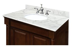
For example, recently I consulted with a client who had plans to rip out everything in the bathroom except the one-piece shower/tub. She sent me some images in advance of our consultation of some combination sink/vanity units she planned to purchase to replace her existing vanity.
Pretty right? Carrara top, built-in vanity = $700. A bargain. However, if you buy this unit and leave your tub/shower from the 70s/80s, people will walk into your bathroom and say “Oh, new vanity, old tub.”
My advice to the client was to buy a white vanity from IKEA and install a formica countertop instead. This advice more than covered the cost of my fee for the consultation by the way.
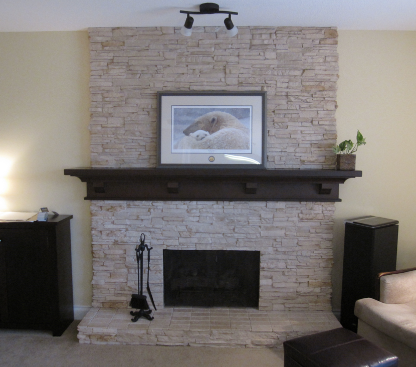
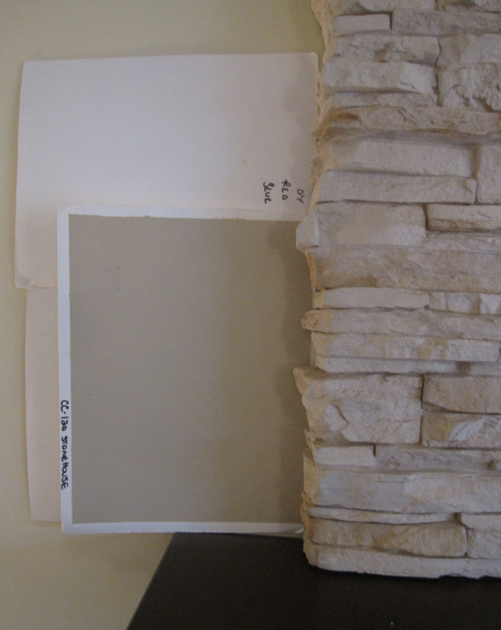
The following couple were not sure whether they wanted to paint their kitchen or take it out. They were also installing new carpets and hardwood floors. However the first thing we had to deal with was the colour of the family room. It had been painted yellow and my clients did not like how it made their new stone fireplace look dirty because of the pink beige undertone.
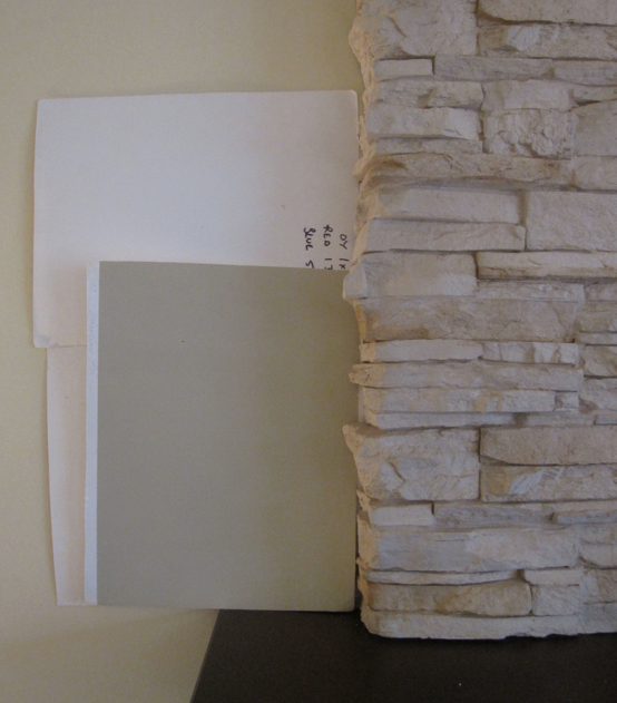
First we tried HC-92 Wheeling Neutral – the green beige just enhanced the pink beige stone even more. Notice how I immediately turned around two other boards so that we could be strictly focused on the colour of the stone fireplace.
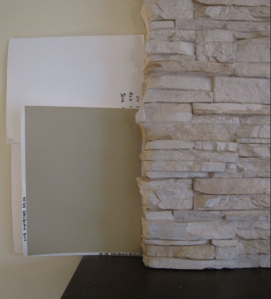
Then we tried CC-120 Stonehouse. It worked because the stone wasn’t screaming pink and neither is that colour but my client’s kitchen/family room was north facing so they felt it would be too dark.
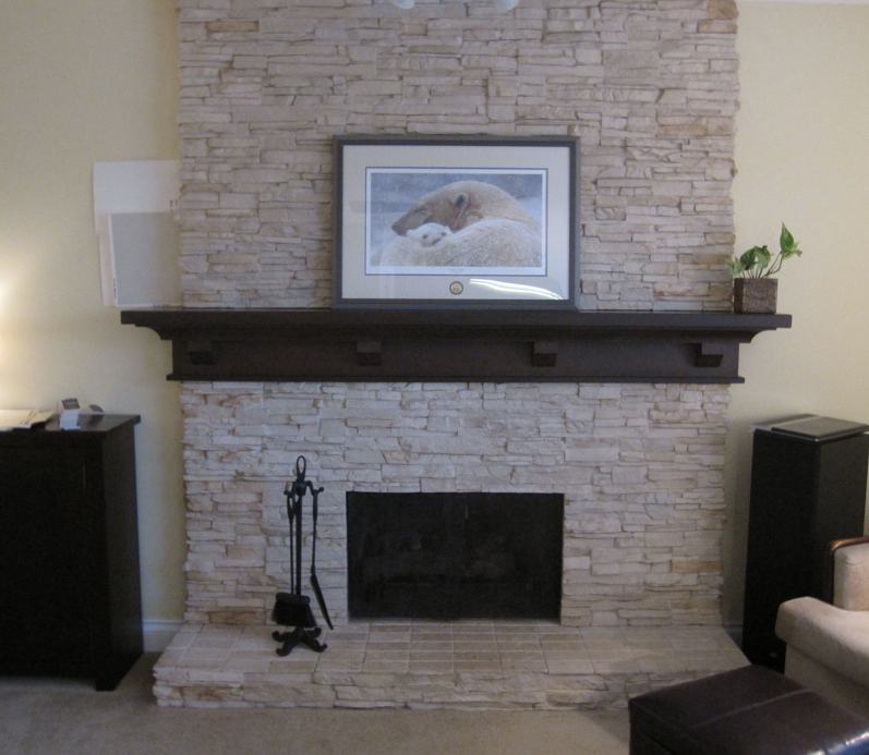
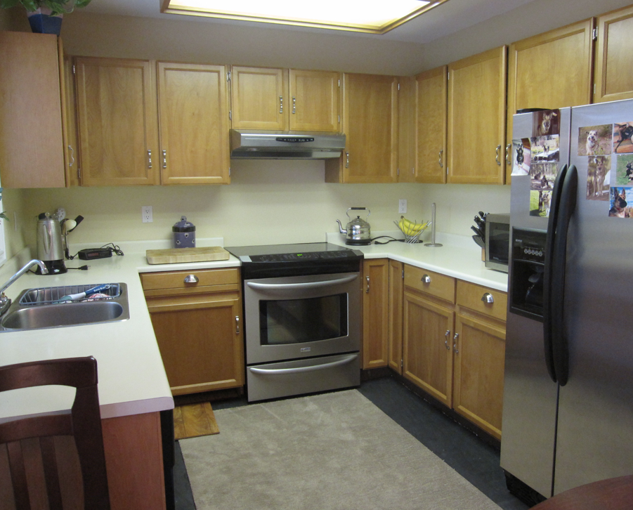
Next we moved on to the kitchen. Here is their 70s kitchen installed in 1981.
This floor was so great with everything in their house I asked how many colours they had actually discarded in advance of my arrival. They said, “A lot, we have been looking for weeks.”
You can see that if you installed espresso brown flooring into this existing kitchen, the floor would scream today and the kitchen would scream yesterday.
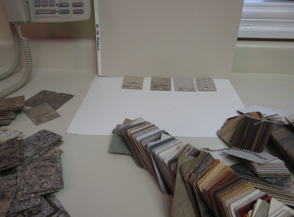
Next, we set about finding a formica countertop. Stone countertops installed in a dated kitchen like this would also be bad as that is not what we were doing in the 70s and 80s.
Installing stone countertops on an existing oak kitchen would also give you an “old and new” look. I immediately nixed all the blotchy “granite look-alikes” on the left; you already know how I feel about granite so obviously the same applies with the fakes.
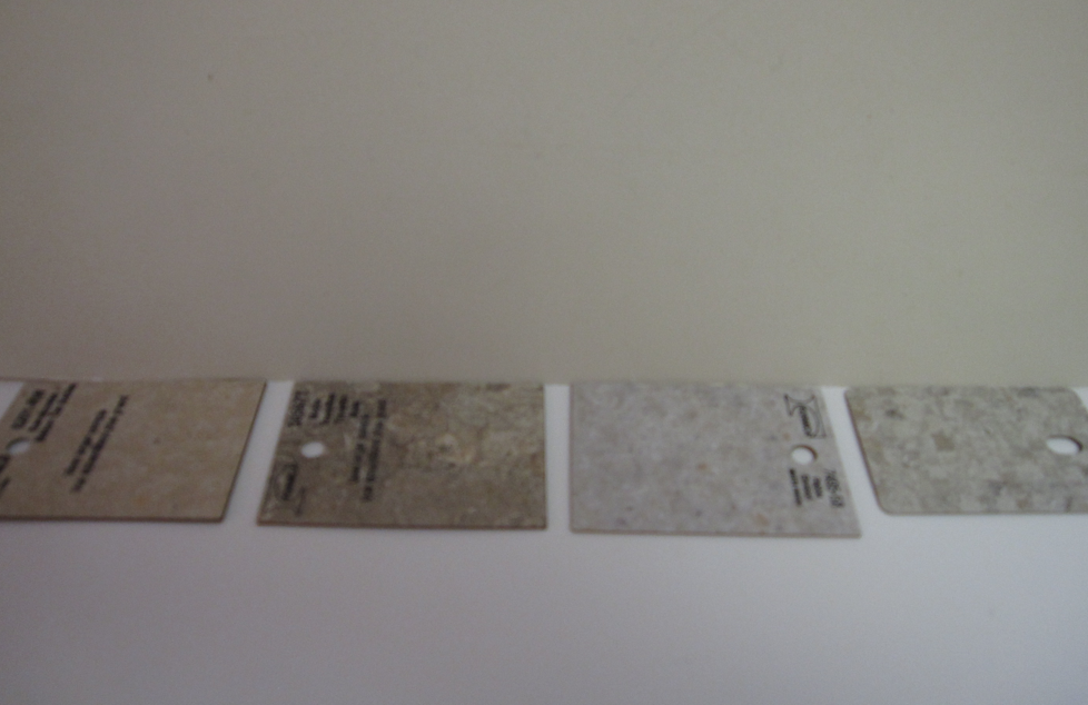
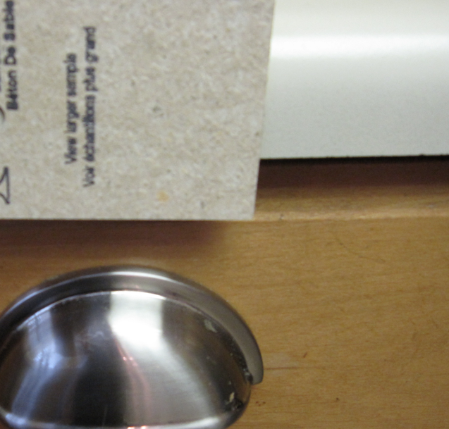
I was once called out to a house to approve laminate samples chosen by the designer in the kitchen store that in no way related to the tiles that had been selected for the bathrooms. Laminates are mostly bad and blotchy so if you look at them all and don’t see one that you like, this is the reason why. It’s why black is even a good choice (although you see everything on it) or even white. I mostly prefer solids or certainly something more like this one we chose (below).
See how it picks up the tones of the cabinet? My clients who were leaning more and more to a painted kitchen by the end of the consultation also asked for a white:

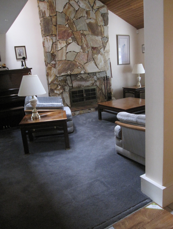
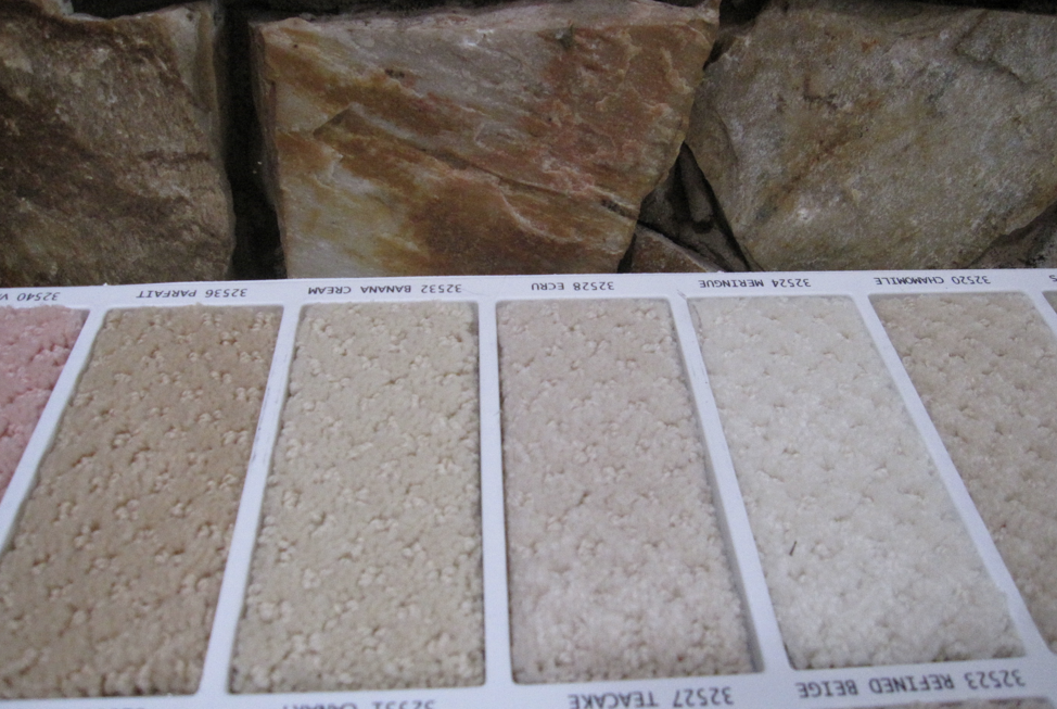
My clients loved the fireplace and cedar ceiling so we made sure that the floor which would go through the entry and down the hall was a good match to their existing elements. Especially important as they are technically dated. My clients were renovating this house for them, not for future buyers so making sure everything tied together well was important.
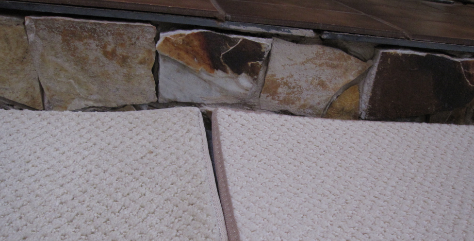
The sample on the far left was the one we chose. Keep in mind carpet, just like paint colour gets lighter when it gets installed.
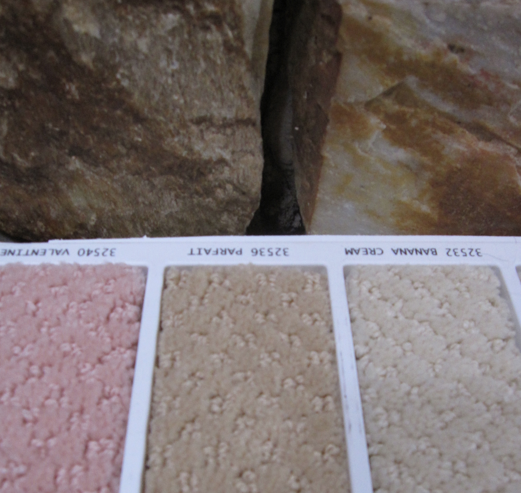
Here’s another look at Parfait, the carpet colour we chose.
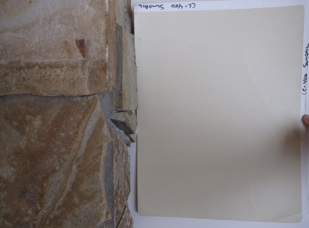
We chose CC-400 Sundial for the walls which picked up the butterscotch tones of the fireplace. Those of you who have purchased my large samples, 1045 would have worked well too.
The butterscotch colour also looked great with the carpet and ended up actually being the complement to the blue-gray furniture in the living room. My client laughed when I said it was blue, she said she had never seen her sofa and loveseat as any colour other than gray.
At the end of our consultation she said, “I was so lost in trying to make all these decisions, I would have chosen a noisy countertop and most likely the wrong flooring. The paint colour was already wrong — thanks so much for helping us pull everything together!”
Recently I received this comment on one of my posts:
“I built a new house . Your site saved me a LOT of turmoil. Everything looks fabulous. Right down to my white kitchen. I can’t tell you how much grief the contractor, trim installer, tile installer, the cabinet maker and my spouse, gave me about that white kitchen! When it was all done, they were in awe. The architect wants to put it in an article they are doing on kitchens. I couldn’t have stuck to my guns without your words of wisdom. I wish you could see it. I owe you all the credit!”
If you stick to a clean and simple look, you will spend months and even years happily congratulating yourself on how great your house looks. And that is way more fun than spending an obscene amount of money on new finishes that in the end don’t work with your old dated elements, are way too busy or simply the wrong colour because you didn’t understand which undertone was which (just like in the first example with the fireplace).
Simple equals happy, period.
Related posts:
Will Installing Granite sell your House Faster?
How to Avoid the Can of Worms While Decorating or Renovating
Is Hiring a Designer a Luxury or Necessity?
Download my eBook, It’s All in the Undertones. If you have a computer, you can download my book!
If you would like your home to fill you with happiness every time you walk in, contact me.
To make sure the undertones in your home are right, get some large samples!
If you would like to learn to how choose the right colours for your home or for your clients, become a True Colour Expert.



Wow, great work Maria, they are oh so lucky to have you!
Awesome post! I love seeing your large samples in action in your photos… and I’m feeling kind of proud that Parfait was where my eye went before I read which of the darker carpets was selected. I think that’s a testament to the TCE training I received from a certain someone 😉
Hi Maria,
Your blog is my favorite distraction 🙂
Did many updates from our consult and will send you the pics when I finish all the ‘little things’ (switch plates, remove frog tape, etc) They take sooo much time.
I’ve learned so much from your blog and consults.
Thanks!
Great, great lesson. Thank you for your constant generosity.
What a terrific post, Maria. Like Sheila (above), I was proud of myself that I too chose Parfait for the carpet right away. And Muslin is one of my favorite colours to use – had it in my previous bedroom and may just do the same here in the new house as we have the same green/taupe linens (sounds gross but it works).
Love this post!
Thanks, Maria, for another wonderful learning opportunity. You have educated my eyeballs!
Great post Maria! I love the colors you choose for everything! The two fireplace wall colors are perfect. Thanks for sharing, I love that I am still learning from you!
Maria,
Great post and each time we do a consultation like this it helps the client trust a designer’s eye on color details.
They will be quite happy for a long time to come.
Maria, would you go to the site Young House Love and see what you think of their penny tile color with the chartreuse wall paint? I’m trying to see the undertone thing, and to me the penny tile has a pink undertone while the paint color is more yellowish? I don’t want to criticize anyone’s choices, but I would like to hear your opinion.
Can you be more specific as to where that picture is, Celeste. They have a big site!
Celeste, yes! Ever since they did the tile reveal, I have been wondering what Maria would say about the colours. Ditto about not criticizing, their reno so far is terrific! It might just be that the paint looks different on screen than it does in person (love the colour, though). Also, I love the examples here! It’s amazing what a difference some properly coordinated colours can make. I hope we’ll get to see pictures when the work is done.
Nothing brings gray to life faster than bright fresh colours and on my screen the penny tile has a green undertone, nothing wrong with that and the yellow together. And when renovating a kitchen you always have to think about how much drywall is left when introducing a strong colour, it’s not done yet, I’m sure they’ll introduce some yellow accents to tie it in later.
Just to be clear, I’m talking about the penny tile question by Celeste & Brooke, not the first fireplace in this post!
I love these posts when you go over the steps and the why of the choices. I just did a consult with cedar ceilings and chose sundial as well. Thanks to your training, I was able to narrow down the choices and felt confident with the end result. Which was…happy client! Thanks Maria
Maria I love this post. I’m so excited because I’m starting to see what you’re talking about and am now picking out the “right” color before I read the answer. I never paid attention to color before and now I’m loving it. It’s still challenging for me, but oh so fun. Thanks for the link to my post about clean and dirty colors.
I get such a kick out of your posts-my daughter painted her guest bathroom vanity, put bead board up,walls,ceiling, new shower curtains, we went to visit , said how great it looked, she said it looks nice for a “polished turd” now, I can’t get that phrase out of my head,now, everytime I see old fixtures with new stuff surrounding it-there is such a fine balance- you, as decorater, would be such a great help to anyone with those type of projects,they recently remodeled their master bathroom, they took it down to the studs, new french doors,carerra marble walls and floors,frameless glass,marbled shower-wow-it looks straight out of a magazine!
Maria, I don’t know if you see these comments several days later, but I just have to say…I was soo disappointed when the client didn’t choose Stonehouse for the fireplace surround! It made the stone look elegantly rich. And…if it’s a north facing, thus kinda darkish room, wouldn’t the richer color have been a better choice? I’m sure their choice worked for them, or you wouldn’t have agreed. (I just obsess a little much over color too.) Guess this is just an academic question….
I’ll check back in a few days to see what you think.
Ugh, I wish you lived near me! ❤️