At the Design Bloggers Conference, this past week, Barbara Barry spoke and I love this quote:
“You should paint a room 10 times lighter than the paint chip you are looking at, so the light can play in the room all day”
I love that visual.
And it also reinforces my post, A Light Colour will Never Come to Life in a Dark Room yet again. Pale, barely there colours need plenty of light to come out and play.
Barbara Barry does not do dramatic interiors colour wise. Most of her spaces are filled with barely there blues, celadon greens and greige tones.
She said she loves neutral interiors because people create the pattern with the stuff of life.
I also prefer lighter colours to lots of darkness and drama. I like drama in dining rooms and powder rooms. I have never specified a charcoal gray for anyone yet, even though charcoal bedrooms and dining rooms abound all over the internet. It’s simply too trendy. But, as they say, it’s only paint.
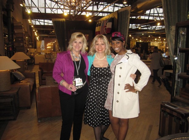
Traci Connell, Maria Killam & Barbara Gilbert
Then I met these two lovely designers (above) who follow my blog from Texas.
Ruthie Staalsen, Maria Killam & Kimberly Ward
Courtney Smart Stone & Maria
I met so many people who follow my blog, it’s been a fun 2 1/2 days!
Back to Vancouver tomorrow!
Related posts:
10 Things I’m Taking to the Design Bloggers Conference in LA
What it’s Like to be the Boss of a New York Magazine
If you would like your home to fill you with happiness every time you walk in, become a client
Download my eBook, How to Choose Paint Colours – It’s All in the Undertones to get my complete step-by-step system on how to get colour to do what you want.
To make sure the undertones in your home are right, get some large samples!
If you would like to learn how to choose colour with confidence, become a True Colour Expert.











Def the grey. I felt comfortable with that room. With the pink room it was like someone was shouting”…look at me, look at me!” I know that sounds strange coming from me because I like deeper colours and don’t have a problem with a bold statement here and there. Maybe it was a previous overexposure. I once worked as a housekeeper for a wonderful lady who was excessively fond of pink. In fact most of her home was decorated like the pink room…perhaps a little bolder with the accents here and there. The exterior and flowers around the house were also in pink. It sounds terrible I suppose but, it really did work. Just not for me. Never been a big fan of pink. I like it in clothing…you can change that. I like it in flowers. But to make a “permanent” feature pink…one that I have to live with…I think I’d rather jump off the roof. Srsly.
I hope you had a great time here in SoCal!
Contrary to my love of neutrals, I like the pink better but would like to see it with the furnishings of the second room.
I have loved grey rooms since the mid nineties but this example appears (on my screen) to be face powder fleshy grey. Not appealing to me. (My current favorite is Collingwood, looks great in every type of lighting here in Southern California)
You mentioned darker grey..we spoke about doing Evening Dove, that beautiful blue charcoal, in my bath. It was stunning, but the weird light in my room made it too blue for the tile. I found Temptation and though it appeared less pretty than Evening Dove, Temptation is perfect with my hard surfaces. In the end, it is a beautiful inky charcoal that makes me happy. Lol, does it sound odd that a charcoal is happy? I guess that the right color will have that effect, no matter what it is 🙂
I instantly liked the pink room more. It has a cosier, more personal vibe. I also prefer the furnishings better than the grey room.
100% the pink one. Way more interesting than the boring beige one.
Definitely pink!!!
Absolutely the pink.
It’s seems funny that while I love color, I prefer the grey room. I think I might soon get tired of pink walls. Actually, I agree 100% with Barbara Barry in that I also like neutral walls and “create pattern with the stuff of life”. Good post!
Karen T.
Pink it is., more vibrant and inviting
The beige/grey room makes me want to run away. It appears sad and “moody.” The furniture looks uncomfortable. Plus the furniture seems to say “you cannot relax or lounge here, you can only sit and talk temporarily.”
What the heck does Barbara Barry mean by stating that the color you pick should be 10 shades lighter than the color on the chip. How in the world can you ascertain and achieve such a thing? My Benjamin Dealer told me that I would not be able to lighten a chosen color without diluting it with at least (I repeat “at least”) 50% white. He said that I would not see a color difference unless I cut the paint by at least 50%. Is she saying pick a color and dilute it by 75% or more? Do you go to lighter chips? But then that gives you a whole new set of issues doesn’t it?
Hi Rita, I don’t think we can take it THAT literally. It’s just about barely tinted colour that she’s talking about. Maria
Thank you Maria. I think understand now. I probably “felt” this intuitively as I always gravitated to these “hints” of color shades but was somewhat criticized by my friends that I was not being bold enough. I recently followed my instincts and painted a room BM Affinity “SPA” – AF 435, which is a pale celedon color. Oddly enough, it validates what Ms. Barry is saying. So so on the chip but on the wall it is the most beautiful, soothing and perfect background color. It seems to both embrace and float the fixed and non fixed elements in the room. No one wants to exit when entering this particular room. I had the opposite experience with BM “Serendipity” AF-205. It also validates what Ms. Barry intends. In this case the color was unpleasant because it was too intense. Lovely on the chip but after I painted six, yes six 3’x4′ white sheets of thick white paper with one coat of this color and taped all six sheets to the walls, the “heat” of the color made you want to leave the room. It was too much color.
I chose both colors by throwing a yard of fabric on 2’x2′ color sample sheets. In the first case it worked and in the second case it did not.
I have stopped thinking that I am incompetent because I cannot pick the right color from a chip. The metamorphic affects of light on paint on the wall preclude instant knowledge of the final result for the inexperienced person. You figured it out before all of us. Thank you for sharing your knowledge.
I love the pink room! I have pink in various room throughout my own home.
I am usually all for color but in this case I prefer the second one. There is too much going on in terms of furniture in the pink one. Definitely prefer the more restrained furniture and scheme of the second one.
Honestly, I like that the pink room is unique but how would the man in that house feel? For me, it’s a little too girly and the gray looks a little lifeless. My eyes keep scanning the room for a color. A little too neutral for me. Also, the picture arrangements seem a little awkward in both size and placement. My choice? The pink room but would add a bit more gray to the pink to tone it down a bit. That would be pretty.
What the pink room does for me….I want to know who inhabits, created this room. It must be a very interesting person. True, it would take me a few minutes to settle down because I would be absorbing all the details, however this is what I love about really highly personal rooms which the pink L/R feels.
BTW I don’t hate the warm grey ! It would win over in most of my consultations.
The grey by a mile. The traditional furniture combined with that pink is just cloying to me. I wouldn’t want to stay there for five minutes. I like the grey room to a degree but I think the sofa is too light to balance off the larger, darker chairs in the foreground. I also think the gallery wall looks too intentional for my taste — I much prefer when it looks like the art chose the room rather than the room choosing the art.
I absolutely love the second picture, to me it’s calm and inviting and I like Barbara’s philosophy of a room “patterned with the stuff of life” especially if that means letting family and friends bring the room to life.
I usually prefer colors, but in this case I’d have to go with the grey room. The pink is just a bit too electric, a bit too much like Pepto Bismol. I like the other furnishings in the room, and if the pink was a bit more muted, it would definitely be my choice. So even though the grey room needs more excitement, I’d go with it.
well, you know me…PINK! Lovely to see you and play in Cali…cant wait until we meet again xo
The grey room, absolutely. The pink one is too busy, too much!
I must say the pink room was very well done and I love the furniture. But after a week, I’d be screaming. So for me, it’s definitely the neutral room. I have an aversion to pink since the “gray and pink” of the ’80s which filled my house. I even went as far as having pink broadloom in my MB. Shudder! We downsized almost 8 yrs. ago and there is not a drop of pink in this house. I am though starting to warm up to the dark pink tones but have yet to specify that for a client. It can be a little scary.
I am a lover of Charcaol Gray, so Maria, before I see you in April, you have some homework to do. LOL. I am getting my bedroom painted BM Escarpment on Fri. Although it’s not quite Charcoal, I can’t wait. My new bold gray and black striped drapery panels are waiting for me to hang them up.
You know it’s pink for me!! Loved seeing you at DBC. Thanks for posting our pic! FYI- Courtney Stone is from my small town too. Isn’t she the sweetest?! Xo
So fun to see you Maria. It was loads of fun and packed with information and lots of bonding time with friends! Hope to see you at the next one in Atlanta, if not before then 🙂
Oh, the grey without question. I have a similar color in my own living room, with an off-white sofa (two, actually).
The pink makes the artwork look dirty, and the furniture arrangement looks too contrived. I know it’s supposed to look “collected”, but it feels too much like Grandma’s House. I tend to go for symmetry in my furnishings, or clean, linear arrangements, because (like Barbara says) we add our own chaos just by living!
I’m going to Pin the grey room. Just love it!!
PS – Years ago, I did a Parade of Homes project in which the walls were painted Monterey Cliffs by (I think) ICI. It’s a dark, WARM charcoal. The floor was a pale travertine with insets of charcoal stone (forget which), and the bedding and drapes were a beige (I presume a pinky-beige, since it looked great with the travertine). The room was stunning. This was in the middle of the Brown Phase, but it got so many compliments.
I’d like the pink walls with the neutral furnishings (with a pop of pink in there).
Definitely the pink!
As much as I love the color pink, I would suffocate in the pink room above. The neutral room is the “after” to the pink room’s “before”. It’s restful and inviting – a place equally suited for retreating or for entertaining.
Hi Maria, I pick the gray room. But it’s not my favorite either. The pink room is too busy for me. I don’t mind pink walls but I prefer them a little toned down. Dustier/grayer
Since my home has very little natural light, I’ve learned to embrace it with darker colors. It feels cozy. White would never work in my home.
The pink is so lively and personal. The beige room looks bland in comparison. I don’t think I’d want a pink room myself, but I can’t deny that it is the one that catches my eye.
Pink gets my vote, inviting and visually interesting, seems to work with many colors. When this, and other, pink rooms appeared in HB, I felt inspired to do something on a smaller scale – went out and bought a can of SW “Pink Moment” to redo my closet. The second inspiration came when viewing a home (as appraiser) where the woman’s dressing room was painted a bright pink, with white built-ins topped with black granite counters. Stunning! The grey room is ‘safe’, fairly monochromatic and what most people would choose.
Hands down the pink room. I also prefer the furniture style and arrangement in it.
The pink room looks as though it’s lived in and, though I’m not a fan of pink and wouldn’t want to live with it, I’d enjoy visiting the person who owns this room. In fact, I remember your Valentine post about your mom and, if I hadn’t been reading when this picture came up, I’d have thought it was your mom’s room and how nice it would be to visit and have coffee. The second room looks to me very “done by a designer” and, though quite nice, doesn’t “speak” to me.
Another timely post for me as choosing a color to repaint my very old white paint master bedroom (bedrooms didn’t get repainted with the rest of the house) is very much dependent on the play of light, not only during the day but throughout the year as the sun moves from all tbe way south in December (when I moved in) to all the way north in June, and my 8-foot-wide window looks out on a greenbelt with several trees and the nearly windowless sunny beige side of a house across the way. My white walls already change several times a day (EACH wall) so I’ve got lots of homework to do.
I, too, love Barbara Berry’s branding image and smile every time I see it.
Although that particular pink is intense, I still prefer it over the nuetral room. I believe it has more to do with the furnishings. I would love to see the pink room with a different coffee table and some lively Tricia Guild floral fabrics on the chairs. The neutral room screams “photo shoot” to me. I can’t picture people actually sitting in this room.
I like the open and calm vibe of the grey room. The richness of the wood furnishings and floor become elevated against the neutral background. The only pink room I have ever seen that I liked was one that Jamie Drake did at the Kips Bay Show house. I flew up to volunteer at the show house and I got to spend all day in that room. It was an elegant room, with a sophisticated feminine feeling. The room also contained lavender shades in the floorcovering. It depends on what one puts in the room. I would never do pink for me, but I have some notes to do a pink room for a client (when that time comes). You must be careful so that it does not turn “sickly”.
Both are fabulous in the hands of a master!
I laughed when I read the comments about Pepto Bismol though…I think it will be a unique day if I ever specify that color for a client. It would even fall short in a baby’s room. For the photo, it’s so great though. Iconic.
I would have to go with the gray for more of a real world room….without little kids! The furnishings aren’t as inviting as in the pink room.
You can tell what world I live in, huh?
You know, even though pink is my least favorite color, I’m liking the pink room over the gray because the gray feels a little sterile for me and the color pink is so happy.
In looking at the photo again, I think I would like the gray room if the chairs and rug were different—if they had a little more “life” to them.
Grey walls, and as for furnishings? A little from column A ( love the funky white coffee table in the pink room) and a little from column B ( the sofa)
After a year of deliberating, bringing home BIG swatches and lots of test pots I am finally painting my living room BM Revere Pewter. LOVE IT! Thanks MK <3
<3 Revere Pewter! Halved it on our kitchen walls, and it's perfection w/white cabinets and red island. And yes, Jude (my email "name"), I painted numerous swatch boards before I finally decided. At full strength, it's the color of our home's exterior.
Normally, I revere Barbara Barry but that remark is loony! I’m tossing it out of my mind, and I’m going to assume she said it off-the-cuff without thinking of us poor slobs in Real Life, trying to achieve her look. 🙂
Thank you! Are we two the only ones that noticed it? Hopefully Maria can clarify what Barbara meant, unless it was – just outright “looney.”
What BBarry meant (I assume) was that paint can go darker than you think (depends on the exposure and how it will bounce around), so be careful with the paint chip color. I remember hearing that in design school.
I LOVE the pink room…..but I am the only female in a household of 5 guys (husband and four teenage sons)….I don’t think it would ever happen here!
I live in the pink room, but always specify a neutral room for my clients… Lol! I’m afraid to think what that says about me.
My first paint experience with paint was back in the 70’s and I painted my bedroom pink.
Never would think to use that colour in a living space, but I actually love the photo in your blog and much prefer it to grey.
Reminds me of a saying for a pink parrafin commercial back in the 60’s ‘Pink Don’t Stink, as they say in the trade’ That ages me huh?
100% the neutral room. I just couldn’t live with that Pepto pink and all that fussy frou-frou.
I prefer the neutral/grey room, although I’d do more splashes of color in pillows and accents if it were my room.
I intuitively go with the more muted neutral/subtle grey blues and greens when decorating, like Barbara. I like having subtle color on the walls so I can either accent with pops of color.
Cute polka dot dress by the way, Maria! 🙂
Jill
Interesting comments. Both for and against the pink room. One thing I keep thinking though, is that while bold color choices can be great and pops of color are delightful, the most colorful or interesting thing in a room should be the person or people in it. The pink room doesn’t leave much room for the inhabitants to shine. Just saying.
Hi Maria – I like the grey room, although it does need more color in the accessories and accents. The pink is too much.
The statement about picking a color 10x lighter than the chip is silly and probably confusing for a client, in general, I understand what she means. It is hard to spec very pale colors if you are not in the space to see if it is correct with the natural light.
Pepto Bismol, anyone? Give me the grey!
xo,
Susan
Gray! Hands down! The pink is pretty to look at, however living in it would get old and dated very fast! I love the soft elegance and restfulness of the gray! It is timeless and soothing!
Although I love pink, that room has never appealed to me. I agree, it’s Pepto Bismalish. I don’t like the second version either, too sterile. Looks dead. However, I totally love Barbara Barry and her book AROUND BEAUTY. At first, I didn’t get it, but after reading the whole thing I was amazed. She likes barely there colors because she’s fascinated by how the light changes and moves around in a room. Of course, you need to have a room with lots of light to appreciate this, so it wouldn’t work everywhere. She lives in CA and talks a lot about how the environment there influences her work. She colored an entire house by taking the colors off a tree in the courtyard. Incredible.
I’m sorry, I really hate the pink room. Not a fan of pink to begin with and it is so…well, an amazing mix of loud and old lady, all in one.
The pink feels happy. The gray feels dull.
I love the pink room. I love the furniture in the pink room, too.
I love the pink room. It’s warm and inviting. The gray room looks pretty dull in camparison.
Strangely enough while I do have a very happy neutral house I much prefer the pink. Help, does this mean I am needing colour in my life?
Robyn New Zealand
The pink room feels friendlier, along with the placement of the furnishings. So, pink for me. And I like Pepto Bismol, too!
Gray – With more pops of color for me. I don’t know. I love color but I don’t think I can put that Pink in a living room. Maybe in a young girls room. The pink room for me is not speaking to me. I love the coffee table though. 🙂
And you look great.
I do remember photos of Windsor’s pink room with the yellow striped chair. I prefer it in its new neutral state. Usually I prefer color, so I think my preference for the second version is because of the furnishings, which are much more my style.
I love Barbara Barry so much! And that dining table in your wallpaper image is my dining table (perfect parsons dining table)! I paired it with her buttoned up dresser as my DR buffet which is a different wood – a dark mahogany wood with pearled silver leaf hardware. And have the horizontal silver leaf mirror over my linen chesterfield in the opposite sitting room (which I just painted BM Iron Mountain – a soft black!). I lover her style and researched her a ton before I designed my space and I love everything! I am typing on her dining table as we speak…so jealous you met her. She’s my icon.
I don’t see gray on my monitor…. I see taupe and I prefer that.
I much prefer the second room although I would have called it ‘pinky biege,’ not gray. I find the pink room entirely too stimulating. The quieter room is what I want at the end of a crazy day. I also prefer the clean furniture lines, and I love the window sofa!
Definately the grey. The grey room is calm and inviting. The pink was interesting and fun, but after a while would drive me insane.
Both rooms and palettes are valid–high contrast or neutralizing effect.
I’ve always wanted to know what Barbara Barry thought of so many manufacturers ripping off her famous chairs. Even I have two of the ripped off variety.
Barbara Barry’s showrooms are wonderful. Sneak into a design center and go see!
I love the pink. Beige/gray is boring! I would kind of like to see the furniture from the second room in the pink one though.
I saw you had pinned these rooms the other day and as I hadn’t kept up with the order (as in, which came first – the pink or the grey?) I found myself hoping that the grey had come first and she’d replaced it with the pink. I was kind of disappointed reading this post that it is the other way around! I’ve LOVED that pink room of Windsor’s and always will.
I love looking at the pink room. Makes me think an interesting person lives there, full of life and personality, and that I’d be welcome. I’d need to edit it to prevent me from being overstimulated if it were my room.
The grey one is relaxing but looks like a do-not-sit-down corporate lobby. It would benefit from some bright colour and prints – not in a crazy way – just to inject some life and movement.
I still find Windsor inspirational.
I like the pink room! It really speaks to me and feels alive! Gray one doesn’t interest me or make me smile!
I do prefer the grey as I feel that I would tire of the pink fairly quickly. I prefer neutrals that can be enhanced with pops of colour.
PINK room all the way!
Pretty, clear, happy.
The gray one is dull, flat, lifeless in comparison.
I absolutely adore the pink room! I could spend many winter afternoons curled up with a good book. It would put a smile on my face every day. In fact, I am planning to paint my dining room pink very soon. I’m sorry but the gray room is dull and I loathe it. It looks like it belongs to a very unimaginative, timid person.
That pink room is my favorite of the two; it makes a statement. Color psychologists have stated for years that Bubble Gum Pink color calms folks down. Supposedly that’s why it was used in psycho wards, because of its settling down qualities. Also, I have heard football coaches had their rival teams’ locker rooms painted that color thinking it would calm the players down so much they wouldn’t be as tough.
I am not a fan of any room in which the wall color screams, “Look at me, look at me.” Which is what I think the pink room says. I think the furnishings should be more the star of the show. On the other hand the gray room doesn’t do much for me either. It seems a little bland, but I could live with it a lot longer than the pink.
If in a northern cooler climate would pick the pink room, feels warm and cozy if in the south with hot summers would pick the beige as it seems cooler and relaxing!
give me pink please! 🙂