One of my on-line clients posted the sweetest comment when I wrote this article asking about the hottest paint colours for 2010, here is what she said:
“Huge thanks to you Maria!! Per our phone consultation, your recommendation is nothing short of genius. Wickham Grey [Living room walls] is beautiful beyond my imagination; ethereal.
The other pick, Shale [Kitchen Cabinets], is also brilliant; it’s quite dissimilar to any of the typical neutrals and very chameleon, which I love.
The consultation was money very well spent.
To anyone thinking about it, do schedule a Maria Killam consultation! You will not be disappointed.” Jan
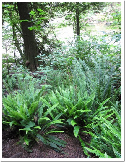
This morning I went out for a run down to the Capilano River (since I live right beside it now), and it was so beautiful, when I got to the riverbank I started thinking about the word ethereal because even the ferns along the path, still new and untouched were such an amazing shade of green! Here’s the definition: Characterized by lightness and insubstantiality; intangible; highly refined, delicate; Not of this World.
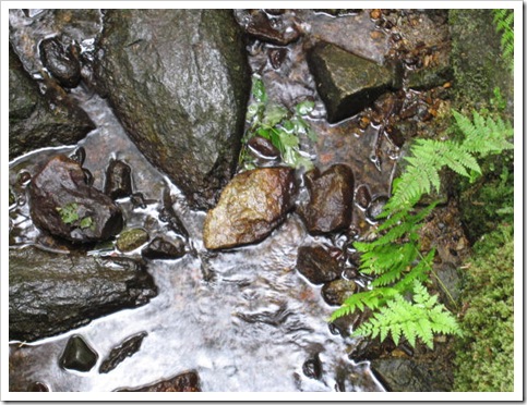
Colour that is defined as ethereal is usually light and found in light-filled spaces.
This is why Donald Kaufman says “A light colour will never come to life in a dark room”.
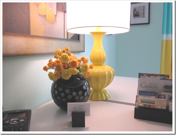
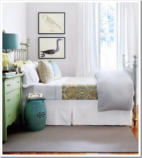
I have had that experience in my Tiffany blue office (sneak peak below) since it was painted. Sitting here I often just sit and admire every corner of my office because the colour is so wonderful!
Here are my tips for creating ethereal colour in your home:
1. Choose a light filled room. If your space is dark already, better to paint it a richer colour and install some lighting (not all recessed lighting–although that would add extra dimension–you still need lamps for atmosphere), because a rich warm colour is what’s necessary to bring a dark room to life.
2. Choose a colour that pulls your space together. Which means the colour should relate to the largest furnishings in the room, so the first place to look is at the broadloom, sofa or drapery. One of the reasons I love the colour in my office so much is because it goes so well with the artwork and the turquoise in the linen drapes.
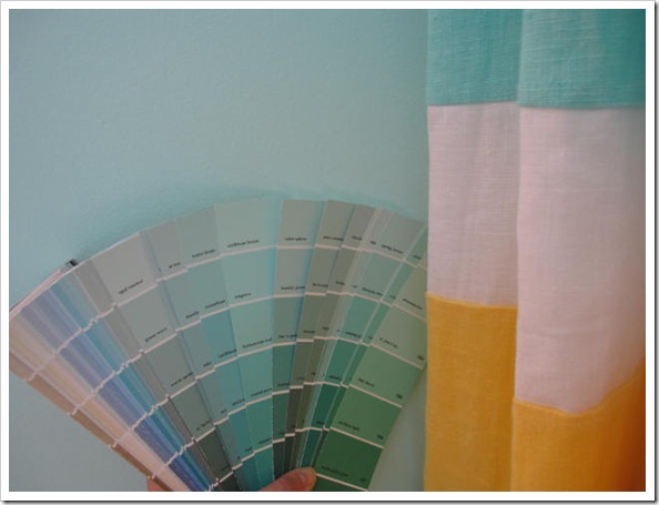
3. Pick one of the top two colours in the strip so that the colour stays light, instead of going to a mid-tone which may not give you the same effect. Remember this is just a guideline, ethereal feeling colour certainly exists past the first 2 colour chips, it depends on how dark the colours are in the first place—some are darker than others–in addition to how large the space is.
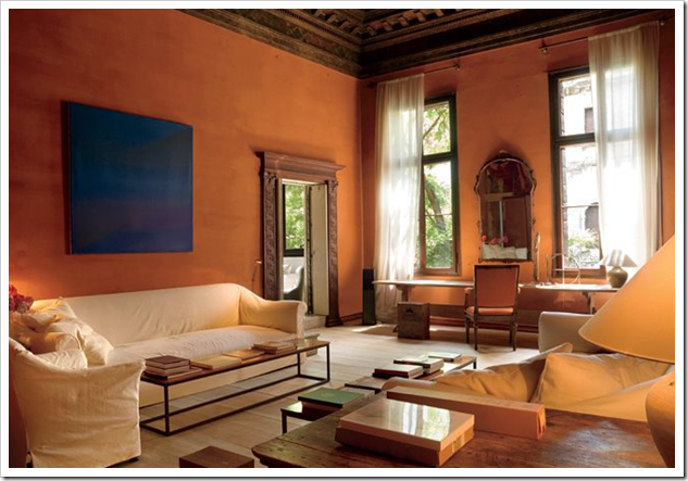
The room below is a darker colour but it’s large and the quality of light is simply stunning (and the lighting at the opposite side of the room certainly enhances the atmospheric lighting here)!
One more thing, there is a big difference between colour that looks ethereal and quite frankly just ‘washed out’.
A colour that might seem washed out will happen when it doesn’t relate to anything in the space, like an entry or hallway for example. Or if you have so much light that you can’t even see the pale colour you’ve installed.
Colour always looks the best when it either relates to other elements in the room or simply is the perfect pale shade with the correct undertone that makes everything else against it look wonderful!
Need help choosing the right neutral or colour? My How to Choose Paint Colours: It’s all in the Undertones ebook takes the hundreds of choices down to 9 neutral undertones along with list of all my other go-to best grays, broken down into 3 undertones, green, blue and purple. The beige undertones of pink, yellow, green, gold, orange and taupe along with the best greens and blues.
My bonus book of colours is worth the price of the ebook alone but you will also get my system of understanding undertones so you can stop making mistakes when sourcing tile, carpet, countertops, etc.
If you would like your home to fill you with happiness every time you walk in, contact us!
We would love to help you choose colours, select the right combination of hard finishes or create a plan to pull your room together.
You can find our fabulous e-design consultation packages here.
Related posts:
The Enchanting World of Atmosphere
New to this Blog? Click here ; Subscribe to my Monthly Newsletter; Become a True Colour Expert
While you’re here, subscribe to this feed so you don’t miss out!



This is awesome… and you are so right! Colors are so important and you have to pick the right color to get the space that you envision. And I like waht you said about colors relating to the space. I'm no color expert but that was one sure advice I learned, it makes such a difference when the color relates and is carried through the home, maybe in different elements…
XOXO
Kiki
What a great word ethereal is! And I love the definition and how it relates to interior design. Thanks for sharing that and I believe your office looks just that…. ethereal.
Nancy
What a wonderful way to describe that color scheme!! I just painted up my Wickham Gray sample – it is a gorgeous color. And your office looks AMAZING!! Turquoise / Tiffany box blue is my favorite color anyway, and I love, love, love it with the yellow!!!
Hi Maria, Ok..so I'm trying to grasp this concept. I think, if I understand you rightly, then 90% of my house needs bolder colors since it has so little natural lighting. Frankly, we have lots of shade and need it to control the heat. Except for my sewing room..all the rooms are dark. It might be that it would help to install better lighting. I have to say that one thing I love about the kitchen is the kitchen counters have under the cabinet lighting and it looks really dramatic! It's almost my favorite spot in the house for that reason.
You seem to be saying that if you have naturally dark space..the fix is not lighter colors but better lighting. The sewing room which is well lit..would be a good candidate for the 'ethereal' colours you describe. Do we just sort of sense this by nature? Of all the rooms this is the only one that I wanted lighter colors for. That being said, I did want a lighter colored couch. I've had it with the dark blue couches!
This is very important to understand and I think will help us avoid some big mistakes not only in our house, but in my father's home which we are trying to sell.
Thanks so much!
Oops..I forgot to say that I ADORE your new office colors and decor!!! (What little you let us see. :o)
Such pretty colour combinations!! If we had the budget–I'd hire you in a heartbeat! You truly do something magical with your eye for colour and design that I'm beginning to think just can't be 'taught'. You are so gifted.
Donna @ Comin' Home
http://www.thehomemakingarts.blogspot.com
Love all of your tips and advice Maria! I always learn so much from you. And by the way, the sneak peek of your office looks stunning! So excited to see the rest 🙂
Nancy
Personally, when I think of ethereal, I think more in terms of something like the slow movement of Alessandro Marcello’s oboe concerto. I will say, though, that you have some very interesting ideas on color. I’ve frankly never really thought about it in that way. Some years back there was an interior designer on HGTV that my wife and I used to watch, Michael Payne, I believe. It was before they decided to go after the twenty-something crowd and load up every show with whiplash cuts, speeded-up film, and spiky-haired hosts with two days of stubble. But I digress. I liked Payne because of the way he asked so many questions of his clients, but one of the things he always insisted on was painting the walls something other than white. Looking back on that, I do think he was right in that, and reading what you had to say just now, I am beginning to understand why. Thank you for your insights.
I have always kept the 'light colors won't work in a dark room' mantra at the front of my mind when decorating. It has allowed me to have a deep navy room that I never thought possible, everyone comments on the amazing color (Hale Navy)! Your office scheme is stunning.
I love the orange room! Those tall ceilings and windows set off by such bold colors are stunning.
I painted my office a similar shade of orange and have always felt warm and creative there. There are double windows on two walls and, like Maria says, the light makes it work.
Your office looks great Maria. Looking forward to seeing more pics.
Maria, your new home is shaping up very nicely! I love etheral qualities in design, Great thoughts on this!
Karena
Art by Karena
Just came back from a long drive through the gorgeous Swedish country side and thinking to myself the reason green, blue, gray feel so right and peaceful is no mistake…The dark pine forest, the lakes, the reflecting sunlight create an unbeatable color palette for any interior.
Love that pop of sunshine in the Carribean Breeze office.
I feel like I'm back in school or taking a refresher course every time I visit your blog. A wealth of information. Thanks! Mona
Wickham Gray is one of my most recommended and used colors for clients. I have used it in as an entry hallway color as well as in a kitchen. It changes from greenish gray to blue-ish gray depending on the light. Absolutely fresh and soft.
Thank you for opening the conversation about ethereal colors. Certain colors such as the ones you describe have such an emotional effect on people. I like how you were inspired by the new ferns by the river on your run. I often walk along a creek near my apartment that is planted with ferns and vines, and the variation in greens is stunning. They all go together. I wish it were as easy to pull off a monochrome green room as it is in nature!
The word "ethereal" grabbed me this morning as I was temporarily having one….an ethereal morning that is.
I love the way things are shaping up at your place. Looks like you are enjoying your new "neck of the woods". You have inspired me to introduce some of that gorgeous blue to my all white master bedroom…
xo Lisa
Your office looks like an extension of my Master Bath. I didn't show you a pic of all my Tiffany boxes I have in my Room. I love this color and will love it even after 2010 when it is no longer the color of the year. And you know there aren't many things "of this world" that are this color (the Sea) which makes it more ethereal.
Love the picture from your office! Love the title of your post! I have a picture on my vision board that shows a room with 'ethereal light'. Exactly what I have been wanting for mine. Lucky me the room is light-filled, though it gets hot during the summer.
Nice Post and Blog! =D
This is mine, hoteloscopy.blogspot.com, please follow me =D
Thanks,
John
such a great description – ethereal! that first picture – love it. greens & grey…sigh, such a great combo.
Ethereal is one of my favorite words, Maria. I've used it often when I describe the atmosphere that I desire in my master bedroom and bath. Is it okay design-wise to have different atomspheres in different rooms of your home? Because I like a more playful and colorful look in my family area.
I cannot wait to see more of your luscious office!!! You know how much I adore that turquoise/Tiffany blue color! And your delicious yellow makes it pop! You really whet my appetite to see more. Hurry and show us more, please!
xoxo
Victoria
I just painted my bedroom yesterday. It was a dark chocolate brown – it was nice but I felt like it just didn't go with the rest of the house.
My bedroom gets tons of light, so I painted it a light soft blue. I used Martha Stewart's Salt Glaze. And I love it. Thought of all your great advice when I picked my color. 🙂
Great advice on creating an ethereal room. Love the sneek peak of your office. Can't wait to see the full reveal. Carol
I tend to prefer neutrals, but the room in that last photo is stunning! I want it.
Great advice on color selection, as usual! When do we get to see that office?? Looks very promising!
What an interesting and insightful post! I do love the way light can change the "spirit" of a room. Thanks for sharing your knowledge!
Loved this post, and shared the bedroom photo in my blog about dreamy bedrooms today!
Love your office, love your blog!
Its Awesome Tips and Advices! swooning over your new home!shaping up gorgeously! I love ethereal qualities in design! Thanks for sharing..Love your Site.