


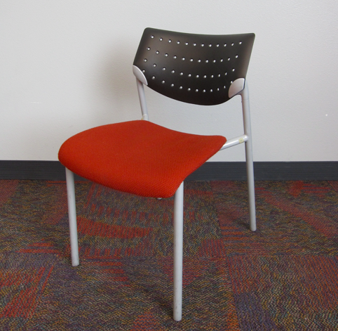
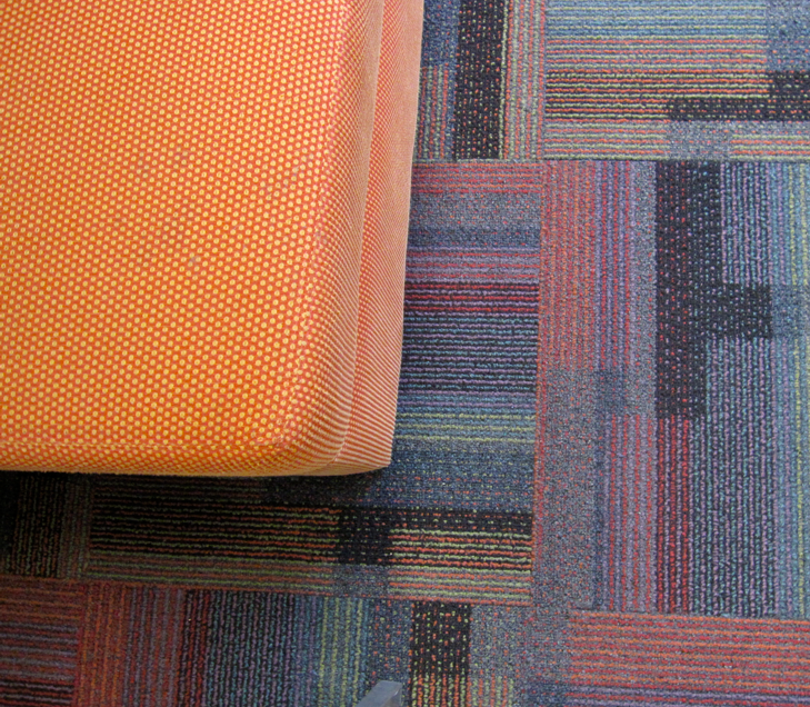
See this busy, patterned carpet which is all throughout the hallways and classrooms where I attended this workshop the last three days? Well, you can see that the rubber baseboard was selected to coordinate with the carpet (they did the best they could–the standard colours are limited). However, the wall colour should then be a second colour found from the carpet. There are already probably about 7- 8 colours in it.
 Photos by Maria Killam
Selecting a lighter shade of a colour found in a patterned carpet (especially in a commercial environment) might seem like a “safe” way to get the wall colour but what you actually get is a completely unrelated colour.
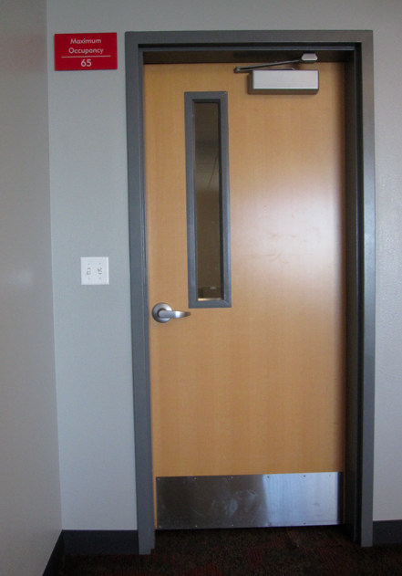
See the casing colour? Well it happens to be BM Gunmetal Gray and the instant I walked into the classroom and saw the wall colour I guessed that the designer had chosen the trim colour and then went to one of the lightest shades on the same strip to come up with the wall colour, which in no way related to the multi-coloured, patterned carpet. I declared it battleship gray as soon as I walked into the room.
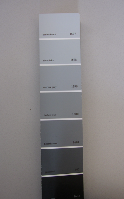 Sure enough, when I pulled out my fan deck (I bring it on all my trips) the wall colour was 1598. (Photo of colour strip taken on the desk not on the wall.)
Do we need to have the coldest, bluest gray in a University classroom? This colour truly sapped my energy sitting in the space.
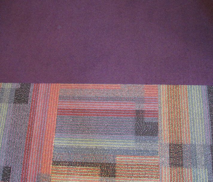
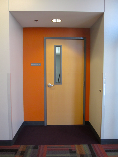 Here at least the orange accent wall on the outside of the door ways and orange seating coordinated with the carpet; however, notice the solid purple carpet here?
 Photos by Maria Killam
Again, if there’s a purple in the pattern it’s much more grayed than the one that was chosen. In fairness to the designer, it may have not been available, custom is very expensive in commercial and he/she most likely did the best they could with the carpet colours. However, when it comes to wall colour, the right colour costs exactly the same as the wrong one.
When choosing a colour for the walls in this kind of environment, stand back and determine first the “read” of the overall colour. Yes, there are many when you look at it closely but it’s the way it reads overall that determines what the wall colour should be. In this case it should have been somewhere in the yellow realm, which stimulates mental activity.
Perfect for a classroom where learning is taking place.

Speaking of yellow, here I am in it, all dressed up last night to go to The Blue Man Group! Definitely not boring, impossible to explain and I would truly love to be a fly on the wall with the creatives that dream up this stuff! Have you seen it? Truly bizarre, and certainly colourful.
Off to the 3rd day of my class! xo Maria
Related posts:
When can you Ignore the Carpet Colour (if it’s bad)?
10 Guidelines to Choosing an Area Rug
How to make your Old carpet look New Using Colour
Download my eBook, It’s All in the Undertones. If you have a computer, you can download my book!
If you would like your home to fill you with happiness every time you walk in, contact me.
To make sure the undertones in your home are right, get some large samples!
If you would like to learn to how choose the right colours for your home or for your clients, become a True Colour Expert.


You look fabulous Maria. As always.
You look lovely!
…and Blue Man Group…I’ve seen them several times and love them. It’s the kind of thing I encourage older children to come up with when we’re creating shows…silly, fun, creative, colorful, musical, interesting and funny.
Hope you have a great day!
Great post – I dealt with the same thing recently with commercial carpet, that rubber baseboard, and paint color for cement block walls. Love those yellow shoes, Maria!
Love your outfit Maria! Very pretty.
Look how cute you are!!
Ugghhh, so much commercial carpet is just seriously unattractive. But I love your advice about how to make it work as best as it possibly can!
Maria,
These are such great examples we mentally register a point when we “see” examples via photo’s. It’s a universal language and clarifies a point.
You look marvelous Maria as always!
Maria,
You look great and I love that color on the wall, the carpet not so much.
Love blue man group. We saw it years ago with our sons. I think they wanted to come home and paint themselves blue. You could do an entire post on that, right. Love the color blue they are.
pve
Ok, great post but it’s the outfit that got me! You’re wearing my favorite color, orange, in such a killer way. And those shoes! To. Die. For. Bravo! Gorgeous! Have a great weekend 😉
What an ADORABLE outfit, Maria! I’m gonna hafta borrow that look;) You look amazing.
Maria,
I am so glad you touched on design in higher education! I work for a University and I am often called upon to select new colors for spaces that are being refreshed. I anxiously await my next assignment so I can put your recommendation into practice and choose the correct colors with confidence!
I am designing a space for a high school library. I would love more posts like this on design for commercial or educational buildings. I am wanting to choose colors that inspire and stimulate thinking biut do not distract or overwhelm the space.