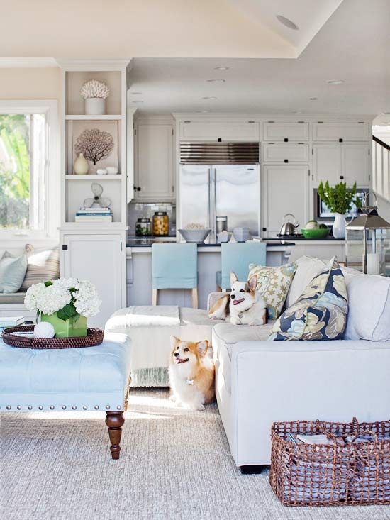
When I had my first website designed, I consciously chose to show only after photos in my portfolio. I did this because when I looked at interior design portfolios that I admired, I saw just one pretty picture after another.
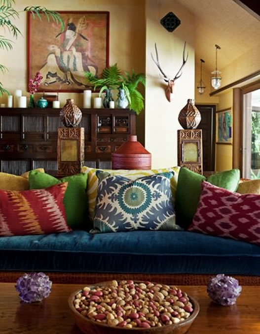
My advice is to show just the after, keep your website as pretty as possible. The reason why Pinterest is the hottest social networking site on the planet right now is because it’s all just one pretty image after another. We have enough stuff and spaces that are not as perfect as we’d like so why would we get on the web just to look at ugly?
Here are the exceptions to just showing ‘after’ photos:
1. When we’re new decorators/designers, we end up usually working with what people have in the beginning and making it look as pretty as possible. Then we might think we have to show the ‘before’ because while it’s probably a lot nicer than it was before we arrived, it may not be to our taste.
It can take years before you get enough experience where a client just gives you an empty room or house to decorate so that you can showcase your style.
2. If you are a stager or re-designer.
As a stager you’re are often working with existing furniture in addition to adding rented pieces to make the space look as inviting as possible.
In either of these cases where it’s necessary to show before photos, I would keep them much smaller than the after and on the same page as the after photo so that it’s very clear which one is after. When a client lands on your website and the first image they see is an ugly before photo, it can be an immediate turn-off.
Also if you are a blogger, choose your images carefully. I’ve said this before and I’ll say it again. People want to look at pretty.
Finally I can’t emphasize enough the importance of professional photography for your website. I hear designers say things like “I didn’t make enough money on that job to photograph it”. Your website is your business card. If you are proud of a project you did, that is the one you should showcase on your website regardless of whether you made money or not.
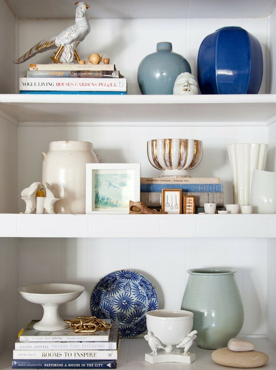
Even five pretty images that you have styled and paid a professional to photograph is 100 times better than 20 badly photographed spaces. Photograph your own house if necessary. The first website I had designed, I had my photographer shoot four spaces in two days and I spent the previous week shopping for extra accessories and flowers to make sure each space looked as good as possible. See my Styled Interiors board on Pinterest for ideas on styling tablescapes and bookshelves.
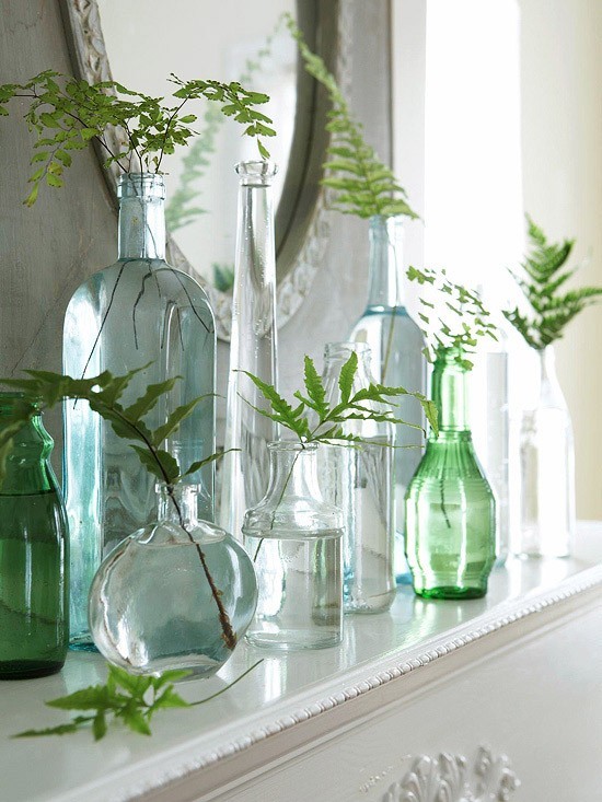
And don’t forget to shoot vignettes (above). Close-up photos are many times much prettier than a whole room shot, that’s where fresh greens and flowers look really good.
If you have a professionally shot portfolio on your website, make sure you link to it below.
Related posts:
How to Style a Kitchen for a Photo Shoot
What Every Designer should Know about Photography
If you would like your home to fill you with happiness every time you walk in, contact me.











Good advice once again. Thanks!
I have “semi-professional” shots for just a few of my projects. I agree for me before & afters would be better. A work in progress! Here’s a link to my “portfolio” http://www.re-ublog.com/p/re-u-portfolio.html
Well…..I’ve had many clients tell me that the reason they chose me was because of my “before and after” shots.
I like before and after shots. That way I can compare the two.
Also, Maria, because your blog is all abou colour, before and after shots are particularly important so I can view the different undertones and why they were changed (improved).
Oh dear – I love before and after shots.
I to like before & after shots… to me it shows what you had to work from & how much better the clients room & life will be & feel after. Loving my large paint samples, have used the a few times already with clients… funny thing is they want to take them home with there presentation packages… not going to happen, hehe
Hope 2012 is going well for you. xxx
Great article, Maria! Getting ready to redo website/blog on wordpress.
My two biggest regrets 1) I did not take more vignettes and concentrated more on whole room photos. 2) Did not take more professional photos.
Also, have seen some clearly flag their before pics in the upper corner and plan to do this on new site. Good idea, though, to keep the befores in smaller format.
I have recently discovered the blogging world. Yours is one of my favorite!
I wouldn’t hire a designer without seeing the before shots. How else can I judge the depth of their ability? I also don’t care about vignettes. I need the room to work and flow, not serve as a backdrop for knick-knacks that I don’t have and won’t buy.
agreed! you need the before photos to see the true ability and change created by the designer…what if all they did was add a plant or go from vertical blinds to add more light? blah!
This is a tough one. Pretty sells…..but, it does seem that the general public does like to see what you can do, they seem to feel they can see more by seeing what you started with. Do magazines sell more when they do their special before & after issues?). Designers, do not necessarily need this validation….homeowners that are considering hiring you, may. (watermark the before images if you used, so it is stamped right on the photo might be helpful)
Topic off a little on Pretty Pictures: Is it just me, (I do not have an account with), but is it frustrating to anyone else that it seems close to impossible on Pinterest to see who is the artist/designer on all the pretty pictures posted? How easy is it to find out the source of the design if there is no information written? So, as a designer (and photographer) I find it disappointing that you can find these gorgeous images on the site, but the who is VERY vague (if non existent)….. am I missing something? I thought in the blog world we were all about giving credit where credit is due? As wonderful and beautiful as Pinterest is, this seems challenging to do.
I am wondering how distracting, if there was a subtle watermark on the images if possible if these are taken from all over the world wide web? It seems that Pinterest has the right to profit from these pretty images, so at least if they are making money off of it, the original creator isn’t forgotten.
Random…..sort of…I love drooling over these images…..but personally, I prefer when doing a blog post, or a pin up, or post on FB to give credit to the designer/artist/photographer/creator whenever possible. Again, help me if I am missing this. Perhaps an interesting post? Thanks
You are the best, you rock at what you do and it’s always a pleasure to follow you on your awesome journey. xo
I would like to see before and after shots on your blog when your dealing with undertones so I can see the difference.
Thanks for the advice, Maria. As a small blogger, I try to put in as many pretty pictures as possible. But like the before/after that shows the progress of my projects.
I think pretty is a good thing but I can only take so much of it. I like to look at a blog that has personality with original photos, odd angels and interesting shots. Anyone and everyone at this point can pull pictures from Pinterest and talk about it but after a while, it gets a little “Stepford” looking, so perfect all the time. That’s one of the things that I loved about your first blog. It had fun content and the photos were very unique to you. So many Designers have the fancy, picture perfect blog and I just thinks it’s a little stuffy and boring. I say take your own photos and keep it fun!
Before and after shots are a great idea if you can get them. For me, there’s usually a HUGE time lapse between the two that’s why I don’t do it.
Ps – in a website portfolio, I think just the best of your best should be showcased.
I love before and after photos. I’m not a designer, and I learn heaps from them. Recently I purchased a book from One King’s Lane (which means I couldn’t flip through it first). The title was 1000 Sensational Makeovers (from House Beautiful), so I thought I’d be seeing before and after shots. Not so. Only pretty pictures. I still study and learn from them, but it’s not the same. I want to know how a designer takes a room from ordinary to terrific, and for that I need to see a picture of what it was like before. (I also love before and after photos of people makeovers.) Especially when you’re working with existing furniture, please let us see what it looked like when you started!
Have to say I agree with Kay. I too am not a professional. Before & after gives us some kind of hope that our spaces CAN be transformed from ordinary to beautiful. These transformations should help to promote your design business, NOT turn people off to your blog. After all, what is a blog anyway, but a promotion tool for your business??
“Before” photos prompt me to say-“Hey, I have a similar situation,” then seeing the after….”I’d like to hire her to do that to MY house!”
Interesting-I get what your saying as a designer and you have one of the most successful blogs out there in cyber space, so i think professionals should pay attention, but personally,me, as a lay person and consumer, am addicted to shows like,Bang for Your Buck,any Design show with Candace Olsen, Get it Sold,etc, and the common thread is the before and after pictures, its what makes it worth watching-the possibilities that you can take an ordinary room and make it have the wow factor is what keeps me coming back for more!!
Just to be clear, I am talking about images on a website portfolio. A blog is definitely the place where you would show the before photo for sure. I have arrived it so many WEBSITE portfolios where the before pictures were laid out in such a way that I was left wondering is this before or after? that is my big point here. Obviously everyone loves before and after photos, it’s why the do it yourself blogs are number 1 because they are constantly showing them. There are plenty of photos on this blog as well taken by me where I’m showing/teaching something that are far from pretty. A blog is the place to do that.
Thanks for your comments everyone!
Maria
I have to admit that on certain blogs I like to see the before and afters. However I do concur most people want to ooh and ahh; as well as get great ideas and tips for themselves.
xoxo
Karena
Art by Karena
In response to Lynn’s comment, there are countless photos on the web I could show where the undertones are wrong but I can’t point that out here because whoever designed the room would not like that.
Follow my pinterest board where I am simply documenting what they are, not judging. http://pinterest.com/mariakillam/understanding-undertones/
Maria
I agree with some of the earlier comments -there are hundreds of pretty pictures to look at on the web but my clients LOVE LOVE LOVE the before and after shots… gives them hope 🙂 Keep up the good work Maria
I could not agree more with you. I think that “pretty” is what draws visitors into reading. We’re so visually oriented in our online experience that there’s no room for subpar aesthetic.
That said, I think before shots are really important, especially in DIY posts. I believe they are best treated in a collage format so that they’re married to an after picture that compensates for the unappealing look of a before shot. Also, good photography, even in the before shot, will make it that much more palatable. There’s nothing worse than a dark, flat image of the before, then a bright, well lit after shot. It reminds me of those before and afters on cosmetic surgery commercials. In the before, the patient always has a scowl, looks miserable, no makeup and the lighting sucks. In the after, they look like they’re on their way to a New Years Eve party, fully done up to the nines. It immediately detracts from the credibility of the results.
Miriam, I hope I get to see you at the Design Blogger Conference next week!
As much as I enjoy before and after’s too you have to understand Maria’s point. Before and afters are not always appropriate for all media outlets. They are great for tv, home magazines, and blogs. But not necessarily for a webpages. It is important to understand that a webpage is a marketing tool. Second, every before is not necessarily bad. I have clients that may have a well designed space but it no longer works/functions for the them. So, posting only pictures of the before and after maybe confusing to the why. Though, if the designer takes this experience online to blog, then yes, it may be beneficial to have the before and after photos. For me, I have before and afters for my clients to see but I typically show them when I am trying to explain something to a client or use as a selling point in a brochure workshop, or newsletter. Last, don’t worry about not seeing the before instead, analyze what is attractive, pleasing to the eye, and what you are drawn too.
Pretty can be pretty boring! Not every client wants pretty and some would balk at having their decor described in those terms. I like to work with clients who want something with an edge, something interesting and not too put together. Don’t get me wrong, I’ve also done the pretty decor too.
How much more interesting and challenging it is when you have to step out of the box and design around a great collection of something or totally different furniture. In the visual arts pretty often has negative connotations and that’s the other half of my life.
I don’t have a design website and use my blog for both purposes. I’ve been told by clients that they were attracted to the variety of styles on my blog and my emphasis on rooms that were not “over decorated”.
O Maria, I went back & reread…for sure your Website has to be as beautiful as a brochure I would hold in my hand for a designer, or any other professional. NO before photos in there….this is your Showcase!!!
Thanks for clarifying.
You’re right, I love looking at pretty!
I really enjoyed reading all of these comments! One thing that I have been thinking about is — even on the blog (because I agree; no before shots in a portfolio) trying to watermark all photos as “before” … because you definitely don’t want someone to pin a “before” photo and have someone else not realize that it was a “before!”
Your distinction between a website portfolio and a blog is an important one. I agree, the portfolio should always showcase your best work.
Maria, your post couldn’t have come at a better time. I have just started a blog and after reading this post I found myself asking, “does this picture really add something that people would want to look at?” before adding every photo. I ended up changing several that were merely “blah” to “beautiful”. That was backed up by someone who told me today that she loves to look at beautiful pictures on blogs. I plan to feature many before and after shots (some of spaces that you consulted me on!) and while I will be showing the Before, I will make the After much more prominent. Thanks for your tips to this new blogger and always fan.
Great advice Maria. You are right. I do home staging, plus I also re-design interiors – and I refurbish furniture as well. I had thought about someone coming to my blog and seeing an ugly before picture…and it possbily being a turnoff.
But what do you do in the case of when I fix a badly destroyed wall and I match up a faux finish exactly (even when I did not do the finish in the first place). In one of my posts last week – I showed how I fixed even wallpaper that was ruined – and you can’t tell the difference. It was a $7million house for sale and I had to fix a lot of walls very quickly before the open house.
Let me know your thoughts!
Linda
Great post! In the first sentence, when you mentioned new designers/decorating having to work with what a client has – you were talking to me. I’m in the process of hiring a professional photographer to take pictures of my work and I’m glad I came across this post because I was wondering what to with my before shots. Thanks for the tips!
Love that your posts are as timeless as your advice/teachings!!