I recently consulted with a client who was fixing up a rental property and we had to choose one colour to go throughout the entire house. So here are my hot tips on the best colour to paint a rental and also a good guide if you are starting with an empty house and moving in before you decorate:
Paint it the neutral that relates to your wall-to-wall carpet.
Especially if it’s all through the main living areas. Even if you have wood floors everywhere, the carpet in the bedrooms is a good place to start to find the ‘neutral’ you will paint the whole place. The exception to this is if the carpet colour is dated (like pink beige). Then I would ignore the carpet and pick a neutral greige that won’t fight with it.
Keep the colour light and the same throughout.
If you have a darker space, here the post I wrote A Light Colour will Never come to Life in a Dark Room does not apply. Choosing a darker colour–doesn’t matter what undertone it is–still leaves you with something that is NOT neutral in the end, and a potential renter probably won’t like it.
So here are my top 5 picks for the best neutral to paint a rental:
Every time I write a post like this I receive emails that start with “I know –-insert colour name here— is one of your favourites but. . . “.
When I was new to the world of specifying colour, I thought that the colour consultants that seemed to specify the same colours over and over again were not creative. But here’s the thing, if everyone is buying the same linen upholstered furniture, installing gray and Carrera tile in their bathrooms and kitchens then yes, you would end up specifying the same grays over and over.
When everyone bought a chocolate sofa during the brown trend, I specified Shaker Beige, Stonehouse and Wild Mushroom over and over.
Like the 80/20 rule I posted about a long time ago. 80% of the time, we use 20% of the colours in the deck.
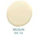
When specifying the same colours doesn’t work is when you don’t know when to choose one over the other. One of the participants in my True Colour Expert Workshop last year said that she once worked for a designer who ALWAYS specified Muslin. It doesn’t matter what the client asked for, she always came back around to Muslin. It’s no different from designers who are famous for using white walls. This way you never need to lose sleep over the wrong colour going up. Smart really. Stick to what you’re good it, if it’s not wall colour, then keep it as pale as possible, it’s hard to get really offended by a pale neutral even if you didn’t get the undertone quite right.
I have learned that specifying a different colour just because I’m bored with the same trend colours actually doesn’t work because I end up arriving later and getting annoyed with myself that I didn’t specify the colour I knew was exactly right.
That’s why when Michelle Ginnerty from My Notting Hill asked if I’d contribute to an article she was writing on whites for the Washingtonian I said BM OC-10 White Sand (very close to Muslin) and Baby Fawn BM OC-15 (identical to Edgecombe Gray), just to be different.
And it’s how I created my core group of neutrals that work time and time again, because really beautiful homes do not look like a rubik’s cube.
If you would like your home to fill you with happiness every time you walk up to the front door, become a client. On-line or In-person.
Download my eBook, How to Choose Paint Colours – It’s All in the Undertones to get my complete step-by-step system on how to get colour to do what you want and to make sure the undertones in your home are right, get some large samples!
If you would like to learn how to choose colour with confidence, become a True Colour Expert.




But, Maria, for those of us who have taken your course, we don’t find it at all hard to be offended by the wrong neutral! In fact, we spend many of our waking hours “fixing” (in our head) the neutrals we now know are wrong everywhere we go!
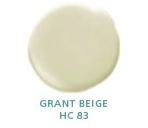
I like your color swatches! Grant Beige is the only one I haven’t tried yet – I’ll look into it. Thanks for the info 🙂
LOVE to see that you are spec’ing colours from other paint manufacturers Maria. 😉
The builder painted my new house SW7011, Natural Choice, with white trim. I’ve been here two years and haven’t changed it, except for a few accent walls.
I love this list, Maria. It will be so helpful for many, because I know so many people move into an empty house with no furniture … but still want some color on the walls! xoxo!
Muslin is my go to colour for anything neutral – used it in my old master bedroom to stage it for selling, use it in our rental income property – it pretty much works with everything. The list is so useful, I’ll be referring back to it as I’m redoing our house. Thanks.
I worked with a broker for a couple of years. My take is that covering an entire house with one color does not always bring the house to the next level or give protential buyers the feeling that the house was well cared for. They even can wonder what’s being covered up.
When I chose colors that enhanced the design elements – often neutrals but sometimes not – the house showed better. In buyers’ eyes that may translate to more upscale, and send a message that the house was better cared for overall.
Sometimes colors were already good and I just added a welcoming foyer color or a quiet contrast elsewhere. Sometimes it would be a neutral – make pretend AF340 Oat Straw – but 50% lighter in some areas for subtle contrast. Too much harmony can be boring; too much contast chaotic or circusy.
The broker also hired an organizer to declutter madly – and the houses sold quickly, despite a bad economy. Just my take!
nice input, thank you!
Another great post. Yes, the article is about colors for a Rental, but your choices are so appropriate and helpful for a ‘newbie’.
Thanks for being so terrific!
I love edgecomb grey!
Hi Beth,
Just to be clear, I am talking about painting a RENTAL. I think the way to SELL a house is to have it staged or already decorated attractively.
Thanks for your comment.
Maria
Point taken! No turquoise or orange allowed. ; )
Such a timely posting as I am (as we speak) working on a rental unit. Is your “all one color” advice for long term rentals? Ours is a weekly rental at the beach and the advice I’ve received says “renters love colors” so I am going for a “flow” of color in sand, sea, stones, and skyn in gray shades with blue undertones. Loved your comment about the pinky carpet as we are dealing with pinky tiles…am thinking about gray with blue undertones to mitigate the pinkiness that we remember so fondly in the 90s. If I am reading your favorite neutrals correctly, none of them would do the trick because their undertones will not tone down the pink. Luckily the grout is gray, so I am hoping to play that up.
Hi Becky,
All of the colours I recommend would work with pink carpet. If you choose a gray with a blue undertone you will have blue walls which is not neutral at all.
Obviously if you rent out a furnished rental then the colours should coordinate with everything in the space and this advice wouuld not apply. Maria
I just used Edgecomb Gray in a rental- it looks great in every room. I’m so happy with how it turned out. Glad to have your other favorite neutrals now, too! Thank you!
Jill
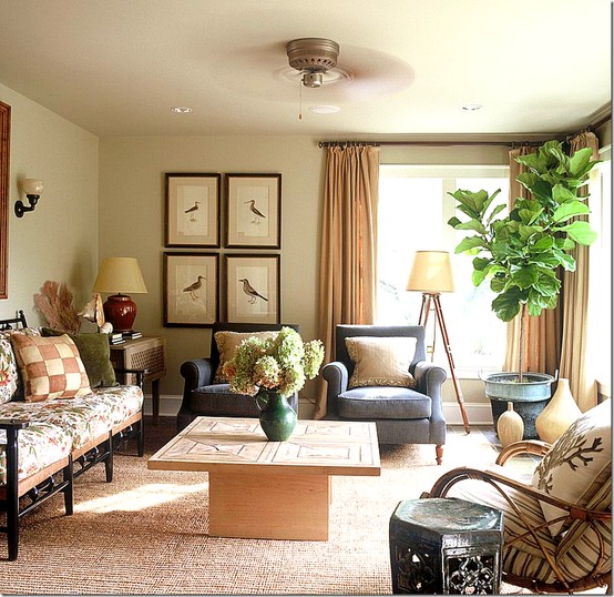
What is the wall color on the living room wall under Washingtonian. Source goes to cotedetexas but I can’t find the color mentioned there either. Thanks! Love, Love, Love your taste and style!
I think Agreeable Grey might be a winner for me!! It is a warmish gray and that is what I need. I just got out my fan deck (my fave thing ever!!) and I noticed the “white” that is on the strip (Incredible White – SW 7028) and I’m thinking it might work to repaint my oak cabinets. I have the builder grade, honey colored oak cabinets and desperately want to update them.
Do you recommend using the “white” from the same color family when doing a white kitchen? Just wondering your thoughts. Thanks!
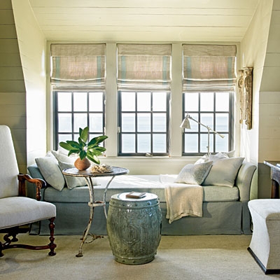
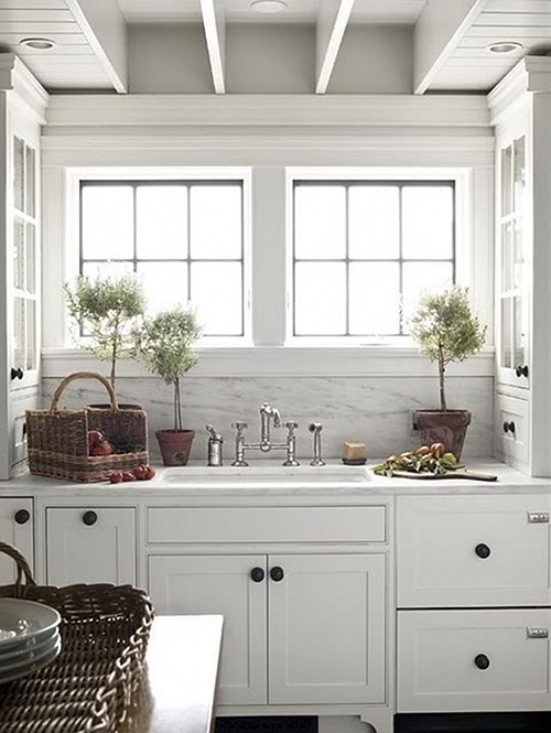
I notice that the ceiling in the pictures seems to be painted the same neutral as the wall. What is your opinion about ceiling colors?
CAT, you read my mind, I am also curious about Maria’s opinion on painting the ceiling and walls the same color.
Hi!
I want to know if it is possible to download your book to my personal computer and then send it to my husband’s computer as he has his set up with the color printer and I do not. I would really wish to have a hard copy on my own computer. At this time it is not possible for me to use his printer as there is a compatibility issue.
Thank you
I have never considered undertones-but have a good eye for harmony; recently I came to understand how important undertones are when I installed Kashmir Gold granite with light travertine tile backsplash. So many shades of neutral in the tile, but now seen all together they are not neutral, but orangey! Everything clashes. Have no idea how to fix it! Walls are Navajo White, cabinets light oak. I hate pink-ey beiges. Any advice gratefully received.
Hi,
I live in Australia, is there a paint distributor that does the same paint colours over here? I really like the Edgecombe Gray, just trying to find a match.
“because really beautiful homes do not look like a rubik’s cube (maybe).” – what a terrific sentence for someone like me, who does not have a design background, who does like balance and proper scale and aesthetic beauty, – but may go crazy with a wide palate out of lack of knowledge or skill in choosing color.
such a thoughtful comment, thanks Beverly! Maria
So I think I understand the ideas of several of your posts. We live in an older home – not an open concept at all! I want the house to flow as you’ve talked about before and I want it to “go” as you come in from the outside which is a soft yellow farmhouse with white trim and gray porch/stone foundation. I have a north facing living room with only one major window and a creamy white slipcovered sofa with dark rattan wicker side chairs. I am wanting to go for a lighter, brighter, happier, relaxing 🙂 palette this time around with soft blues and greens for accents and some painted furniture. (ie: Annie Sloan’s Duck Egg Blue)
I love the look of some of the neutral rooms with soft greige walls in Ballard Designs catalogs and was wondering about choosing a soft gray for the walls. Maybe greige would be better than gray, though.
I like the list you gave in this post, but am also considering what you have said about light colors and dark rooms. So you would suggest Rice Grain rather than Agreeable Gray for a “neutral” grayish look because it is a deeper color for this darker room? Or maybe I should scrap the gray idea and go with muslin…
Hi Maria, This article was great! I just bought my first home ..and not having any furniture yet (moving from small apt), I am literally starting from scratch. Pretty scary! Any recommendations for painting ? One neutral color for the whole house while i slowly start figuring out furniture, etc.? The house faces south if that makes any differnce in your recommendation!
Thanks for any advice – excited not to live in stark white apartment but unsure how to start out paint color wise in new house with no furniture.
Regards
Beth
HELLO MARIA
CHOCOLATE IS MY THEME/ACCENT COLOR. I HAVE CHOCOLATE LEATHER FURNITURE THRU OUT MY RENTAL. MY BASE COLOR IS BM MANCHESTER TAN AND HAS DONE WONDERS FOR MY SPACE. I HAVE MY LR/DR/HW PAINTED IN THIS COLOR. THESE SPACES ARE OPEN BAR FLOOR PLAN. DINING ROOM ADJACENT TO LR AND KITCHEN AT THE CENTER…HW TO THE SIDE NEAR ENTRY. I LOVE THIS COLOR BUT I DO NOT WANT TO PAINT THE BDRM AND BATH IN IT…MY ACCENT COLORS ARE SAND/SEA…NOW MY QUESTION IS WHAT IS A CHOCOLATEY RICH BROWN COLOR I CAN POP IN THE KITCHEN THAT BALANCES WITH BM MANCHESTER TAN AND BM WHITE DOVE? I LOVE CHOCOLATE IF YOU COULDN’T TELL BY NOW…I AM DYING TO DO A CHOCOLATE BDRM OR BATH BUT AM NERVOUS ABOUT SUCH A BOLD COLOR…BUT OH HOW I LOVE CHOCOLATE AND WHITE…MY RENTAL WINDOWS ARE ALL NF EXCEPT FOR A BACK WINDOW WHICH IS EAST AND VERY SUNNY AND HOT IN THE SUMMER….ANY SUGGESTIONS OR GUIDANCE IN MY CHOCOLATE VISION WOULD BE WONDERFUL OF YOU…THANK YOU FOR THE BM MANCHESTER TAN, WHAT AN AWESOME COLOR IT IS ! AND IS GOES WITH ALL MY ACCENT COLORS….JOSI
I have used each of the neutrals that Maria showed above in the last year and they are all working well for me–with the manchester tan and edgecomb grey in one house, and the muslin and grant beige in other house. All working as a calm background for other things going on in the rooms. Thanks to Maria for selling the packets of neutrals and made my life easier.
I also used a lighter Ben Moore color–called “Fog Mist” in the U.S.–that is equivalent to a lighter version of Grant Beige. Pale but just enough to differentiate the walls from White Dove trim. And you move from a Grant Beige space to a Fog Mist space and it’s smooth transition that feels a little brighter.
So funny. When I saw the title of your article on my FB I guessed Edgecomb Gray and Manchester Tan. I once painted my bathroom White Sand before I really understood undertones. The ceiling was Ocean Air so it had a surf& sand feeling to it. I probably chose White Sand because My vanity top was a pink white. I just specified Baby Fawn for a clients powder room because she had chosen the new faux wood tile in driftwood colors. I would add Revere Pewter to the list although it is darker
I too wonder about ceiling color. Should a natural as light as manchester have an off white ceiling, or just paint it the wall color.
off white, keep it fresh! Maria
I tried a sample of Edgecomb gray and wanted it to work, but it looked pink on the wall in my family room. It has windows that face west. Now, I’m strongly considering a Sherwin Williams paint called Cloth and Stone. Have you ever heard of that color? Any of the neutrals with a green undertone seemed to look flat in my house or purple. I don’t like pinky beige. I like ballet white also, but not sure I could do white furniture.
I have 2 rental properties which both required painting recently. I took your advice and painted one muslin. LOVED IT! Turned out perfect! (Because it was similar to the color already there it only needed one coat!) My other rental I chose Edgecomb Gray and I am not so happy with it. Though it may blend well with the gray carpet we installed in the basement, it does not compliment the oak kitchen cabinets, and looks terrible against the beige tile in the entrance and really bad next to the gold towel bars in the master bath! (While we updated the hardware in the other bathrooms we decided to keep the gold in the master as the jetted tub created too many issues-this is a rental after all!) The Edgecomb Gray also does not go well with any of our bathroom countertops as they all seem to be off white with beige undertones. I wish, wish, wish I had gone with the Muslin for this house. Too late now, as the house is over 4000 SF and the bill to paint was astronomical!
Maria great post .
I know your right .
When we built our new house you gave me classic gray to use throughout .
When I first saw it I was a little disappointed ? by my wanted a color .
That had turned out to be the best!!
Looks great in every little place and goes with everything .
Shared that color with several friends everyone has loved it .
From that day forward I’ve never questioned anything you have ever said !
There is no doubt for me you know color .
Nancy