When I asked y’all last week to send me an email on when and under what circumstances you found my blog, I received this note from Deb in Arizona:
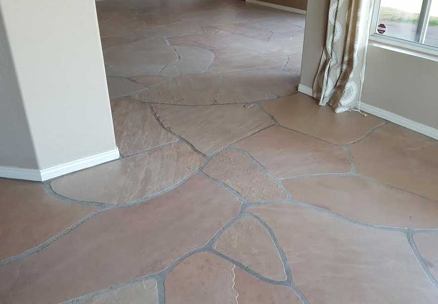
I came to find you on the internet just a month or so ago so this is fresh in my mind. I just bought a 25 year old home in Scottsdale AZ. Originally I thought we would redo the cabinets but this quickly escalated into a complete kitchen remodel. And then the floors started bugging me, they are pink and orange flagstone. What can I do to minimize all the pink and orange drama underfoot? Replacing them was over $20k and completely blowing the budget.
At this point my husband is wondering why in the world we bought this house in the first place. What can I say, the views are killer. (See below, thought you might want that as one of the WORST floors ever) I looked high and low on the internet trying to find a way I could decorate and live with them. That is when I happened upon your website. Your words of wisdom have been a big factor in making a very painful decision – those floors gotta go.
Here’s the picture she sent me:
By the way, I’m going out on a limb to call it Saltillo flagstone. I’m sure you’ll correct me if I’m wrong. Let me know ASAP so I can delete this sentence, haha.
Don’t they look like they belong in a chateau in Europe? Gorgeous!
This was my response:
“Ack, OMG really? They are kind of awesome. . . and they don’t scream pink, from here they seem yellow/orange/pink, if I lived in Arizona, I would probably decorate around them, seagrass rugs, cognac, green greys, yellows.
Where do you ever see floors that look like they have been there forever, like you’re in Europe or something. . . I don’t know Deb, before I ripped those out, I would get a decorating plan to see if you could live with them.”
So Deb purchased my e-Design package “Create a Classic Kitchen” and proceeded to take photos as per our instructions and sent them over:
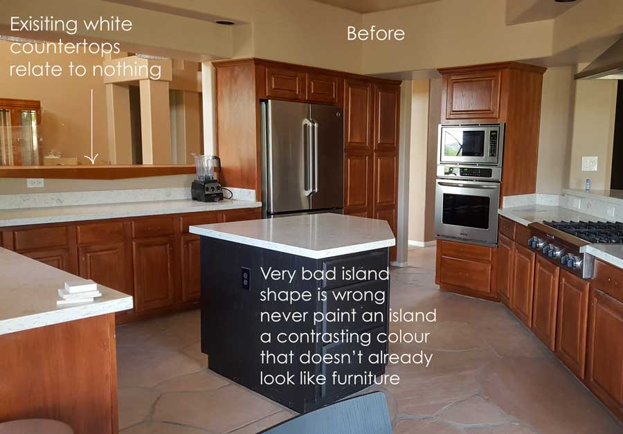
When I saw her existing kitchen, I understood immediately why she thought the floors should go too:
Wait for it.
Are you ready?
Here it is:
It just doesn’t get any worse really. You couldn’t install a kitchen that ignored these floors more (well you probably could). Cherry cabinets with white countertops??
Nooooooooo.
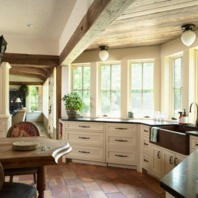
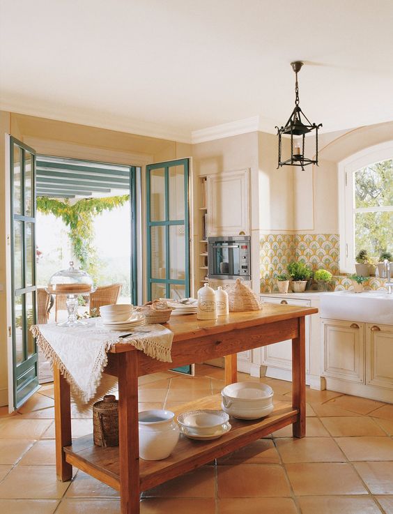
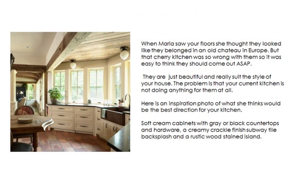
This is what her kitchen should look like:
Cream cabinets, black or stone coloured countertops, rustic looking wood stained island.
Here’s another pretty kitchen with similar coloured floors. I would even break my rule of subway tile here. If the floors are staying, might as well coordinate the backsplash to them.
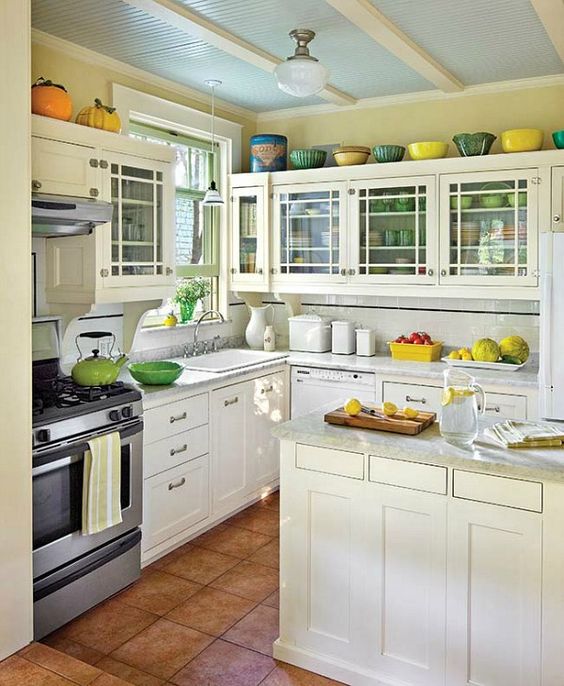
Now lets consider this kitchen (above). The floors are not nearly as pretty but do read terra cotta which is a neutral all throughout Europe. I wrote a post about terra cotta floors after our trip to Tuscany last year here.
However, the problem with this kitchen is that it’s totally ignoring the floors. No warm wood to relate to the orange, the white cabinets are too white and of course the strip of black accent in the backsplash? Not doing anything for this kitchen.
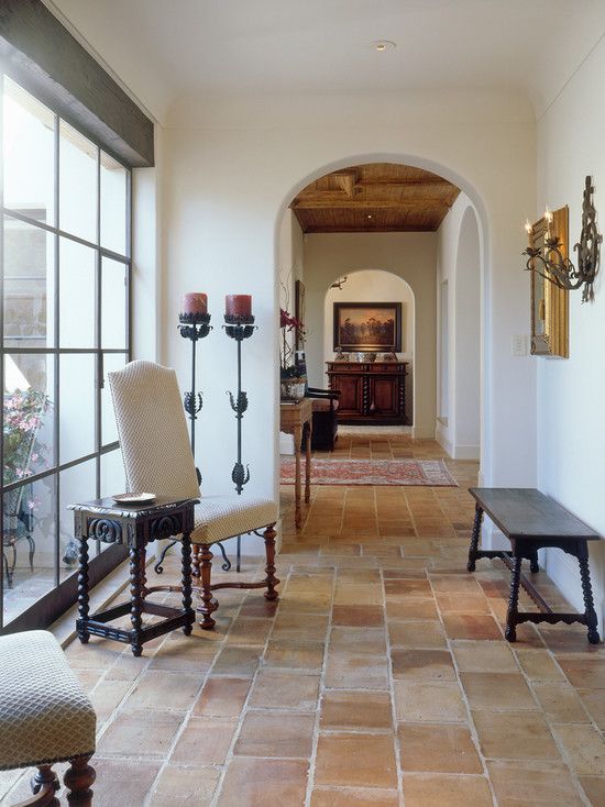
Here the walls are whiter than the floors which are very similar in look and feel to Deb’s irregular flagstone. However the furniture and artwork repeat the warmth of the Saltillo flooring.
The thin frame of the gorgeous floor to ceiling windows contribute to this John Saladino inspired decor as well as the warm, wood ceilings which you can see through the doorway.
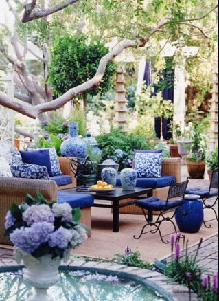
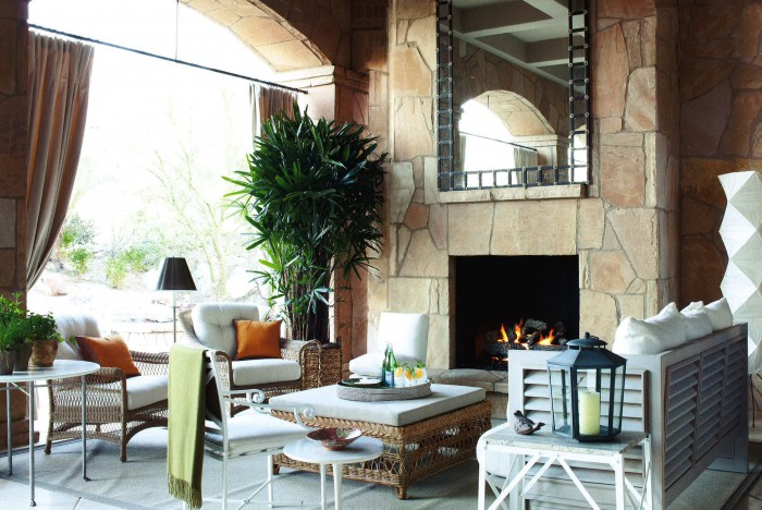
And speaking of John Saladino, look at how Deb’s flagstone is kind of on this fireplace designed by Saladino. And check out the white outdoor furniture.
The natural wicker ottoman and 2 chairs with orange pillows also repeat the orange/pink and yellow fireplace.
This tile is definitely more neutral feeling than other tiles you’ll find throughout homes in hot climates, but you need to repeat the warmth of natural tones in wood or wicker as shown above.
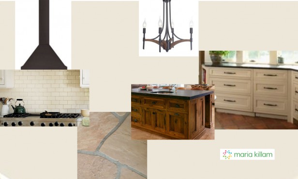
Tricia and I talked about the design of Deb’s new kitchen and this is what we sent her:
Debra had chosen this light fixture which definitely works with this scheme as well.
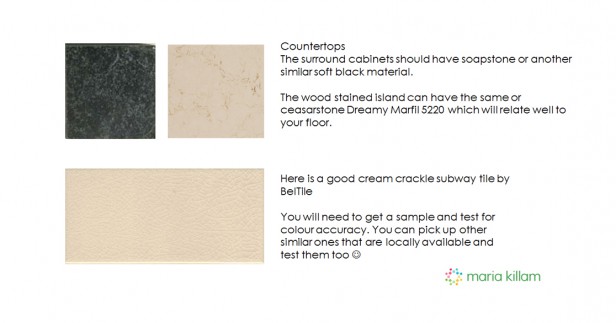
Here are the countertop suggestions.
And the hardware
Since choosing 1″ pulls for a recent project that I’ve been working on I have fallen in love with minimalist hardware.
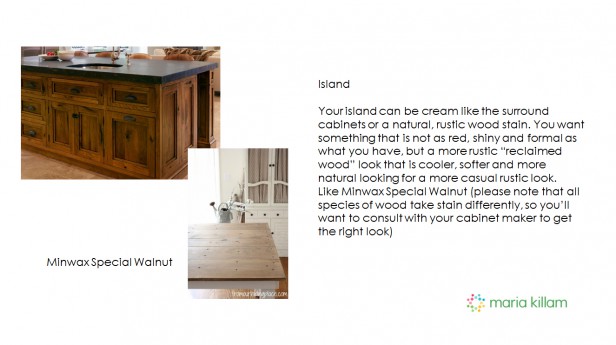

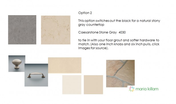
Deb loved our suggestions and ran out to collect samples for our approval.
So that’s what you can expect when you order one of our kitchen packages.
Not to mention the money we saved this couple in their renovation. I’m guessing her husband is loving me now 🙂
A word of caution in case you are about to throw out the baby with the bathwater like Deb was just about to do.
When you are NOT the professional, and you’re trying too hard to follow all the rules you’ll read on my blog or others, you don’t know which minutiae to follow and which advice to ignore.
That’s when you can easily go down the wrong path and end up spending more money than you should.
So notice that the way to work with this tile is to WORK with it. Don’t ignore it. You can still achieve a fresh look and feel as shown above.
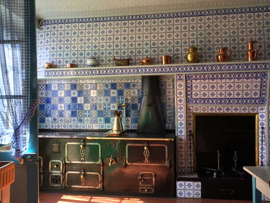
I’m in Paris for Maison & Objet and yesterday I went to Giverny Monet’s Garden and I have some more orange tile to show you:
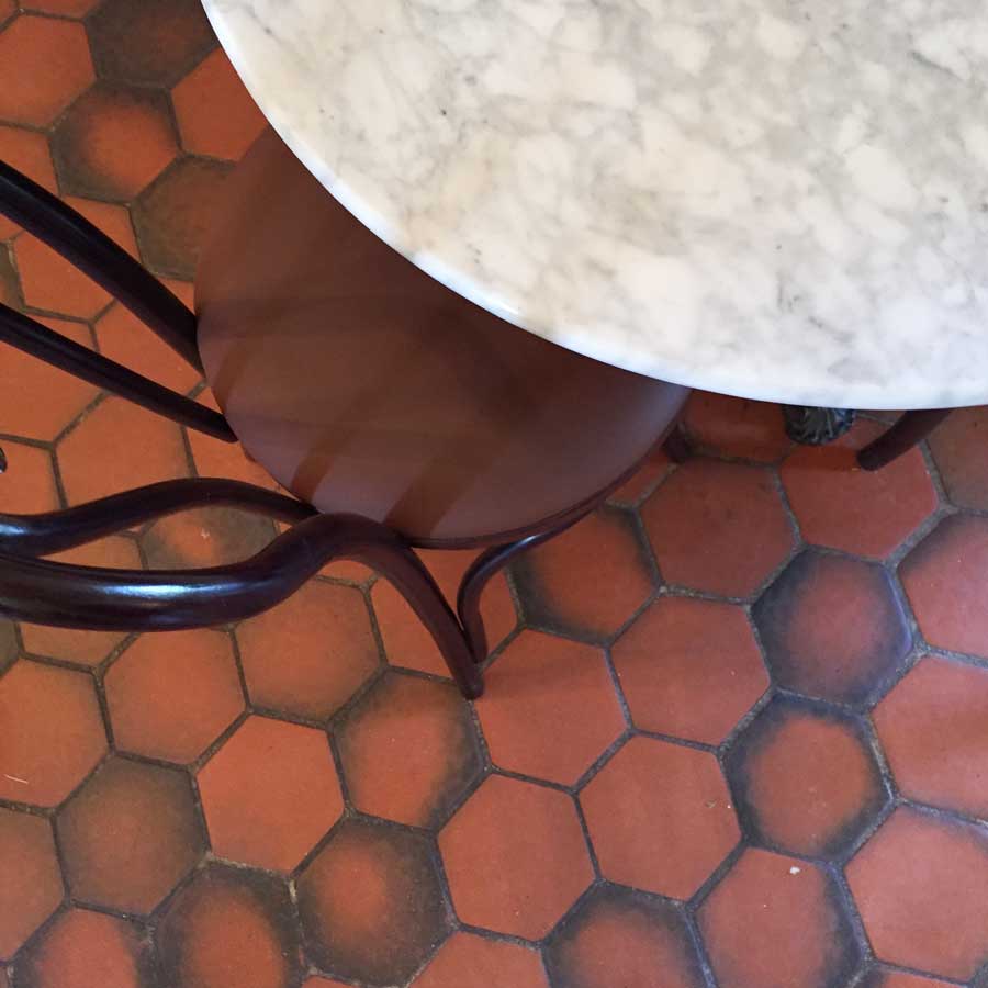
I stood in the kitchen looking down at 6″ terra cotta hex tile (sorry it’s hard to see in this pic) This house was built in the late 1800’s so it’s very old.
As blue and orange are complementary colours, the blue and white (gasp) accent tiles look very timeless and perfect here.
Tobi Fairley refreshed a kitchen for her Mom with terra cotta floors in turquoise here.
Turquoise is also lovely with these floors.
In one of the outbuildings where I had a cappuccino, here was more hex terra cotta tile but this time with black.
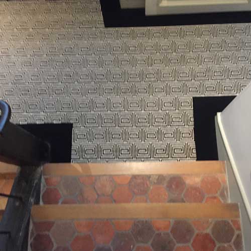
The stairs in my hotel look like this. They are growing on me combined with the graphic black and white rug. However, black also looks great with this floor. Just like black looks great with an orange brick exterior.
There’s very little I have not seen in styles and decor in my 20 year career so if somethings bothering you but you can’t figure out what to do or why it’s bad or wrong, well I most likely can tell you. After all, there’s only so many styles and each era installs the same trendy items over and over so it might be that there’s something new mixed with someone old and it’s just not working. Go see our packages here.
I feel bad for whoever installed those cherry cabinets in Deb’s last house. They probably hated those floors as long as they had their kitchen. Or even worse, it was renovated to sell which certainly didn’t do that house any favours!
If you need help coordinating your kitchen finishes, you can purchase the package here.
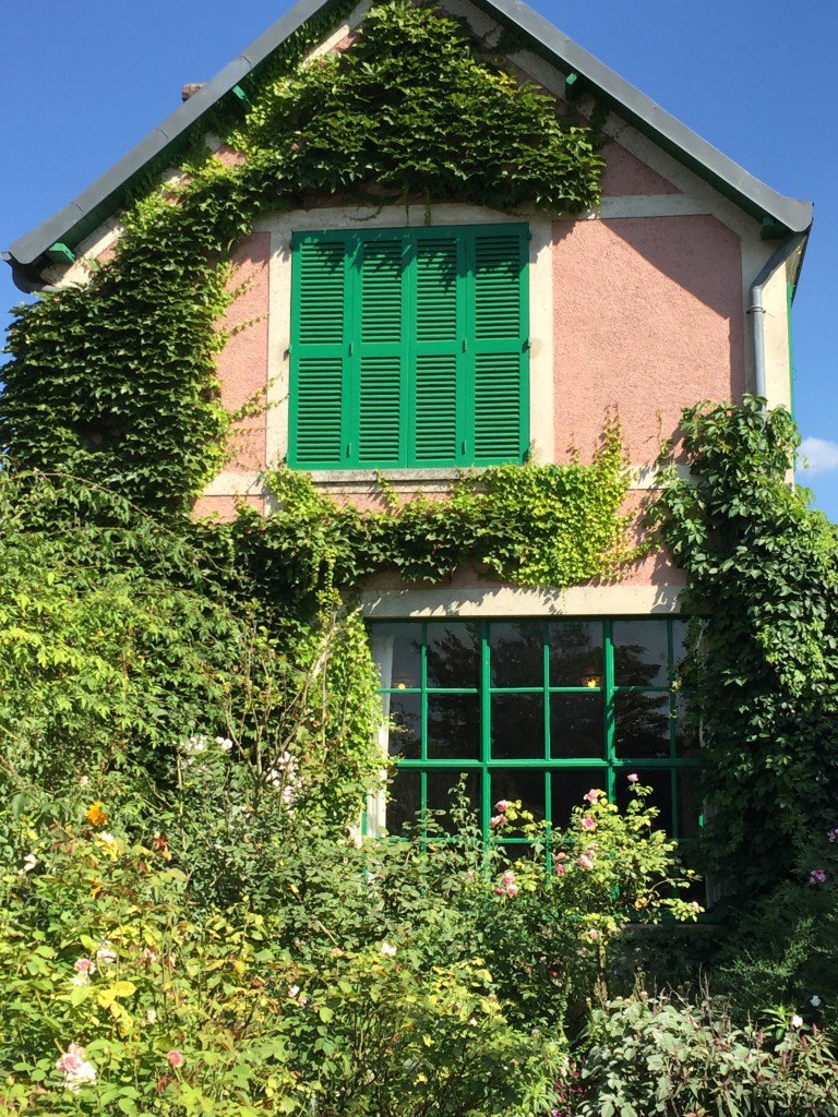
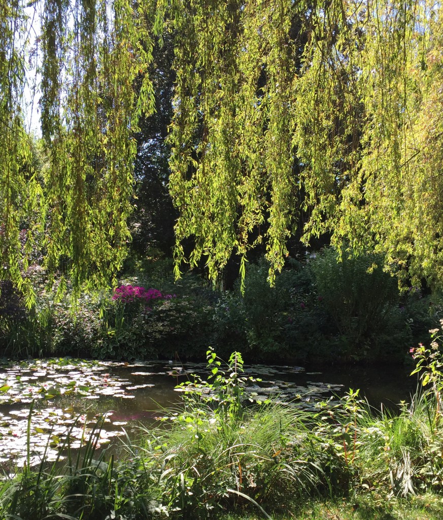
In case you haven’t been to Monet’s garden, here are a few pictures just for fun:
I posted an image of this house on my Instagram and said “This pink and green colour scheme only works here in this context” and one of my astute readers said “but the pink is dirty in comparison to the green” and she’s absolutely right!
His gardens really were an attraction not to miss, and you haven’t even seen the lily pads yet.
Whenever I travel, I go out of my way to take photos without people in them because they look better. One time my sister said “Are these postcards?” haha. So look at the end of this one.
People.
I couldn’t wait any longer for them to stop streaming by 🙂
Hope you enjoyed the glimpse of his gardens!
Maison & Objet starts Friday, I’m excited!
Are you are planning a new kitchen and you are overwhelmed with the endless options and possible combinations of finishes. Let us help you with our convenient eDesign services here.
If you’d like to train your eye in colour and design to become a True Colour Expert, register here for one of my Fall workshops.
Related posts:
The Timeless Floor Everywhere in Italy
Don’t Hire a Designer the Same way you Buy Oranges
Cream is Old, White is New and Other thoughts about Italy







Call me old fashioned but I love the look of Sautillo tile. Frankly, I am getting bored with all white kitchens but what do I know?I would always prefer unique over cookie cutter.
Great call. Those floors are totally salvageable and will retain some regional soul that I predict will become ever more satisfying as time wears on. LOL about the Pelligrino bottles in Tobi Fairley’s kitchen makeover. I have 13 massed in my kitchen and that green glass is gorgeous throughout all the light phases of the day (speaking of Monet).
Haha it’s a great green accessory for the kitchen countertop for sure!!
Great post, Maria! The kitchen will be lovely with creamy cabinets and soapstone countertops. I personally love the warm look of creamy glazed cabinets. I hope you’ll post some ‘after’ images. Have fun in Paris!
The floors look like Arizona Buckskin flagstone. Which is different from Saltillo tile. Most of what I have seen in the stone yards here in Austin come in different shades, from the peachy tones to the pinky peach tones, I love the cream cabinet recommendations from Maria, it will look fantastic!
Thanks Carole, as I live in Scottsdale area as well. I wondered what the local flagstone was called. I see it in older high end homes. I would try to keep the floors as they add lovely texture to a home. And, you are also right, Saltillo tiles are not flagstone. Saltillo comes in many shades and sad to see it totally fall off the fashion spectrum. Saltillo tiles take regular maintenance to look great.
Thanks, maybe I’ll still keep Saltillo in the headline since that’s more common. . . then more people will find this post! Just wanted to make sure I didn’t sound like a total novice 🙂
Absolutely correct! Don’t ditch the floors, they suit life in AZ. Paint the cabs, change countertops and wall paint color. But the above can also throw you back almost 20K if done by a pro. (Up where I live anyway.)
But, it might help to know what the rest of the floors look like in the house surrounding the kitchen…
Same throughout!
Lol about the no people in the pics. I’m like that, too! Am currently working on a kitchen, bath and laundry room where we’ll be using soapstone on the counters. The client had such an immediate reaction to the slab, I told her you have to get that, nothing else made you respond like that.
Maria,
I, too, think you nailed it. Deb, your house will be stunning.
I adore that floor! It is exactly what I hope for in my kitchen as we slowly remodel, and the various looks you posted are perfect!
I love Saltillo tiles (becauseI don’t even like orange, I think of them more as a tera cotta color).
I think in a world where we feel the need to replace everything every 10-15 years because it “screams” a certain year or decade, it make really good sense to pick a material that relates to a place instead of a time.
Saltillos are classic but unusual, natural. They are elegant yet unpretensous, easy to live with and clean, versitle (to a point) and timeless. And the are really beautiful!
I don’t think they work absolutely everywhere, for example if the rest of the house is very tract house cookie-cutter they will likely look out of place. And they are not to everyone’s taste, which could affect property values.
I think a lot of the Saltillo tile on the market is not of the quality that is was a few decades ago, so I think you have to be careful about that.
Saltillo would be my absolute dream flooring; I waste a lot of time looking at photo of Saltillo tile floors!
I agree, the true Saltillo from Mexico is gorgeous- dog prints and all! ! Lots of knock-offs around unfortunately.
I had to chuckle at your sister’s comment. My husbands insists on having someone he knows in every picture he takes. “Otherwise you might as well buy a postcard.”
You sure saved Deb from a massive mess of ripping up her tile. Good thing she found you.
OMG, Maria, you did it again! Put you finger exactly on the problem and saved Deb a ton of money. My respect for you knows no bounds.
Thanks Sandy you are so sweet 🙂 I love my readers!
I hope we get to see the “after” photos!! 🙂
Maria,
Love your solution. And my immediate reaction was the same as yours–why would anyone want to get rid of that gorgeous floor? I went with hardwood in my kitchen, which connects seamlessly to the rest of the house and was the only sensible choice, but part of me always yearns to live in an old house with old stone and tile and brick. The Giverny kitchen is stunning, and if I had my druthers, my kitchen would be exactly the same. The stove! The blue and white tile! The floor! But it wouldn’t exactly work in my 1964 ranch.
perfect timing. my sweet daughter and son-in-law just moved into military housing yesterday in puerto rico. it’s a hurricane-proof 1940 house with original dark pink/green/red/black tiles (and a resident BIG bright green lizard!). it’s a rather demanding set of colors to work with, but no floor changes allowed. i’m forwarding this post to her. thanks!
The new kitchen will be lovely, but the ‘old’ one would have been nice too if in the right house. Since it looks so new, I hope the owner is able to donate the cabinets and island — maybe to Habitat for Humanity?
I love option 2 with the gray counter top matching the grout in the floor. Perfection!
I am wondering what color paint you have advised Deb to use on the walls? I also have saltillo tile and am struggling to find the correct cream color.
Hi Elise, we specified SW Patience for the walls and Creamy for the cabinets
Maria,
I have been a huge fan of yours, reading all your posts (multiple times), purchasing all your ebooks, etc. They truly “saved” the new custom home we built from the builder’s “designer’s” ideas. Anyway, I wanted to tell you that posts like this one are what is going to sell your online design packages. I am very happy for Deb that she reached out to you.
Featuring your new packages this way is a great marketing plan for them (in my opinion) as this way, potential clients can see the issue and relate to it via buying the package, apropos of their own situation.
Paris.. poor you :((
Option 2 is gorgeous with the outstanding floors. The husband should be doing the Happy Dance since you saved him $20,000 already on the floors. You are just a genius, Maria. And, seeing Giverny again in your photos was a real treat. I love the pink house with the green shutters and Monet’s kitchen is perfectly beautiful. He and Van Gogh loved to combine yellow and blue.
Deb’s kitchen will look terrific and I think the floors have great promise with cream cabinets and your other suggestions. I am wondering if her floor needs a “sealer…enhancer” …maybe it is just the light in the picture but Maria compared to the example pictures you posted Deb’s floor looks washed out. If you are going to work with it and I think definitely keep the floors they might look better if they weren’t so “washed out looking”….just a thought.
I like that you showed a sample of what you receive in your kitchen package. It gives us all more of an idea of what you get if you buy one. I
am hoping you do a post with your other packages too like this one!
I also enjoyed the pictures of Monets garden. Wish I were there, have fun!!!
Great post and loved the pics from Monets home and garden, brings back such great memories we we’re there in April. I loved his kitchen!
Perfect timing for a perfect post! I have the exact Saltillo floor shown in the inspiration shot with the gorgeous creamy cabinets. I’ve been torn about how to learn to love the floors in my 1990 home. Now to set about getting the cream cabinets and wood island. Problem solved! Thank you, thank you, Maria!
Ah Maria. You’ve been in the States too long. Opening a post with ‘y’all’?
Please go back to Canadian English….
I’m note sure these are Saltillo, but I love Saltillo tiles, and terracotta in general. By the way these can be customized..a bit different stain, a bit more sealant..the surface can be made more sleek or more rough.
And they look amazing with the right colors. With surprising amount of right colors, I should add.
Great post. It will be one beautiful kitchen.
Hi all ,
Fun info :
Flagstone is named after either the general area it is quarried , or many named after a specific quarry … often quarried close to where it is used , as a clue if you want to identify a flag., ( here inOnt. we often see Port Credit and Wiarton flag, example .) .Flags get their colour from the local mineral deposits.
This picture is a lovely Arizona Flagstone , the typical famous pinky colour is from silica in the Quartz !! Arizona flag is well known .
Saltillo tiles are a clay as opposed to rock , also getting colour from the local minerals , widely used around Saltillo , Mexico , and all over Mexico .. Don’t know if it originalted there , tho .
I absolutely love your suggestion and pic examples Maria! I have a tile floor that’s similar but a more of a sand color and have thought of removing it also. However, after your examples I feel good to go in another direction. However, my cabinets are a birch/maple tone, the granite is verde peacock (green, flecks of brown and a tad of orange) and don’t think the cabinets should be creamy as that will match the floor. Would it be more advisable to just paint the walls a color to match the floor tile. Currently, the walls are SW Boardwalk…almost matching the cabinets. Help!
When I travel, I’m the same way. I always take lots of pictures without people. 🙂
Another Scottsdale gal here. Keep the floors. As others have stated, they are not Saltillo tile, they are flagstone. Completely different beasts. One being man-made and the other natural stone. I love the floors. I have seen seen many of these floors in N. Scottsdale/Troon area and I think they are amazing. Work around them.
I love all your suggestions! I knew there was a reason I follow your blog 🙂 I happen to be a designer here in Scottsdale AZ, that happens to get ALOT of business through realtors because I truly love remodeling! We call this flooring Flagstone, and it is the bane of all custom home sales existence because in the past it was often put in custom territorial homes -that tend to emulate the “Tuscan” trend for lack of a better correlation (it is more hispanic/Santa Fe) that currently is not in trend – it looks like it needs to be outside, which is what it was originally meant for. Just beautiful on patios! The rustic atmosphere of territorials so popular here in the Southwest are not always currently grasped by homebuyers so used to the up-and-coming trends -we definitely lag behind to a point here in AZ. And yes, flagstone is incredibly expensive to put in and tear out- very heavy product! That being said as beautiful as it can be- the thick grout lines and the layered effect of the facing, make it very hard to keep clean, which is part of the reason it is now so unpopular. As much as I’d like to see homeowners work with this wonderful “old world” flooring, the real estate side of me says to tear it out now, and enjoy some updated flooring because when you choose to sell your home it may be the biggest deal-breaker which is unfortunately what I’m seeing time and time again right now with custom homes on the market. I’ve been called to change out the flagstone flooring in several homes in the past few months because they are not selling and specific feedback is the flooring!
Oh my goodness! I love her stone floors! Gorgeous!! But the rest of that kitchen has to go lol!! Your mock up was perfection. Love the first one with the weathered wood, creamy cabinets, black or gray counter suggestion etc. It’s going to be so pretty! Lucky she found you when she did. Enjoy your trip!
Great post! By spotting the correct issue, you were able to solve years of reno-creep! Surely, even if the floors had been replaced, there would have been disappointment in that kitchen, and that would have been redone too! Can’t wait until my next reno project to use your services….
Love ‘flagstone’ and never have seen it before applied to an interior space so I think its wonderful Maria that you are encouraging her to keep it. That said; definitely not to offend but I actually thought you may have photo edited the small Island in as an example as ‘not what to do’ …. ☺. To conclude; IMHO your suggestions are definitely going to give the space a new life. -Brenda-
Thanks Maria for another great blog post. Even after taking your class I continue to learn and grow from your posts! Thanks to your asst. for sharing her home and dilemma of her paint. And love the pics from Paris!
Thank you for this ! I am considering saltillo floors and creamy cabinets because of this post. Would I have to repaint all of my bright white baseboards and window trim the same creamy cabinet color? Thanks!
Maria,
Is Ceasarstone’s Dreamy Marfil a pinky beige?
Hi! I’d love a bit of clarification — in this post you say “Nooo!” to white counters with cherry cabinets, but in your post about the Best Counters with Stained Wood Cabinets you recommend white or cream …
Or maybe you meant that neither the cherry nor the white counter go with the floor!
I don’t think her floors are really saltillo tile. They look like flagstone made to look like saltillo tile. A lot of your other pictures do have floors with that tile. I no longer live in AZ but I did have a kitchen with saltillo and I really liked it. It was durable and did not show a lot of dirt that gets into a house with kids. I really just decorated around it. And, to me, it was much better than the “muddy” tile you see so abundant now. I wouldn’t have wanted it in my whole house but just seemed fitting in my kitchen.
Another terrific post!!!!
I’m so happy to see this article posted again! My entire home has Saltillo floors, and during the gray trend it was almost impossible to find inspiration for my kitchen remodel. This article inspired every choice I made…especially the “This is what her kitchen should look like” photo. Thank you, Maria, for inspiring what turned out to be the most beautiful and timeless kitchen I could have come up with for my home. It makes me think of you often!
I really enjoyed reading your post. My husband and I are pondering buying a house with pink, yellow, beige Saltillo tiles right down the middle of the house and into the kitchen. I don’t know what these people were thinking when they had dark brown wood look tiles installed in all the open rooms connecting to the Saltillo. I liked the picture you found that had the same pink and beige Flagstone featured on the fireplace. You gave great advice. Thanks!
Hello,
DIYer here with contractor hubby.
I just want to say THANK YOU for the review/advice on this kitchen. I found this blog post after searching and searching for kitchen cabinet makeovers with “terra cotta” flooring. This posting may indeed solve a similar dilemma I am having with color choices. It also confirmed some of my previous choices were on the right track toward the ultimate vision of painting my cabs and walls. It’s been about a five-year vision, lol, but I’m getting there. ; )
My 800 square foot open-space kitchen does not actually have terra cotta flooring, but rather a porcelain-stamped tile that we chose to coordinate with the adjacent/contiguous fireplace area. Thus the flooring has a terra cotta-ish stone look with oranges, pinks, tans, greys, and clays. My countertop is a generic Corian with a tan base and speckles of dark greys and browns. I chose both the flooring and the countertop to coordinate with the fireplace and the honey-stained oak cabinets in kitchen proper and honey-stained knotty pine walls in fireplace area. When we installed the tiling, I paid extra and waited extra time for a muddy-colored grout despite my husband’s annoyance (about the time delay,not the money,lol).
Anyhow, my thinking at the time was that muddy-grout would match the color of the soil that gets dragged in my woodland setting home on a daily basis with three dogs and a husband and son in construction. All four entries to the house are through this central kitchen location, and I am very pleased with my selection of flooring and the grout, even three years later. I chose the countertop as the best bang for our buck and the speckles to subtly coordinate with the grout and it looks great, too.
Thus far my backsplash has just been sheetrock painted in BM’s “Pensive,” which, depending on the time of day, looks light brown and other times, greenish. But recently I had my husband install pseudo “wainscoating” as a backsplash and I’ve been playing with color samples on that area and also the table area where I had him install the same wainscoating. So those areas are stark white right now w/ splotches of paint samples and can remain just as they are until I find the perfect colors. I will note that while my husband has repeatedly offered to tile the backsplash, I have not wanted tile b/c I think there is so much TILE in the flooring I didn’t want another fixed element to “talk tile” — the flooring and the fireplace and also a bay window over my kitchen sink are the features I want to accentuate, NOT the backsplash. (And not the cabs.)
Now it’s time to paint those oh-so-dated honey-stained knotty pine walls and oak cabs. And while I had been stuck on greyish browns or brownish greys, –either of which look too pink or too green–I had never even thought of CREAM until I read through this post. I already have the dark brass hardware and pot rack. And hubby is building us a farm table out of walnut from our property.
My kitchen is huge and U-shaped — more cabs than we actually need — so I am also thinking to pull four double-cabs off of one wall (across from the bay window) and install walnut planks as open-space shelving instead.
Now, because of this blog posting, I am researching CREAM colors. Currently interested in Benjamin Moore’s “Gentle Cream” for all cabs and walls in different finishes. And maybe even BM’s “Mississippi Mud” for the backsplash/wainscoating, lol, although THAT could be risky.
Would be happy to send you before/after pics. Again, THANK YOU!!!