I have lost count of the number of times I have been hired to help a homeowner ‘correct’ a colour issue created by a designer who chose finishes without knowing how to combine the undertones of the colours and neutrals of the tiles or granite they had selected.
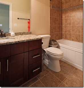
This bathroom of one of my on-line clients is typical of so many that I have seen over the years (she inherited it when she moved in). The countertop and tile are completely different undertones and do not relate to each other in any way. What would your advice be for this homeowner? Take this test. . .
If your answer to question #1 was NO. You might benefit from my Specify Colour with Confidence™ Training. The foundation in colour every designer and do-it-yourself homeowner should have is ‘how to combine neutrals’. Selecting a ‘colour’ is usually way easier than pulling a room together with the right neutral for the wall or furniture if that is what is required.
When I first started colour consulting, it took me probably about 6 months to even see neutrals or beige as an alternative to colour, I was so convinced that my job was simply to choose colour. However most homes are not simply a kaleidoscope of colour even if you live in Florida! Even a homeowner who loves colour will inject neutrals somewhere either on the walls or in the furniture. It’s what makes a space feel balanced and attractive.
Which neutral is then correct?
I have seen many supposedly ‘neutral’ sofas chosen incorrectly without understanding which undertone is right and it can suddenly take what you thought was a ‘neutral go-with-anything’ sofa to a very bossy colour indeed.
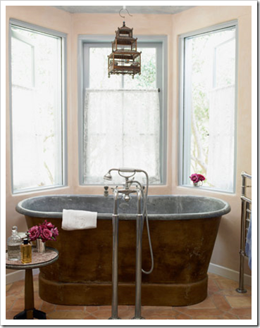
 House Beautiful – See the walls are pink to coordinate
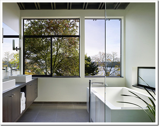
And if you are a homeowner about to install these kinds of finishes, look one more time at the inspiration photos you will find on-line. Out of the 50 House Beautiful ‘best bathrooms’ in this link, for example, you can count on one hand how many multi-coloured, tiles (above) are shown including the one I’ve featured in this post.
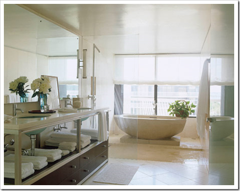
And it’s why (just like white kitchens) I prefer mostly white finishes in bathrooms. They are clean and beautiful and if they are the ones that make it into magazines, consider that it may be a more timeless alternative for your home.
Isn’t it time to do the best course on colour you’ll ever find? Become a True Colour Expert.
Related posts:
Slate or Porcelain Tile in the Bathroom
Are your Colours Married?
Which Hardwood Floor is the Most Timeless?
The 3 Most Important Words in a Consultation
Is your Flooring Bossing you Around?
New to this Blog? Click here ; Subscribe to my free Monthly Newsletter; Become a True Colour Expert


I so relate to the undertones of beige. When I moved into my home I suddenly found out that all of the carpet had a pink undertone, and anything red just made the carpet look more pink. Totally eye opening. Your posts are always so interesting. Hugs, Marty
Do tell…color me stumped!
Sorta.
Although I would do a white on the walls of the bath to offset the two dislocated color tones.
I just got spooked! I just published a blog on beige (mentioned you by the way, come see) and then I saw your post on neutrals!
Great minds I guess … great post too!
I can see that the counter tops and the floor are not the same hue, I would suggest to go more brown in the paint…more tan…less orange, less peach, less red.
pve
This is fun! I think the tile has pink undertones and the counter's background color has yellow undertones. I'm not sure of the best solution, but in the reflection of the wall the paint looks to have yellow undertones. I think that is a problem because the tile is much larger of a surface than the counter so I think it would be more important to harmonize the wall with the tile. Since there are so many colors in the counter I would probably pick one of the ones in there that can work with the tile (maybe a green?) Or I would pick a neutral with pink undertones, and tell her to replace the counter since that would probably be cheaper than replacing the tile. Maybe a white on the cabinet since it would then at least relate to the fixtures? Am I totally off base??
Curious to see what the webinars will be like. 3 days still? more? less? Dying to do in person training, but can't do it this summer. xx
I know Maria! I know!! haha I know all of the answers only because of your training in Atlanta. I am actually going crazy about all these undertones, I see them everywhere! My next blog post is actually about the undertones in my stone fireplace.:) I am just loving it. Thank you very much my friend!
OK, revising 🙂 I'm thinking probably a brown with pink undertones, and leave the cabinet as is (since it has is reddish brown it should be fine with the tile?) Putting a green anywhere (even if there are possibly flecks of it in the counter) would probably just introduce too much of a new thing.
1. No. If you have a magic wall color that makes this work, I will be so impressed.
4. Granite is green, tile is pink?
I'd mount the shower curtain rod high, get a nice long curtain in one of the colors in the granite and keep it closed. And wear sunglasses when showering. It's not so bad on the floor, and a couple of white rugs would probably cover enough of it.
As soon as possible, rip out all the imposing tub surround tile and go with white.
Tricky bathroom!! I think the tiles are pinkish and the counter is yellowish! I can't really tell from the pic, but how about some orange on the walls to kind of combine those two, without having to rip tiles and increase expenses?? But Maria, please, give us your answers…. Don't just leave us like that!! I'd so love to attend your seminars, but I'm a poor girl from Greece! And you're a decorating genius btw!! Kisses 🙂
An awesome post with wonderful photos!
Fantastic!
fantastic piece, maria. such great advice in general and especially for me right now as I am undergoing a bath re-do! donna
I'm probably completely off, but my initial instinct is to paint the walls white with a warm creamy undertone and to replace the mirror frame with a dark wood to match the cabinets.
Maria, I can't fly to Canada for your course. I wish you had just given us the answers in your post. This is frustrating.
hmmm… I would try to lighten it up by using a creamy ivory on the walls to tie into the grout in the tile and the countertop. I'd also paint the vanity out the same colour and change to hardware to something darker. I'd change the mirror too to something larger with a dark frame to serve as an anchor. I think the dark / reddish vanity competes too much with the already mismatched floors and countertop.
Thank you for the color tips..
Oh dear! The hardest color consultation I ever did was to find a "beige" to work in a bedroom with a huge upholstered headboard with pinky beige fabric and drapery fabric (which had already been purchased) that was in yellowy beige tones. Client was dead set against a color because she had gotten rid of terra cotta walls already. I found exactly one Benjamin Moore color that was just the right balance between the yellow and pink to look good with both fabrics — but the client wanted "options" because she had already tried and failed with so many colors when she painted up the larger samples. EIGHT DIFFERENT PAINT BRAND FAN DECKS LATER … finally found one more beige that would work.
What really kills me is that she had been working with another interior designer before she met me and hired me. Cannot believe the interior designer helped her choose that drapery fabric with the headboard already in the room.
Happy ending though, because she was ecstatic with one of the colors I chose after painting her room. Whew!!
Read your blog and am curious what the BM color was that met her needs. I have a similar problem
Thanks
Hey, no need for anyone to get their knickers in a knot! I'll post the answer but if I wrote it in this post what fun would it be to try and guess what it is?
Check back on Friday and I'll post it in the comments.
Maria
I have lost count on the number of times you recite that you ‘have been hired to correct’ color or otherwise by designers, when you are not an Interior Designer. Color theory is part of the formal education process; I find it disrespectful that you consistently challenge our training and knowledge for your own personal gain.
JMO.
My memory of four years of design courses was that “color theory” classes were about intensity, hue, value, chroma, Munsell color wheel and all other color systems, analogous, complimentary, historical colors, etc., but almost nothing practical about the science of paint on a wall and how the light and surrounding colors and refractive light affect the complexity of a paint pigment.
So glad Maria is finally making sense out of the color wheel. I am thrilled to be re-educated.
Anonymous,
I understand why it may feel disrespectful to you. I spent 12 years in school myself in a different field. However, there are many in the design field who do not understand how to apply the color theory they learned in their formal education in a practical way, as evidenced by the many, MANY color mistakes I see. Until I started reading Maria’s blog, I felt like the pickiest person on the planet because I kept noticing what I termed “mismatches” in finishes and color. It doesn’t take a formal education to recognize, visually, when something is wrong with color. However, it does take education to know how to fix it without relying simply on trial and error. That education can be formal, as in a classroom, or it can be learned “on the job”, ie. through experience, self study, mistakes and successful results. I don’t recall Maria ever stating she was an interior designer. However, she has expertise in a specific area of design. To believe that one can become expert in a field only through the avenue of formal education is itself arrogant, myopic, and disrespectful to those who are extensively self taught. She also happens to be right when it comes to color and many formally educated designers, sadly, are not. She markets herself because she is not stupid, the information she provides has value, and you must believe this to be true on some level or you wouldn’t keep reading her blog a countless number of times.
Lord have mercy you get some wicked comments! Lighten up everyone! haha
Hi Maria! Haven't talked in awhile. Great post! I actually signed up for blogfest but had to cancel. My g-pa had a heart attack and had to have a quadruple bipass. Very scary. And he is a veggie like you. Eats really healthy and works out every day. Anyways hope all is well on your end!
xo
amanda
Hi Anonymous,
An interior designer is NOT a colour designer. I don't pretend to be a trained interior designer but I am a trained and experienced colour designer. The two are separate and distinct. Saying you are an interior designer does not automatically give you the distinction of colour expert. It would be like saying a doctor is also a specialist in every area of medicine.
It is not my intention to insult designers, but to teach them to be able to fix colour mistakes and also to not make them in the first place.
Every designer who participates in my courses is at the same level of understanding undertones as the homeowners who attend. This is not 'wrong' in my opinion. It is simply because 'colour theory training' is very distinct from 'distinguishing undertones' which is what you'll learn in my course.
In design school you learn 'colour theory' and if you've done it, you'll know it has absolutely nothing to do with distinguishing undertones.
If I offended anyone by that comment, I apologize.
Maria
>>An interior designer is NOT a colour designer. I don’t pretend to be a trained interior designer but I am a trained and experienced colour designer. The two are separate and distinct. Saying you are an interior designer does not automatically give you the distinction of colour expert. <<
But all interior designers SHOULD have extensive olor training the way you do it. You just may change an industry, Maria!
Oops, I didn’t read down far enough to see you already responded to Anonymous or notice the dates on these posts.
I am building a house and I have been reading your blog… Got me nervous I am not doing everything right!!haha Loving your ideas and tips! 🙂
I'm so behind on reading but in the process of catching up. Neutrals are one of the areas that make me crazy. People mix match them all the time. Since white and tans / beiges are my favorites, I can't tell you how many people think because it's tan it goes with other tans or beiges but there are significant differences. Some have a more puddy color, some have a more yellow color and they simply don't go. That's my word "don't go". I see it all the time in kitchens and bathrooms or people putting a tan tile down to match a granite but it doesn't blend. It's hard to say in the picture because colors on computers are hard for me to read but I do know looking at it doesn't go LOL! Great post.
Sooo… what's the answer? 🙂 For my taste, even if there is a paint color that would help temporarily, I would lose that tile and fast. It doesn't play nicely with anything else in the room.
My screen is notoriously bad at color representation, but the tile looks orange and the countertop pink on my monitor. There seems to be a tawny-brown fleck in the countertop that might mix well with the tile, so I would probably try some samples of that.
With so many existing colors (white, orange-brown, pinky-taupe, red-brown), I definitely wouldn't introduce another color!
Sorry for the delay in posting the answer.
The answer is indeed a shade of white. If you choose a yellow to coordinate with the granite countertop it will look bad against the porcelain surround. And the surround is so pink no one would want that colour in their bathroom.
My client was already painting her kitchen White Dove so I suggested she use that same colour on the walls and repeat the 'white' in the shower curtain etc.
She will definitely be changing it but as you know, there is sometime a very long list of priorities to spend your money on before you get to perfectly good tile that is simply the wrong colour.
Help…I have a neutral bath gone wrong. The tub tile is a tan tile with chicklet tiles that are a mix of tan, dark green and light green tones. The fixtures are white and the cabinet base is a creamy white with a yellow undertone. We still have the option to pick the granite counter top and wall color. Remodeling for my friend and have made a mess of my selections. Please help…
Hi Sherry, To help you I would need to see photos, please email me for my on-line rates: [email protected]. Thanks, Maria
This article was so written for me
I’d like to point out something that was not discussed in this article: the size of the bathroom mirror. I read once that in general people don’t feel comfortable in bathrooms with massive mirrors. In addition to the elegant white in the last bathroom, I also prefer the size of the mirror over the one two photos above. When I redid my bathroom and substituted a much smaller mirror for the wall-sized one that existed previously, I got countless positive comments and instantly felt more comfortable.
”
source”
I do not agree, look at http://cotedetexas.blogspot.com/2012/06/readers-kitchen-series-inspired-by.html