When shopping for my clients, I buy all my silk flowers at Chintz and Company which is located in the heart of downtown Vancouver. Every time I go there I see this building (which is right next door). I love heritage buildings and especially this one with the happy blue colour. So yesterday I took a picture just for you!


It’s Benjamin Moore CC-904 Cascade (and a great boys room colour as well by the way) it’s the colour of the sky and rare to see it on a commercial building (or any exterior in Vancouver for that matter). I looked up their website to see how far this colour goes in their branding and sure enough, it’s the exact colour of their site as well.
Periwinkle blue is the happiest and warmest of the blues. A mid-tone ‘colour of the sky’ blue like this is open and expansive. Blue in general is the #1 choice for use in Corporate branding and identification. As Lee Eiseman says in her book Color: Messages and Meanings, ‘the constant challenge of such pervasive use of the colour is to keep it looking fresh and not hackneyed. If the essential message begs for a true blue image, look to a combination of dominant blue used in innovative combinations’.
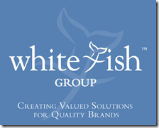
The White Fish Group is a brand management company. Choosing this colour works well in a suggestion of “always being there for you”, strong, reliable, loyal and the purple undertone means that working with this company will also be fun. All of this I got from just the colour of their site, which is certainly a strong argument for choosing the correct colour for your company logo!
Have a happy weekend!
Related posts:
White: Messages & Meanings
Can White be a Lonely colour? (Definition of Orange)
Why your Teenager wants a Black Room? (Definition of Black)
Warning: You are the Colours in Your Home (Definition of Green & Purple)
Michelle Obama in Vogue (Definition of Hot Pink)


It is sooo true how we find comfort(or despair) in the colours companies choose to associate with ! I never really thought about all the other messages it conveys..
Brilliant post – and just on time since I am working on a website revamp !! I should probably get your take on it..:-)
Vitania
So that's periwinkle blue…agreed it is a happy and warm color…thanks for the interesting post.
Hi Maria,
What a fun post- I love to think about color and branding- and obviously this company is very talented in what they do -because you can't help but notice them.
I love when a company takes a single color ( Tiffany&Co., Hermes, UPS, etc.)and makes it distinctly their own.
I often think if I had to pick only one color to represent me- could I do it? It's fun to think about!
Thanks for the mention- right back at you!
If you would have just told me about the building, my first reactions would have been "A blue building. I don't think so!". After seeing your picture, I must say that I like it. It really works with their logo. Another very interesting and informative post, Maria.
xo
Brooke
i so love that blue! ~ being that blue is my favourite colour to begin with… 🙂
true enough, blue and also red are the most used colours for logos (one only needs to open the yellow pages and have a look). unfortunately, not that beautiful periwinkle blue, but the more boring version which is often something like the web-like royal blue. sometime ago it was decided that those were the most highly visible colours, and i guess being so generic they also were the easiest to pick. how things have changed…
as a starting point, an important criteria in choosing a colour for a logo or branding, is the name of the company itself, and the nature of what they do. in this case, the name was decidedly a factor. the rest is all about having a good designer to pick the right pantone number that will represent best the client… 😉
Hi!
I'm glad to visit a great blog. Smart posts and beautiful photos. I like to contact people, all over the world, by his blogs.Would you follow me,because I'm afraid to lost your blog?I'm waiting your visit. Thank's
I just ordered new blogger business cards in a nice medium French-sorta blue. I almost went with the slightly deeper blue that you show, but find it a little common – makes sense with all those brands in blue! Glad I went with the lighter shade but very happy I went with blue. It has been my signature colour all my life. I even buy all my gift wrap in blue and use white or green or pink for accent….makes wrapping a breeze to have a coordinated palette and I never have to think about it. I love the BLUE brand!
Great post, xo Terri
Fabulous post Maria!
I am so attracted to that blue and now I know why.
When I am ready to brand myself you will be the first contact and then I will go to Whitefish.
Terreeia
Great building color and it does set you at ease when you're approaching it. I really like this color and it's the color of my carpet at home. Very relaxing and welcoming at the same time.
Bette
What a fantastic post – thank you! I've never seen periwinkle blue used on a storefront before – I LOVE it! And so smart of them to take it all the way through their branding.
Has anyone else noticed that Tiffany's blue changed slightly in the past few years? http://tinyurl.com/bfccl5
I love almost every shade of bly from pale robins egg to deep ultramarine! Lately very enamored of a purple periwinkle, grayed down blue.
Another great post, Maria! I am surprised by how much a I like the blue building.
This post is also very interesting to me because the company I work for uses a very similar shade of blue in its logo.
it's definitely refreshing to see a building in such a beautiful hue. Businesses should take note, for successful branding should extend to every aspect of what they put out there for public consumption… including their storefront and interior spaces.
totally agree, rachel! it IS refreshing. i think the colors in building design are often a forgotten aspect in marketing/branding/advertising. interior and exterior color creates an experience for anyone using the space – clients, customers, employees, etc. and if that experience doesn't align with the message the business wants to convey the overall identity of a business can get confused. i LOVE that white fish took the branding to this level. i would hire them!
So true…the branding continuum…threading the color throughout.
Great post!
i need to tell my dad to put in me in a happy colorful apartment than send my sexy crazy ass to therapy. I think it would be cheaper and hey an apartment!!
That building is phenomenal! Right now I am trying to figure out my logo, colors, etc. It is hard!
periwinkle blue is officialy my favorite colour.
Hi Maria!
Color is like a litmus test for me—it says what I am feeling. It can also sponsor a "shift" help me energetically, mentally or in attitude.
Love the periwinkles and am currently working with it!
love, kelee
The study of Color Psychology is definitely an interesting one to delve into. -Brenda-