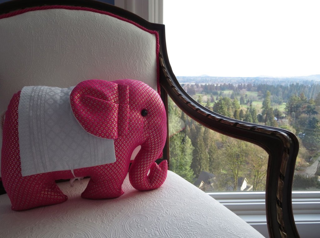
View from the Master Bedroom
In early 2014 I went down to Portland to work with a design coach. I called my friend Barbara Miller who lives there to find out if we could have a visit.
Barbara said “Yes that sounds great, and why don’t you stay in my Mom’s 6 million dollar house while you’re here. She’s in Palm Springs and won’t mind”.
Hmmmm. . . . well if you insist, okay!
I’m sharing her Mom’s house with you here because it fits into this question I received about how to create flow in a house with a white kitchen.
“I decided to go with the white kitchen, now what?? How do I carry the design into my dining room and living room which is fairly open concept? I would like to go with a blue/green/grayish wall colour (not sure which one yet), white trim, and will be doing medium brown hardwood floors. How do I coordinate everything else so that it flows nicely from the kitchen? Do I go with all white window treatments? What colour of sofa and area rug would work best? I want to keep the light, fresh, feeling that one gets from the classic white kitchen and carry it into the rest of my home. Any thoughts would be much appreciated.”
This question is great because it’s true that not every single house in the world is a candidate for the white kitchen I’m always harping about. But if you are that person and you want to make sure your kitchen flows with the rest of your house, here are 13 guidelines to consider:
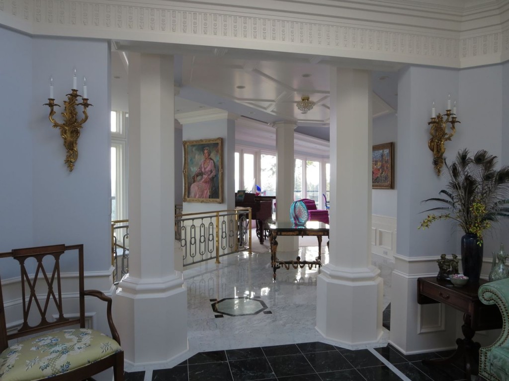
1. Lots of white trim and woodwork which connects to your white kitchen is a great way to create flow.
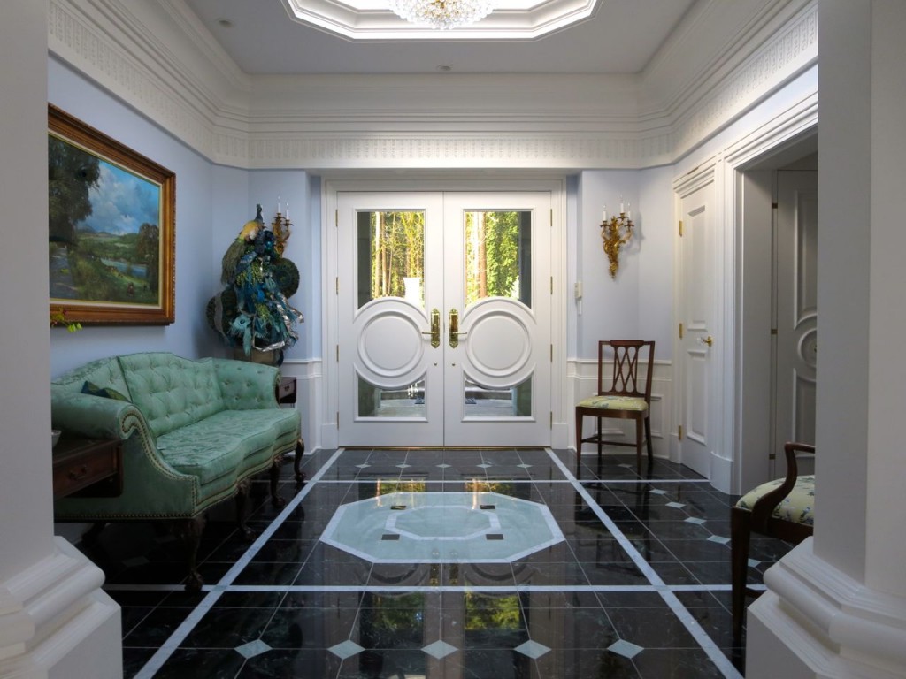
2. If you install white tile, in this case, the entry, halls and kitchen are Carrara, make sure you choose a white that coordinates with it. That will become the fixed white element that dictates which white you choose.
It does look like the white here is a little too creamy for the Carrara but because there’s so much of it, I didn’t notice that until I looked at the photos. I always find it interesting how designers and homeowners can break the rules when serious attention is paid to the decorating like in this home.
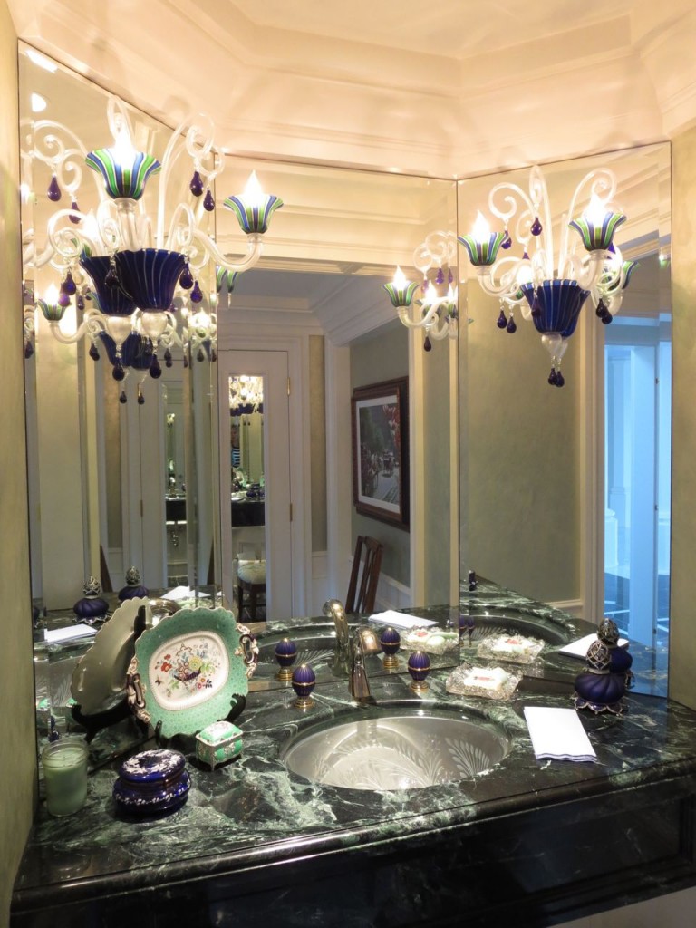
3. Make sure adjoining rooms relate. This is the glamorous powder room attached to the entry. I love that the black and green marble countertop coordinates with the entry and the bejewelled accessories on the vanity.
4. Eliminate beige carpet which just looks dirty with clean and fresh colours and consider a colour instead.
5. Unless you have a totally contemporary home where the focus is all on the art and therefore, does not need to coordinate with the decor, keep your artwork fresh as well.
6. White furniture definitely helps to repeat the white theme. If white is completely unworkable for you, make sure the sofa colours you choose will work with the addition of white pillows or incorporating white into the drapery.
7. Keeping your colour choices clean instead of muted or dirty, keeps the feeling of flow consistent throughout the house.
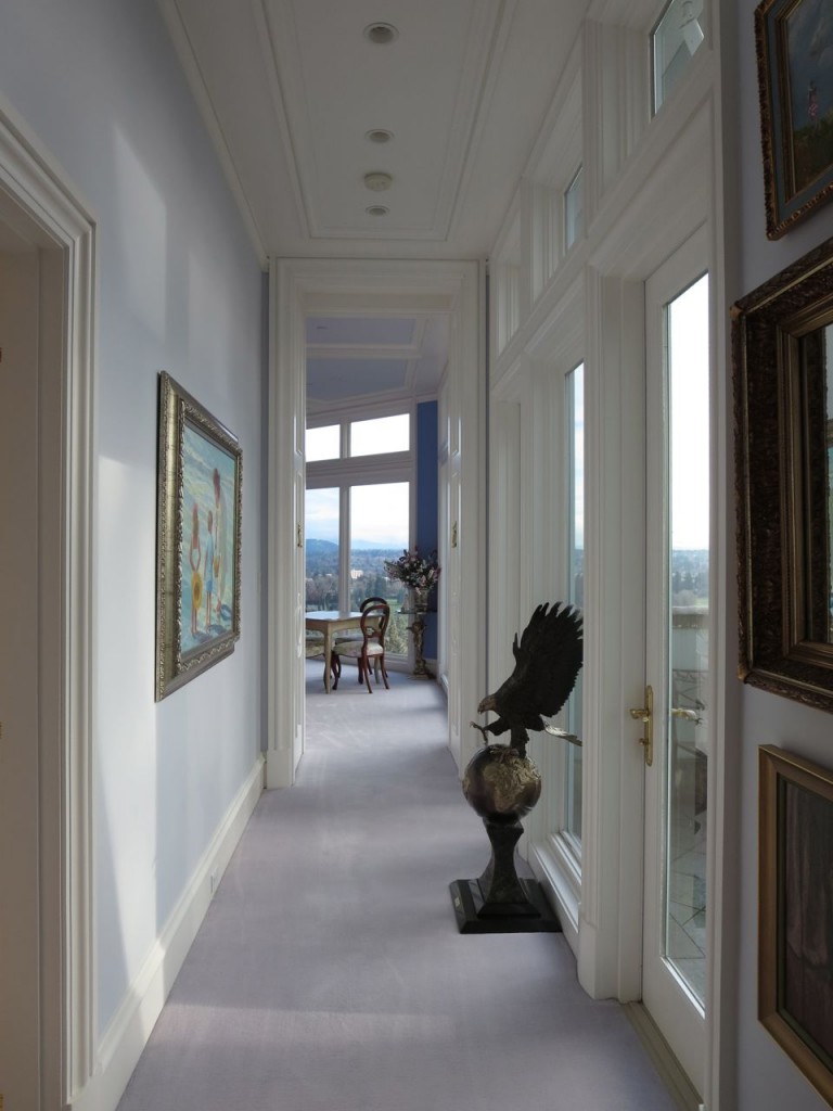
8. Blue on the ceiling always feels like the sky. You can see the blue ceiling in the master bedroom at the end of this light-filled hallway.
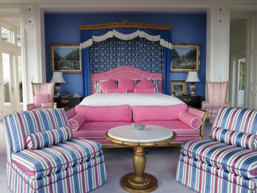
9. If you’re going to have an accent wall, paint it behind the headboard which is usually the most obvious place in a bedroom.
It’s better if there are no windows or doorways creating an awkward T with the paint colour.
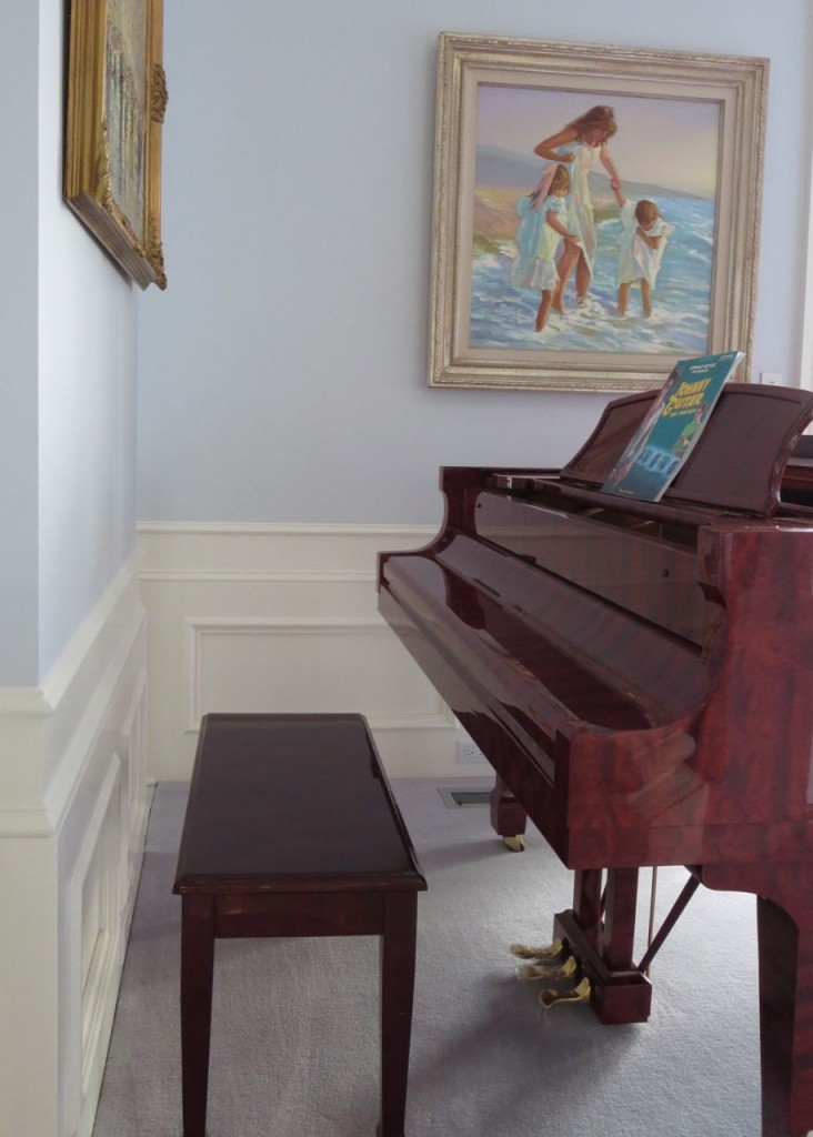
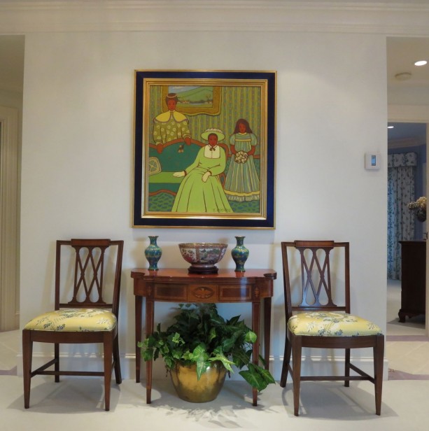
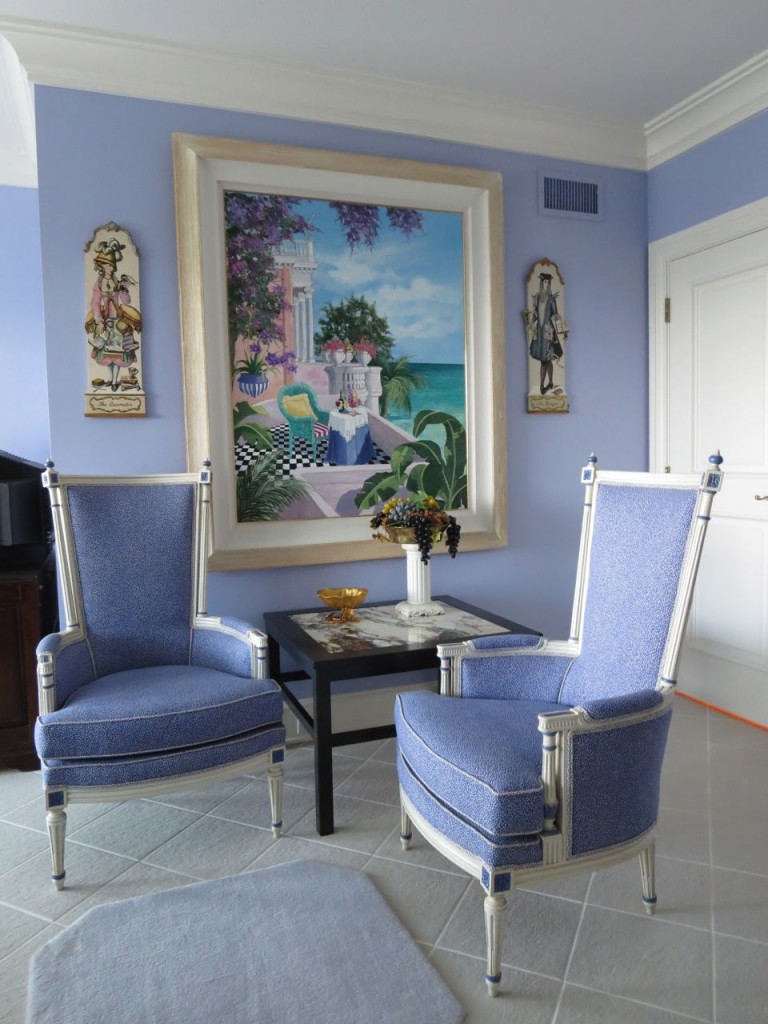
10. Normally I tell my clients not to leave a random room white if you have colour everywhere else but I didn’t notice that the hallway on the lower floor was basically white until right now. My eye was distracted with noticing the artwork and how it related to the fabric on the chairs in this pretty vignette.
I really appreciated the attention to detail every where in this house.
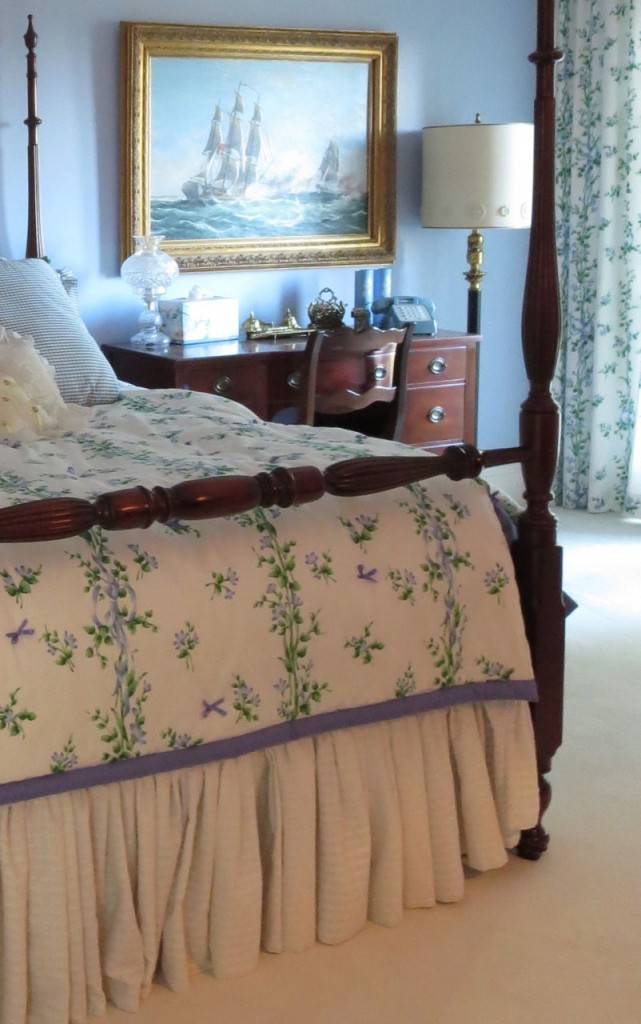
This was my guest room. Look closely or you’ll miss the individual bows on the duvet cover.
11. Keep the white in the bathrooms the same as the fixed white in the main rooms for perfect flow. If you don’t have that luxury, make sure your trim matches the tile in the bathroom. It looks odd if your trim is creamy everywhere else and then you take it through your white-on-white bathroom.
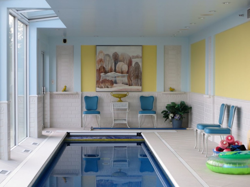
12. Notice that the soft pink tile does not read like the normal, muddy pink beige that would suddenly make the yellow look wrong. I like how the artwork ties it into the space.
I swam in this lap pool two mornings and felt very luxurious indeed.
13. Notice that the colour palette for this house, greens, yellows, pinks, blues and lavenders were alternated throughout. This house feels happy, everywhere you go.
The kitchen in this house is not white but the floors are Carrara and the countertops are Blue Pearl. I did not get a great photo so I haven’t included it here.
And here I am with Barbara (right) and her son Trevor having dinner at a fondue restaurant in downtown Portland.
We had a fabulous time and thanks Barbara and her Mom for having me!
PS. I don’t have any colour details because I took these images just before I left the house on Saturday sorry.
Related posts:
The Right Way to Create Flow using Colour
If you would like your home to fill you with happiness every time you walk in the door, become a client. On-line or In-person.
Choosing whites can be, well, complicated. Download my ebook, White is Complicated: A Decorator’s Guide to Choosing the Right White, to learn how to get it right every time.
Download my eBook, How to Choose Paint Colours – It’s All in the Undertones to get my complete step-by-step system on how to get colour to do what you want and to make sure the undertones in your home are right, get some large samples!
If you would like to learn how to choose colour with confidence, become a True Colour Expert.













Another “Maria Killam: Houseguest ‘Cribs Edition’!” I love it. Awesome! I hope you are having the start of another great year. Looking forward to another year of inspiration! xo
Gorgeous house! I’m sure I would have gotten lost in it!!! But I’m also sure I would have enjoyed it.
I think different shades of white throughout the home can work. They either have to relate to each other someway or they should be placed so you can’t see the two unrelated whites at the same time.
But they can’t be like my curtain rods right now! The trim on my windows is slightly creamy, but my rods are bright white. I thought I could get away with spray painting them white instead of using my trim color, and it’s just not working… They’re fine when the curtains are closed, because I can’t see the window trim, but not good when they’re open. It doesn’t bother my husband, but I’ll be painting them the trim color when the weather gets nice this spring!
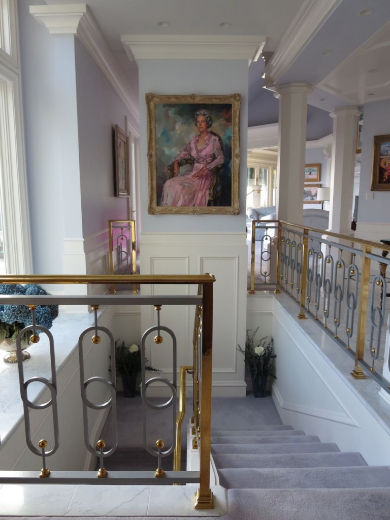
Thank you for the tour of this happy, well appointed house while I enjoyed my coffee this am. I love the amazing portrait above the staircase-it is moody and fresh at the same time; I want to know all about the subject. I must say my favorite picture is the last one because you all look fabulous (that orange banquette looks fab and comfy) AND so happy, including Trevor with his mom…my 14 year old son is in that “I don’t want to be with you but first can you drive me to my friend’s house” stage:)
Love the muted and fresh wall colors throughout this house! It is so refreshing and probably relates to the personality of the family. Can you find out the wall colors for us?
Hi Maria,
It wasn’t until the end that I realized that these photos were from the home where you were a guest. What a lovely home. I noticed the creamy white next to the bluey white right away and I would be the one repainting- but that’s just me.
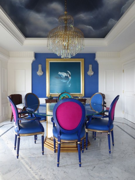
Love the timeless furnishings; the accent walls and that stormy ceiling in the dining room. My favourite was the pewter and antique gold railing which looks very art deco. And to have a grand foyer like that…one can dream! Thanks for inspiring us today..
A lot of kitchen companies now directly tackle how to create a seamless flow from kitchen to living room with ranges of living room furniture specifically designed to compliment the kitchen furniture. You might choose the same shade & style for kitchen and living room, in which case people often select different flooring to mark a distinction between kitchen and living room. Alternatively people often choose the same style of furniture but a contrasting colour tone. It works really well!
Hey, you jet setter, you! Well, I was thinking….yes…lovely home,etc….until I got to the picture of the lap pool! Now THAT’s a luxury I could LOVE every morning!!! Good for you that you took advantage of the opportunity to luxuriate in the pool!
I told Neil—let’s build a modest house, but a wonderful indoor pool! He hasn’t bit on that yet! Ha!
Wow, you get to stay at the nicest places.
I was so excited to read this post because I’ve been wondering how to do this myself. I almost emailed you with an Ask Maria question.
It has never occurred to me to bring the white of the cabinets into the adjoining rooms.
My thinking was that I needed to bring the accent color I had from my living room & dining room into my white kitchen. My accent color is navy so I couldn’t picture using that color with black countertops.
Since I already have the white couch, all that’s needed is to add some white window treatments. You had told me to do that anyways since my current ones don’t work with my wall color.
Sewing new, white window treatments will now solve 2 of my biggest decorating problems.
Now…if only Spring would come so I can set up my large work table in the garage.
Can I be her friend too?
Woah! Lucky you Maria! What a great place to stay and wonderful learning experience for us! xo
Once upon a time, I “refreshed” my kitchen on a budget. I was able to get a deal on solid surface for the countertops, new sink. The trim throughout the house was white, but the refrigerator was almond and I couldn’t replace it at that time. I continued on with the white trim, but did the glass fronted cabinets in a tone that picked up the almond, made the difference seem more subtle. Eventually, I got a stainless steel fridge and painted the cabinets the same as the trim. I was a nice transitional fix!
It was wonderful to see you! And yes I love that Trevor will be seen with me! He has come out the other side…I have four other teens you don’t see in the photo!
The portrait over the stairs is my grandmother – she spent 6 weeks in Spain being painted by a famous artist and I’m embarrassed to say I don’t know his name. I’ll ask my mother and see if I can get any color information for you.
I’m so glad you went swimming – it’s my favorite part of the house! xo
I liked the front door.
What a great subject! I’ve been wondering that myself.
I also really liked the idea of choosing a colored carpet instead of beige as they all get dirty looking and that
grey in the pictures looks so fresh and pretty!!
I’m beginning to think that almost all expensive elements in the house need to be white so you can change out
accessories and paint the walls for color……it would make
decorating so much Easier!!
Thanks for a great post
The powder room looks so luxurious, I love the lights, the accessories and the triple mirror. It is a happy looking house. I may steal the idea of the sky blue ceiling for a guest room. Your point about using a color rather than beige for carpet made me say, “Maria is so smart!” Thanks for sharing this lovely house.
wow! great pics, great house! Thanks also for clarifying the white issue. I really needed this help as that’s what I have been working on. I keep hearing your voice remind me, which is awesome.
Wonderful post! Wondering if one can have a white kitchen, not cream, if their décor is warm colors?
Great question, if your decor is more earthy, a creamy kitchen blends in better. Maria
Thanks Maria!
What a lovely, cheerful home. Its great to see a place with real personality.
The home is lovely and looks lived in but pulled together. The contents reflect an older person who has led an interesting life and collected some beautiful things along the way. I love Portland. You fail to mention that Portland can be gray and rainy, but this house would be bright on the grayest of days, with a lot of windows and some bright finishes that would look good on gray days and at night. Thank you for sharing this.
Yes I didn’t realize Portland was just as rainy as Vancouver and Seattle until Barbara told me! She said “That’s why it’s green”, but I’m used to green from where I live so I would only notice the absence of it, haha. Thanks for your comment Bill. Maria
Maria, such a timely post again. And your response to Julia about a creamy “white” kitchen is right on for me, but most importantly, I’m realizing that Phase 1 or even Phase1a of a consultation with you is due now and it isn’t even going to be about my kitchen but rather about new flooring in my very chopped-up open floor plan home with the kitchen visible from the front door. Even though a lottery or inheritance needs to come my way before new floors actually get laid, decisions can and need to made now so that I can move forward, and I’m so glad you’re available.
P.S. Love the way you provided teachable moments while you treated us to a tour of that wonderful home. As BillP says, a very interesting woman lives there and I bet she’d be fascinating to know.
Another great post, and a cheerful house. – I prefer muted, earthy, warm colors, and would love to see more posts for people like me. I want creamy kitchens and bathrooms, to go along with creamy trim. I don’t care if clear, fresh colors are trendy, that’s never going to be me, my furnishings, or my artwork. Just like I would never have any gray in my home. Yeech! IMO, depressing!!! I know you have your POV, and want to talk about trends, but don’t forget about the rest of us!
In responce to your comments and those of your readers;
The white paint was the same though out . 10 years may have changed the color somewhat. Also different shades are reflected in the white at varying times of the day. Finally your camera was reacting to incandescent lighting.
The basic color palate was periwinkle. Carpet customed dyed in a pale shade. Deeper versions appeared in the leather seats on the dinning chairs, the velvet on the dinning room wall, and on the sofas in the lower lounge etc.
Every fabric house has a different take on the color, so it took a lot of trips from the sample rooms to the house, to check the effect of local light on the selected prints and supporting details, trims etc.
To my eye the pool floor is white, but it was a compromise choice. Safety, as in non slippery, was more important than the shade of white. I had the tile show room people bring me some water and I walked barefoot on all the competing wet tiles.
Finally, I was bucking a trend to muted, beiged out shades at the time I was planning my home. Like your last commenter, I do not follow trends, I make my own. And my love is clear bright spring colors.
The artist on my Mothers portrait was Ricardo Macarone, who was painting a King at the same time. His dress uniform and mothers gown hung in the same closet. The king sat in the mornings, so Mom could have her hair done, and she sat in the afternoon. When the artist finished with them, he moved into Buckingham Palace for 6 months to do the British royal family. It was about 1969 or 70.
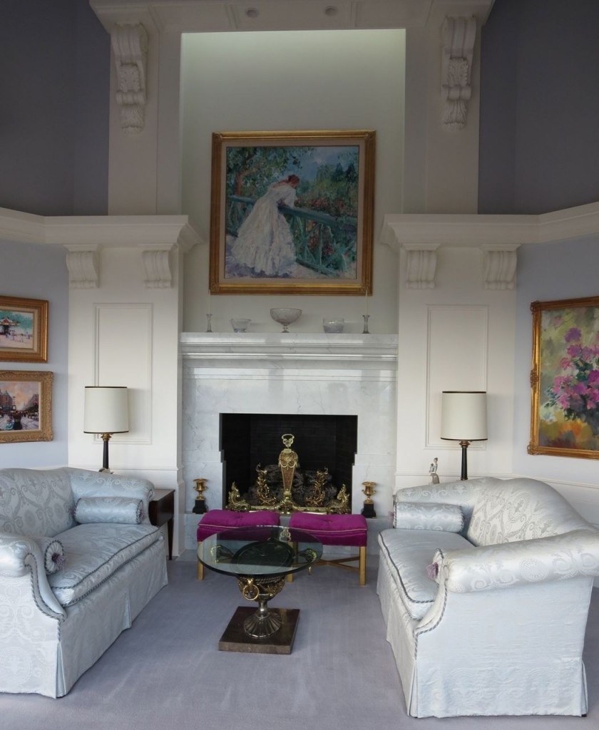
The floral painting on the right wall in the Petite Salon photo is by the same artist. We acquired it in 1973 on a visit to Madrid. As he explained through his interpreter, “it is the last painting of my Happy period.”
I am very glad you enjoyed your visit. I hope we will have the chance to meet. Barbara B.
A few more notes. Someone commented on the light fixtures in the guest powder room. I flew to Venice and water taxied out to Murano to design and commission the sconces and the dinning room chandelier, which to me represents raindrops falling from that stormy sky. The blown glass drops are made with 24carat gold mixed into the sand so when you see them up close they give off a rainbow of color. Much like the prisms of the crystal in the Rotunda (entry hall) sprinkling rainbow colored polka dots all over the walls and floor. I hope the sun was out during your visit.
I clicked send before getting to my second note. Actually all the walls of the master bedroom are periwinkle. It is just that there are very few walls. The wall surface behind the bed is the only wall surface wider than two feet. You can see one of them in the picture of the hallway.
The painting in that hall is by noted artist Robert Williams and is of my daughter. Trevor was the model for the children, but they represent Colton and Weston. The others are in earlier paintings.
Thanks Barbara for letting me share your beautiful and colourful home! Maria