via {pinterest}
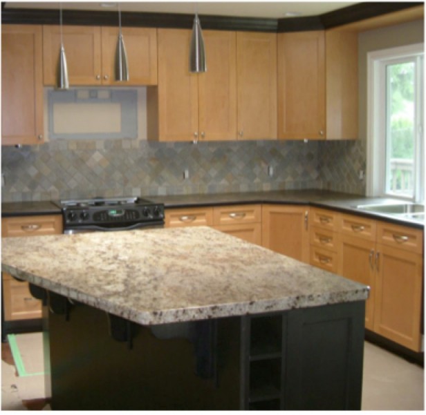
Glenda in Langley, called me to help her choose new perimeter countertops and backsplash to coordinate with the existing granite on her kitchen island. The current countertop was a laminate and she was upgrading to stone and the busy, multi-coloured backsplash had to go.

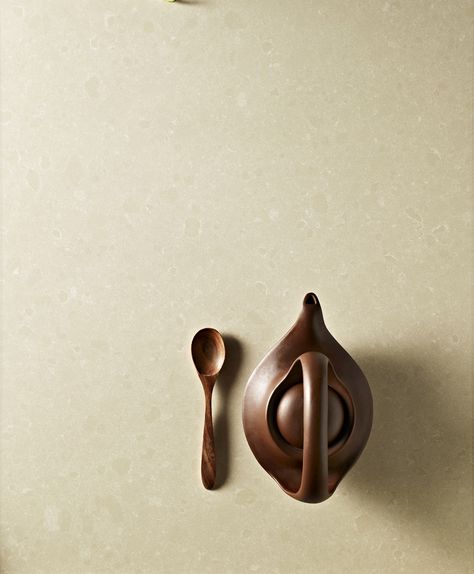
I wish I had the photos to show you how we chose the colour but here’s what we did. We took a stack of quartz samples in yellow beige (because that was the background colour of the granite–not white or cream–plunked them on the top until we found the one that matched the best. 2200 Desert Limestone.
2200 Desert Limestone
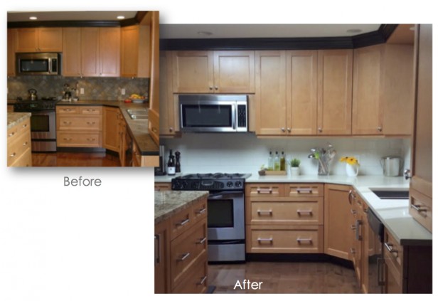
Here is the after photo. Note that the lighting in this photo makes the countertop look a lot whiter than they actually are, but you can get the overall feel. Simple and clean. Keeps the attention on the cabinets instead of everything screaming “Look at me, look at me!”.
If you’re wondering which countertop to choose in your wood stained kitchen, look no further.
If you keep the finishes in your kitchen this neutral (above) you’ll have an almost unlimited number of colours to choose from when you decorate! Generally, wood stained cabinets will give you a more earthy look and feel, installing a neutral foundation like this will give you the option of incorporating the brighter, fresher colours that we’re all craving these days!
In my Renovate with Confidence™ Focus on Finishes webinar with one more week to go I received an email from one of the participants with her aha moment:
This Aha Moment was honestly just like a light bulb when on in my head when I saw Maria showing how to make the commonly used builder tiles work in a home. This correlation came crystal clear to me:Timeless or “Boring” Finishes = Tons of options for paint colours, my present & future styles and decor. This is awesome because I love to change things around often and this gives me a “blank canvas” to have fun with for years and years.whereas…“Trendy” Finishes = Only having 1, or maybe 2, really good coordinating paint colour choices to go with whatever the dominating trendy finishes are. Thus limiting myself to a room of grey, beige or heaven forbid…pink undertones (haha)… FOREVER. To me…that is BORING.Kind of ironic isn’t it? Thanks so much for this one Maria!” JW, Alberta, Canada
If you would like help creating a palette for your home, become a client. Online or In-person.
To get your exterior colours right, download my How to Choose Exterior Colours with Confidence webinar and get my go-to list of colours.
Download my eBook, How to Choose Paint Colours – It’s All in the Undertones to get my complete step-by-step system on how to get colour to do what you want.
To make sure the undertones in your home are right, get some large samples!
And, if you would like to learn how to choose colour with confidence, become a True Colour Expert.


Thank you for all your help again Maria you are the best!!!
This is a great improvement. Too bad the “after” photo doesn’t more accurately reflect the color of the new countertop. I like the solid surface backsplash- very clean looking (and easy to keep clean, too!)
I can’t tell very well from the photo – what is the backsplash? Subway tile or a solid in what colour? Thanks.
I have the same question. It is not obvious to me from the photo that it is the quartz. It could even be painted. If it is quartz, and you didn’t want to go quartz, what different backsplash (including color choice) would you have gone with in this kitchen?
Oh, I see where you answered it below. Thanks!
The solution is so clear! Thanks for walking us through this once again.
Maria, what direction would you have gone in for counters if there wasn’t the existing granite? (The floor looks quite different in two photos.)
Nice, clean solution.
I would have chosen exactly what she has. It a clean and fresh look and gives you many options for decorating with other colours (which is really my definition of classic and timeless). As I’ve said many times, hard finishes is not the time to be “interesting”. This is where people should be “safe” not with their sofa colour.
There is so much needless money spent on ripping out the previous homeowners perfectly good, brand new finishes because they are so “personal and interesting”. Maria
I like how you framed your definition, since some people could think classic and timeless means traditional. But I can see this applying to a contemporary aesthetic just as much. BTW, I hope hope you offer your webinar again.
Is that white subway tile on backsplash?
It’s actually the same beige colour as the countertop and it’s a larger scale subway tile.
The kitchen looks so much more updated. And the lighter color looks fresh. Good job!
The island in the first photo is black, in subsequent photos is wood-toned. Now with wood-toned island, am bugged by the black crown molding, as there is nothing it relates to (see, I DO listen to you… LOL )
The black island with the granite countertop looked great together in the photo. What are plans now for island?
If leaving wood tone, why would the new neutral countertop not be installed on island, too? seems it would lend continuity. (?)
Without seeing rest of room or space, just from photos, liked it black ever so much more. 🙂
(love the color you picked, guess I am focused on that island and crown molding for now. Which MAY be the perfect end result — the countertop you chose ‘relieves’ the eye so much that I can start noticing other things… hmmmmm INteresting….)
The island wasn’t black in the original picture. It is woodtone. The reason it looks black in the picture is because of the shadows, and if you’re on a laptop looking at it, the angle of your screen. When I adjusted the angle of my monitor, I could see clearly that it was always a wood island.
I agree. The island looked black but the floor was covered with paper so that must have been midrenovation. I too do NOT like the black trim, even if the island remained black the trim on the cabinets should be wood toned. It is an eyesore. The surface in both spots I believe is the quartz. This is really trending right now in kitchens – to have a solid backsplash – usually the same as the counter. Wish the image showed the softer color because the white stands out to me…but it does look more fresh!
Ahhhhhhh……
Well, it should be black.
Jes’ sayin.
A soft Downspipe (FB) or Peppercorn (SW)
And crown to match.
laugh!
Again, am stuck how the eye can see these things, with an upgraded countertop.
Thanks, Maria — that is the REAL lesson for me! 🙂
Keep being awesome!
what an interesting post! i agree with the poster who said the island appeared black in the first picture…the funny thing is, i think a black island would work beautifully with the existing light wood tone cabinets…and had the island been painted black, the dark perimeter countertop would have related very well to it! big no to the black crown moulding, i think i would have just had them stained to match the cabinets
it’s really hard to make judgement because of the lighting issues, but in this rare instance, i think the darker countertop would have worked better than the light color (sorry, maria, jmo only!)…the light wood tone with light counters look somewhat ‘floaty’, a darker counter seems to ‘anchor’ the room (at least this is how it reads to me with the lighting, which obviously could be skewing my perception of the room…
Too bad that with all the marvels of modern technology, neither cameras nor computer monitors can show true color. One can stand in one’s own LR and love the green couch, for example, and then take a pic and wonder “what in heaven made me like THAT shade of green?” Even when before and after pics are taken from the same angle, it can be difficult to see things clearly. That being said, the white countertop and backsplash are great – like continuous under-cabinet lighting on all the time without the bill for electricity. Would definitely change that black/dark trim above the cabinets, maybe the same as the wall color?
Yes it’s actually very difficult to accurately photograph wood stained cabinets in general. This was taken by my client but even I (clearly not a professional photographer) would not have been able to get a much better photo.
“There is so much needless money spent on ripping out the previous homeowners perfectly good, brand new finishes because they are so “personal and interesting”.”
EXACTLY!
I’m a LEED AP (Green Building) and I view it from an environmental perspective — needless resource wasting.
Kudos to you Maria for what you do.
“………installing a neutral foundation like this will give you the option of incorporating the brighter, fresher colours that we’re all craving these days!”
Not all of us are craving the colors you prefer. What some of us like in the homes of others is just not what we want to live with (crave) day to day. That said, I do like the neutral foundation.
Love the new counter — but I agree with another poster — I think the black crown molding would look so much better if it matched the new counter.
It was not in my clients budget to also replace the island and the moulding (which is also in another area of the kitchen not shown) to tie in with the rest of the kitchen. She is very happy with the transformation as is.
Enough said about the black moulding 🙂
Maria
The black moulding bothers me too. It accentuates the fact that cabinets don’t go up to the ceiling. But the black does relate to the appliance trim and the base/ kick plate of cabinets..also black. It can be painted whatever color is on the walls…..cannot see any wall space in photo. I agree that black quartz counters would’ve been ok too but glad to see busy backsplash gone
I really like this transformation and how the granite relates to the quartz, but doesn’t try to “match” it. I think the same countertop on both would have been too much. It is very fresh now, but still warm as the undertones are correct.
I think the molding pained to match the wall or ceiling would be fine and could continue into the rest of the kitchen. That’s an inexpensive solution, but it really may look just fine in real life. Pictures are so deceiving sometimes.
Wow! Great transformation. I also like her beefier cabinet hardware; it really pops! Thanks for sharing, Glenda.
Well I’m reading this late but I feel like I have to put my
2 cents in. I am bothered by the “brightness” of the white
counter-top and back-splash in comparison to the rest of
the room. Seems like that should be another element of
color to be addressed in color choices……….not only the
light or dark value but the bright or dullness compared to the surroundings. A black and white photograph would tell the tale of the contrast of all those colors accurately no matter how white it is…….
Just a thought
HI Carol,
Thanks for your comment! I’m sure it might represent what others are thinking.
Generally, I like to post images that reflect colour accurately (obviously), however, this was simply another great opportunity to show the difference between trying to coordinate a patterned backsplash to patterned granite and how that DOESN’T work.
As I said in another comment, wood stained anything is hard to photograph which is why it’s showing the contrast to be higher in the photo than it actually is in real life.
Maria