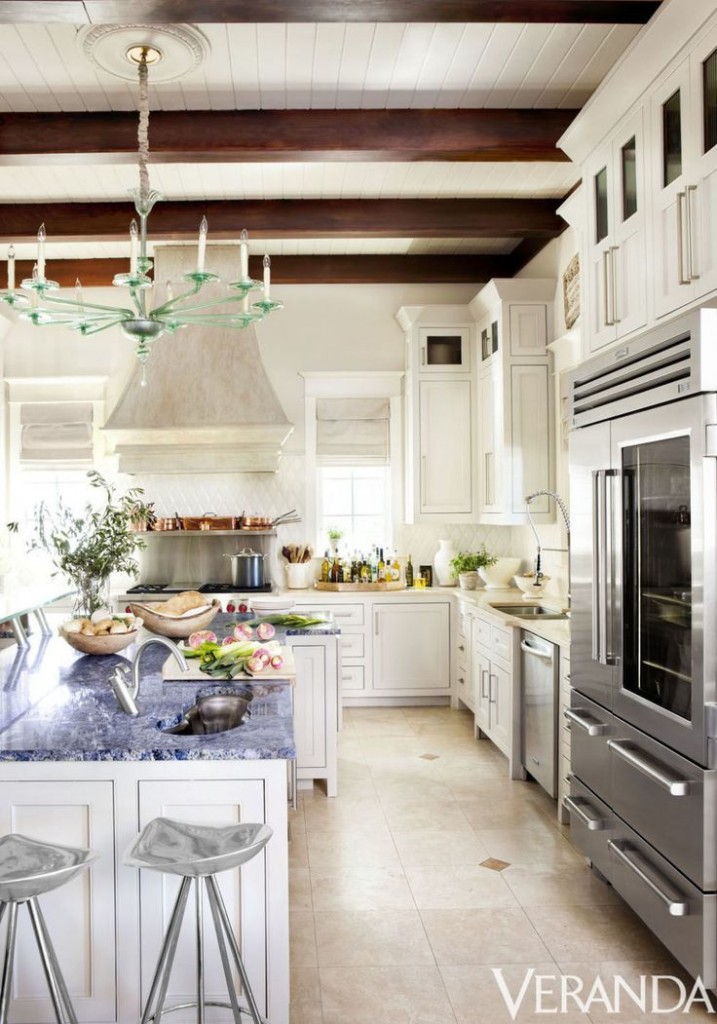
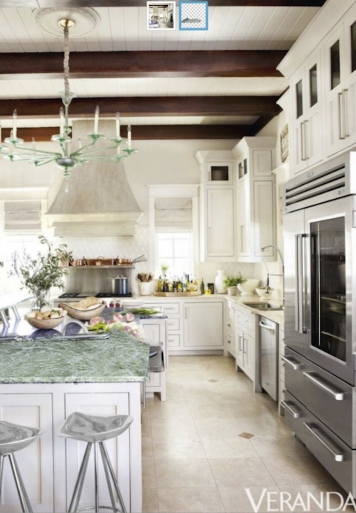
I was flipping through the May issue of Veranda magazine when I came across a kitchen I thought was so pretty, I just had to share it with you!
Notice it’s pink beige (tan, latte) and blue, which is a good combination when you want to keep beige fresh.
The stone floors are not blotchy and very pale, and the perimeter countertops appear to be a perfect match. Notice they are solid — as it should be if you have pattern anywhere else in your hard finishes. You could almost say the floor and countertops are the colour of sand, and the island granite is the ocean. It’s Azul Bahia granite.
Love the green chandelier! To my eye, however, it would have been even more perfect if it was the same blue as the island.
So here’s the lesson of the day: if you are going to choose something exotic for your island, keep the rest of the kitchen quiet so that your island can remain the focal point.
This means choosing primarily solid finishes, including light painted cabinets.
And, notice that beige works with white as long as it’s pale. Your kitchen does not have to be gray to be on trend.
When you are searching for inspiration for your renovation, you’ll notice that the spaces you love have one element that is the most important. Everything else should take a backseat to your most important and ‘artsy’ looking piece, like a granite topped island.
I thought it would be valuable to show you how NOT to use this (OR ANY) granite the next time you have to make a decision.
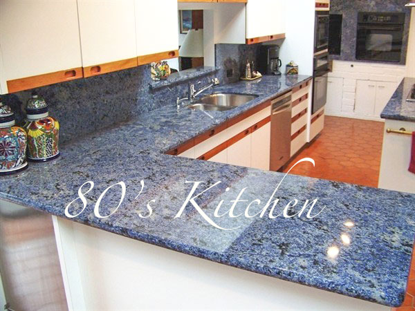
In this 80s kitchen, the granite looks new, while the rest of the kitchen is dated:
Azul Bahia is one of the most expensive granites to use! Therefore, unless this is your forever house and you are clear you want this granite, DO NOT install it in a kitchen that looks like this (above). It is not a good choice for a house you plan to sell any time soon.
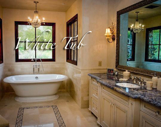
Below, we have pink beige tile, which works well with the blue granite. What stands out for me here are the white tub and sink. They don’t relate to anything else, not even the window trim:
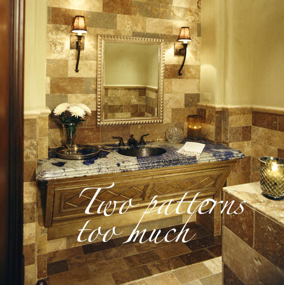
Below is an example that breaks all my pattern mixing rules for hard finishes. My guess is that whoever had these samples before the installation was probably looking at the lightest floor/wall tile sample and a small sample of the blue.
Looks gorgeous. . . until it goes in. Mistakes like this happen, every. single. day.
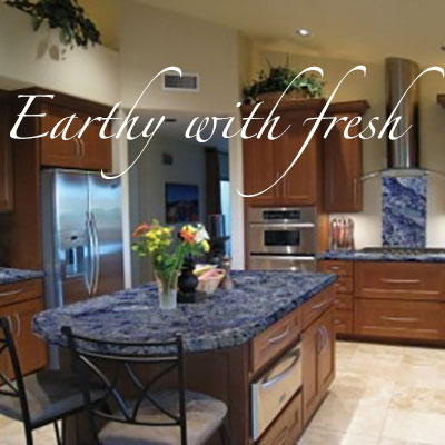
In this kitchen, below, you might be thinking, This is a complimentary colour combination. What’s wrong with that?
To my eye, the granite is clean and fresh, while the cabinets are earthy.
Remember when I wrote the post Is your bathroom perfect, or perfectly nice? Well, the same principles apply here.
I searched in vain to find even one more image of a kitchen that had a gorgeous granite island, but in every image I found, there was something about it that made it not perfect, just perfectly nice.
So I decided to make this a post to show you how NOT to incorporate this blue granite. I want you to discover for yourself how to get it right, especially if you are just about to go out granite shopping!
I want you to love your house when you walk in the door!
Have a great weekend, my lovelies!! xoxo Maria
UPDATE TO THIS POST:
One of my lovely readers, Karen Ann Jenkins sent me this photoshopped image of kitchen we are talking about with a green island instead. It looks great with the coordinating chandelier.
Related posts:
Why Choosing Granite is So Hard
What Everyone Should Know About Porcelain Tile
If you would like your home to fill you with happiness every time you walk in, contact us! We would love to help you choose colours, select the right combination of hard finishes or create a plan to pull your room together. You can find our fabulous e-design consultation packages here.










I usually agree with you, Maria, and I can see that the blue in the Veranda kitchen works a lot better than the blues in the other photos, but the blue in the Veranda kitchen still feels like it does not relate to anything else in that room. I don’t see any other blue there. Would a granite that was greenish or a deeper beige (like the accent color in the floor) than on the counters work?
Hi Maria,
The picture with the white tub…is it possible to add some white flowers or white accessories to make the white tub work?
And there’s probably a white toilet in the room. Maybe some white towels.
Thinking about the green chandelier–I see why whoever planned it thought it would work with all the small touches of green in the styling. But the light is fixed and the other green bits are not, plus the green light is placed over the blue island. So that’s why a blue chandelier (or no color) would have worked better
I would say to choose a greener stone and keep the beautiful light.
I tried it with a green stone (in this world’s worst photoshop) and it seems to fall flat, doesn’t it? I think the blue is much better with the floor. They should have a clear or milky glass chandelier. A blue one would be too matchy-matchy and a red one too nautical.
Here’s the link
http://tinypic.com/r/a9murp/8
I don’t know..I kinda like it being similar(analogous) color to the island countertop, but not the same.
Having said that-this kitchen seems huge..so I think blue chandelier would have worked here just fine too(but I’d make it cobalt. maybe). And clear chandalier would. And scarlet red chandelier maybe would have worked too)) When you have proportions, size, and architectural details like in this kitchen, you can really have fun in the chandelier department. Maybe they took chandeliers in several colors, and tried them over the island, like a jewelry:) Until they decided on this one.
Though blue is my favourite colour and the granites in blue are beautiful; it still wouldn’t be my first choice for a counter top however to each their own … ☺. That said, re the bathroom with the white tub I think my first step would be is to paint out (lighten) the window frames. As for the 2nd bathroom, totally agree as IMHO the patterns of the tile and granite basically compete. Last but not least; though the earthy cupboards warm up the stainless steel appliances and range hood (silver being an earth alloy) I have to agree with you Maria that the blue in this case just doesn’t work or at least is debatable if you intend a contrast. -Brenda-
correction .. that should have read “or at least is debatable UNLESS you intend a contrast.” -Brenda-
I have worked on five kitchens in the last six months, and not one has used a granite other than a honed black, and that was for the perimeter cabinets and the island has a Danby marble. Most of my clients are using marble – two used Corian! (Well, really one kitchen is super modern and used white Corain everywhere – the other used Alabama White marble in the kitchen and Corian in the butler’s pantry.)
Is anyone using granite anymore?
Oh yes, ALL THE TIME, ALL OVER THE COUNTRY. If you’re not doing it, you must be in a big, metropolitan city.
This post is for anyone still in love with and about to install granite. Keep it on the island and keep the rest quiet.
Maria, I would say nix the green chandelier. There is enough going on in that kitchen. Instead use a clear chandelier if you love that look. The bathroom with the white tub stands out like a sore thumb. I would paint out the trim around the window and possibly the cabinet. The second bathroom is just a disaster!
I think white fixtures in a bath are like wood floors or jeans, they go with just about everything. It doesn’t bother me at all. Besides, if you go with bisque, the tub, toilet and sink are all likely a slightly different color unless you stick with one manufacturer. Even if they match, you can have problems with undertones (pink beige with yellow beige) and just too much brown that plagues many c. 2000 bathrooms.
I agree that adding a bit more white to such an earthy color scheme could improve it though, such as nice thick fluffy towels and a white orchid, and maybe some white window shades or curtains. A trend I never understood is the big windows by the tub or by the toilet. Should have died a long time ago, but we still see it in new houses. Even without nearby neighbors, you risk flashing the kids or visitors in the backyard. At least these are fairly high up.
If I had the kitchen with blue marble counters, I would reface the cabinets if I could afford it, or paint them out if I couldn’t.
What bothers me about the kitchen is not the green chandelier with the blue granite (I imagine there are other accents of greenish glass in the kitchen–some hand blown recycled glass tumblers maybe?) but the ultra-modern European style bar attached to the island (barely visable, far left) in contrast to the traditional cabinetry. I would like to see more views to make up my mind on that one.
The entire house has a similar color scheme, and very traditional style, so maybe it all works in person.
wow, you’re right..i haven’t noticed it at all, until i read your comment. it really seems out of place. but it’s so far away in the picture..so hard to say, maybe you’re right and it does make more sense in person, picking all this stainless steel handles and faucets’ shape, etc.
(still wouldn’t pick it, but then it’s not my kitchen.)
The chandelier, on the other hand, doesn’t bother me at all. It’s beautiful, and subtle enough.
I didn’t notice the extra attached bar until you mentioned it, but after that I noticed that the glass edge of the bar top matches the chandelier and may be that is why it was chosen. Also the bar stools seem to be more modern and stainless, possibly to coordinate with all the stainless appliances. Just my 2 cents.
I’ve sold enough houses to know that the blue stone will turn off a lot of buyers, regardless of how much it costs. I’d say, keep the green fixture, nix the stone. Regarding the white tub, tubs are white, add some white elements and it’s fine. On my monitor it appears that the inside of the sink has a pattern, not just white, yikes.
I don’t like granite at all..any granite for that matter. I am not a granite person so to say. But as a buyer, I can tell you that if I feel a good vibe from the house, and I generally love it, and the location is right, and the floor plan makes sense-I’d put up with an irregular shade of the granite on the island..
Now what I wouldn’t be able to put up with-an irregular shape of the kitchen:) I saw once a house like that..they put very strange triangle island in the middle of a quite narrow kitchen, that also was in the way between two rooms, like a passage space. That was really awkward combination. And much, much more expensive to change..if possible to change at all.
I’m with you Bill about granite period. It’s highly personal and installing that blue granite would be like the same colour sofa nailed down in your living room and assuming everyone else is going to love it.
At least do it right, if you’re going to do it. That’s why I wrote this post.
As for “forever” houses..I’m currently in the midst of remodeling my fourth house (so I was very excited when I found Maria’s blog!)..and out of four houses, it’s a third “forever” one. Life takes us to different places..one house will turn to be the “forever” one for sure, but i don’t believe anymore in my ability to predict which one it will be. What can I do? I guess work with a house, not against it, when planning (more or less) permanent fixtures; from my experience, if you’re thoughtful and take your time-the house will love you back. And somebody else will love your house too, one sunny day.
That 80’s kitchen! Having lived with and reno’d 70’s an 80’s kitchens, I find them amusing. I guess that the budget was very limited, and the counter was the most worn out thing. Should have gone with a counter that had warmer earthy tones to match the floor, or just waited until there was money for cabinets and floor. The granite is unlikely to survive if they replace the cabinets, which are probably not worth refacing. Also, I find having the backsplash match the counter granite is overwhelming. But I still love granite, and these blue pieces are nice.
I really like these what not to do examples. It really helps me to see this better. Of course I am an avid fan of all of your blog posts. They are so helpful to me as a new designer. Thank you so much for your posts.
Great Post…Very informative…Thank-you!!
We always say there is only one bride in the room and no other surface should compete with the bride.