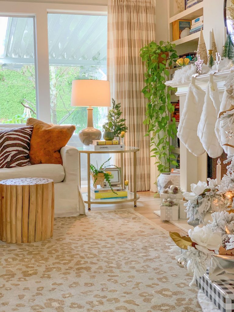
It’s time for my Christmas home tour and this year I’ve created a lovely silver and gold colour palette. I’m also sharing a few details about my living room design transition – including how I settled on this lovely new leopard rug.

Whew, what a year 2020 has been! And it’s not over yet!
The pandemic arrived and if you’ve been following me for a while, you’ll have seen Terreeia’s progress when she took on her health and wellness this year. It filled me with joy that as a result, she asked to be in the photos for the first time ever 🙂
Okay, as a recently mentioned, my decorating is currently in transition.
I’ve loved my raspberry and yellow living room but it’s looked the same for 8 years so it’s due for a makeover. But I’m keeping my sunflower yellow sofa, I still love it! Stay tuned.
I ordered this leopard rug (below) for my studio (reveal coming soon) but then I decided to try it in the family room which also needed a new rug.
I love animal print rugs because they read neutral (just like when you wear leopard) and work with so many colours!
I also love these Antelope rugs which are currently on sale!
Martha Stewart Beige Leopard Rug
How to identify the neutral in an area rug
Identifying the neutral in an area rug can sometimes be tricky because they are usually lighter on one side, and darker on the other side. This rug is green beige and taupe.
You can see that the background of the rug, picks up my new taupe gourd lamp (above).
What if you had this rug but had not chosen the lamp yet. How do you know which undertone is in the rug?
You’d narrow down the colours that look the best with the rug, with my System for Specifying Colour® colour wheel (included FREE with each set of boards). Then you’d place them on the carpet (with one of the colour samples turned around so you could create a blank background).
Then you’d take the colour you THINK is correct, and compare it to the other curated neutrals in my system.
If you don’t see a better colour, then you’ve chosen the right one. Just like magic! Hooray!
Then once you decided that the background of this rug was taupe, you could take that taupe paint chip shopping with you!
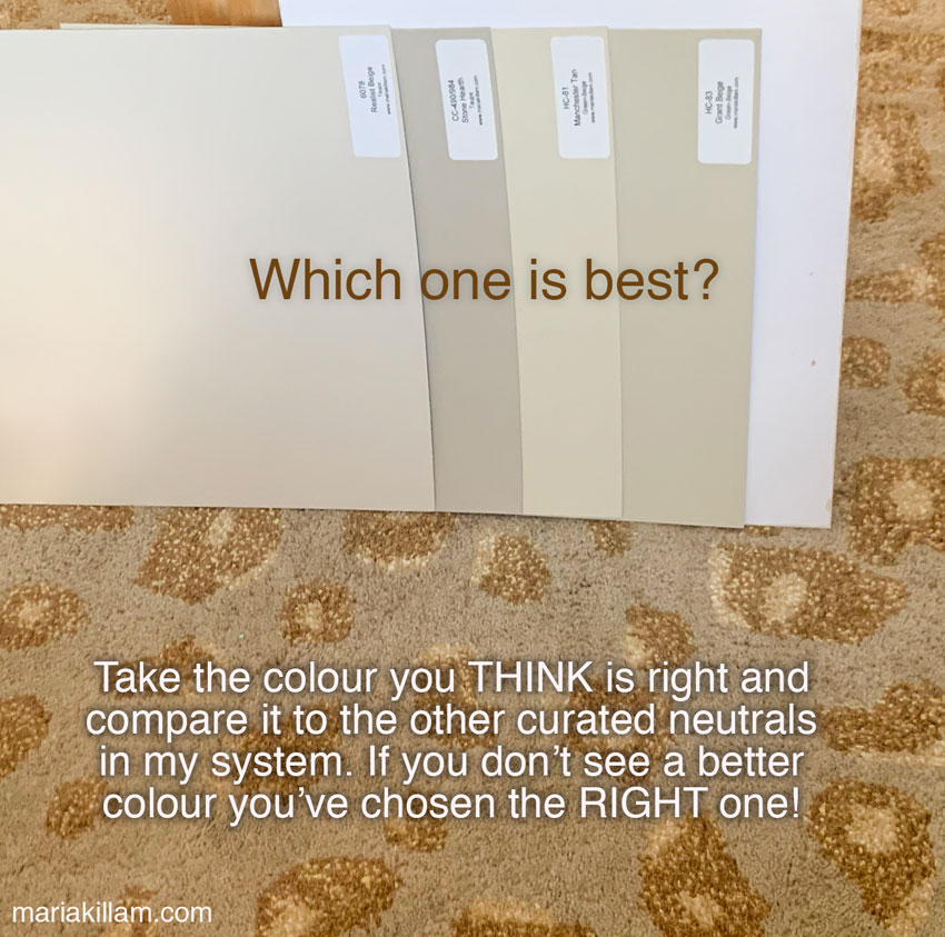
And the only way to compare is you need to have all of my system colours with you.
Please let me know in the comments if you’ve had an aha moment reading this. I had it written more convoluted until I shared it with my CEO Terrence Murtagh and he helped me clear it up so I think it makes a lot more sense now, haha.
I can be too deep in the weeds sometimes!
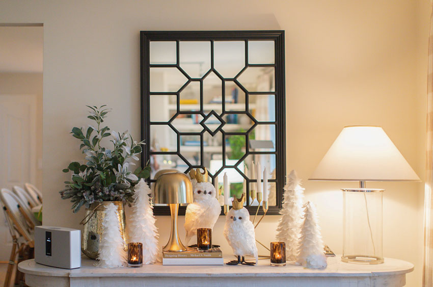
Silver & Gold Holiday Decor
Anyway, back to my Christmas home tour:

This room I switch up often. And this year my tree is decorated primarily in gold and silver!

I’ve fallen in love with flocked trees, probably because we rarely get snow in the West coast.


I also replaced the end table in this room, and now I have two places to create a vignette, hooray!
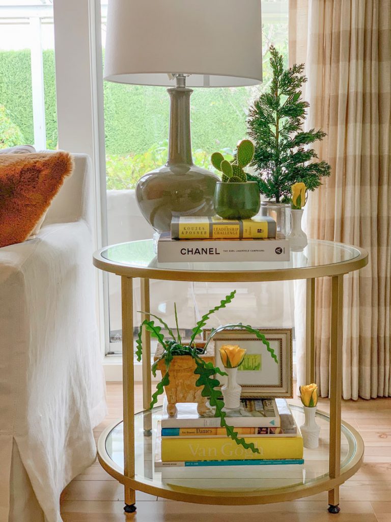
Taupe lamp similar here | End table | Square version here | Nesting tables
I posted the before and after of my previous table on Instagram. One of my readers said it was the perfect solution for a plug that sat underneath the table that she also needs to access!
An even better mirror here | Table lamp

Photos by Macy Yap | She took a photo of Terreeia and I dancing to Christmas music 🙂
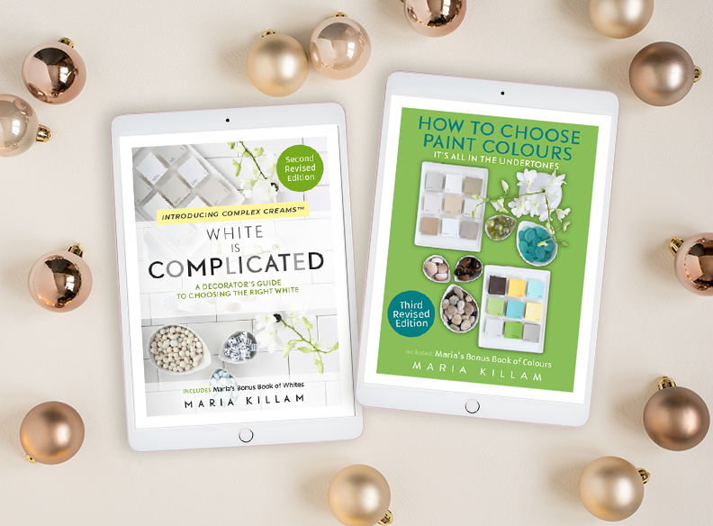
And if you are a colour enthusiast, in the design business, or you want to master colour, having my system in large colour samples is the ONLY way to consistently get neutrals right!
“I use those every day! When I walk into an in-person color consultation, it gives me instant credibility. And of course, they are the best tool to pick colors for my clients.” Michelle Marceny, the Colour Concierge
If you want the complete, curated list of the colours that belong in The System, and you’d like to learn how to choose colours accurately, you’ll find them in either of my ebooks. They do not overlap in any way.
Thanks! I found the ebooks helped me when picking the white trim when we repainted. Loved having her lists of colors to narrow down the paint decks when picking room colors!
Also Maria put into words what I saw but could never really explain. She also confirmed that you do not go trendy in what I always call the hard surfaces because they are too hard to change. Wish she was around earlier before I learned the hard way. Elizabeth H.


Terreeia looks amazing!
Prior to this post, the colors in your home have been quite clean. We have not seen any beige or taupe colors… in any of your rooms. While I think the new rug looks great in this room, how is it working with the flow of your other rooms?
Thanks.
Hi Gina, yes my decorating is in transition, I’m currently planning a makeover in my living room and I haven’t even decided whether the leopard rug will stay in this room, I may put it back in the studio which is the room I initially bought it for.
Stay tuned it will all work in the end! Great question!
Maria
Congratulations to Terreeia. She looks so happy and healthy. The room looks lovely too.
Good morning Maria! It is so great to see Terreeia in pics with you. Terreeia, you look marvelous, happy, healthy and full of energy. I am so glad for you and your journey is inspiring. Maria: I love the white, gold and silver Christmas decor. Also, loving the rug and lamp with softened colors. Super-nice update! Thank you for sharing:-)
Well here’s a heart-lifting moment – how wonderful it is to see someone regain their health and confidence. *Looking good* Terreeia. Your Buddha bowl recipes went down a treat in my house. And thanks Maria for unstinting steerage.
Oh my goodness! You two are adorable 💗
I have loved your brights, but also like this new look.
After years of a very bright tree with star ornaments in neon shades of pink, green, turquoise, and purple, I stumbled across a basket of mercury glass pumpkins at the glass museum. I bought one but couldn’t stop thinking of a tree with nothing but those pumpkins. So I went back and bought a dozen more. I have just one star on top and do a metallic ribbon. I keep the pumpkins in a basket the rest of the year, because I like looking at them.
Beautiful updates! I always enjoy seeing your beautiful designs and Christmas decor. So pretty, always. Terreeia looks great, too. So good seeing her :>
Love the rug, I looked at it from your link and the “beige” looks so much browner than in your photos. Is it?
You have to look at all the images. . . the darker brown leopard do look darker in the shop pics! Maria
Does this mean that all of the paint samples you have in the picture work with the rug and that you would choose the light or dark color depending on what else is in the room such as the lamp?
Always informative and inspirational! I just realized that I can use my color boards to find a similar green in the artwork over the fireplace so that when I’m shopping for accessories, I don’t have to rely on my color memory. And that blue in the bedding of the guest room! I used the boards to choose paint colors and fabrics for couches, etc. when I built my new house but this has opened a whole new world.
Hooray, I’m so glad! Maria
Beautiful! You show the rug with neutral samples. Which one did you choose as the best one?
The lighter green beige one works with the lighter tones in the rug, and the taupe samples work with the overall ground of the rug! Maria
Could you tell us which specific colors (as shown in the picture) are the “lighter green beige” and the “taupe”? Even though I’ve been following you for years it is still difficult to determine the undertones until I’m actually told.
I was thinking that the “Stone Hearth” actually matches the rug background the best. Is that the green beige?
Yes Stone hearth works best here! Maria
Gorgeous photo of you and Tereeria! And I love your new rug.
Thanks Kim 🙂 Maria
Hi Terreeia! so nice to see you in the pics! Stay happy and healthy! Debra
Zockers! Terreeia Looks fantastic, and it’s not just the body but the joy and health that is shining out of face…and spirit! I know the struggle and the work that went into your transformation. How exciting! Kudos!!!!!
Terreeia just makes me so happy these days!!! She needs to wear that silver sweater till the threads fall off. LOL I LOVE it.
I watched her Instagram videos on Budda bowls, and love the idea of deconstructing ingredients and having them ready to go.
Everything looks wonderful, Maria. Merry Christmas to you both.
`Wow Terreeia you look absolutely maaverlous! I know how proud you must be and I am proud of you also! So typical of you, your determination is strong. Good quality!
In regard to the animal print rug, I love it! I put a very similar one up the stairway in my clients home. She always got positive comments. I personally think it goes quite well in your room. From my tablet I would say that either of the darker colors work best. Will be so anxious to see your full reveal and your choice.
I picked the color to the left of the white. Was that it?
Maria the carpet is so much like your drapery which surprised me. Tell us about that please. Thought earlier you says this should not happen.
Love that rug! You and Terreeia are looking good! Happy holidays! 😉
Way to go, Tee, looking fabulous! That rug looks makes the family room. I love it when things work out like that! One criticism of this post: You two should have had a glass of bubbly in your hands—chink, chink!
Adore the rug!,
wow, another white/ tan room; can’t get enough of that she says sarcastically. I will be glad when the bloggers get out of this phase!
Maria, I am feeling very nostalgic for Yarrow since I left in July. It was wonderful to see the photos of you and Terreeia on your blog, this morning. (wow! T is looking fit and happy!) and the beautiful photos of your home. You know I love metallic and white!
Happy fourth Advent to the both of you.
Lois Klassen
This is a great article! I have that rug too and love it!
I’m trying to paint a bedroom: What if you have your boards up and nothing feels definitive? I thought dark pink beige but when I painted the wall Muslin it looked too peachy and the carpet started looking taupe. At certain times of the day it also looks to have an orange cast. Maybe I just go with a green beige? I’m starting to feel color impaired!
Can I ask why you used 2 Green Beiges in the lineup – is that because you used a lighter green beige and a darker green beige – Grant Beige and Manchester Tan? (I thought Bleeker Beige was the darker color?) Also – since Cedar Key is the light color of the taupe wheel why was that not included?