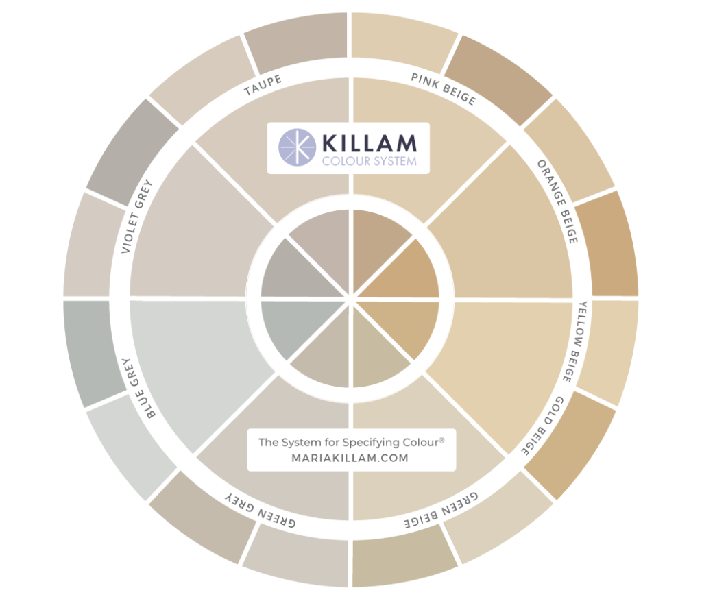
There’s one important detail about using the colour wheel that you may have missed. So, I’d like to review it here. How you hold the wheel and your paint boards can make ALL the difference in identifying the correct undertone. This reader’s fabric photos are a perfect illustration of what I mean.
How to find the undertone in a fabric
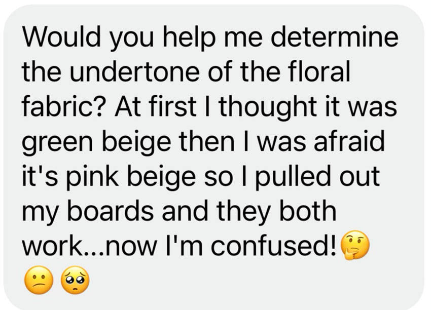
Thank you to everyone who participated in sending in photos of the colour wheel in use! This conversation I had with a reader last week, basically sums up how to use the wheel, so I wanted to share this example with you as well ICYMI.
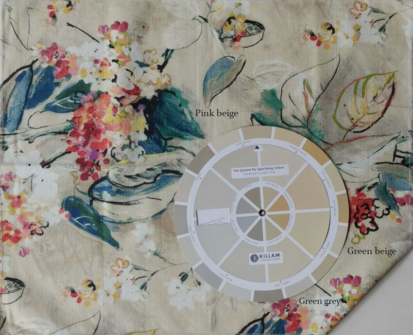
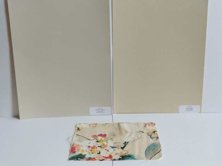
She sent me the following photo and when I saw the fabric, I thought it might be green grey as well, so I asked her to send me photos with the fabric and the colour boards.
This is what she sent me (below).
Is it obvious yet?
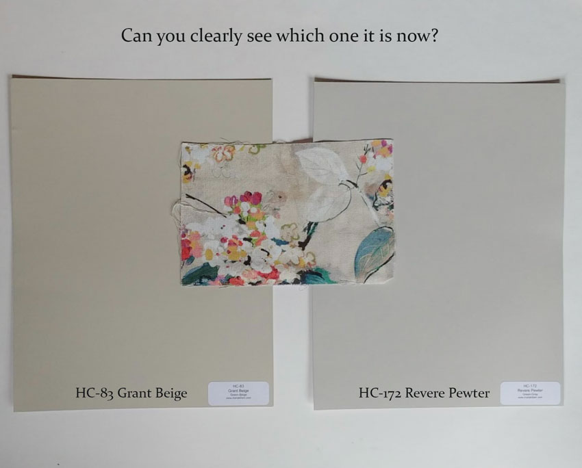
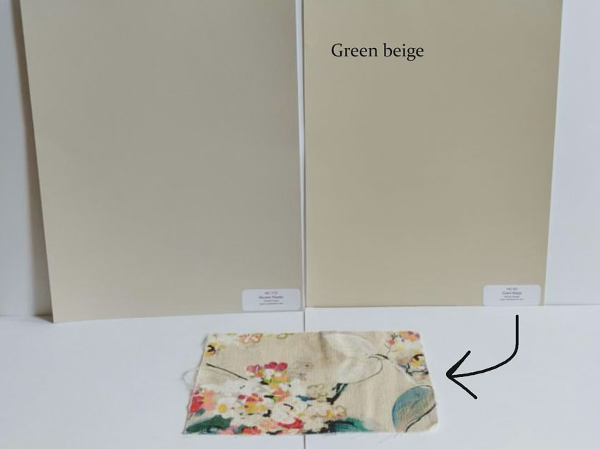
Nope, so then I asked her to prop up the samples so that they are vertically installed in the same place they would be IF THEY WERE PAINTED ON THE WALL.
Now which one is right?
Much easier to see now isn’t it?
Other steps in finding the undertone
Here’s what she did right initially.
She chose boards that were very close or very similar in value.
The best definition of value is this: You can’t say either is lighter or darker, that’s when the values are the same.
When you use test samples that are in the same value, it’s much easier to identify and choose the correct undertone.
Once you’ve chosen the correct undertone, you can then compare the item in question to lighter colours in the system (or darker) to determine which value or paint colour you want to end up with.
And that’s why the boards work so well in conjunction with the colour wheel because if you’re painting up one sample at a time, you might paint the wrong ones and you could end up with a colour that’s just ‘meh’ instead of perfection.
Okay onto my birthday giveaway, here are the 55 winners:
55 WINNERS!
Winners randomly chosen from Facebook and Instagram comments. We will try to also tag you on social media, but if you recognize your name or handle, please email [email protected] to claim your prize. *Prizes cannot be exchanged or redeemed for cash value.
25x Colour Wheel + eBook Bundles ($73 value)
Crystal Bugno
Heatherellehughes
Jacksonmaryellen
Lea_aylmer
Sarahapaulk
Donna Bonanno Richards
Michellechang.co
Tleesweet
thebayoublonde
1512.farmhouse
Keirawilliams__
Bellinglyn
Suzannerushing
Cara Arnott
Dawn Marie
Anne Williams Brower
Erickaespe
Sharmelerickson
Jennijk87
Lucyh.interiors
Mironovvanessa
Cheryl_weststeyn
Dreamsofdogwoods
Campbrl
Karen Taelman
15x Shop Online with Colour Confidence online training courses ($99 value)
Lucy Wilson
Cornelia Dodge
Melissa.b.haggerty
Bellinglyn
Michellechang.co
Kates_home
Janorval
Noankwaters
Lmcganja
Amyslowik
Annelit63
Brendalewis2011
Findboiserealestate
Emilygreenatl
Tessa Henry
10x Exterior Colour Selection Masterclass online training courses ($349 value)
Jennifer Ledford Norman
Abinteriors
Lisadjunnila
Sitwellbewell
Worthwhile.style
Melissa.b.haggerty
Cshell444
Bethsiesel
Leighsukraw
Stef_travellife
4x 1 Set of Large Painted Colour Boards (your choice) ($379 value)
Erinpaskett
Mandymmeyers
Stg588
Paula.s.adams.18
1 Ticket to my Specify Colour with Confidence live, virtual workshop this fall ($1850 value)
Alderwood2004 (yay!! fall dates will be announced soon)
Thank you to everyone who participated and congrats to our winners! If you missed any of these colour wheel lessons, I’ve linked them here again! These are posts you are going to want to SAVE for future reference!
→ Colour Wheel Lesson 1 – Let’s start with the basics and define all 9 undertones.
→ Colour Wheel Lesson 2 – Flip your colour wheel over and I’ll show you how to compare whites.
→ Colour Wheel Lesson 3 – What if you have a busy stone or tile pattern? Let’s talk about finding the overall read.
→ Colour Wheel Lesson 4 – Now it’s your turn – take your colour wheel to your bathroom or kitchen and tell me which undertones you see!
→ Colour Wheel Lesson 5 – And lastly, one of my favorite lessons, taking your colour wheel shopping!






If you don’t have Instagram…How can you see the 5 lessons you posted here?
Also, once you have determined your color undertone….let’s say violet-grey
How do you go about finding violet-grey undertone paints?? Or are you saying
that we should be specifically using only the paint colors you’ve selected on your wheel spectrum?
I just don’t know what to look for at the paint store
Thank you
Hi Sarah! The posts are also located on Facebook: https://www.facebook.com/colourmehappy
Maria’s system is outlined in her eBooks (https://mariakillam.com/products/#ebooks) – and that’s where you’ll find a list of the system colours for each undertone. The paint colours on the wheel are custom and only meant to represent the light and dark neutral undertones you are trying to identify. Once you’ve narrowed it down to 1-3 possible neutrals, you use the paint colours identified from Maria’s system to further match up the undertone that looks closest.
Hi. Same question. Could not find the videos on you tube through that link or on Maria’s channel!
I don’t do Instagram or Facebook. No thanks.
Any other way to see them? Thanks
I love your Blog Maria! Your advice has been immeasurable in helping me pick carpet and bedding recently and make other styling decisions! I am very grateful for your Heart of a Teacher and your wonderful advice! I was very disappointed to be left out of the opportunity to win one of the wonderful prizes because I don’t use social media. I hope you will post the content where those of us who don’t use Instagram and Facebook can read it. If you have another giveaway in the future, I hope you will find a way to include us. I share your website just as much as social media users but in a more personal way.
Happy Belated 55th Birthday Maria! Best Wishes!
I love that fabric. Can you tell me the name / manufacturer? It has all of my favorite colors in it, and I’m so relieved its green beige instead of pink beige. Now I know I can use those colors and get the undertone I like.
Subway tile was the answer to a $2000 question on Jeopardy!
Fabrics can have multiple background tones in different areas of printing. If the client has a piece of fabric with the selvage (the bit on the edge with the printing) there should be dots of the pure colors that were printed in the design. Comparing those dots to your color boards may be helpful in addition, to isolate the background color or colors from any other tones and to check if the background is made of multiple similar colors
This is such a helpful example/lesson, Maria, thank you. And the comments here are helpful/interesting, also.