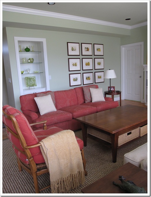
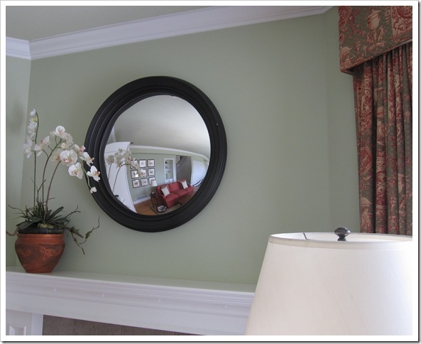
A few weeks ago I arrived at a client’s home in White Rock to discuss her new white kitchen including which countertops, backsplash and colours would flow with the rest of her house. When I walked into her great room, I said “Wow what colour is this green?”. She said, It’s HC-116 Guilford Green.
There are so few greens in our Canadian BM Deck. We don’t have two decks like those of you in the US. I have always had a bigger sample of Fernwood Green 2145-40 painted up and it could also be interpreted as one shade lighter than Georgian Green HC-115 so I don’t think I have ever specified Guilford Green because of it.
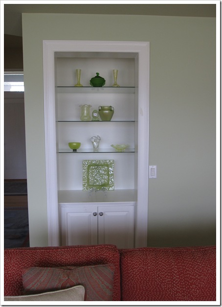
My client commented that everyone that walks into this room reacts the same way that I did. Now obviously it’s a pretty and decorated room with the coordinated furniture and drapery, however this green really was beautiful. And it was all about to change as an extension was being added to the existing kitchen. The glass shelves with her art glass collection (below) was perfect with this room.
Photos by Maria Killam
By the way, did you know that there are many colours you can easily see with google images? If you google “Benjamin Moore, Guilford Green” and click ‘images’ you can see rooms painted in that colour. Try it next time you are wondering what it actually looks like painted.
One of my clients once said “I am ALWAYS surprised when I see the colour go from a tiny 2 x 2 paint chip to the wall. It’s why wall colours are the hardest to choose.
Do you know what I do all day long when consulting with clients? I take the colour they are looking at and find a grayed down version of it. Colour gets twice as bright when it gets all over your walls so it’s the reason why a pretty paint chip doesn’t necessarily make a pretty wall.
Which colours have shocked you the most?
Related posts:
The Difference Between Fresh Greens and Yellow Greens
New to this Blog? Click here ; Follow me on Facebook and Twitter; Become a True Colour Expert
While you’re here, subscribe to this feed so you don’t miss out!


Aqua actually! About eight years ago in our old house I saw a beautiful room in a magazine and thought I'd like our kitchen and dining room painted in the same aqua. I chose what I thought wasn't too bright a colour and it ended up blindingly bright! It would have been totally overwhelming in the space we had..so we repainted..beige..haha!
My mother wanted a pale gold color for her dining room, and that was a hard color to pick. Most of the colors turned out way too yellow. Finally we went with something that looked beige on the strip, but turns out it was the right color. Thankfully we'd only been painting posterboards, and not the room, otherwise it would have been extraordinarily expensive!
Shades of orange. Years back picked out a beautiful Scalamadre wallpaper that was tone on tone. The sample, though larger than 2×2, looked like it was terra-cotta with burnt orange. When it got onto the walls it was more like Clementine with a bit of terra cotta . . . Just so much brighter than it looked on the sample. I still find that shades of orange toned items change so much.
Maria,
Great points here, I actually select a color and go lighter because it actually gets multiplied by itself in spaces. It has worked out for my clients as well especially when their furniture or window treatments have a print. It gives the eye somewhere else to to look when finding the room pleasing.
Bette
I used Benjamin Moore's Fernwood Green in my kitchen & one of my bathrooms. I always get compliments on the color! You can see pics here of the color:
http://fisilis.wordpress.com/2011/05/03/welcome-parade-of-homes/
There's a great blog called Favorite Paint Colors that showcases pics of rooms and the paint colors used. Love it and being able to see the color up on an actual wall.
http://favoritepaintcolors.blogspot.com/
A specific blue…I visited an under-construction home in St Augustine and loved the blue on the walls in the MBR. I found the paint can and copied the color. When I got home, I painted my mbr that color…Ick!!! I did not take into consideration the coastal skies and light vs the lighting in my room. It was absolutely different…It's going to be repainted this spring…
Jane
Limited color deck? That must make you crazy. Seaglass was one of my favorite surprises. Bm needs to get on the ball for Canada!!
Thanks for this "Green" post and at least a million of your other posts. I've learned so much!
jane
Oh! And by the way, I just started a new blog and mentioned you (and Laura Trevey). You can find the post at:
http://thundermoonlife.wordpress.com/
I am a fan!
Jane 🙂
The most shocking was actually a tan that turned out to be an exact replica of that nasty skin colored crayon from our childhood. Luckily, I always test on drywall squares. So I found out my mistake before buying a large quantity or doing any painting.
When I was painting the rooms in my house, I chose a blue which I would've thought was subtle enough. When it was on, it was overwhelming. I learned by experience to choose two tones down from the color I chose, to get the effect I want. I mistakenly thought the formula was to go two steps down the card on a color fan until I read your post on how they arrange colors on the fan! So there is no "formula" to follow and just your eye?
At one time I also chose "tomato soup" of Ace for my powder room wanting a nice rich orange red. When the first coat went on, I almost fainted–it was neon! My painter said to relax and wait until the third coat was on, and he was right. It toned down to the exact color I chose on the chip. So I'm confused now–does the "tone down 2 steps" only work with light colors, and the "wait until all the coats are in" work for bright bold colors?
I would take your course in a heartbeat if I was traveling around that area. I love reading your posts and learning. Thanks for being generous with your knowledge!
I love the clean lines and soft color options you have chosen. Your blog is a new inspiration for me. Thanks! Stop by my blog if you would like: http://CleverlyChanging.com
Thank you for your amazing blog. We are about to paint our master bedroom and I realized while reading about beige on your blog, that the carpet (I think) is a pinky beige. Could I use guilford green in this room or do I need a color with more blue (we looked at Sherwin Williams’ filmy green as well). Thanks in advance.