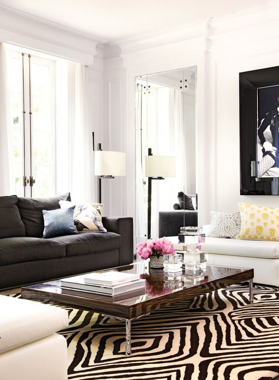
Now that the black trend is here, we will be seeing a lot more black sofas! Here’s an Ask Maria post about decorating around one. What colours work best with black furniture?
Really the question should be, “What colours DON’T go with black leather furniture?” If you have black furniture, you have decorating and style options.
However, if your entire room is already shades of black and grey, you’re probably wondering what colour curtains will work or what colour cushions will make the room happier? Well, it’s kinda too late. This post explains WHY.
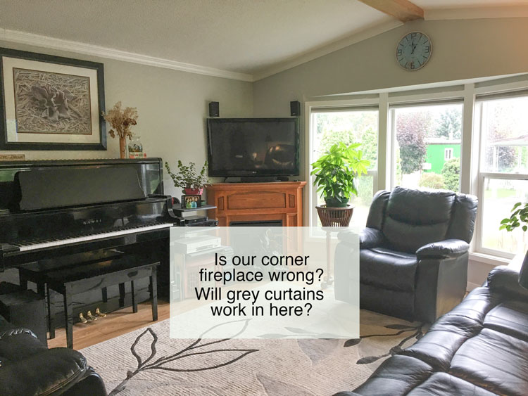
I thought this post would be helpful to so many who have a living room that looks like this.
A real living room
The one with the comfy leather furniture that the husband probably picked out. No offense to husbands in general but while we all love to sit on recliners (myself included) it doesn’t end up with a look that would make it into a design magazine right?
But we can certainly make it much better.
What colours do not work best with black furniture?
First, the colours that don’t look amazing with black are earth (muddy, muted) tones or really dark colours. If this is the look of your existing furniture, and you install a sage green rug and drapes, or gold beige rug and drapes, dark burgundy, navy blue, or eggplant rugs and drapery, well that’s going to be really hard to pull off.
Not that it cannot be done, but in general, if you are not an experienced decorator, stick to brighter, lighter colours.
A well decorated neutral room needs CONTRAST and perhaps warmth introduced by wood stained furniture to create a warm and inviting room.
Add more black decor.
Start with a rug that also has a little black in it. That also helps to make it look more coordinated.
And, here’s a question from my reader with existing black furniture:
“I am wondering what design of curtains would look best in our living room. I’m wondering if grey would work?
We were also wondering what we should do with the fireplace. It’s just an electric one. But it doesn’t seem to fit with the room.
We just have a small mobile home that we live in right now. But I would like to make it look as nice as possible.”
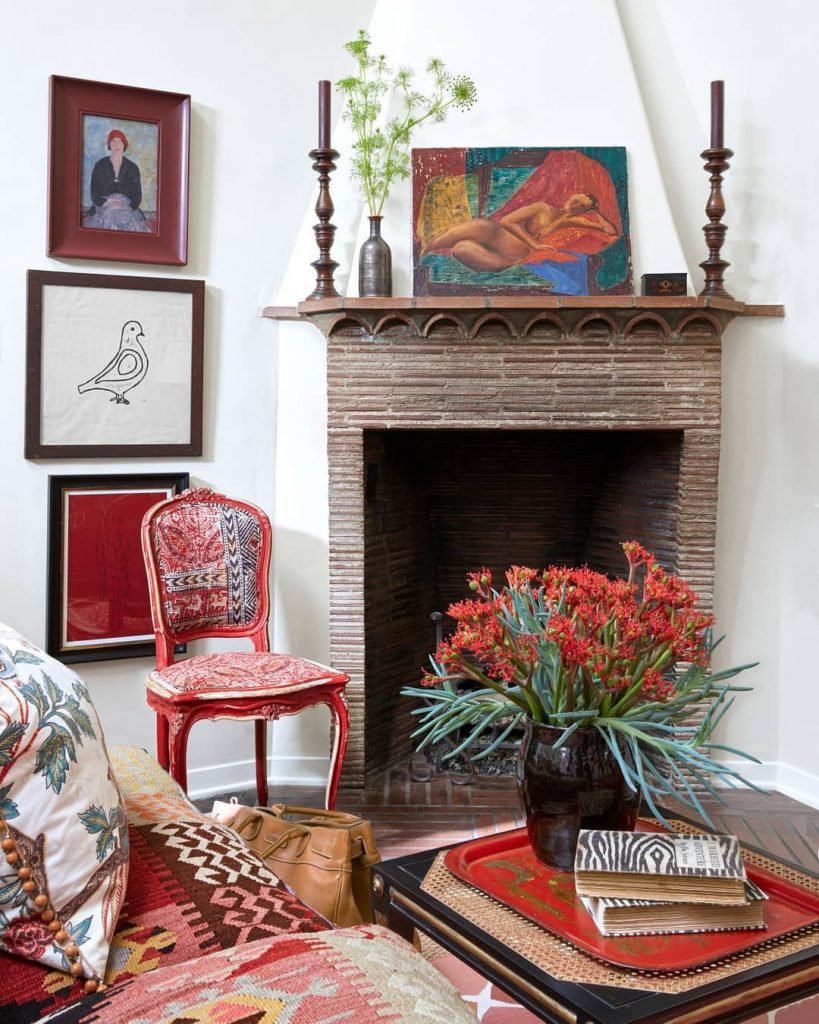
A corner fireplaces should NEVER and I mean NEVER be installed in the first place. Builders love to install them because it makes it easiest to vent the fireplace but they are really hard to decorate and arrange furniture around.
It’s even extremely difficult to find a pretty decorated corner mantel anywhere online. This was the best one that I could find.
Corner fireplace decorating | House Beautiful
To my reader: Mostly, the reason why your fireplace bothers you is because of the overpowering black television.
Since you don’t have any other oak furniture in this room, I would consider painting it your trim colour. However, since your TV has to go somewhere, it doesn’t look like you have any other options.
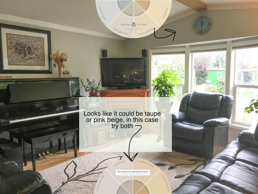
The first guidelines to getting colour right is to identify the existing colours in the room. If you need to decide what should stay and what should go.
She sent me several photos of her room. This is what makes it easier to choose colours online, once you’ve seen the same room from many angles you can get a good sense of what the undertones are.
In this case, the walls appear to be a green beige and the paint colour doesn’t work with the rug which is more pink/violet in general (above).
To be clear, it’s not like green clashes with pink. However, your paint colour should pull your space together, not be chosen because it’s happens to be the complement to pink (for example).
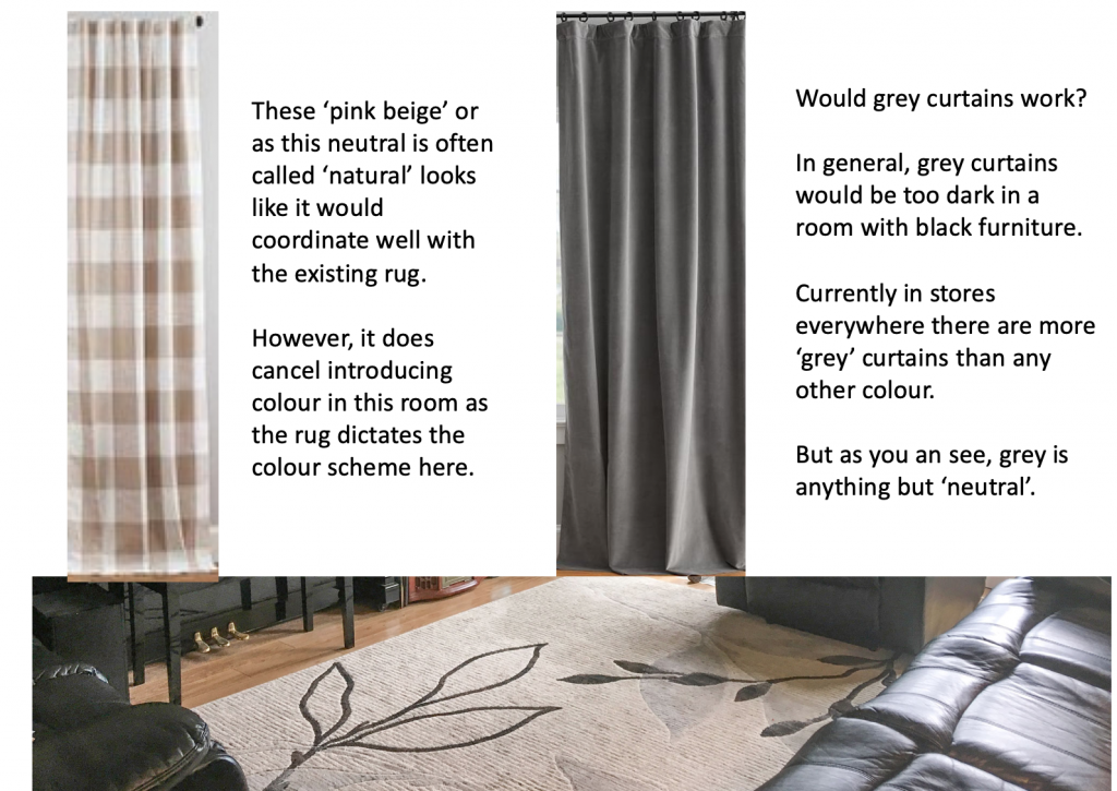
If you keep the existing rug, I would suggest the buffalo check drapes (above left). Then the palest pink beige in my system would be perfect with this combination. Find the list of all my curated colours here.
What colours work best with black furniture?
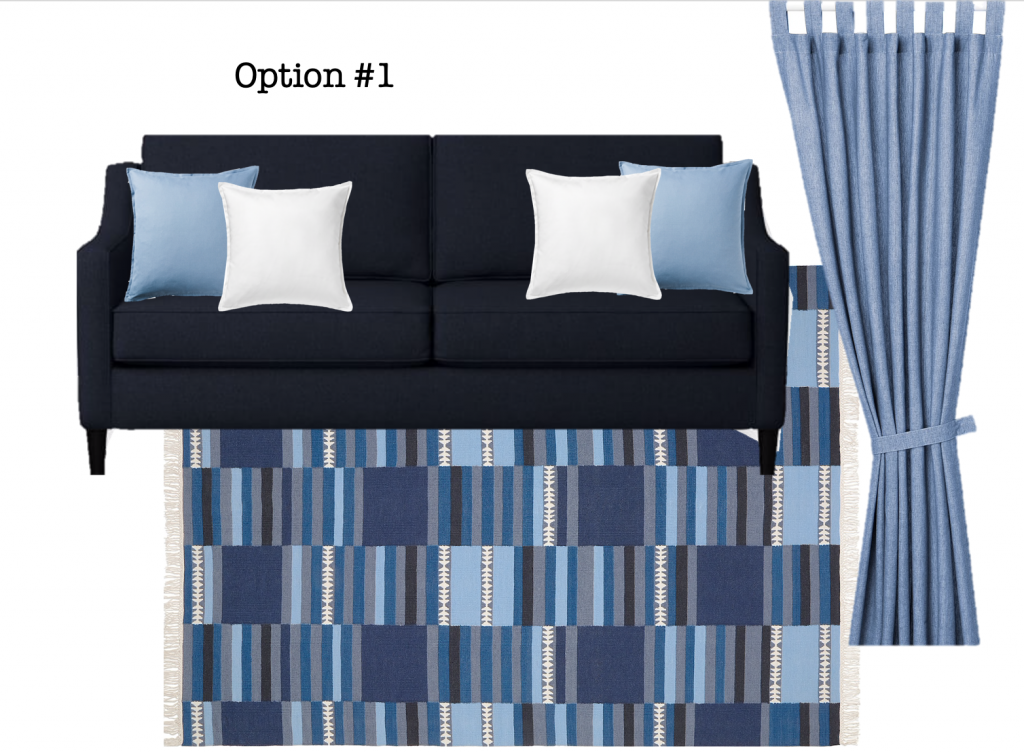
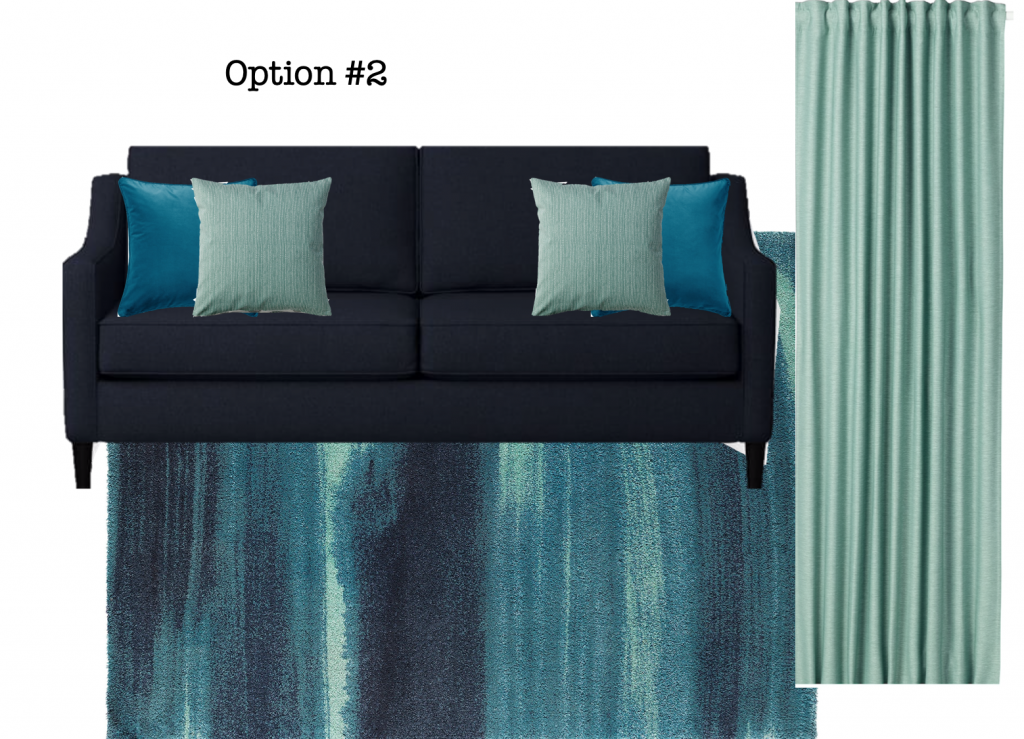
However, if you want to introduce any colour into this room, you’ll need to buy a new area rug, here are two from IKEA along with curtains and pillows.
IKEA rug | IKEA Curtains | Sofa | Light blue cushion | Blue & White Cushion |
Keep in mind, two panels on each side of such a large window will look better than one. The minute you close one panel on a window this big to cover the curtain, it looks like a sheet blowing in the wind. Even if you will NEVER close your curtains you want them to LOOK like they could close.
And make sure you install rods that go at least 10″ past each side of the window so that they can stack against the wall and don’t cover up the windows. Here’s a post I wrote about measuring for curtain rods.
IKEA rug | IKEA Curtains | Sofa | Teal cushion | Turquoise Cushion |
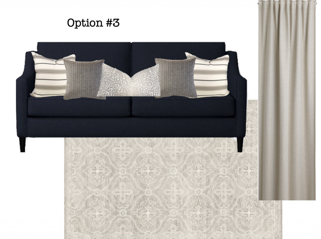
And here’s a third option in ‘neutrals’ but as you can see this room doesn’t have a bleak ‘all grey’ look even though this rug is cream and grey. The cream in the pillow creates contrast and interest and lightens up the black sofa.
IKEA rug | IKEA Curtains | Sofa | Knitted cushion | Striped Cushion | Lumbar cushion
My new eDesign decorating add on includes 2 combinations of: 2 Decorative Pillows, Coordinating Area Rug, and 3 Colour Accent Palette (designed to be used to shop with so you can buy lamps, accessories, etc). It needs to be purchased with one of these paint colour packages (below).
When you purchase one of these packages, you can select this add on under ‘Customize Your Package’ at checkout.
Related posts:
How to Decorate with Black and How NOT to Decorate with It
4 Ways to Decorate around Your Charcoal Sofa
Ask Maria: Do the Undertones in Dark Colours Need to Match?









YAY! My black leather sectional from the 90s is now officially “IN” again! LOL. If you wait long enough, it will become trendy again!
On a serious note, thanks Maria for a very informative and educational post about working with black. I’ve been following you for maybe two “trends” now and you’ve been an inspiration to someone who has no ability/talent/gift for decorating! Thanks to your services my home looks great. When I retire I will finally be able to take your course!
Dis you consider suggesting that she get rid of the black leather or move it to a man cave? It’s too heavy and too much for the room size. Sorry but true. It will never look like the high end black and white rooms with a pop of navy or green. This room needs life! Also I am getting good…Anticipated you saying that she should just paint the fireplace the trim color. I said think wall color to really blend but yes, I guess it would be trim. The student learns from the teacher!
Can she put drapes on her window with the fireplace being so close to it? She would have to hang them covering the window without any overlap on the wall.
She has two windows in this room. . . I think the TV looks better on top of the fireplace than if we moved it out. So the drapes could go on one side in this room and on both sides of the window above the sofa. Maria
Sometimes you have to work with what you have. They have black leather. She mentioned it is a small home. I think it will look very attractive and livable with the checkered beige curtains – my favorite. Painting out the fireplace is a possibility but they may like some wood in the room. I’d repeat it somewhere, if so.
I looked at the room again and saw a wood beam on the ceiling like the fireplace. Also, I don’t see room to pull back drapes 10”. Maybe a pull down shade of some kind would work better.
If that’s just a portable fireplace, I would consider getting it out of the room. It will interfere with opening the drapes and I think there are too many large, dark pieces in the room. I would edit carefully. If they have a lot invested in the couch, maybe get some smaller scale chairs? If the piano has another place it could go, that wall would be nice with a credenza for the TV with a display around it to make the tv less of a black hole. I like the color combinations you picked, my personal favorite is #3.
@Tanya
They said they live in a small mobile home so I guess there is no man cave . Not everyone can afford to get rid of the furniture. They are trying to work with what they have and make small changes. Maria suggestions are great and won’t break the bank.
I love these types of posts! Very educational and gets the creative juices flowing. Please keep these coming and thank you!
I agree with Stacey…how will the client even have curtains with the fireplace in the way? It doesn’t look possible. And if the piano could go in a different location, that would make a huge difference, because there are so many black pieces in the room. And, the TV could go on that wall with some non-black furniture and a nice artwork display around the TV. If the piano needs to stay, could the 2 armchairs be replaced with smaller armchairs covered in fabric? If everything needs to stay, I think I like Option #2 best so that some color can be introduced (however, I notice that the Ikea rug might be too small for that area). Option #3 is really lovely – it doesn’t introduce much color, but maybe that’s okay! Maria, I love when you take these real-life situations and help people find solutions!
Great suggestions. Looks like there is a way to make an imperfect room look better.
Why are readers all criticizing her furniture? She didn’t ASK about getting new furniture or some condescending critique- and it’s obviously NEW! She’s also not ASKING to have a “high end black and white room with pops of color”. Nor is she asking how to make it go into a “design magazine”. It’s a “SMALL MOBILE HOME” – where is she supposed to “move the piano”?? And if you play, you’d KNOW they want it in the LIVING ROOM regardless. Cheesh. Anyway, dear reader I think your place looks lovely and wish I had the piano! My vote is #3 simply because I can’t live in blue and I’d put a couple of very colorful bright flower arrangements in with it… but #2 is sorta modern and lively if you like it.
Thanks Cynthia, you said it best! 🙂 Maria
I love option 3
I think the checker drapes would be so lovely in this room. This is a real home and real room and I’m glad you’ve tackled the issue and you did it so in a very real way. The only item I’d considered moving away is the picture about the piano. Would that help make the room lighter? It’s competing with the tv and it’s visually heavy to me. Maybe three smaller pictures in a lighter frame closer to the piano would be more appealing. Perhaps no pictures at all but a nice long planter with lots of greenery would help bring the room to life even more? What do you think Maria? Also, I love that big window and the floors!
I quite like that green-beige wall color with the black furniture, wood-tone floor, and greenery outside the window–but totally see your point about it not going with the pinky-beige rug. Could you see that existing wall color working well, with a different rug (and curtains)?
There is only a little bit of floor showing, and it is right next to the rug, so I’m not sure if the floor might have some yellowish tone to it, which might not work as well as I think with the wall color.
I love Option #3
Can the TV be hung on the wall over the piano? She has a lovely picture over the piano now and the piano overshadows it. Maybe the piano would also overshadow the TV (and no one is going to be watching TV while someone is playing the piano.
I like the rug, so I’d go with the checkered drapes
Hi Maria! I think the homeowner has a great space. I love the big window and all the light! The wall color is soothing too and goes great with the black furniture. Black furniture is classic, it’s a great vehicle to make color stand out. I like all three options for color, but I think #3 is the best. Mostly so I could add bright fresh flowers whenever I wanted some different colors. Or put out a few more green plants. Any holiday decor or colors would pop with #3. I like the idea of painting the fireplace. It’s gonna be cute and warm. I like that this is a real room meant for real people living real life. I’m always on here looking for practical ways I can make my home pretty and comforting. It’s reassuring to see a reader share her sanctuary and get help for the same things I struggle with. Home is so personal, like our hearts. When we open it for people to see inside, we are vulnerable and risk pain for a great reward. Dear reader thank you for sharing so I know I’m not alone in my quest to make a lovely home that nurtures my soul and my family. Mostly, I’m just grateful to have a safe home.
For a person with a simple personality like me, the combination of black and white is a perfect combination and is always used frequently and used a lot. If you have a black piece of furniture and want a wall with contrasting accents, you can opt for white. Walls and make your black furniture an eye-catcher in the room. of you and conveys a feeling of classic and modern.