Trying the chase down the perfect white paint colour online? You’re sure to find a few that are mentioned over and over again. And that may have you wondering about other not-so-popular white paint colours. How to choose the right white depends on which category of white works with your finishes. Keep reading to find out more.

Google is one gigantic popularity contest. And in the world of paint colours, especially lately with whites, the same ones pop up constantly. BM Simply White, White Dove and SW Alabaster and Snowbound are the Kardashians of paint. Simply everywhere you look.
And if the same white comes up in your search over and over, it must be good right?
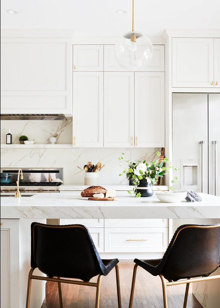
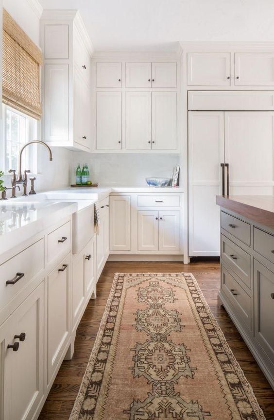
White Kitchen by Kimberly Ayres
Are all the other whites wrong?
But what about all those OTHER whites in the paint deck? Are they somehow inferior or flawed? For quite a few of them the answer is probably not, they just don’t have sophisticated celebrity managers. They have no buzz.
There are oodles of true whites, off whites and creams that are perfectly decent. You could spend days and days analyzing the minutia of their merits and flaws. The question is why? You have better things to do with your time. And it can be so elegantly straightforward to choose the white that best relates to your finishes from the well established roster of good whites. And then get on with the fun part, decorating your fresh new house.
I got this question from a dear reader recently that made me think that many of you may be wondering the same thing:
Hi Maria!
Long time reader of your blogs and posts and have learned so much.
I’ve fallen in love with a couple of whites I rarely see mentioned online – Benjamin Moore’s Steam and Gardenia from the Affinity line. Steam just seems like a perfect white, not cool, not warm, yet it’s rarely, if ever, mentioned in any online literature on whites. Gardenia throws a little red, but so very slightly that I’m not sure you’d even notice it on a whole wall.
Any chance you could share your thoughts in a blog post on these whites that get very little “play?” Is there something wrong with them that no designers see their greatness?
Thanks in advance. My daughter just started her career in interior design in Atlanta and I’m going to get her into one of your workshops soon!
To which I replied, “That’s a good question but its also the reason my system works. No longer do you feel like you have to have seen every single white up somewhere, you just use the ones that work over and over again.”
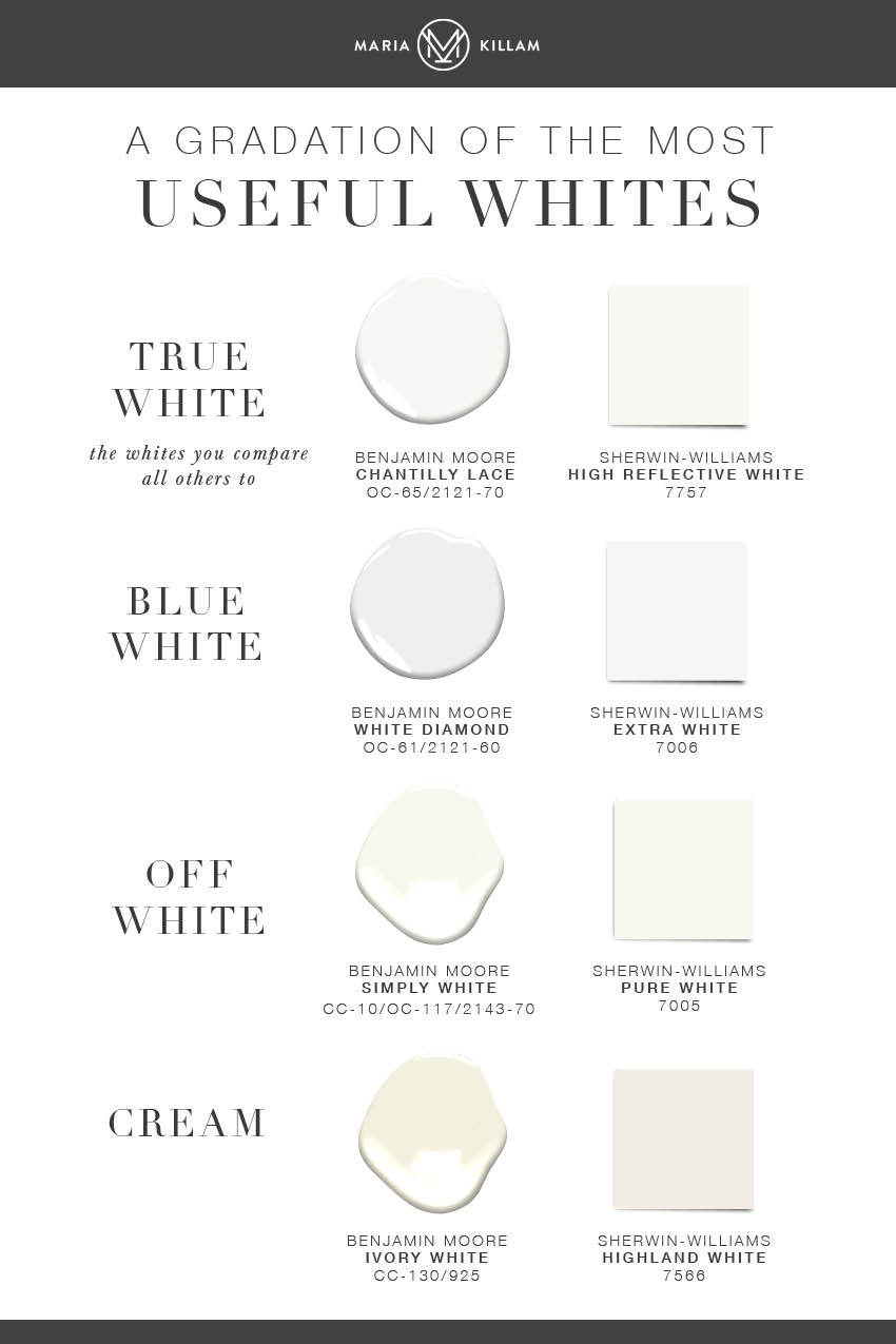
Because unless it’s your jam to find a unique and rare white for your house, something that will work kind of like your own signature fragrance, all you really need is to know is which category of white you need from my gradations of useful whites to work with your finishes.
The Gradations of Useful Whites in my System for Specifying Colour
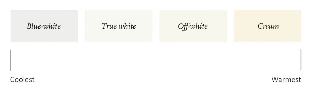
And in my system, I have identified a few well balanced and versatile specimens of each gradation. They are the ones that work, over and over.
White is complicated. Grab my eBook for a complete list of my favorite white paint colours and how to decorate with them.
How to choose the right white paint colour
Because once you’ve identified the correct kind of white you need, the beauty is, now you DON’T HAVE TO go through every available white in the deck through a process of elimination and drive yourself crazy. You know immediately that YOU ARE HERE. And you can move on to make all the other, more fun selections for your project.
I’d much rather spend most of my time finding just the perfect artwork or fabric to bring my room to life than to sit around splitting hairs over this white and that.
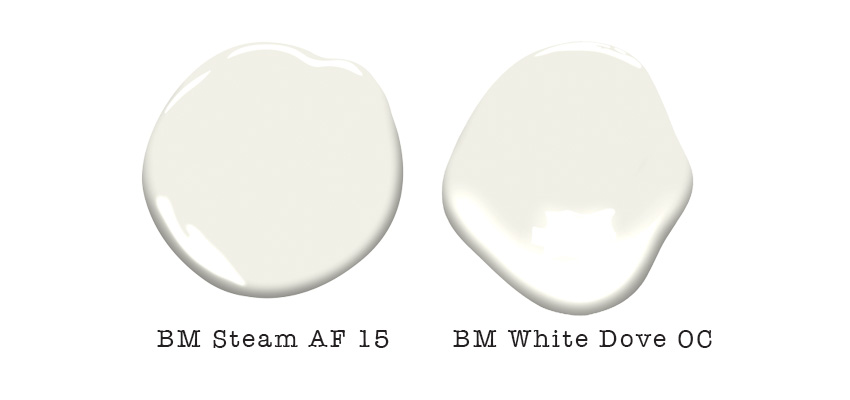
Honestly, once your cabinets or your wall is painted, you’ll never see the difference between BM AF 15 Steam and BM White Dove OC 17. They are both pretty off whites. And if that’s what you need to coordinate with your countertops, either will pretty much do.
White Kitchen by Jamie Keskin Design
Choosing the right white is not like mining for precious gems
Now say your finishes dictate off white. But you end up choosing a true white. Because you weren’t sure what to pick, so you just picked the brightest looking white. Then you’re probably in trouble. That’s when you can see the difference, when there is a whole shift in gradation. In this case, your white would be obviously stark.
So my advice is, if you fall in love with a lesser known white in the deck. First identify which gradation of white is belongs to by comparing it to the known list I provide in my ebook about whites. But at the end of the day, I think your time and energy would be much better spent sourcing the beautiful and unique furniture, textiles and objects that will truly make the room uniquely yours.
My mission is to make colour easier for you.
If you have a question for my Ask Maria column, email me here. Please note, it’s rare that I can post an answer to a question without a photo so there’s a higher chance that it will be considered if you send photos, taken without flash and in good natural light.
To learn how to explain WHY your white is the right one, become a True Colour Expert.
PS. We are HIRING AGAIN. Our eDesign department is extremely BUSY and we need a virtual colour designer who can commit to 30 hours a week. Go here to apply.
Related Posts
Ask Maria: What’s Next After the Gray Trend?


The more design I do, and the more I read your posts, the more I’m convinced that there are not many “bad” colors. There are colors that work best in a space and colors that don’t work.
I chose aesthetic white (sherwin williams) for my home several years ago and I love it. At the time, it didn’t come up on any of my Google searches but it worked for me.
This why we love you! You make our life simple! I am presently working with a contractor who told me he was a color expert so he seemed to see color correctly until they painted my clients wood ceiling. They used kills or another sealant. Painted the wood white to match the rest of her ceiling and it came out pink. I told him to check the undertones in the paint and check a small area because of the wood plus sealant before they painted the whole ceiling but he said he knew what he was doing! He needs your class even though he said he is a trained color expert! Ugh!
Hi Maria, this post’s lovely kitchen photos with timeless white cabinets and various white countertops got me wondering since none of the kitchen pictures showed painted walls in them. How do you incorporate the now trendy white wall color as a “main house neutral” when have (painted wood) white cabinets without it all looking too stark? Use a very light wall color from another undertone category (greige, taupe, or green gray?) that gets picked based more on your home decor? Is this why non-white trim colors are becoming uber popular in the design blogs to help with white kitchen / white wall contrast?
I get what you’re saying, Maria, and I mostly agree. For most things, if you’re picking a white, once you’re in the right family it would be close enough. But I am still so glad that I went with Benjamin Moore’s OC-118, Snowfall White, when I painted my kitchen cabinets about 8 years ago. I had (and still mostly have) white appliances in the kitchen, and each from a different manufacturer, so none of them had the same finish/undertone. Thanks to your advice I painted large posterboards of the colors, and the most popular colors weren’t the ones that looked best to my eye at working for all of the appliances. Snowfall White did, however, and I’m glad I picked it! (The kitchen walls, on the other hand, probably should have been a different shade of green, at least for our nighttime lighting.)
Well Maria, that first letter (Steam, Gardenia) was from me! I never saw a response but probably missed it? But … I ended up with Distant Gray in the whole house, basically a doubling of what’s in Chantilly Lace, so clearly I was wanting a *very* neutral white. And I love it! Medium dark wood floors on the first floor and very fluffy white-ish carpet in the entire upstairs. I feel like I can b r e a t h e in there now. But I still love Steam and Gardenia!
I’m pushing 60 and want to get a bumper sticker that says, “I loved white walls before it was cool.” This is, unfortunately, our eighth house, and every single one got Ben Moore white walls, starting with our 1955 California contemporary in China White and on through our two basic ranches, one colonial, one french country, and now a foursquare.
Haha that’s awesome, thanks for your comment and for the question that inspired this post Jenifer! Maria
Perhaps consider including Benjamin Moore Oxford White (aka White Heron) in your recommended collection of whites. I think it fills a gap between the True White and Off White categories. It’s clean and modern but softer than Chantilly Lace.
It is in my curated collection 🙂 Maria
A few years ago I wanted to paint all the builders grade oak stained wood trim in my home plus the ugly orangish stained 90’s kitchen cabinets. I ended up using BM Paper Mache, it has a yellow undertone to it. I haven’t seen this color mentioned much in all my searchs of white paint. It turned out great, not to bright and not too dull or dirty looking.
Hi
We are painting the body of our house Benjamin Moore Polo Blue and am conflicted on what shade of white to use as trim. I am considering Wedding Veil and White Diamonds- thoughts?
My walls are (sw) repose grey and trim is (bm) decorator’s white. I want to paint my kitchen cabinets. Because of the undertones, I am struggling with a color for my kitchen cabinets. I want a light color because I don’t have a ton of natural light and my kitchen isn’t really large. Can you suggest anything?
This totally happened with me and my discovery of Benjamin Moore Ecru 2014-70. I never see this color mentioned anywhere but it is just an amazing color and completely transformed my small living room. It is warm and neutral and flatters everything around it, even people lol.
The room is north facing and I have a giant tree out the window that reflects green into the room during the day. I had Benjamin Moore Mascarpone on the walls and they always looked like a sour yellow-green during the day and sort of flat white at night and it was not complimentary to my furnishings and decor. The room just absolutely depressed me.
The ecru reads as creamy white during the day and, most importantly, no green shows up on the walls. At night it is a really lovely warm pale apricot. My wall art looks phenomenal against it, oils with gold and wood frames, my black and white geometric throw pillow, medium brown leather ottoman, and my ugly dark gray sofa all look very intentional. I can go a little crazy with plants and not worry that any dingy green will bounce around. And I also have a few water colors in white frames that look just as fantastic on these walls.
Anyway just wanted to give a shout out for this color that I never see mentioned. It should get more attention because I think it could save a lot of rooms!