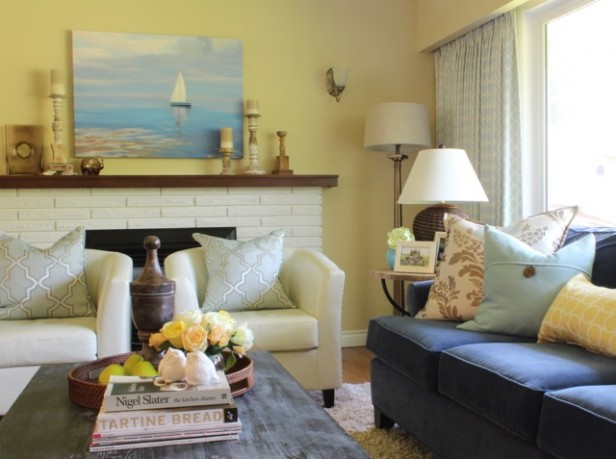
After
Since my sister Anita renovated her kitchen almost four years ago and opened up her kitchen to her living room she has schlepped home approximately 11 area rugs.
“Maria, the one I have is a $200 placeholder from Costco and I even broke the cardinal rule and got the pink beige one because I didn’t know what else to do!” She wailed.
“There’s nothing wrong with that, It goes with blue. But it’s a shag. That style of rug looks the best with a modern sofa because it softens the square lines. In your traditional living room, it definitely looks wrong, especially because your walls are yellow beige. Now you have a blue sofa and a beige rug and no yellow yet? And, can we paint them, by the way? They are so muted, it’s hard to shop off-the-shelf because the colour trends are clean, bright and fresh.”
“NO! I love the yellow walls you chose for me!”
“I know but that was four years ago, before I really understood grey and how great of a backdrop it is for bright colours! Either that or your yellow walls should be brighter”
“No, I’m not painting them, she said.”
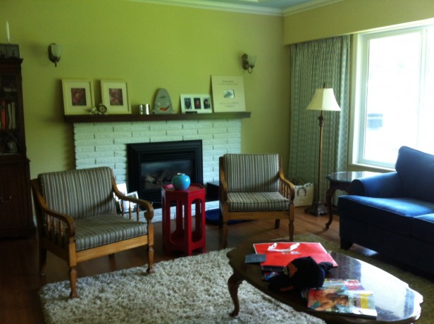
Before
I asked her why she has two two cream leather chairs that are not an exact match? Also the other 70’s chairs I bought from a garage sale when I was 21 that she has had ever since I upgraded from them many years ago. “The fabric does not go with your drapes at all? And the cushions are so flat? What happened there? You should have ordered them wrapped so they have a crown just like your sofa cushions?” I said.
Anita said, “If you look close, you can see the blue in the stripe, I gave the upholster the old cushions and told him to make them the same and he didn’t And the cream chairs are placeholders until I can figure out what to do for the real ones.”
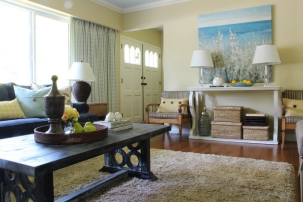
So I decided it was time for a decorating intervention. The only thing that really worked about the room was the drapery, navy sofa (chosen by me) and the art above the console that Anita chose.
This (above) was what her living room looked like at 2:30 pm yesterday.
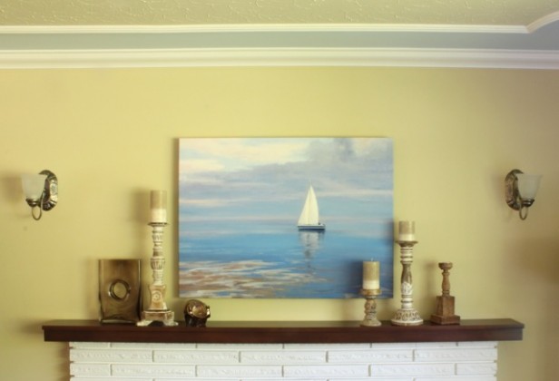
After
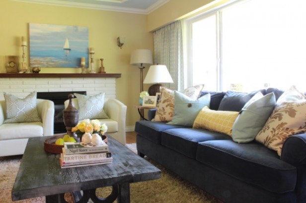
This is what it looked like (above) at 10:30 pm that same evening. This photo is the closest representation of what the colour actually looks like. It’s BM 240/CC-230 Delaware Putty.
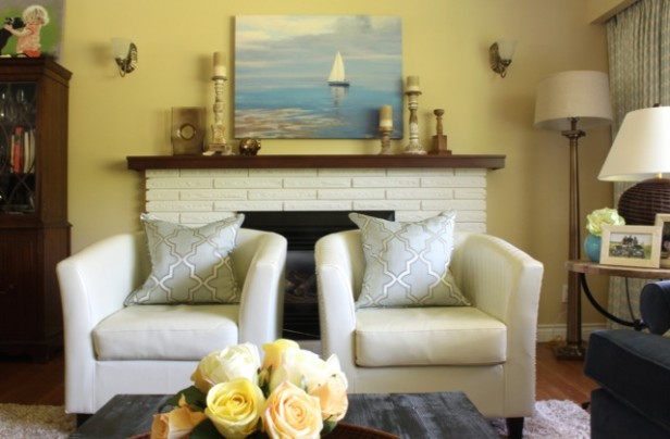
I was even able to tuck the 70’s chairs further away from the drapery fabric as well as turn them from being the first thing you saw (the focal point) when you walked into the room, to some extra seating that you can pull up in a pinch. And the yellow pillows with the brown buttons are a perfect match to the wall colour.
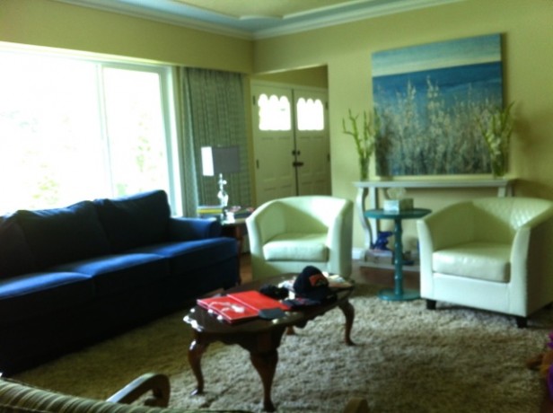
After
We found almost everything at HomeSense and a few items at Target, across the street. (Target has only just arrived in Canada a few months ago).
So, approximately $2,500 later. I was magically able to work with her pink beige shag!
Her husband Aaron is an Accountant and they have a good habit of budgeting and writing down everything they spend. When we got home, she told him right away “It’s better this way, like ripping off a bandaid–do it fast!” she laughed.
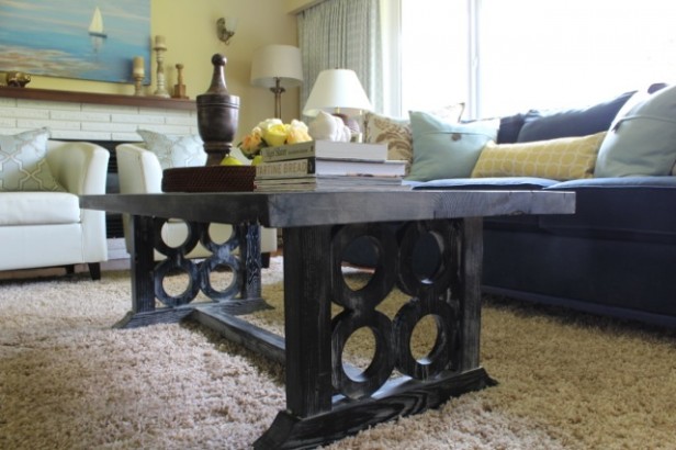
I don’t think anyone would want the old feeling of the room back! Aaron said the coffee table is his favourite and he loves the nautical feel of the room.
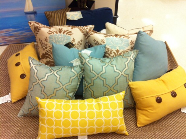
When we got to the back of the store where the cushions are, I plopped down a small rug on the floor that happened to be nearby that was pink beige (the same colour as her shag back home).
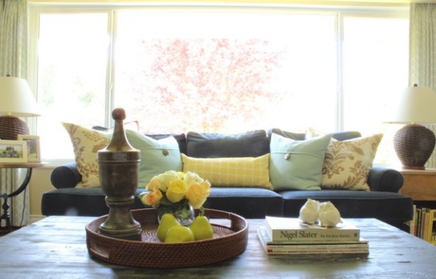
You can see her navy blue sofa cushion in the back along with a small piece of her drapery fabric (which I chose for her in the renovation) and the ‘not-so-fabulous’ new striped chair fabric.
So, we broke the yellow and pink beige rule. Here’s why it works:
1. The coffee table is blue. It visually pulls the blue over to the middle of the room which makes up for the fact that the carpet is a solid. The coffee table is a great, unique find that saves the room from looking like it all came from one store.
2. The two large pillows in pink beige, brown and blue, pull in the carpet and the accent in the room. Coordinating off-the-shelf cushions without one fabric to tie everything together is a challenge but we did it, hooray!
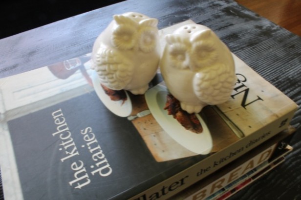
3. Pink beige is like burlap, so take advantage of those textures and repeat them in the room. Like the Ralph Lauren basket weave lamps on either side of the sofa, and the funky, mis-matched natural and cream coloured candle holders on the mantle. Then I repeated the brown on the coffee table in the tray.
And, of course there’s nothing fundamentally wrong with pink-beige, it’s when it’s chosen without any consideration to how limiting it is with so many other colours that it’s just plain BAD.
You almost can’t tell that her two kid-friendly faux leather chairs are not exactly the same.
When I plucked the vase of faux roses off the shelf in the store, that’s when Anita said “But I buy fresh flowers?!”
Yes, but do you reliably have them in your living room every week?
No.
Well then, a tablescape is kind of dead without them.
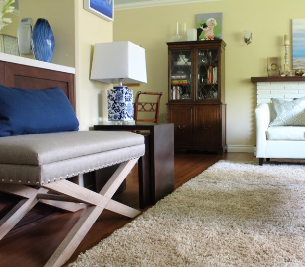
It’s so easy to source anything when you Understand Undertones™. See the pink beige X bench? A great score because it even has storage. Here you can get a glimpse of the island in her white kitchen (the island is only brown facing the living/dining room) which–when the room was opened up to the living room during the renovation–created a seating challenge here. Anything that stuck out into the room was in the way of traffic towards the dining room.
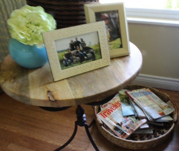
I tucked a low basket for magazines beside the sofa underneath the funky, distressed end table.
Photos & Interior Design by Maria Killam
And here’s the best picture. Hey, I’m getting better, I could never have taken this shot without my photography course this winter.
Don’t forget, you need lots of cream with pink beige too. That’s how you keep it fresh instead of dull and earthy.
Have a great week everyone! xo Maria
Related posts:
How I Created my System of Understanding Undertones
Why Pink Beige Should be Banished Forever
What Everyone Should know About Beige
If you would like your home to fill you with happiness every time you walk in the door, become a client. On-line or In-person.
To get your exterior colours right, download my How to Choose Exterior Colours with Confidence webinar and get my go-to list of colours.
Download my eBook, How to Choose Paint Colours – It’s All in the Undertones to get my complete step-by-step system on how to get colour to do what you want and to make sure the undertones in your home are right, get some large samples!
If you would like to learn how to choose colour with confidence, become a True Colour Expert.



It’s a miracle! 😉 It really does look pulled together and on-purpose. Once again you prove that you’re a color pro!
Awesome makeover!
Magic! Listen to your sister Anita!! Sister tough love is the best when your sister is Maria. I am jealous. xo
Very pretty Maria! I really enjoyed reading this post, and it is always helpful to have ways to work with pink beige! Thank You!
lovely transformation!!
I really was giving up when I bought the “pinky beige shag rug special” from the big box store. I wish I had better words to express my gratitude and delight in the beautiful transformation that is my new living room.
Watching you work was such a joy! You pulled pillows, lamps and the perfect pieces of art that all matched! Right out of thin air. No digging and wandering around the store. Bam! This one, that one, throw pillow here, cute ceramic elephant there and you did it with no hesitation. It was awesome. Not one piece you picked was out of place when we got to my place.
Small details. The new bench did not look right until the carpet was moved 4 inches to the left.
Seriously.
My husband just asked me if I ever plan on leaving our living room tonight. I might not.
And for the record, one day I will be able to explain why I hung that 4’x3′ (ish) painting off centre on that wall and how I didn’t notice until you pointed it out. One day. Or maybe I won’t ever have to because I have you to fix it.
Lovely reading this touching, appreciative tribute to your talented sis! Your room looks great! I’d give anything to have had even one sister and you have three! How lucky you are..
Beautiful! You make it look so easy, but I know, it’s not…
Beautiful unification! I can see why you brought the chairs from the yard sale home. They would be lovely painted with fresh upholstery. Thank you for sharing.
It does look better – guess you could say it now is sweet.
Yes, it’s “sweet”. However, it’s kinda hard to tell the difference between the before & after in some of the photos.
WOW! That looks so great!!
And the thing I like the most is that you were able to do it for not a lot of money!! (unless you count all the money you spend over the years developing your eye and knowledge of undertones 🙂
The pillows are are key to pulling the whole look together.
Maria, would you please define what color range I should be imagining when you reference the color “cream” and/or when you reference the word “ivory”? Should I be thinking off white, yellow beige or are both referencing the same color idea. Perhaps the term definition may mean different hues to different color experts but I would like to know what you are referencing so that I can understand what your are trying to teach me. As always, thank for your blog.
Cream is in the real of 925 Ivory white or darker, off-white is 967 Cloud White.
Cream goes better with pink beige than white because it’s earthy.
Great question, Maria
Maria,
As I am reading your post, I noticed that the photography course you took did pay off. Your photos are amazing! Beautiful transformation and I love how you got pink beige to work. Besides Navy and Cream, what colors work with Pink Beige?
Ellen
Red, blues. That’s it. That’s why it’s such a hard colour to work with, it looks dirty with most colours, especially the clean ones out now. Maria
Maria, This is just a fabulous post! I love how you explained and showed all the little changes, decisions, and purchases to redecorate a home working with what Anita already had.
The new color is fabulous! I bet Anita is just thrilled. Miss you friend!
This is a major improvement, with the #1 new item award going to the coffee table. Even without your great eye for accessories, replacing the coffee table and lamps with ones that don’t scream “yesteryear” makes a huge difference.
Do your sister and her family not use their fireplace? That seems like such a shame to me!
They totally do, but the living room really is small without the chairs in front of the fireplace, however there’s enough room to move them to the side in the wintertime to enjoy the fire when it’d cold!
I agree, the coffee table was a major score that totally makes the room sing!
I think putting the chairs in front of the fireplace is a great idea for the months when you don’t use it; nothing looks bleaker than that black hole in the wall! And the off-white chairs fronting the off-white surround is a perfect example of decorating serendipity!
I have pink beige tile and purple taupe througout my house and my other main colors range from the purple reds, purple, blue through blue green. But I find most “Colors” work. What doesn’t work is yellow undertoned or green undertoned beige.
This is the print I have hanging in my one deep purple taupe wall, (the other walls are lighter taupe). The wall is almost matches the clouds.
Family Tree – Jaguars By Lee Kromschroeder
http://www.artbarbarians.com/gallery2/main.asp?artist=113&pic=3004
Fabulous before and after! I love how you explained each item and where it was placed too.
Simply Amazing! I love everything about the new space you created. I just bought the very same white console table from HomeGoods last week, I haven’t brought it home yet but I can’t wait to get it, it was marked down to $110!! I also have those cream club chairs on my to buy list from Overstock, I love the ones without the quilted pattern. Your sister and I have very similar taste in home Devore.
Hooray, make sure you install some baskets like we did, it’s so empty and and open otherwise. Maria
We brought the table home tonight and yes, its a large open space underneath that’s screaming for big baskets! Its a beautiful table for half the price.
Maria, I wonder if you could tell us about the ceiling — I can see just a bit of it in a couple of the photos and it looks like it’s painted blue, or perhaps it matches the walls with a border of blue?
HI Sandy,
I don’t remember the colour anymore but it was chosen to relate to her blue glass backsplash.
There’s about a foot going around the room that is in between the crown and another strip of moulding. It’s one of my favourite features of her living room.
Maria
*How to work with what you have when what you have doesn’t work.* Beautiful.
Maria SO needs to write yet another e-book – on staging: accessorizing, “scapes,” etc. In her free time, haha.
I can relate to Anita’s love for her yellow walls because I have them too, in the dining room and hall, and absolutely love them. I know that gray would look more updated, but I don’t care. Everything–the art I inherited from my parents, the furniture, all the colors in my house–looks great against that color.
Wonderful transformation, Maria. The coffee table alone makes an amazing difference, and those cream chairs in front of the fireplace are perfect. HomeGoods is wonderful and I spend a lot of time there, but I wish I had your skill of seeing things and pulling them together quickly! I know, it’s the ten thousand hours of practice that make you such an expert.
Love the room! Thank you for explaining step by step how you transformed the space.
Lucky Anita! Nothing like a ‘good tweaking!’ That bluish coffee table really kicked it up a couple of notches…great find! It takes both confidence and a good eye to buy a painting this way (I cannot see the diff betw those 2 leather chairs!!) Interesting post about revamping ones things with a talented, new pair of eyes and a few clever additions.
HI Diane, One is quilted with nail heads on the side while the other is totally plain but it is hard to see that in the picture.
Thanks for your comment! Maria
Maria, The room looks lovely. Btw, I see little difference between the white chairs & like the 70s’ wood chairs. I love that YOUR sister went out & bought a pinky-beige rug for a room with yellow walls…when you have me and countless others losing sleep over dreaded pinky-beige in our homes 🙂 Another comment asks about the fireplace. I wondered the same thing–It seems it should be a focal point but its ignored. Did room dimensions dictate that choice?
Haha, I know right?
Yes, the room is too small to have the chairs on the other side.
Thanks for your comment! Maria
Maria in the 1st picture there are sconces on the wall, a floor lamp in the corner, and a table lamp beside it. Can you tell us about this? A great post. What a fortunate sister! It is very beautiful plus so homey.
Yes, you can NEVER really have too much lighting.
Nothing wrong with two lamps located within 3 feet of each other. The only other way to bring that corner to life is with a big plant with perhaps an uplight positioned underneath it, that would have been pretty too. We choose the bronzy one to relate to the existing sconce lighting (they turn on with switch on each one so it’s hard to find sconces that do that).
Depending on what you’re doing in a living room, you’ll have different lights on, you wouldn’t necessarily have every single light on at once.
Even if you have an end table or a dresser in a bedroom and you’re convinced you would never walk over and turn the light on, a table lamp simply belongs on a table in general. Consider them to be single until they are together and married, hee, hee.
Thanks for your comment!
Wonderful teaching blog, Maria! You could create a series based on Anita’s room, a “how to work with what you have when what you have doesn’t work”, if BethB would sell you the rights to her quote. You could focus on undertones first as you did here because that’s most important, than “staging, accessorizing, “scapes” as BethB also suggested.
Is Anita still in her living room?
My takeaway was my reaction to the pix from HomeGoods with all the pillows and the rug you picked. It looks like a jute or sisal or otherwise “outdoor” rug and it worked. And then you mentioned that pink beige is like “burlap” and you suggested adding the basket weave items. That type of rug doesn’t work for everyone in every situation, but I love them for the cats (they are indestructible) and for their casual, outdoor indoor feeling that suits my style here in the desert, and it’s interesting that because they are “natural”, the pink beige in many of them doesn’t seem to limit as much. (I remember the 2012 post you did on the Ralph Lauren Desert Modern collection which mixed pink and yellow beiges so well.)
Ok, Maria, I want you for a sister too!
xo,
Paula
You did all this in 1 day? WOW!
If you were my sister, I wouldn’t buy ANYTHING without running it by you first.
Could you use another sister?
Great transformation, Maria. Those not-so-attractive striped chairs are hardly noticeable since you tucked them on either side of the console. I actually looked for them, and thought they were out of view. You made them disappear in plain sight, clever girl!
But I do have one question: Wouldn’t it have been less expensive to replace a $200 rug than spend $2500 to make it work? Or am I missing something?
There were no new, remotely even workable area rugs there and in actual fact, the only items that would need to be replaced if a new rug was purchased at some point were 2 throw pillows since the rest were perfect with the blue and yellow existing colour scheme and the $149 pink beige X ottoman.
She desperately needed new lighting, end tables and accessories which would work with a better area rug down the road.
And accessories add up fast!
Great question! Thanks for your comment!
Thanks for your reply, Maria. Now I get it.
My favorite aspect of the project is that you transformed a dated traditional space to an updated transitional one with a few well-chosen accessories. I need to do this in my own living room, so I’m studying these before & afters like a math text before the big exam! Thanks for the inspiration and guidance!
Amazing transformation, Maria!
Wow it looks beautiful! It reminds me of a movie/TV show set now. What a great way to illustrate what you always say about creating a look and a feel.
Don’t like on the stuff on the fireplace wall or mantel. Art works well on it’s own, less is more.
Thanks
I’ve said it before and I’ll say it again. Maria you are equally as good with styling, as you are with paint colours! Truly brilliant!
I second the vote again, for a styling e-book, I’d buy it!!
I’m speechless!!!
Thank you so much for sharing this beautiful “before and after” with us, Maria! I love how you are both realistic with design budgets and try to work with what a “client” already has AND are able to “walk us through” your thinking and reasons for doing things–I think that is what makes your design blog so much more interesting and relevant to me than most of the other design blogs! I am learning so much. I agree with BethB–you should write another book on decorating, staging, accessorizing, etc.!!!
It’s decorating 101 – nothing special people.
Perhaps that is so — some folks reading here have obviously already had that “course” yet others are coming to this blog to continue to learn and be challenged.
The point Phyllis and others are making — one I agree with — is that Maria shares her thought process behind the choices made (e.g. why X works but Y doesn’t). I’m a very analytical person so her way of describing projects stands out to me from other blogs that don’t share such details. And yes, it’s possible to be both creative and analytical!
Maria, one of your best posts ever! I too love Home Goods for art…the Coffee Table is a huge improvement over the dated -too small oval. I have the same style coffee table (ugh) and have been searching for several yrs for an affordable, simple, parsons style or glass topped w no luck yet. Love the art and the pillows of course. I am a pillow fiend. I make my own and buy at pier1, pottery barn or home goods……would love to see a simple large scale navy/ cream rug though. That would be the cherry on top. Betsy O
The colors you have chosen tie the room together brilliantly. I think that the uplight in the corner might be a better solution for lighting the dead corner and I think that the art above the mantle is too small for the scale. Maybe a beefy frame could be added to the artwork?
Love it!!
All in a day’s work! Ha!!! What a fabulous transformation, and I loved seeing that Anita left a comment!
xo, Traci
It’s all brilliant. You sister must be so happy.
One quibble – the floor lamp in the corner next to the fireplace is distracting my eyes. I think it’s taking strength away from the table lamp in front of it.
AND, “Home Sense” ROCKS (we have “Home Goods”) with such fantastic “reasonable” selections! Nice work!! franki
I REALLY love the makeover! Everything looks so fresh and new and updated yet still has a style they both love. For me the deal changer was the coffee table because it added so much needed ‘heft’ to the design.
Now my own thought about mixing beiges: We live on one side of the Missouri River. We used to live on the other. When we moved a couple years ago, there was no snow at that time in the winter. So the numerous trips on the bridge gave me many opportunities to see a myriad of natural neutrals…all displayed by God himself with His wonderful paintbrush!
And ya know what I learned? I learned that pinky beige/yellowy beige/greenish beige CAN all work together! If figured if God can put the colors together and they look fantastic,we can do it too 😉
But there’s a secret I learned. If you repeat the varying undertones of beiges in a space, it will work. Example: If you have only one pink beige and all the rest is say yellow beige, you’ll definitely see something “off”.
So that has saved many a client who cannot repaint or cannot purchase a new sofa. We find other neutrals in the ‘offending’ beige and add more of them in. Voila! Success…although I’ve got a long way to go to get it good as God does :-
Love what you did here! Gives me hope for my pink beige walls. Question: we have pink beige walls that can’t easily be repainted (BM bradstreet beige). I have done the two adjoining rooms in SW blonde (yellowish) and SW silvermist (blueish). We are doing a kitchen remodel with white cabinets. Any whites that do go well with pink beige? Hoping for a whiter white, not too creamy/ivory. Thank you!
Cloud White would work with Bradstreet Beige.
Maria,
This is a great post… thank you so much!! I can’t stop thinking about those beautiful light blue Moroccan curtains. Can someone tell me where to find the fabric?
thanks!!
Amazing!! Loved reading about the whole process and learning a little more. The transformation is fantastic!
So overjoyed about u and u sister.
When it comes to artwork, I so respect Anita having stories with her picks of art.
Purchasing art to buy off a shelf has no history, it only fills a space.
For me, it doesn’t work over the mantel as it’s much too small and has no story.
Perhaps in Anita’s travels she will find the perfect piece.
A rekindled relationship is precious and forgiveness of oneself and others is a true blessing for the entire family. Maria, ur highest achievement was humility and I so respect that as a precious jewel.