I’m featured at Blue Label Bungalow as one of Erika Ward’s Tastemakers! She asked me some great questions, click here to read.
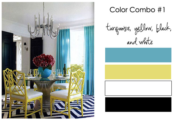
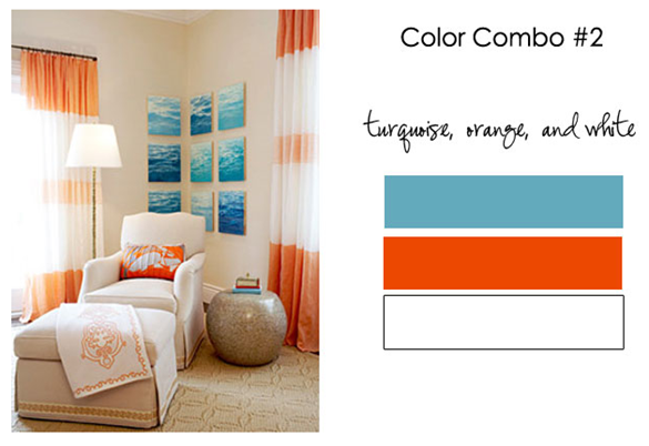
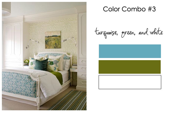
Since turquoise is the colour of the year for 2010 she asked me to show 3 combinations using turquoise, these are the ones I chose:
The common denominator in all these combinations is white because it looks the best with fresh and happy colours!
Which room is your favourite?
If you would like to transform the way you see colour, become a True Colour Expert.
Related posts:
Before & After Blogger at Pure Style Home
If you are new to this blog, click here to see the Best of Colour Me Happy
While you’re here, subscribe to this feed so you don’t miss out!


Oh heavens Im not sure which is my favorite…I think the first one. And congrats on being a tastemaker. What a great title!!!
Hmmmm… I'm on a bit of an orange kick at the moment, so I'd have to say the turquoise, orange, and white room is my favourite. That colour combo says "summer" to me, and I want it to be summer right now!!
Kelly
Jonathan Adler if I had to pick, I am obsessed with that house he did for Liz Lange. But all three are fantastic!
Congrats!! Favorite combo? hhhmm, tough choice but I say the turquoise, green and white..but on second thought, the first one with yellow…wait, no… gosh, they are all fantastic!
My favorite is #2 Great combination's Maria. For some reason the red in the top image..the centerpiece bothers me, as you know though I usually work with a very limited palette! 🙂
Karena
I love turquoise so it is hard to choose, but I would have to go with the last one as my absolute favourite room.
Still loving turquoise-green-white even though "beachy" has sure gotten lots of ink in recent years. Feels like it could be year-round more than the others for some reason. Congrats on your new moniker! Wish someone would say that about me in public…
Interesting and fresh combos…smiles.
Very cool, congrats. I'm obsessed with the turquoise, yellow, black and white!
I love the combo, those are the color's for a wedding I'm in, too, so they have grown on me!
I also love turquoise with red and white (sounds weird at first but I love it!!!)
It's difficult because they're all nice, but I'd have to say the first one. Yellow has grown on me in the past year or so, and it's not bad in limited quantities. But I would change the rug. Just a personal taste kind of thing; I'd find a different pattern.
Also, I agree with Karena, the centrepiece jumps out at you. And not in a good way. Maybe white flowers, so the vase shows more.
Lovely, Maria. How fun is that? So glad you chose turquoise!
Oh.. amazing.. I love orange.. so am a bit partial towards the second pic.. Lovely.. lovely.. inspirations.
Definitely Turquoise and Orange!!
I am seriously considering re-doing my living room in these colors!!
Gorgeous!
You gave an awesome interview Maria! Thank you so much for your participation!
All so pretty and fresh! I would choose the green room as my favorite. Looking forward to reading your interview.
Do I have to pick? I think I love that top one. I just want to have a few friends over for a dinner party!
(in that space and show off my new colors!)
Love all 3!
Congrats, tastemaker!
pve
I'm loving each of your examples, Maria… but since I have to chose one I'd say the turquoise, green and white. The other 2 choices were fresh and fun, but this combination – with the more olivy green – is more serene do me. Still fresh, but in an understanded way.
I enjoyed our dinner date last evening! Let's be sure to do it again soon!!
Victoria
every room is great…but for some reason i am loving the turquoise with orange. its fresh and looks a lot like spring! great combo!!!!!!
🙂
What deck color is that turquoise?
I love the last room – the turquoise, green and white is so fresh and liveable. Great interview!
Great, unpredictable combinations. I think that green shade (what is it?!!!) with the turquoise seems the freshest and most livable. Though each time I see that first image, I fall for it!
LOVE them all and the rooms you chose to showcase them….but I think the Jonathan Adler room is divine…one of my all-time favorites. I'd kill for that bedroom though!
They are all so fresh and happy. I'm not sure I could relax in the first room but I could in the second and third !
The third pic is favored. It reveals how well ferns and ivy look with this color.
They are all fantastic! But number 3 is my favorite. The colors and style of the bedroom in this image are the closest match to my own taste. They also happen to be the same color combo I used for paint and fabrics for my laundry room!!!
I love the last one. Love blue, green and white as a combination; it has a sense of calm about it and the last bedroom looks incredibly serene.
I loved the top two… great job taste maker you deserve it really…
how is chocolate and turquose for a combo.. i recently did my baby's changin table in that combo.. it is here..
http://deeppurpleandblue.blogspot.com/2010/01/chocolate-and-turquoise-changing-table.html
it still needs more touches.. but what do you think..
#3 is definitely my favorite! It is soothing with the green. I like the others but wouldn't want to look at those colors every day.
I love the turquoise green and white room! My own home is warm earthy tones ( red, orange, green, brown, yellow ochre) with small hits of turquoise-usually glass.
Great interview & questions. I am waiting for that book of yours – I can't wait to buy it! 🙂
I like Combo #1. For my home I'd probably have to make them slightly warmer and use cream instead of white. Can we add dark brown furniture to the mix?
Great color combos! I love the last one…looks a lot like my blog color scheme that I redid last weekend. :o) xo, Cristi
I love #3! So cool, calm and collected. Perfect for relaxing, brainstorming, blogging, etc. I could see myself lounging there all day and night! Good pick!
L.O.V.E. this post! Keep up the great work Maria!
geez gone for a month or so and now you're famous!!!!! go u lady!!!!! come over to my bedroom and decorate it with the yellow black and turquois combo!
Love number 3! Looks fantastic and like a tropical place to be!
I like turquoise and orange, great post as usual and a wonderful interview, I know you will have everything you want. You are very deserving of it.
Firoozeh (my name translates to turquoise)
A book and a retail location. I had no idea. I learn something new everytime you are interviewed. The orange and blue are my favorite.
My daughter Leila wants to redecorate her room. Her color palette? Turquoise and orange! I'm going to have to show her this post. I know she will find it inspiring!
Congratulations my tastemaker friend 🙂
xo
Brooke
GREAT combos, I like turquoise with olive and with brick so much! they are all made for each other, uh oh, maybe they will have a threesome and make some amazing new color! We can only dream.
I love blues and greens together, so my fav is the turquoise and olivey avocado green!
#1, but I think its because I love everything about the room (chairs, rug, etc.) I also like turquoise with orange.
Do I have to choice.I love them all. Great picks.
Those are all delicious; there's no way to choose! And you are most definitely a tastemaker!!!
I love colour combo 3, the freshness of the green plays off the turquoise and the white just makes the whole scheme very crisp.
I love the font you used to write the colours, could you please tell me what it is called?
Cheers,
Sam 🙂
Hard choice. I really like all of them, but if I had to pick it would be #3. I'm actually using those colors right now in our garage loft. BTW, I loved the interview. Congrats!
marcie
I love all three combinations, but if I were to pick one to use in my own home, I'd definitely choose #3.
I've been wrestling with what colors to settle on for our bedroom, and now I'm definitely leaning more toward the turquoise with green.
I have long loved that first picture and the turquoise/yellow combo. Beautiful (and so is your blog!).
Maria,
Love all 3 and difficult to choose!
Love the 1st because I LOVE turquoise against black.
Love the last,because it is so fresh looking.
LOVE orange,,but for some reason the 2nd is my LEAST fav of the 3.
Ooh! I LOVE that pure clean turquoise against the muddy deep green, and the white really does set them off!
Those are gorgeous, Maria! You're so right about white being the right element to freshen everything up. Those rooms are gorgeous. You'll convert me to turquoise yet!
I love all these combos, but I really like the turquoise, green and white bedroom. So fresh!
I love the turquoise/green/white combo. It's calm, yet exciting, if that makes sense.
Love #3 combination as I have used that exact photo for inspiration as well 🙂 White does add that nice crisp contrast that makes everything feel clean and fresh and the green always makes me feel like I am bringing the lovely outdoors in. xo
All things considered; I vote for the turquoise and green and white. That seems to feel awesome to me while the others are too exciting and stimulating.