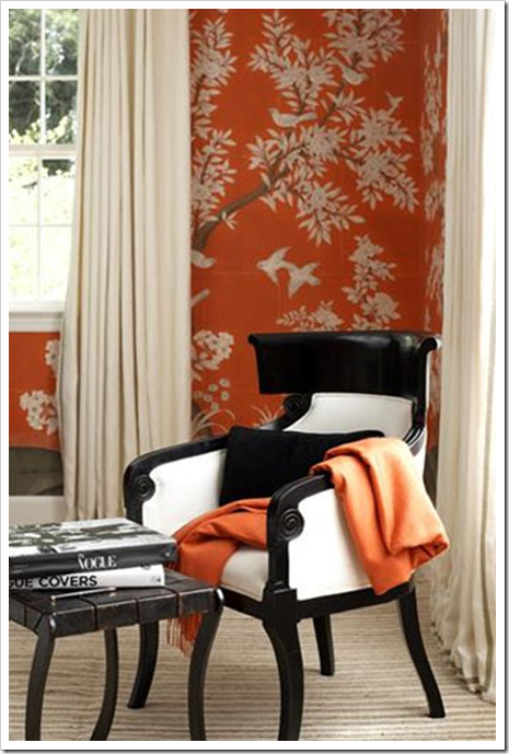
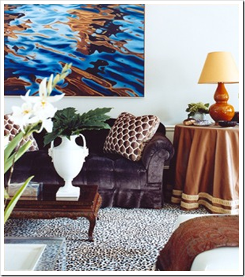
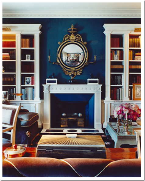
A reader posted the following comment/question which I thought I would address in this post;
“One term you frequently use disturbs me, and that is the word “dirty” to describe those colors which are not bright or primary. Well, dirty can be fun and has it’s place 😉 – – but it doesn’t seem to belong in the decorating lexicon. My understanding is the creation of such colors includes adding a minute amount of paint from the opposite side of the color wheel. Why not call these complex colors? Or if that won’t work, invite suggestions from your readers for something better?”

Yes you are correct in that an orange colour (for example) is muddied or muted, therefore ‘dirty’ by adding blue (from the opposite side of the colour wheel).

And thanks for asking such a great question! You are not the first person to be disturbed by the terminology. Here is the reason I say ‘dirty’;
1) It’s the opposite of Clean, so from a language standpoint, it just makes sense.
2) Clients understand clean vs. dirty when I’m showing them colour and discussing the context of each choice we are making.

You are welcome to use whatever terminology works for you! Another way of describing a ‘dirty’ colour is by saying it’s muted, or toned down, or if you feel more comfortable, call it a complex colour as you suggested (all of them are right)!
It’s the way I learned it, and just to recap; Colour can only be described in three ways, it is ALWAYS either;
1) Clean or Dirty
2) Light or Dark
3) Cool or Warm

Click here to read a post that explains it further.
If you would like to transform the way you see colour, become a True Colour Expert.
Need help choosing the right neutral or colour? My How to Choose Paint Colours: It’s all in the Undertones ebook takes the hundreds of choices down to 9 neutral undertones along with list of all my other go-to best grays, broken down into 3 undertones, green, blue and purple. The beige undertones of pink, yellow, green, gold, orange and taupe along with the best greens and blues.
My bonus book of colours is worth the price of the ebook alone but you will also get my system of understanding undertones so you can stop making mistakes when sourcing tile, carpet, countertops, etc.
Related posts:
The three ways to describe colour
The Difference between an experienced Colourist and a Novice
It’s All in the Undertones, download my eBook here. (if you have a computer you can download my book).
To make sure the undertones in your home are right, get some large samples!
If you would like to learn to how choose the right colours for your home or for your clients, become a True Colour Expert.
While you’re here, subscribe to this feed so you don’t miss out!


I learned it that way too – "dirty" is the correct term. :o)
Whew! I hope she doesn't subscribe to DECORNO.
I describe it to my clients as 'greyed' because basically when you add opposites together you get a grey neutral with undertones of either one of the two colors depending on which way it leans.
Every time I visit your blog I learn something new. I so appreciate you sharing your knowledge.
Great post Maria! I'd love to see where all your inspiration comes from.
Ruthie
I have always described that palette as muddy, again just a term the opposite of clean to me. It works in small doses however I much prefer clean.
"Dirty" works for me, as does 'muted', 'muddy' or 'toned-down'. It's preferable to terms like blah, bleak, boring, cheerless, desolate, dingy, dismal, drab, dreary, dull, gloomy, grungy, lackluster, murky, somber, etc. 🙂
Correct me if I'm wrong but I believe "complex colours" is an oft-used Benny Moore term for the Designer Classic Collection and Historical Colours.
I'm a big fan of dirty colours.
Happy Hump Day!!! 🙂
Arlene, your comment just made my day (I love my readers, you guys rock)!!
x
Maria
Dirty doesn't bother me a bit … except in my house! 🙂
Oh, and I mean dirty dirt in my own home, not dirty colors. I love dirty colors!
about dirty colours: there is only one white i can imagine my walls painted of – dirty white!
white, as fridge white (or clean white) is so cold, in the other hand dirty makes it warm.
one colour can be everything to anyone it it has the right prefix.
i like dirty!!! 🙂
xoxoxo
Who doesn't like being dirty? 🙂 There is clean fun, but it's not quite the same. Arlene, great comment! xo
I'm a "Dirty" girl too!
It's just a good way to describe certain colors and my clients can understand it that way as well!
Catchy heading Maria!
Congratulations to Jamie. We'd love to see your space after Maria's consultation.
Sometimes I like 'em clean and sometimes I like 'em dirty. Does this mean I'm Bi-Chroma? 🙂
Really good headline. I couldn't wait to read the post. You didn't disapoint with another well written and informative post.
I tend to think of it in terms of "tone" vs. "tint." That is, take a pure unsaturated color (think of a ruby or an emerald). It is made dirty or muddy by adding tone (black), or made clean by adding tint (white). I'm not sure how this analogy would work when talking about working with just black or white "colors" though. (because how can black be added to black, and white to white?)
Hi Just ask,
Yes tone is about adding gray and tint is about adding white, what I'm trying to say here is that although that is correct colour theory terminology, the client understands clean vs. dirty, and I like to keep it simple!
Thanks for posting a comment!
Maria
Maria, you've got my wheels spinning again! We use the term "muddy" and "muddied" to describe colors in a rug. I must post about this as it is the fiber quality of a rug that determines whether or not I use the term. –Jane T.
Is 'Wilmington Tan' and 'Baby Turtle' in adjoining rooms asking for problems by one making the other muddy or do they flow together?
I love the term dirty. It is simple, to the point, and makes sense. I hate uptight words that just are there to make someone sound smart. DIRTY!
i dont understand why dirty houses bother me so much
I would never have understood or found the intimidating and yet vague adjective “complex” in any way useful. I would have given up trying to understand color theory. However, once a wonderful Benjamin Moore paint dealer advised me that the color I had chosen for my bathroom was not working because I had chosen a clear or “clean” color; I knew immediately the mistake I had made and I have never made that same mistake since 2007. I had painted my bathroom 3 times and it was still not right. Every time I went into the room I felt almost “hot” from the warmth and brightness of the various colors I had chosen and painted 3 different times. We all love the pretty, bright and clean colors on a chip. But on the wall they can be hard to live with. He suggested a toned down or “dirty” color which I applied that day. Wouldn’t you know it looked divine!! Received nothing but “ooo’s and ah’s” about the bathroom. Not to mention that the house sold in 28 days. Clean and Dirty are the way to explain paint color. Not to mention less pretentious.