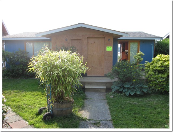
It was a rare, sunny and gorgeous day here in Vancouver last Wednesday at 7:20 am, when I hopped on the ferry to Gibsons to see my clients Sandra & Michael. I decorated their home 4 years ago in Richmond. They have fallen in love with this little town on the Sunshine Coast and found the most adorable cottage which is under a complete renovation.
I suggested Misted Fern CC-668 with white trim and she loved the idea. Sandra is so much fun! Later when she found the colour chip with the muddier colour she threw it on the floor and stomped on it. I adore my clients.
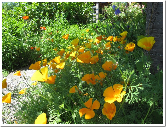
 This is the view from their balcony
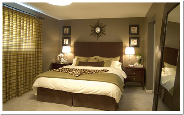
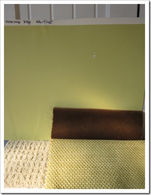
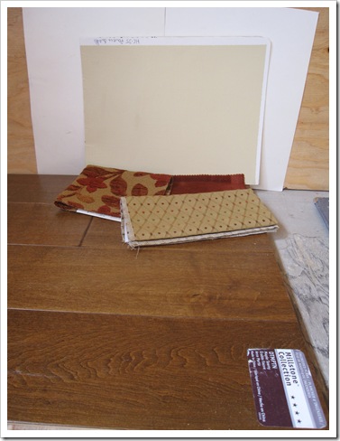
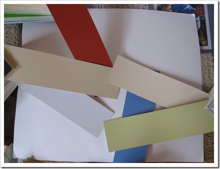
I still had the fabrics from that job so I brought them with me that day. First we selected 2146-40 Pale Avocado (above) to go with the bedding and headboard but then when we went through some drapery books to find some new fabric for the windows found this one from Robert Allen (YoungLove – Tarragon), so we tweaked the colour to Fernwood Green 2145-40 (below):
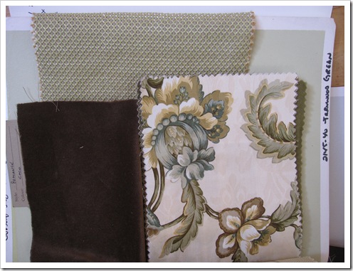
The pillow sham fabric had two tones of green in it. Right above it looked great with Pale Avocado but it also worked really well with Fernwood Green when we found this new pattern with the cooler greens. Love my big samples, very hard to see colour without them that’s for sure!

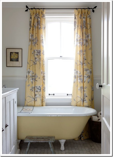
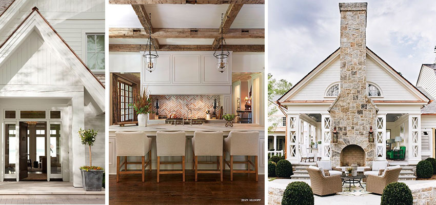
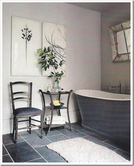 This is the wall colour Sandra wanted for the master bathroom! (pinterest)
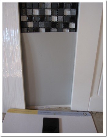
The plan was to install 8 x 8 white tiles on the floor with this little black 2 x 2 insert. Michael liked the black/gray and white mosaic accent tiles and we had a discussion about stone countertops and whether they were necessary. Since they were running over budget already (who doesn’t on any reno) I suggested a laminate countertop instead so they would have extra money to create a look and a feel with their furniture and main living space. If I had to choose, I would always go for a wonderful and decorated living room over stone countertops.
The final decision to install stone or laminate should be based on your neighborhood. If you live in a high end area where home buyers expect to see stone countertops then that’s a good argument for having them.
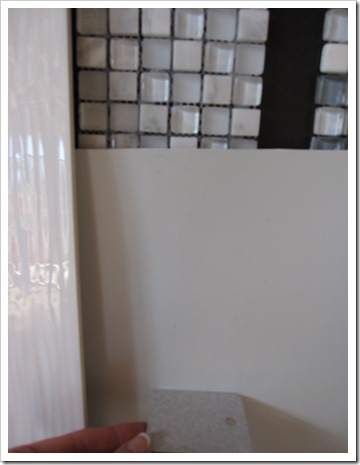
Here is the laminate countertop I suggested. Then I turned the board around to this lighter carrara, glass and white mosaic accent which Sandra loved already and Michael (happy that we nixed the stone) agreed. And I’m always quick to minimize an accent tile which stands out too much (but you already know that :). The wall colour is Wickham Gray.
For the guest bathroom, we selected alternating white and yellow 8 x 8 tile with a yellow laminate countertop (similar yellow as this bathroom above).
 Interior Design by Maria Killam
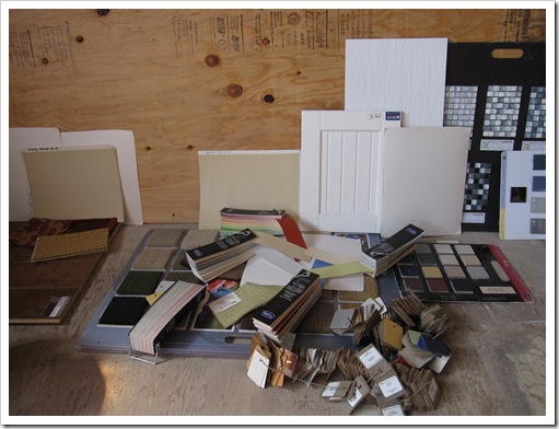
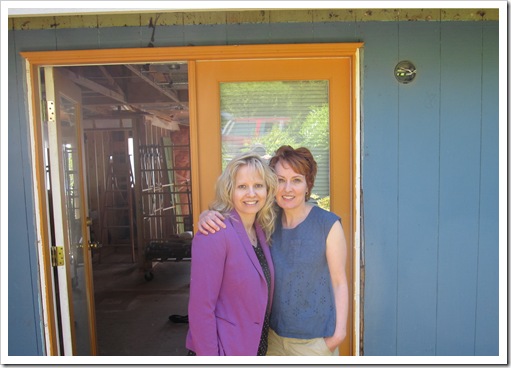 Maria & Sandra
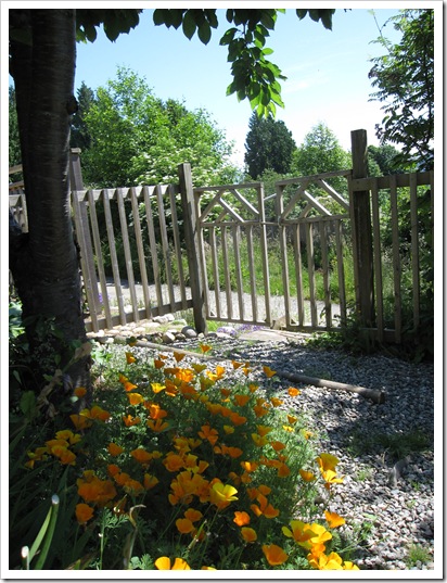 Gibson photos by Maria Killam
Related posts:
Which Hardwood Floor is the most Timeless?
Is Hiring a Designer a Luxury or Necessity?
The Best Exterior Trim Colours; NOT Cloud White
The 80/20 Rule also Applies to the most Popular Paint Colours
If you would like your home to fill you with happiness every time you walk in, contact me


Great job Maria!! A view for me always!! A terrace even small,can be made really beautiful!
xoxo
Karena
Art by Karena
Come and enter my fashionable Giveaway!!
Great job Maria!! A view for me always!! A terrace even small,can be made really beautiful!
xoxo
Karena
Art by Karena
Come and enter my fashionable Giveaway!!
A view. It doesn't need to be weeded and watered and mowed.
Love the mix of colours Maria, and how you repeated the red from the couch on the front door and powder room.
Great idea to go with the laminate, most designers wouldn't have mentioned that option.
That colour/finish selection was a LOT of work, but I just know it'll look fabulous, hopefully you'll be able to post the new pictures of the completed work 🙂
Well, that's why we moved all the way form vancouver to the Maritimes… We moved here because we could actually by a house that would be millions of dollar in Vancouver, but for so much cheaper here. We got the view (waterfront) and the gardens, and the house. But I still miss Vancouver so much! call me crazy!!! LOL
Anyways, I love your pictures and your picks. Great choices here.
Have a blessed week, Maria!
xo
Luciane at HomeBunch.com
What a beautiful property!! Great advice, Maria, and I can't wait to see it when it is completed!!
Nicely done, as always! I love Wickham Gray, especially in bathrooms 🙂
Maria,
This looks like such a fun project in a lovely home. Since I've had both a garden with a view it is hard to choose, but I will choose garden because I love to work with nature. Have fun with this!
Bonjour!
You have such a creative eye!
Beautiful blog and great posts. We are thankful to have stumbled across your blog.
Check us out too please 🙂
http://chezjolly.blogspot.com/
Jessica & Holly
Gibsons is so quaint, and this reno is going to fit right in, but in a stand-out way! If I had to choose, I would pick a view every time 🙂 Love your choices Maria, and I think my favorite is the red door. What a great way to create flow…