Recently I was in a lovely home in West Vancouver for a Colour Consultation. My client’s home was such a perfect example for a post, I asked her to send me a photo when the painting was complete.
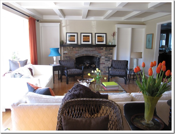

The colour in this room was a bit too pink for her (above) so we picked a new one. We didn’t change the intensity, just went from a pink undertone to a green undertone with Revere Pewter HC-172.
She also wasn’t sure of the colour she had already selected for the dining room (she was taking the paper down) and wanted my opinion there (below).
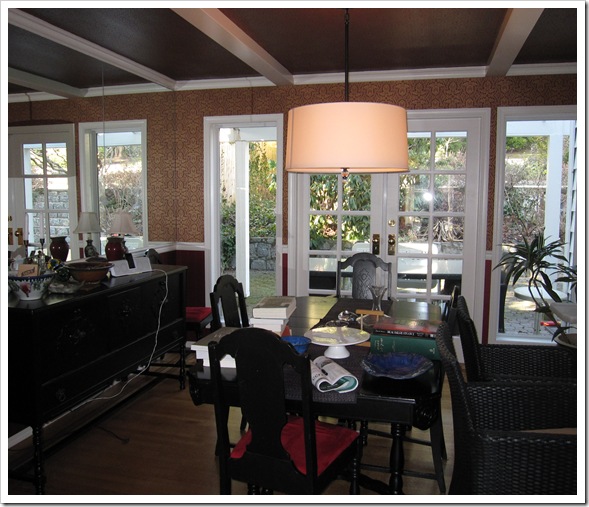
The wall (above the chair rail) has a wall to wall mirror. I now have the ‘after’ picture of the dining room with the colour we chose but I would like your opinion as well, on which colour you would paint the room. I will post the ‘after picture’ on Friday to show you what I specified with the name of the winner (randomly chosen).
The winner will receive the umbrella from my Colour Marketing Group Conference (even though it rains a lot in Vancouver I don’t use an umbrella, I just duck my head and run :).

It’s black with this logo on it and it even has a light at the end of it so you can see where you are going (batteries included).
To qualify please:
1) Click to follow my blog (on my sidebar on the right)
2) Post a comment with your recommendation for her dining room (if you already follow my blog just leave a comment).
Keep in mind that my client will be installing the same orange drapes in her dining room when it’s complete.
Related posts:
The Right way to Create Flow using Colour
Pssst. . . It’s a Secret [for colour lovers only]


Oh it's so nice to me to be the 1st comment! love your blog and i'm a follower from before… This is The most pleasent thing in blogs i've recently touch with!
Soo… 🙂 about the color..i think maybe it's something with green-calm green..but don't know how to show you the color that i think is your chouse
I was thinking maybe you used the green understones in the pewter paint & went with an actual green??
i've been a happy follower for a while now!! 🙂
xoxoxo
hm, tricky. seeing as she liked her neutrals, i'm going to guess another shade of beige, perhaps somewhat darker? maybe nantucket gray? of if we're going a little more wild, perhaps she'll pick up the turquoise from her lr and bring that into the dr. that would look lovely with the chocolate browns. wedgewood gray, perhaps? or really crazy, maybe seaside resort? hard to tell without matching the colors to the lighting in the space…
Can't wait to see what you chose!
Hmmmm, not sure… initially I was thinking just the same color, Rever Pewter, but I'm not a professional so I kept thinking… Maybe a shade of that beautiful blue found in the living room?
Again, love your blog and love this little game. 🙂
I wish I had my BM color deck but it is packed away since we are living in s transitional place. My guess is two fold since I just started reading your blog and I am not sure if you feel curtains should blend, so if you do I would think you might choose an orange paint color to go with the curtains OR one step darker of the Revere Pewter to keep it transitional.
I would love to see a buttery yellow. Don't ask me why, I just feel the room needs some sunniness( I don't think that is a word!)
A pretty blue. I'm family can I enter? I need a new umbrella. 🙂
maybe cc-276 ?
Oh Maria, I don't have enough info for this, so I will disregard the blue lamp shade for my first pick.
(Is blue her accent color?)
Anyway, with the BM HC-172, I like Fieldstone 1558 for walls and paint the ceiling the HC-172.
OR, If blue is her thing and she wants more color, use that wonderful Cascade from White Fish.
( by the way I love that you took a picture of that building with my car parked outside, I am just wondering how it got way up there)
Not easy to visualize the space, but If the dining room has almost no walls I would probably go with the same hue of the curtains, it would be fun and more vibrant.She obviously loves that colour.
I don't have a suggestion for the dining room, but had my old bedroom painted Revere Pewter and it was beautiful.
Porter 515-5, Stonehenge Greige would be a nice complemetary color from Porter's new color wheel.
SW7032 Warm Stone is also a good compliment in an updated color pallete from Sherwin Williams.
SW7046, Anonymous and SW7045, Intellectual Gray would both be great new greens that would be a lovely contrast and add sophistication.
BM? I guess HC101
blue dining room!!! like a baby blue well a really light blue bc i love black furniture in blue roooms and its so relaxing when ur trying to eat ur breakfast and ur all realaxed. or she can head over to my blog and pick a mural out!!!
turquoise!
I am not certain how these rooms flow. But it must have a green undertone. A green could be fun and refreshing.