This weekend I consulted with one of my lovely readers in Seattle when I was there! She emailed me a few weeks ago and asked if I ever come to Seattle, and this weekend was it!
 First 4 Photos by Maria Killam
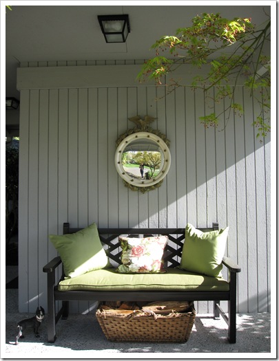
This is the wonderful vignette that greeted me when I arrived so I had to take a photo to show you! My clients are completely renovating their house, moving the kitchen from the back of the house to the front where the view is (below). It’s very exciting!
The hardest piece about any renovation or brand new house is deciding which direction to take on. . . well, everything (especially when you are starting from scratch). What colour are the countertops? The cabinets? The flooring? What colour should my furniture be and then how do I pull it all together with the right colours so I have flow throughout my entire house?
The entire exterior of this house is going to change to a more craftsman feel. Even the power lines (above) are going underground so they don’t interfere with the view. My clients had decided if they were going to stay instead of move, they wanted everything done right!
The siding was going to shingles and she was considering a semi-transparent stain until I confirmed that the maintenance would be too much work (re-staining every 4-5 years if you’re lucky).
She had actually matched a colour she liked on a house she had seen to a paint chip and painted up a large sample. Then when she held it up against her existing colour she worried that it was wrong.
Why? Because it (HC-105 Rockport Gray) just looked muddy and ugly next to her existing colour (HC-165 Boothbay Gray). Everytime you compare a muddy or muted colour next to a cleaner colour, the muddy colour looks ugly. This does not mean it’s a bad colour, it’s simply that you don’t have a context for the new colour because you are still comparing it to the old one.
I confirmed that it was a great colour for her new house and that her first instincts were correct (which they often are unless it’s not our area of expertise, that’s when we usually second guess ourselves!).
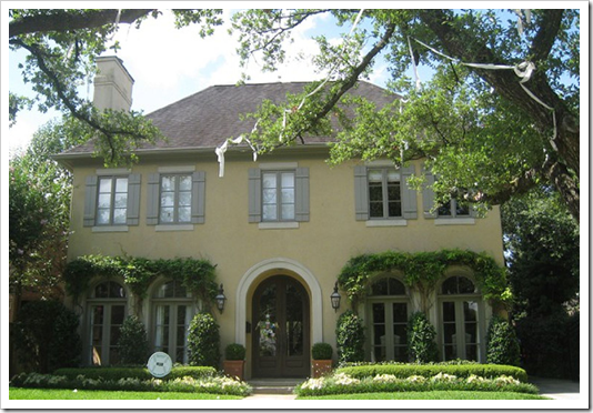
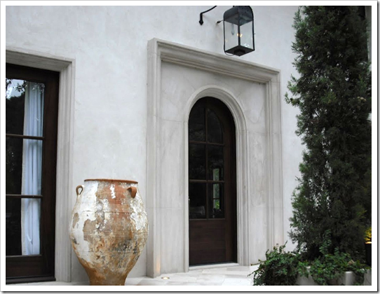
I recently consulted with another client on her exterior. We chose 2 colours, a much lighter gray (second image below) than her existing colour which was muddy and dark (she hated it) and a yellow beige (directly below).
Later she emailed me and reported that the first one looked blah and boring (which it would compared to a much darker colour) and the second one looked like a bumblebee (which would happen comparing to the existing dark, muddy colour).
However she confirmed that she had also painted up large samples and walked around the house holding them up to the existing colour.
She lost all confidence in my advice as anyone else would have as well. I had failed to advise her (in advance) how to test the colour so that she could see it for what it was.
Just because I have helped you choose a colour for the interior or the exterior of your house doesn’t mean you are going to like it when you see it up on a bigger sample or that I can predict every time, how the light is going to change it.
Therefore, as arduous and painful as testing colour is, hiring me is not going to save you from that angst (sorry). Hiring a professional will however, give you the confidence to move forward with your colours, renovations, decorating plan for your house, etc. Testing is just a necessary piece of getting the colour right!
When this happened, I realized I have not been consistent in advising my clients on exactly the steps that are required to test colour properly (especially on top of an existing colour)!
So, here are the steps to seeing your colour accurately and knowing if it’s right for you and your house:
1. Buy a quart of the colour you are testing.
2. Paint up your new colour on a minimum 5 ft x 5 ft area, preferably beside the window trim so that you see it in context with your trim colour.
3. If you can’t confine the area to in between the edge of the house and a window (for example) and you can’t force yourself to stop comparing then it’s better to actually paint a 1-2 ft strip of white around the test colour so that you stop visually comparing it to the existing colour.

The only way to avoid this process is to walk up to a house you like with the same trim and the same siding and match the colour to a paint chip. Even then the lighting should be the same (eg. North vs. South), the roof. . . it’s harder than it looks!
If you would like help creating a beautiful and classic exterior, we have exterior consultation packages available here.
If you would like to transform the way you see colour, become a True Colour Expert.
Related posts:
Effect of Natural Light Exposure on Colour
5 Steps to Choosing the right Exterior Colours
Should your Interior Colours flow with the Exterior of your House?
Insider Secrets to Testing and Selecting Paint Colours
New to this Blog? Click here ; Subscribe to my Monthly Newsletter.
While you’re here, subscribe to this feed so you don’t miss out!







Love your first lovely image and then had to just laugh at "the how NOT to test color!
Karena
Art by Karena
New app is called ColorCaptureBen and is free. Here's the link
apple.com/iphone/appstore
and also a brief article on it
http://www.nytimes.com/2009/05/21/garden/21apps.html
and no I haven't tried it, but I bet I will! Thanks for the heads-up.
Hope we will get to see the Seattle house when it has been completed. Lighting also makes a tremendous difference when choosing fabric. It amazes me how different a swtach will look in the store as compared to what it looks like once I bring it home.
This is why YOU are the expert! Never realized there was a template for testing exterior color.
Studying gardens throughout Europe I realized their beloved colors wouldn't work in Georgia, USA. Light & soils too different.
Clients ask questions I have to answer, "We aren't there yet."
Designing is a template & installing is another template.
Garden & Be Well, XO Tara
What a wonderful post! You are so right about advising clients to test the color … and how. Thank you!
I've used the new iPhone apps; there's one for Sherwin-Williams and one for Benjamin Moore. Here are links to my thoughts!
http://www.tracizeller.com/blog/post/paint-smackdown-theres-an-app-for-that.aspx
http://www.tracizeller.com/blog/post/just-call-me-sherlock-holmes.aspx
I downloaded the app last weekend but I haven't used it yet ! I'm kind of excited about it though.
Awwwee.. I wish you were swinging by Cleveland soon! I really want to paint the front door and change the bubble awning we have out front to a more dramatic color scheme… yes.. it is a bubble awning, came with the house.. we think it is charming so it stays!
Another informative post! Thanks Maria!!!!
I'm so glad your client is going to have the power line buried, as that is the first thing I noticed when you showed their amazing view. I love their house and garden – can't wait to see the changes.
That picture of how not to test colours is too funny.
Exterior Colors are SO hard! I have been putting off repainting my own house because I just don't want to deal with making a decision (and possibly the wrong one!)… your advice is great. It's so hard to just look at a little paint chip and think you have an idea of how it will look. I think the Rockport Gray that your client is using is gorgeous by the way!
I love the painting advice. I'm sure she was comparing every color to her darker one instead of just looking at it on its own in the grand scheme of things.
Lila Ferraro
Queen Bedroom Sets
I have the "Ben Color Capture" app… well, I've tried to "match" several wall colors I've seen, and it just does NOT work very well. Saw a wonderful yellow at a doctor's office (of all places…) but couldn't begin to get it with the app. Disappointing. It's fun, but not really useful….
The iphone app is okay and depending on the lighting can come somewhat close. Great app in theory doesn't nail it though.
Yes, you're so right. The Rockport grey is a very good choice indeed especially since they are going craftsman. What color did you specify for the trim? The existing white is very stark.
A trick I have learned along the way to really "see" a color is to look at it out of the corner of your eye. For some reason it works.
Great post Maria. I don't have any luck with the Ben Moore iphone app. If there is any shadow (which there normally is), it always picks a gray colour – not even close to the real colour.
Great advice. Curious about that app too, but color on a house or wall and color on my computer screen always look so different!
Thanks,
Sue
The apps for color are toys. Good for playing around with color, maybe for looking up a color name or number or whatever, but color apps should never be used for any kind of serious color searching or matching.
One part of the art of Color Management is getting color out of the additive space and into the subtractive with accuracy; so the colors are so similar the average person would call it a "match". For example (in normal language), from what you see on your monitor — or screen on your phone — on to a piece of paper or into a gallon of paint. That kind of achievement with color is kinda a big deal and it is usually beyond the abilities of the average person using basic, every-day equipment.
I guess that's my biggest point of angst with the apps. They market them like they are some kind of a reliable tool or effective color solution. They are not. Syncing up the two spaces of color, additive and subtractive, takes some know-how. It is just the way color works right now. Some day, who knows, but for now the color you see additively on a monitor or a screen is not just magically a "match" for the reality of subtractive color that exists outside those light emitting devices.
The whole app thing is kind of fun, but that's about the extent of it.
Tried the app, deleted the app. Doesnt really work at all.
Love the way you explain the colour process. Exteriors can be hard to nail. Lately I'm bored seeing the same neutral house colours… house after house I drive by.
I love it when I see a nice crisp dark blue, the deep reds, charcoal grays and fresh greens with lots of white trim.
Your project in Seattle looks awesome. How was the shopping? 🙂
Susan
This advise is awsome and I guess, when the time comes (hopefully soon) to find new paint for wall and trim in our house I will surely consult you first!
XX
Victoria
Good topic- and timely.
I've had the best luck finding other homes for inspiration, but you are right- the directional light needs to be similar for accuracy.
Those sample boards are soo important.
-Ann
Will you have a look at my recent post? They are doing exterior colors tests for a nearby new house. I caught them in mid-test they are trying new colors.
Anyway I'm glad I don't have to choose. I'd always hire a pro to pick colors. A pro will tell you why and sell you, know how to test and know how to tweak to bring it all together.
Here is my paint testing post: http://tinyurl.com/ybrrf9d
Whenever I'm selling paint, I always suggest that the customer go down to the office supply store and buy a large foam board so they can move the color all around the area that they want to paint. It keeps them from coming back for several quarts. The most I've sold one person is 25 quart samples, then she finally hired my wife for a color consult. Wife picked colors she had already tried, but presented them correctly.
The HGTV shows do not help the DIYer a bit when they show them smearing s spot onto the wall and immediately asking the homeowner what they think. They might as well just look at the color in the can.
HI Maria!
I ran into a problem like this with a friend who was adding a new addition. She hired an interior designer to do all the design/color but had me walk by to give my two cents on the exterior. I was greeted with tiny brush outs on the exterior of the new addition. It's no wonder they had trouble visualizing! I said, expand, expand, expand onto large boards. They didn't take my advice and were surprised and disappointed how different the color was when they painted the house*sigh*. They're stuck with it now until they can repaint in a few years.
OH, I have the IPhone BM app. and it's just not very accurate or useful I find:(
I love, love, love your blog!!
What are the colors on the yellow beige house in the post?
the "how not to test color" image is a hoot! thanks a bunch for the tips. you know i devour your advice 😉
I love your blog & recommend it to many folks on GardenWeb.
I'd like to pass along a tip for folks who want the look of stained shakes, but not the upkeep. Nichiha makes a fiber cement product that comes in about 10 colors of transparent stain. The upkeep is the same as other types of fiber cement & installers seem to like the product better because it is thicker.
We just broke ground for a new home in Upstate SC & will be using Nichiha Sierra Premium shake in the mahogany color for most of the exterior. We chose the color by going to our wooded lot with several samples and propping them against different trees to see how it will look in the natural setting we are trying to maintain.
My mom used to say that, a home is not just where you live, but where people understands you. However, my wife and I are not on the same page when it comes to remodeling our home. We are reconstructing our living room for 2 weeks now. I'm planing to adapt a minimalist design. I don't want it to look very busy. My wife, on the other hand, wants to put a lot of things in the area- like the book shelves, piano, pictures and so on and so forth. We are trying to work things out and we'll probably meet half way. In spite of our differences, we agreed on what to do with the sidings. The siding contractors (Minneapolis based) that we hired are doing a tremendous job. They installed the vinyl sidings. They also fastened the vinyl strips into our exterior walls by interlocking flanges. It was awesome. However. As to the color, we are still working on it. My daughter tried the Color Change apps in I-phone. It was great! It has a magic selection tool for automatic area selection. Definitely a must-have for interior designers and D-I-Y decorators!
Hi Maria, I am currently experiencing all the problems that you and your loyal followers have identified. Finally painting our exterior, thought I knew exactly what I wanted but its just not working! Painted big boards, big patches on the house and the colour just keeps changing. Help!
Raised Ranch. Lower level is stone (with greys, red, gold, taupe tones), upper level is vertical wood paneling – red closest to CC122 boxcar red. I thought I would channel brick/concrete/black houses and when I replaced the windows, chose a grey/beige to disappear into the stone (closest to HC105 Rockport Grey). The challenge…what to use on shutters, front door and garage door. And how many colours are too many? Black too harsh, want more monochromatic. Have tried CC540 Stampede – swatch looks perfect, but depending on the light and what it is next to, looks either: perfect, green or gold! Any thoughts? I can send photos, set up a consult. Do you have time? Painters coming tomorrow or Wednesday!
[email protected]