It’s exterior and renovation season! I have been analyzing countertops, cabinets, tile, and exterior colours with so many of you for weeks!
Two years ago in the summer, I launched 37 Days of Undertones, and it was a big hit. Every day, I would post an image on my Facebook page and tell you the undertones in the colours. You all participated and did so well because you’d read my first ebook and knew what to look for.
Now that I have a white ebook, too, we’re going to do it again, only BETTER. Remember how you got the answer right away last time? No more, friends. ; )
This time, I will post an image on my Facebook page every weekday morning starting Monday, April 20 (5 days a week) until the end of May, and it will have beige, grey, or white as its dominant neutral. You’ll have an opportunity to guess the undertones throughout the day, and I’ll post the correct answer at the end of each day. Make sure you click like so you’ll be able to see the feed and participate.
Who’s ready to test their colour confidence?
This way, I’ll be teaching you how to fish instead of just giving you the answer immediately. You’ll need to have both of my ebooks to understand what I’m talking about! Many of you have the books already, and thanks so much for buying my work! It’s the reason I can continue to help you here on my blog and through all the work I do.
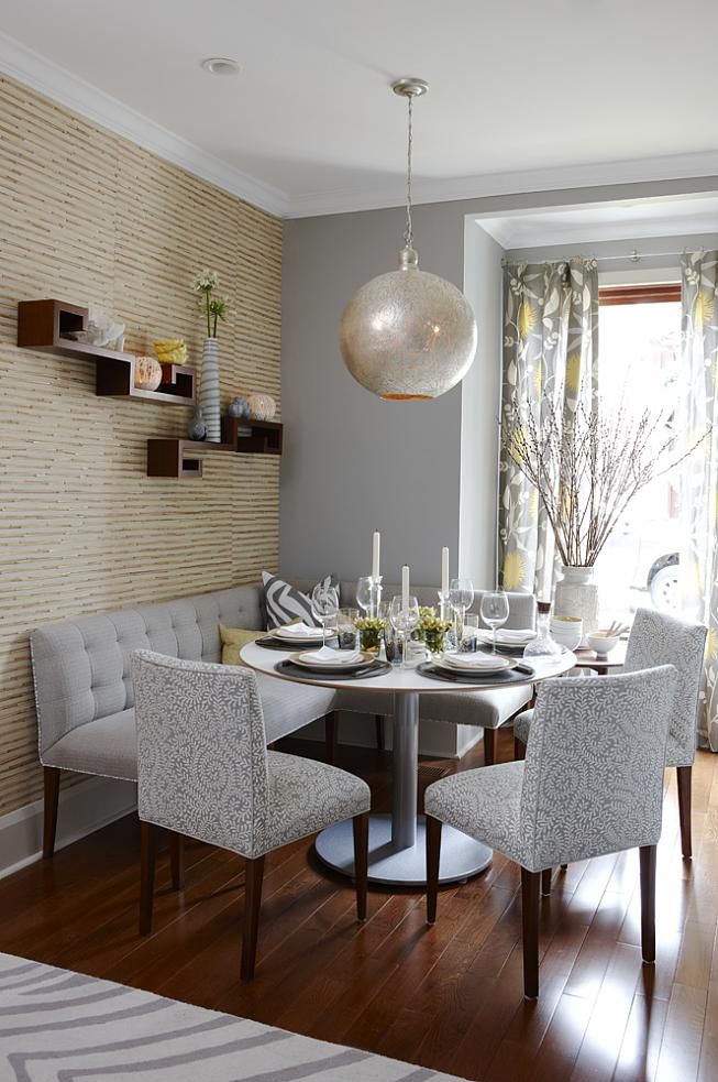
For example, the image below is yellow beige and blue grey. The trim and the ceilings are blue white. This one is interesting because you can see that the white is technically a little stark looking against the yellow beige wallpaper, and yet perfect with the grey. An off-white would have been great with both.
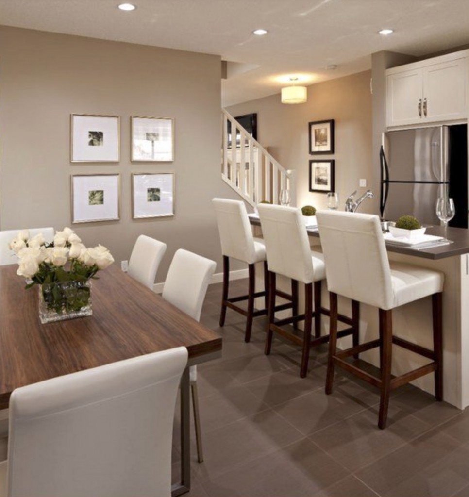
The tile floors below are a very strong and dark pink beige, and it looks like the walls are also a pink beige (although not as pink as the floors, making them appear slightly green beige depending on how you look at it). The kitchen and chairs are all cream, as they should be with such an earthy colour scheme.
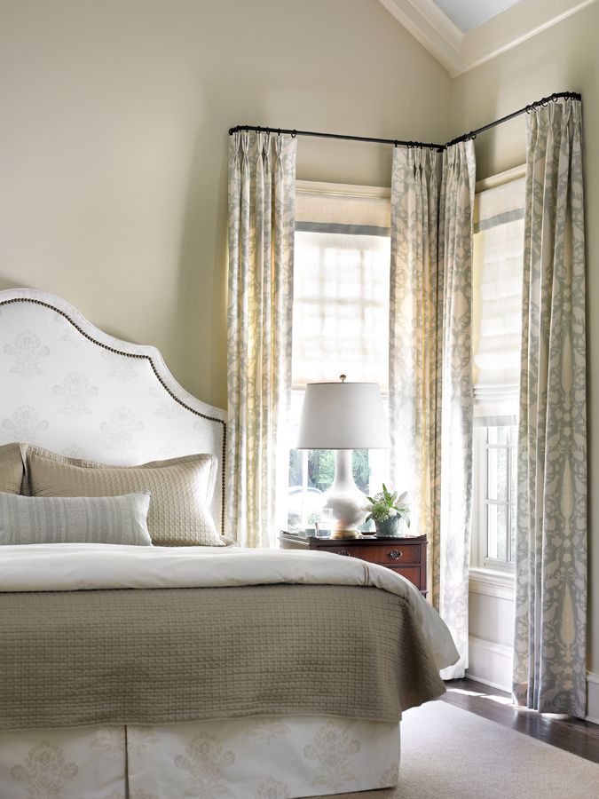
Below are green beige walls, which look great because they relate to the coverlet and pillow shams. Also notice the off-white headboard and skirt, cream trim, and cream repeated in the drapery.
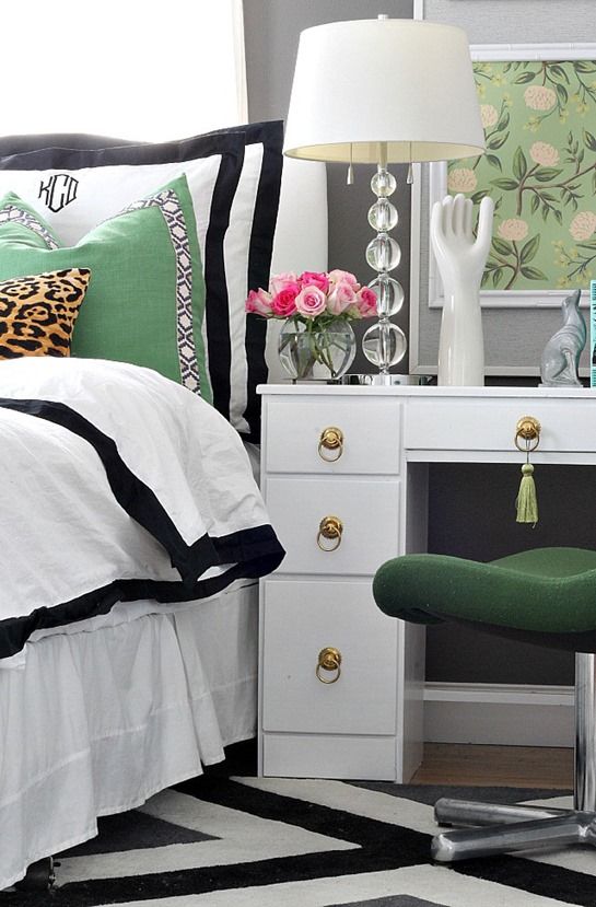
Below, notice how the desk and bedding are white, but the carpet is off-white and black? That’s fine, especially on the carpet where pure white is harder to keep clean. Even if this carpet had more cream in it, you could use it because it’s on the floor. The glimpse of grey you can see here on the walls is a blue grey.
If you need to brush up on your beige and grey undertones as well as whites, you’ll need both of these eBooks, you can download them here.
My exterior on-demand, on-line training webinar can be found here.
This training comes with my go-to exterior colours, which will narrow down the thousands of colours available to just a useful few.
Here’s what Dawn said about the training:
“This was amazing! I learned so MUCH! I love that you added Sherwin Williams colors to the bonus books and the training videos.
Thanks!P.S. We are soon to be replacing our roof and I was planning on doing a charcoal/black, but since doing this training you’ve got me second guessing, since we do have a lot of roof ;-)”
Need the perfect cream or white for your exterior? Find it here in my training.
Need just the right gray for your house or a door? I’ve got a curated list for you to chose from:
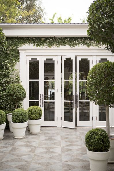
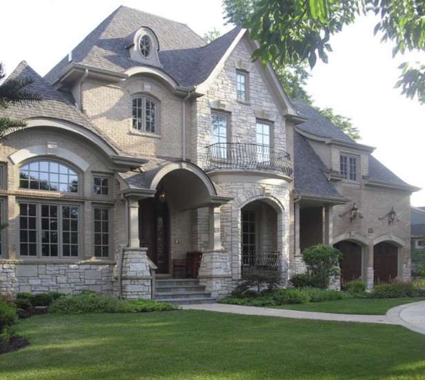
Need to know how to choose the right stone or brick for your exterior? I’ll teach you exactly how to do that, so you get a house that looks like this…
…and not like this.
If you are renovating or building a house this year and need a step-by-step plan, you’ll want to watch these videos at your leisure, in your PJs, to make sure you end up with a plan that is beautiful, instead of one that’s full of mistakes. Download this training here.
Here’s what Anna said about this training:
“About a year ago my husband and I were looking at replacing our existing counter top with granite, and changing our back splash. I had no clue on what colour of granite because we have “Oak kitchen cabinets”. Anyhow, we were looking at a granite with colours that had yellow, chocolate brown and cream in it. I think it was called giallo, and a glass mosaic tile that were squares with colors of chocolate brown and cream, what a mess that would have been!
I was going to spend $7,000.00 on the whole thing, and remember the sales person saying how good the two would look, until I came across your blog and took your webinar last year and this year and stop immediately after listening to every thing you say. Classic and timeless this is what I wanted for my house. We are now looking at subway tile with a quartz counter top in off-white or cream colours. Thanks to you or we would have messed up the whole thing. And $7,000.00 that would have looked like a mess. Thank thank you so much.”
For example, I came upon this image the other day:
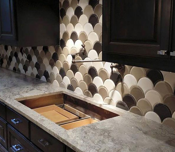
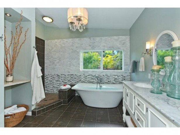
So if you are renovating or building a house, there are questions you don’t even know you’ll be asking right now that I will answer in this training.
It might not not occur to you to even question a decision you’re about to make until it’s installed and you are not happy.
Here’s an email from Joan:
It’s wonderful to have Maria’s advice and guidance in a central resource.I found Maria’s blog just in time to make smarter decisions in our renovation, and I worked with a wonderful color consultant in the local Benjamin Moore store who absolutely knows about undertones and was able to guide me away from ones that were–subtly–wrong. I can’t thank Maria enough for explaining what to look for and how to ask the right questions and properly test for choosing color all over our house, and for explaining both how to work with fixed elements and how to choose new fixed elements that we can live with no matter how our decorating style might change.Please pass on to Maria how amazing her writing style is–everything she wants to teach us is clearly described and illustrated, and she always includes, “…and this is why….” With humor and personality. Thanks to her teaching, I think we’ve made our house flow with individuality and elegance, and I now understand why other spaces often strike me as hodge-podge because of my color sensitivity.Best wishes to Maria, her staff, and her business–with enormous appreciation!Joan
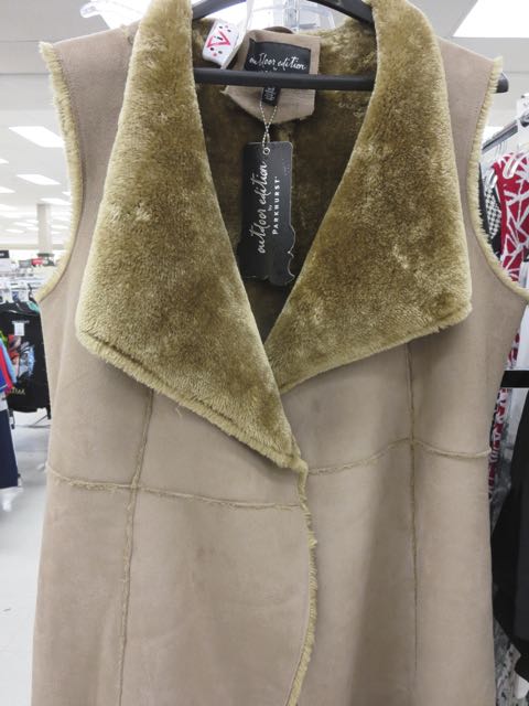
To wrap up, let’s do a little preview of this undertones game right now! I snapped this in a clothing store because it’s just a classic example of what NOT to do in home decor.
How would you describe the undertones/colours in this vest?
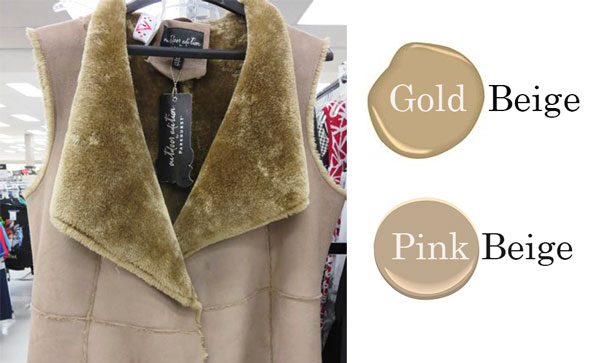
The answer is gold beige and pink beige. Most of you thought it was green beige and that’s because gold beige looks green (instead of orange). So it’s a tricky one!
I’ll be in High Point this weekend! Stay tuned for some updates on trends!







Fuzzy stuff is green undertone, unfuzzy stuff is pink undertone.
I agree! And, sadly, it’s exactly like a vest my former mother-in-law once gave me! I returned it for something much better….
The collar is green and the body is pink.
That’s how it looks to me, too.
Love this post and can’t wait to play along at home.
I’d say the suede is pink beige and the fur is yellow beige. A definite no no!
i believe that bedroom is actually from emilyaclark.com, it’s Emily’s mater bedroom. It also would be helpful if you’d provide a link to the actual post you’re referencing vs. to the blog in general. It’s like finding a needle in a haystack to find the original image.
Correction: http://bliss-athome.com/2015/02/26/bedroom-makeover-reveal/
Thanks Shelley, duly noted!
Pinky beige and greenish gold.
Pink bodice and yellow collar.
You must have been reading my mind. I have all white furniture (including two love seats) in both my living room and my office/den. I am wondering what colour area rug to go in both (wood floors are “cardboard box” colour… rugs I’ve looked at that have a bit of “white” in them look too cream. I had thought of a fairly neutral, lightly patterned Dash & Albert rug which blends in with the floor and has the perfect undertone to go with the floor, and then to use colourful accents such as citroen, cherry red, and maybe navy for cushions, etc. What would you advise for the rug…go neutral or go colourful??? I’m not sure I can live with a white that is really cream in a rug…and was thinking either a neutral that blends in with the floor or a solid colour that pops. I also really like the indoor/outdoor rugs I’ve seen which look ‘casual’ yet not too outdoorsy.
The fuzzy stuff is green beige and the main part is pink beige. what a mess!!
Thank you for training my eyes to spot the difference. I apply to everything. Will be doing a color consult today. Thanks to your boards I will have no problem.
The fuzzy stuff is green beige and the main part is pink beige. what a mess!!
Thank you for training my eyes to spot the difference.
Vest body undertone is pink beige; collar undertone is green beige.
Inside fur side is green beige and suede is pink beige.
fuzzy green undertones and pink undertones
green undertones and pink
green undertones and pink
Fuzzy stuff is green beige and smooth is pink beige
I would say pink beige with green fur.
Green beige collar, pink beige body. Hideous.
Pink & green. Usually I’m guessing but this one I’m positive on. (I think.)
Hello Maria,
I’ve been reading your blog for a few months now and bought your two e-books. I must say that you’ve completely changed the vision I had of colours. COM-PLET-LY. Now I know what’s been bugging me in my house, and I know what to do about it! Thank you so much for taking the time to educate us.
Do you intend to publish your book in french some day? I know a few french speaking persons in my family who would greatly benefit from your wisdom 🙂
Your new loyal reader,
Cyntia
bottom is pink-beige et de collar is yellow-beige
I see pink undertones in the body and yellow undertones in the collar.
Green/pink…ugly and wd be totally unflattering!
Of course it is green-beige and pink-beige!!
I loved the series last year and am looking forward to the one this year! (I better get both my books out and “study” before Monday!) 🙂
I looked at it again and now think it might be yellow-beige and pink-beige (because green-beige is what you use with pink-beige)
The main part of the fur looks green but if you look at the edge it looks yellow.
Pink biege and green. I don’t think the fur is biege. It’s green. Green makes pink biege look even more pink. That’s my guess 🙂
Yellow green btw
Maria, the discount code is not working for me ???
That vest looks dirty pinky beige to me.
There’s so much value in providing guidance in picking exterior colors. Painting the outside of the house is SO expensive. It’s not like choosing the wrong color for an interior room. The whole neighborhood can see your mistake and you know they’ll be talking about it behind your back!
I tried both codes …spring 2015 & spring 2014 ???
spring2015 worked for me (no spaces)
Collar: green beige
Faux Suede: pink beige
Gold beige and (very) pink beige….
Pink beige outside and moss green inside. Moss green is a dirty colour, a brownish green, and since green and pink are colour complements it makes each of them look even worse.
Pink beige faux suede
Green beige on the fuzzy stuff, but the edges look a bit yellow beige. Hideous!
Wow, that vest. I can’t unsee that! Gold & pink. Excited about the undertones game, it’s always very helpful! -Jill
I am picking up a goldish brown with slight yellow hints in the faux fur and the faux suede outer jacket definitely has pink undertones.
This is exactly what they had done in the house we purchased 2 years ago. I had to repaint every room!
Ever since I found your blog and website, I cringe every time I see pink undertones in furniture, tile, etc.
We are now in the process of renovating another home and my husband picked out a tile with pink undertones that he thought was amazing and could not understand why I didn’t “LOVE” it too. He totally could not see the pink until I put it up against my Chantilly Lace sample board I made. THANK YOU, MARIA!!!
I also see gold and pink!
Pink beige vest and yellow green collar.
Collar is green coat is pink beige
Pink beige for the main portion of the vest;
Green beige for the collar.
pink suede, green fur
Pink beige vest and yellow beige collar – can’t ask “what were they thinking?” because they so obviously weren’t.
Looking forward to the undertone game. The first one was total fun though I was just starting out. This one should be even more fun because many of us are now armed with knowledge from your courses. Great idea to hold the answer till the end of the day – challenges us all to exercise what we’ve learned.
I’ve got greens and gold colors on my walls. Is it bad that I don’t like cream trim? I like crisp white.
Love the game to test myself. I immediately saw pink & yellow. In reading some of the comments where some saw pink & green; I can see green but I still have to go with yellow.
I see pink undertones in coat and green in fur collar
Maria,
The body of the vest is pink beige and the fur is yellow-gold beige. Thanks for all your posts-love them!!
Maria, I’m having trouble too, with purchases using the discount code in this email. I tried about an hour ago and again just now…..
spring2015 without any spaces. . . that will work.
pink undertones on jacket, and fur has green undertones
Fuzzy stuff yellow ish with green undertone, suede is pinky beige
I wonder if the florescent lights of the store or our monitors are playing with us since some say beige and some green beige for the fur…I see yellow/green beige faux fur with that pink beige vest…
The undertones are pink (suede) and green (fur). I hope you won’t be sporting this vest next winter, Maria!!
Haha, that’s funny!
If you ask me, that house has way too much going on too. At minimum take out that segmental arch curved fascia below the dormer, or the dormer, but don’t have both!
This isn’t the worst “McMansion” I have seen, but you got to know where to stop. At least the colors are harmonious, which plays down its overly complicated façade.
Green undertones on fur, pink beige on vest body.
Fuzzy collar has a green undertone. Rest of vest a pink undertone. Eeeks!! 🙂 this is going to be fun!!!!
The dreaded clash of pinky beige and yellow beige!
Pink beige suede. Gold beige collar
Pink beige and green-brown.
Pink beige suede and yellowy green fur. Question re: the first photo of the breakfast nook. The walls don’t seem to be a very blue gray like Wickham or Coventry…I almost thought they were slightly green gray. I just couldn’t pick up the undertone there. Seemed so neutral.
I say the suede has a pink undertone and the fur collar has a yellow and green undertone.
body of the vest is pinky-beige, while the fur is green-beige. Ick.
My initial thoughts were pink beige and yellow beige however I can also see green in the collar but will stick with my first thoughts on pink and yellow……ewwww….either way it’s not pretty !!
Green undertone collar with pink undertone body? 🙂
Body of the vest is pinky beige undertones and the fur of the vest has yellow and green undertones.
pinky beige and greeny beige.
Also, Maria, do you watch Mad Men? the bloggers, Tom and Lorenzo were talking about the difference between 2 kitchens featured on the show: one, trendy (to the 60s) and the other more classic. I thought of you!
Green undertones in the fur. I get confused but perhaps warm grey with brown undertones in the vest part?
Fur is green/ beige, material is pink/ beige.
Pink beige suede honey gold lining
Green undertone on the fur and pink undertone on the leather. ;0)
Yellow collar with a pink bodice
I see the suede as pink beige and the collar as a really ugly yellow green beige. Kind of awful!
Yellow
Pink-beige and gold-beige – ick looks dirty!
Green beige collar and pink beige vest.
Pink and green under tones
Green yellow undertones on the collar and Pink beige faux suede body
The fur is a greenish-yellow while the body is pinky beige
I’m going to say pink and yellow beige. Whatever it is it’s an awful combo. I’m trusting that you did not buy it.