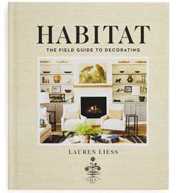
I am seriously delayed in posting about Lauren’s book, Habitat: The Field Guide to Decorating, she said her publisher sent me one last year but I never received it.
So I stopped waiting and bought it myself last weekend. I’ve known Lauren as long as I’ve been writing this blog because we started our blogs around the same time, almost 8 years ago.
Lauren and her husband Dave made the decision to spend the money to decorate their house and showcase it on the blog and doing this totally launched her career.
Just like it launched mine in the world of colour.
I have literally over 100 decorating/coffee table books and I can count on one hand how many I’ve read cover-to-cover, Lauren’s book is one of them.
She has a system and a philosophy for decorating like I have a system for Understanding Undertones of colour. It really is a field guide to decorating. And the whole book is written in the same conversational style as her blog which makes it easy and fun to read.
Of course, designers who are really successful and have been in the business a long time will have a system too, but to find someone who can articulate and teach their philosophy on decorating? That I think, is rare.
Here are some highlights from her book, but there’s so much more, get it here.
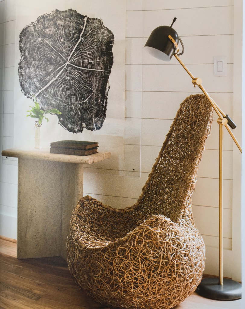
Odd or Statement Chairs
This was my favourite tip and I used it immediately, this past Friday when I was with a new client.
Deborah called me to create a colour plan for her new kitchen renovation and a fresh colour scheme for her entire house.
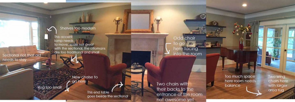
Standing at the doorway of her living room (below) talking about her paint colours, she confided that her husband wasn’t too thrilled with the prospect of re-decorating this room because it was rarely used, so the sectional had to stay and probably the two chairs in front of the fireplace.
Since her area rugs were too small and had to go anyway, I suggested that the tuscan orange chairs be repurposed as well. Better to bite the bullet if the sacrifice is small now rather than build an entire room refresh around a dated colour scheme.
The living room was narrow with a fireplace located directly in the middle of the room.
She had a sectional on one side of the room and the grand piano paired with an antique desk (not shown) located on the other side of the living room. In the middle (because this arrangement now left an empty space in front of the fireplace) she had two chairs facing the fireplace so that when you walked into the living room the first thing you saw was the backs of the two chairs.
Once we planned the new arrangement so the spaces had more balance, (something Lauren talks about in the book when she teaches how to arrange your living room), there was one spot left beside the fireplace and I said “This is where the odd chair should go”. (above)
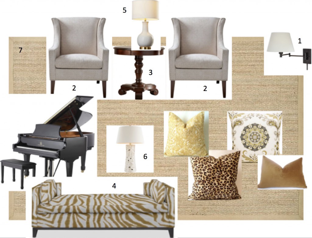
Deborah said her house felt dark, especially this room so we picked out some new lighting. She needs at least 8 lights in this room not to be confused with the existing recessed lighting which do nothing for atmosphere. So if you’re feeling like your house is dark, it’s likely you don’t have enough lighting.
A new chaise across from the sectional, wing chairs across from the grand piano to create more of a ‘piano room’ on the other side and some new pillows and lamps to go with the gold sofa and we have an inexpensive room refresh!
Lauren said odd chairs can often be found inexpensively at flea markets or antique shops so we’re still on the lookout for Deborah’s odd chair!
As Lauren says in her book:
“These chairs are typically not used when the immediate members of the household are present, they often see use during parties and events at which people won’t be sitting for prolonged periods. Not every seat needs to be comfortable enough to sit for hours on end.”
Lauren loves odd chairs like some women love shoes.
Chairs in general I think are often a designer fetish, I have 11 chairs between my deck and my backyard just outside! Crazy I know!
Colour Palettes
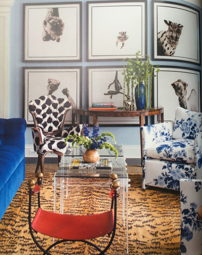
To create flow, Lauren likes a colour palette to be woven throughout multiple rooms, with the repetition of at least one colour throughout , resulting in an overall palette for the entire home. She also adds:
“I like to mix “fresh colors” with “dirty” murkier colors. To me, the interplay of fresh and dirty colors is much more interesting than a room full of one or the other; a space filled with all fresh colors can lack depth, and one filled with all dirty colors is instantly enlivened by the addition of fresh colors.
Here she brought in a bright orange chair combined with the more muted, cognac coloured rug. Just like a bag in this colour, everything goes with it, especially orange, my family room is a good example of bright orange and cognac together.
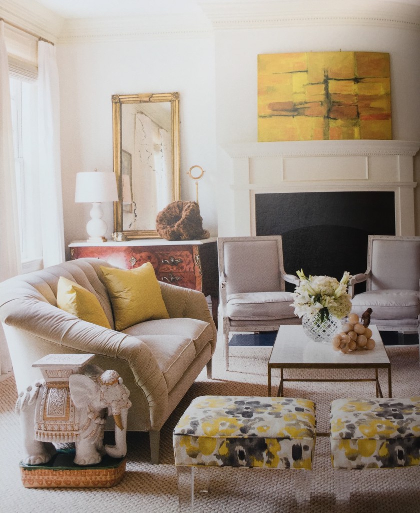
Love this pretty gold and grey/beige living room. The yellow beige sofa is repeated in the natural fiber rug and the green grey chairs is repeated in the patterned ottomans.
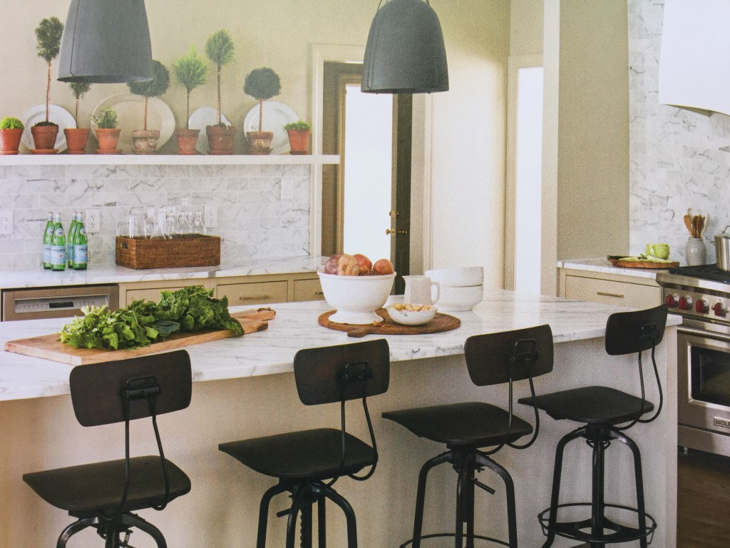
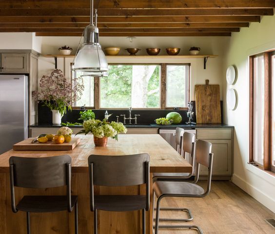
Kitchens without Uppers
Lauren’s kitchens also have a fundamental timeless look and feel. She only designs uppers when it makes sense with the architecture, when there is not enough closed storage in the lower cabinetry or when a client requests it.
I like the way she used the same countertop material for the backsplash here. Because there are no uppers, the window cuts into it and she kept the walls pale, it doesn’t feel heavy. And it totally works with the ‘mountain house’ she designed it for.
In the average house with lots of material, repeating a black countertop on the backsplash looks too heavy so don’t copy this look unless your kitchen is similar.
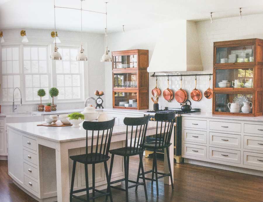
This kitchen is my favourite from her book. Instead of regular uppers, she used antique barrister bookcases and I love how she linked the colour of the wood stain with the row of copper pots, so clever.
TV Placement
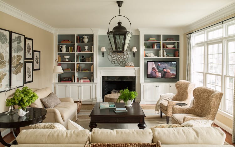
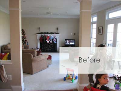
Okay this photo is not in Lauren’s book but it one of her interiors. What struck me about this image in particular when I saw it was the ‘before’ picture because isn’t this what everyone’s great room looks like before millwork?
Keep scrolling, it’s below the ‘after’ picture, I’m just warning you, you might get slightly depressed when you see the before picture because it probably looks familiar!
I have shown this before and after to so many of my clients. Especially when they have millwork that needs to be designed around their television that isn’t going to be right above the mantle.
Interior by Lauren Leiss
Lauren has a chapter devoted to layout and creating balance in a space that’s not to be missed.
Coffee Tables
Lauren says sometimes she will select the coffee table first because it can be a major statement piece. And then she lets the coffee table guide the selection of other pieces in a room.
The look of your coffee table can often make or break a room so this is great advice!
Lauren has created lists of furniture required for each room to help you make your own. You can buy her book here.
Which tips will you steal ASAP?
PS. I frequently receive emails that sound very similar to this one that arrived the other day:
“Do you have a wait list, or a referral list of other senior practitioners of the undertone method who are local to San Francisco? We just closed on a condo in San Francisco in an iconic building and would love to work with Maria, but someone who trained under her would be the next best thing. “
Very soon, it will be hard to sell yourself as a colour expert if you don’t have my training under your belt. The only place to get it is at one of my Specify Colour with Confidence workshops. Find yourself at one of my five courses in Los Angeles, Washington, DC, Charlotte, Tampa or Upper Montclair, NJ this Fall. Register here.
Related posts:
Box of Knowledge (My first blog post October 31, 2008)








When I got Lauren’s book & read the part about mixing clean & dirty colors I immediately thought about you & what you would think about it. Because I thought you had said it was a No-No.
In my class mixing clean and dirty colours is a no-no yes. Because I’m training your eye on getting the combination right. Clean and dirty is one of the biggest mistakes designers make when they choose colour and training your eye to distinguish when something is clean/dirty also gives you a ‘WHY’ when you are explaining to your client why your colour suggestion might be better than theirs.
Like Lauren, I love odd chairs like some women love shoes. With the exception of my living room sofa and two matching club chairs, my home is filled with odd chairs. Mostly Louis XV-and XVI-style, which make me very happy!
Lauren is seriously seriously talented.
It’s a good thing I live across the world or I’d have to have her make over my house.
She is an artist in design and decoration and I admire her work immensely
Lauren’s book is also one of my favorite reads. I’ve been following her from the very beginning and I’m still amazed at how her business and evolved through the years. Such an inspiration and model for so many because she marches to the beat of her own drum.
I’ve been a fan of Lauren’s since at least 2011 and do love her work. That said; agree with you Maria that one cannot have too much lighting and …. chairs … ☺. Loving your recommendations for your client’s new living room and am delighted to see that you are contemplating on using a settee in the new floor plan. (Reason: I’ve been hoarding an antique one for many years to eventually use in my living room as well.)
-Brenda-
Brenda, I love chairs but my newest obsession is antique settees. I have a lovely cream velvet curved tufted one at the end of my bed, and just redid a small camel back one for my kitchen nook in b&w cabana stripe outdoor fabric with a nubby fabric on the outside…So, so cute!!! I love Darryl Carter’s idea on using them at dining tables, in kitchens, etc. 🙂
Love how Lauren decorates, very similar to how I like to decorate. Love the odd chair idea, will check out her book, I am always open to new ideas.
I’ve had Lauren’s book for 6 months and not only have I read it cover to cover, I refer to it constantly for ideas. It sits on the table next to my favorite reading chair and I love to pick it up and just look at the photos- they are so beautiful!
Maria,
You’re right….I am depressed now. This is what I’ve been wanting for my family room for years. My husband insists it will make the room look too small; I never thought to remove the hearth…problem solved. Great post….I’ll be buying Lauren’s book soon!
I, too, have followed Lauren frm the beginning and so agree with her idea of what I call a “funky” chair. So much so that I created a pinterest page on funky chairs and wrote about it on my own blog. Her design aesthetic is so warm and inviting and I cant wait to see what she does next. Thanks for sharing this.
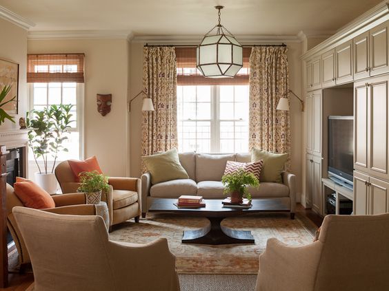
Quick question about that gorgeous “after” living room under the “TV Placement” heading. Regarding the furniture placement, how does the traffic flow into this room? I love the look, but with that large sofa in the foreground, do people have to sneak around the sides to get into the room? Thanks for featuring Lauren’s book – I’m going to check it out. Love your blog Maria!
I love how Lauren mixed the blue couch with the other warm colors in the living room that has the orange chair. I love all the interesting colors together. To me, that is the epitome of beautiful decorating- mixing prints with other prints that are modern, fresh, and colorful, along with solids in such a way that you never get tired of looking at them.
As it happens, I’m reading her book right now! You’re right, it’s full of good ideas, yet I freaked when she talked about mixing clean and dirty colors! But, I’m not having it, just doesn’t look right to me.