From trending green tiles to warm neutrals, discover how to avoid the most expensive renovation mistakes that cause 85% of homeowners stress during their build or remodel projects.
Learn essential colour coordination tools and expert strategies to prevent costly finish selection errors, especially in today’s shifting design landscape where beige has joined the traditional black, white, and grey palette.
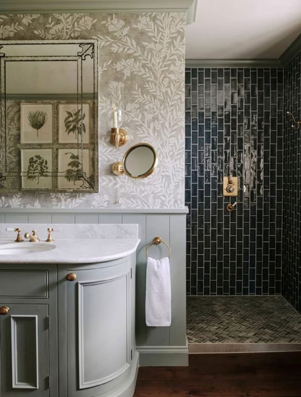
Trending Green Tile
In the last few weeks, I’ve just been looking at green tile everywhere. Is it my algorithm? It might be, but along with the warm neutral trend always comes a trending neutral colour. So, although green has been on the fringes for almost a decade, cognac raced by and took the lead, which is why most people with a new sofa right now are sitting on a cognac one.
While cognac may have sprinted ahead in popularity, green has been steadily gaining momentum in interior design, emerging as the next influential neutral in this warm-toned era.
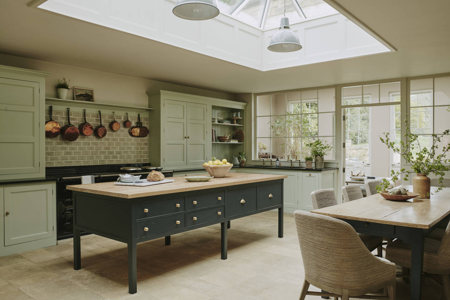 Interior Design by Sims Hilditch
And right alongside green tile, is generally much warmer tile as well, which leads me to the point of my point.
Starting your home project with fear and anxiety?
Any guesses where the most expensive build and renovation mistakes are made?
New construction and renovation season has snuck up fast and you might be feeling a bit behind the ball on making decisions for your project.
Not to mention, these are BIG decisions and so MANY, right?!
And not only that, but the MANY decisions all need to all be perfectly in harmony with each other.
Eeeek! Whether you are building, renovating or even decorating, it’s easy to see why without fail, OVERWHELM is inevitable! Apparently, at least 85% of renovators find the process “stressful to extremely stressful”. And one of the common consequences of a major home project is relationship strain or breakdown.
I just received an email this weekend from a woman who said:
“I want to pick your brain on a million things! How to not have wasted space when creating a privacy vestibule to primary suite from living room. I need shower wall and pan, bath floor and counter top collages in certain tones and styles and for kitchen, laundry and butler pantry. Making the most out of cabinet space vs open shelving, pocket doors vs reg doors, window sizing in a room vs window location in a bedroom, etc – so much more! I need it all! I’m literally crying tonight because I’m so stressed over renovation and building spec houses for first time – AT THE SAME TIME!”
So yes, there’s reason to expect some stress. Even if you’re still at the blissful stage of being ecstatically excited about the prospect of Creating Your Dream Home.
By the way, if you are feeling any of this, you are not alone! So many people in this stage confess that they are both scared and worried about getting it wrong.
But it’s what what comes after this statement, that scares ME the most. It inevitably goes something like this:
“I’m just going to feel the fear and do it anyway”. . . or. . .”I’m going to trust the process.”
Let me just tell you this is NOT the time to jump in with your eyes closed and your nose plugged.
It’s when the thousands of decisions come knocking that it gets intense. My eDesign department is part therapy truly, we have so many clients who hire us after the pressure hits. And the most common amazing feedback that we hear?
“You saved us so much stress! Now we have a clear plan and a way forward with our project!”
So if you are tackling a home project this year, whether it’s big or small (because let’s be honest, choosing the perfect paint colour can make anyone lose sleep). I’ve got you!
The most expensive home project mistakes
So have you guessed what the most expensive common mistakes are in home projects?
It’s when you choose the wrong colour for a major finish.
And since we are no longer just managing black, white, or grey with this new ‘warm neutral’ trend. We’ve added BEIGE to the mix and that changes everything. Everything.
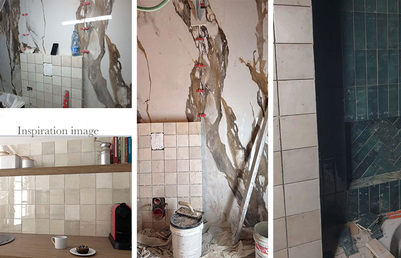
Maybe you don’t love the stone you picked because you thought it would look completely different (scroll down). Or that zellige tile in the end was not cream like it looked in the inspiration image (below) but pink beige instead. Bummer.
Those are high ticket oopsies.
You end up either eating the cost of replacing them or live with them unhappily. Every day you try not to think about what they cost.
This homeowner said, “Help, my designer told me this combination works. . . I like the way the tile looks beside my green shower but not how it looks behind the toilet! What do I do now?”
Well my lovelies, you likely know what the mistake is and why it’s wrong, but how do you avoid this in the first place?
Is the cost of fixing this mistake worth it to you? Or do you live with it?
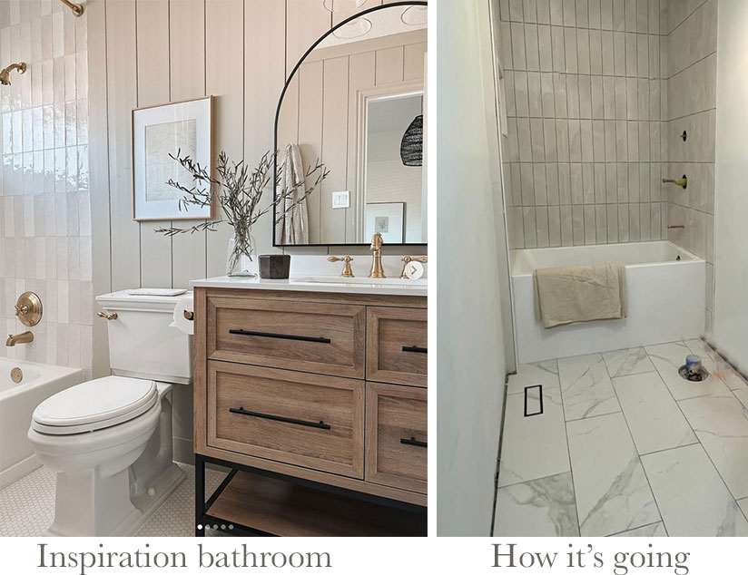
Here’s another one I found: “Help! I’m trying to copy this bathroom but my surround tile doesn’t match the floor now what?”
The secret to perfect neutral harmony
There is a very simple and affordable solution to helping you make decisions about neutral finishes in your new build or renovation project.
So, do yourself a HUGE favour and get the right tools and guidance to will help you coordinate the colours of your paint and finishes perfectly. This will reduce SO much stress.
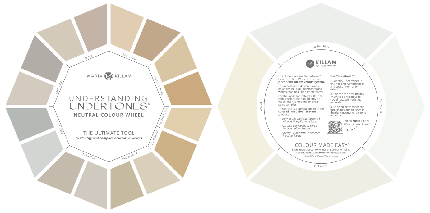
The front has the 9 neutral undertones and the back has the 4 gradations of whites
Start with my neutrals and whites colour wheel. This has the 9 most useful undertones of neutrals and the 4 useful gradations of whites. It’s a portable tool you can carry with you to get a read on the undertone of ANYTHING you are looking at.
This has got to be the handiest guide and you might even say “insurance against” making colour mistakes in the subtle world of neutrals and whites.
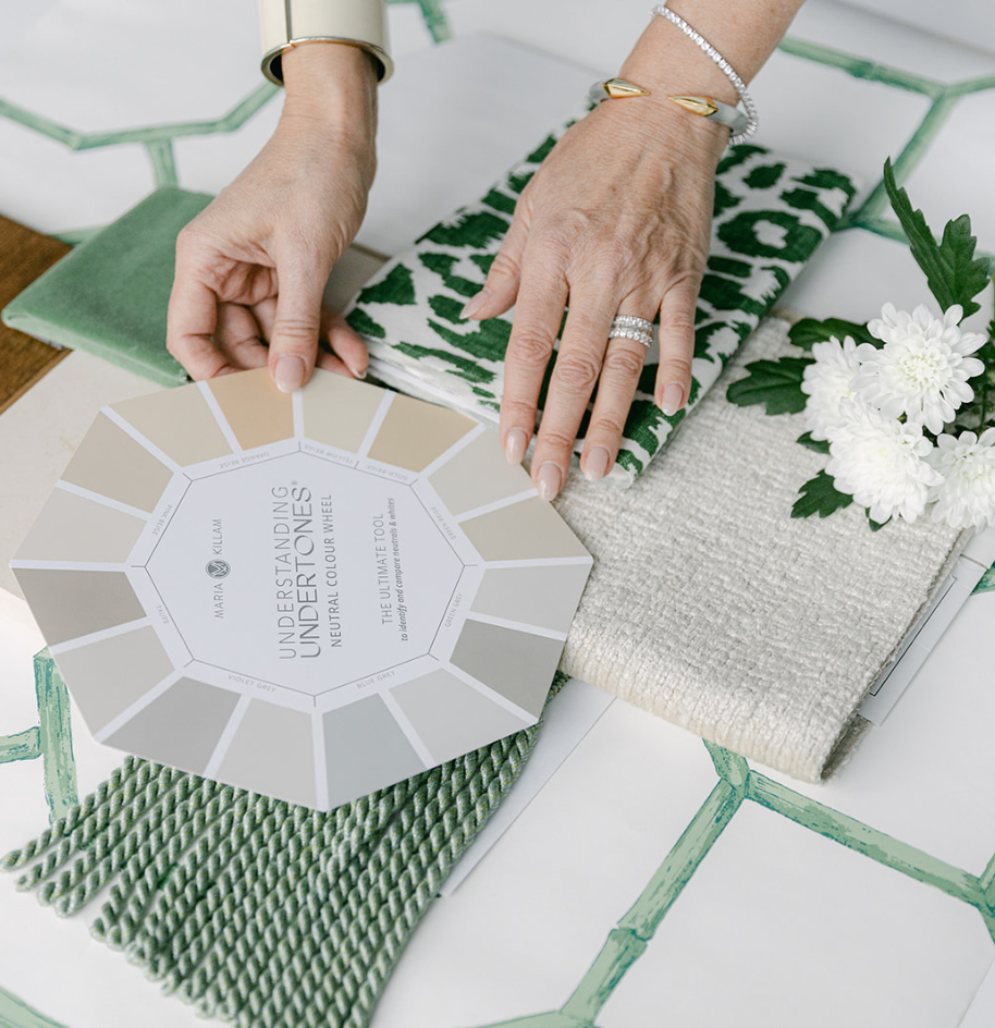
Simply place the colour wheel right on top of whatever you are trying to see, and you’ll quickly see the closest matches. You’ll also eliminate a whole lot of “what’s not going to work.”
The goal in any interior or exterior project is to work with only one or two neutral undertones and make sure all the neutral finishes harmonize having the same undertone. Same for whites, ideally, if your countertop, for example, is off white, off white is the gradation of white you want to choose for all other white finishes. When you can easily narrow down the options you’re working with, this makes life easy peasy.
My go-to paint colour collections with Samplize
The next most important tool is large paint colour samples. And I’m excited to share that I have a fabulous new collaboration with Samplize!
This means you can now shop my curated colour collections and get affordable paint samples shipped right to your door FAST!
The most important step of planning your project is testing and comparing all your colours and samples together. And now, it’s never been easier!
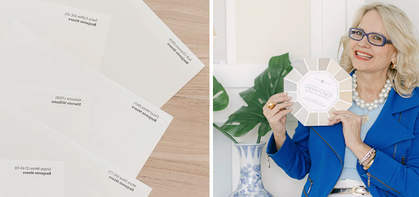
Now you can verify the undertone of anything by comparing it with large painted samples. While the colour wheel is the most convenient tool for dramatically narrowing down your options, it’s much easier to see colour in large samples instead of with tiny paint chips.
NEW! You can shop the full collection of colour wheel colours in Benjamin Moore, Sherwin Williams, or Farrow & Ball through my collaboration with Samplize.
Other handy collections I’ve curated with Samplize include the best whites, my favourite pale neutrals, and the best neutrals for the 🔥 trending warm neutral kitchen cabinets.
This is the most convenient way for homeowners to test and they ship OVERNIGHT in most cases! You can just add the whole collection to cart so you can compare all the colours easily and figure out which are best for your project. Shop here.
And to get the most out of my Neutral Colour Wheel and Samplize colour collections, you can get the scoop on the undertone of each colour and more information on coordinating colours, neutrals and whites inside my eBooks.
While they are not as sturdy as my colour board collections, the best thing about Samplize paint samples is you don’t have to buy 50 samples all at once, which is how I’ve always sold my large painted colour boards.
So, if you are a designer or a homeowner with big projects ahead of you I would still recommend investing in the Killam Colour System in Benjamin Moore or Sherwin Williams. You can see them here.
Create your Dream Home
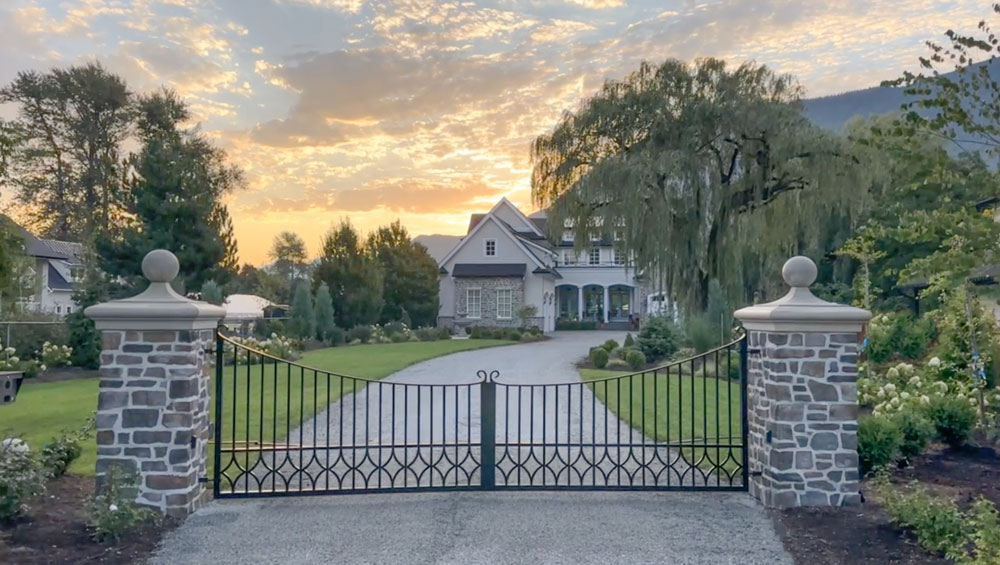
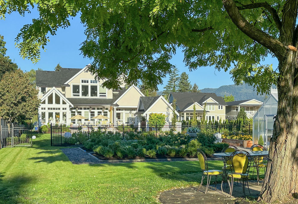
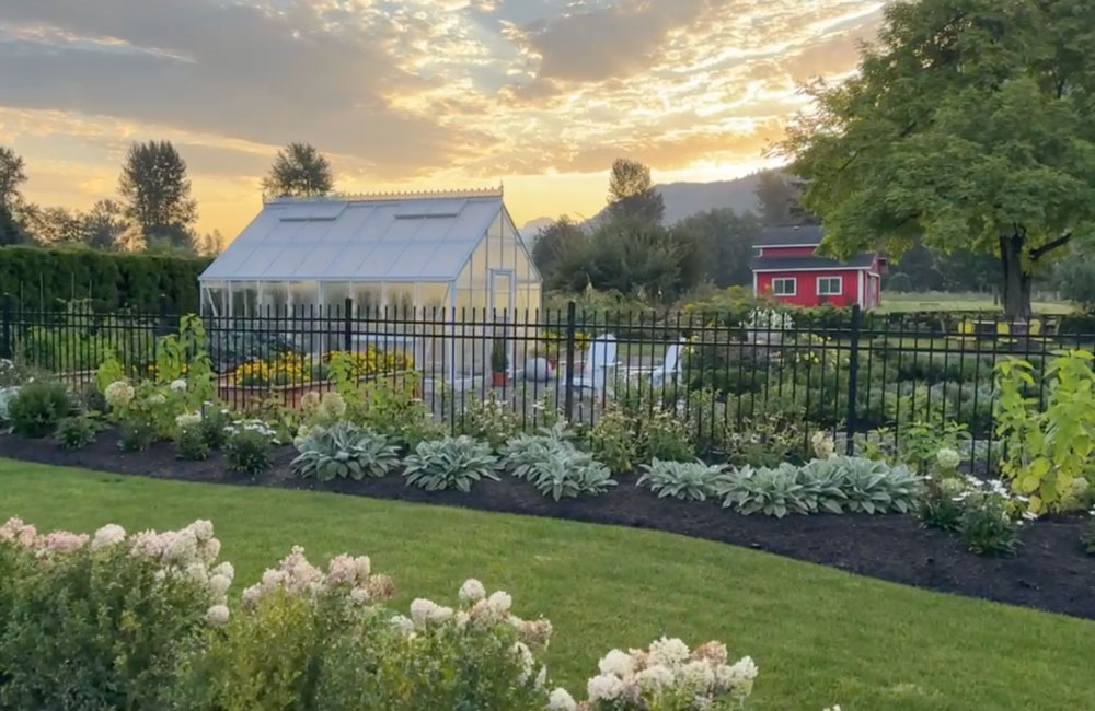
Here’s some current photos of my dream home.
Sign up here and make stress disappear!
Want to know what the ultimate stress buster is?
In addition to learning more about choosing the perfect colours and finishes, my two day course for homeowners, Create Your Dream Home, also teaches you how to create the perfect plan for your project. It starts with having a clear vision and point of view–which you’ll learn in just two days with me.
I’ll show you how to work through all the various ideas and inspirations clamouring in your head to distill the best and most timeless ones. You’ll learn how to be so clear about your vision and your plans that you don’t get pushed around by your contractors. That means you won’t be tempted with compromises that lead you away from the path of YOUR VISION. And ultimately your dream home.
Still on the fence? Sign up here to attend my FREE masterclass, so you can TREND PROOF YOUR DREAM HOME. Save your seat. Spots are filling up fast.
Related Posts
7 Best Paint Colours for the Trending Warm Kitchen




Love the new Samplize collaboration. Awesome! Thank you.
I was reading and all I could think with the difference in the floor and tile tones is that they’re going to have to split the difference.
The place that I used to rent had white tubs and a grey almond 4×4 surround in one bathroom with travertine marble. The other bathroom was cream in some areas, pink beige in others, honey oak cabinets, with a white toilet and builder grade almond countertops. We split the difference and found one color (literally only one paint color played nice enough) that made everything look better and replaced the mirrors and the light fixture.
I’ll post in the decorators forum if I can find the photos.
edit – and figure out how to upload them
This is why you can’t decorate off the internet. You have to have an actual sample of the tile/paint/wallpaper/everything. Colors on photographs are deceiving. What looks good under professional photographer controlled light may not look the same on your non-color calibrated computer screen. Then it looks different when you get it home and look at it in your available light. Take the time and order your samples. You will need them for future color decisions, so start a file box of the finishes in your house.
On another subject, My Goodness! your landscaping is spectacular. Your house appears to have been plopped down in a Disney movie set.
Thanks Rebecca. And that’s exactly what happens even with samples. One or two Pink beige zellige tiles will look creamy UNTIL it all goes up if you don’t know how to compare BEFORE it goes up. That’s exactly what I teach in my courses! Thanks for your comment! xo
Oh no, sad for the bathroom owner. Too much going on: square tile, rectangle tile, herringbone pattern, heavily patterned stone. I’m on my phone so can’t quite make out the undertones or floor tile.
So glad to hear that you are partnering with Samplize to make your curated color collection more accessible! Thank you Maria for sharing with us your knowledge! Best wishes from Alaska 🙂