When you’re looking to make an update to your space, you’ll likely focus on one element that bothers you or that you are prepared to change. But this approach most often creates a domino effect of changes that will need to be made in order to make that new change actually look right.

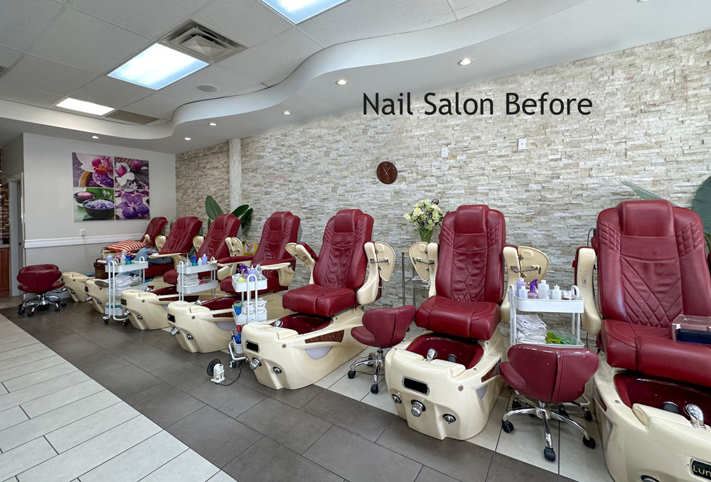
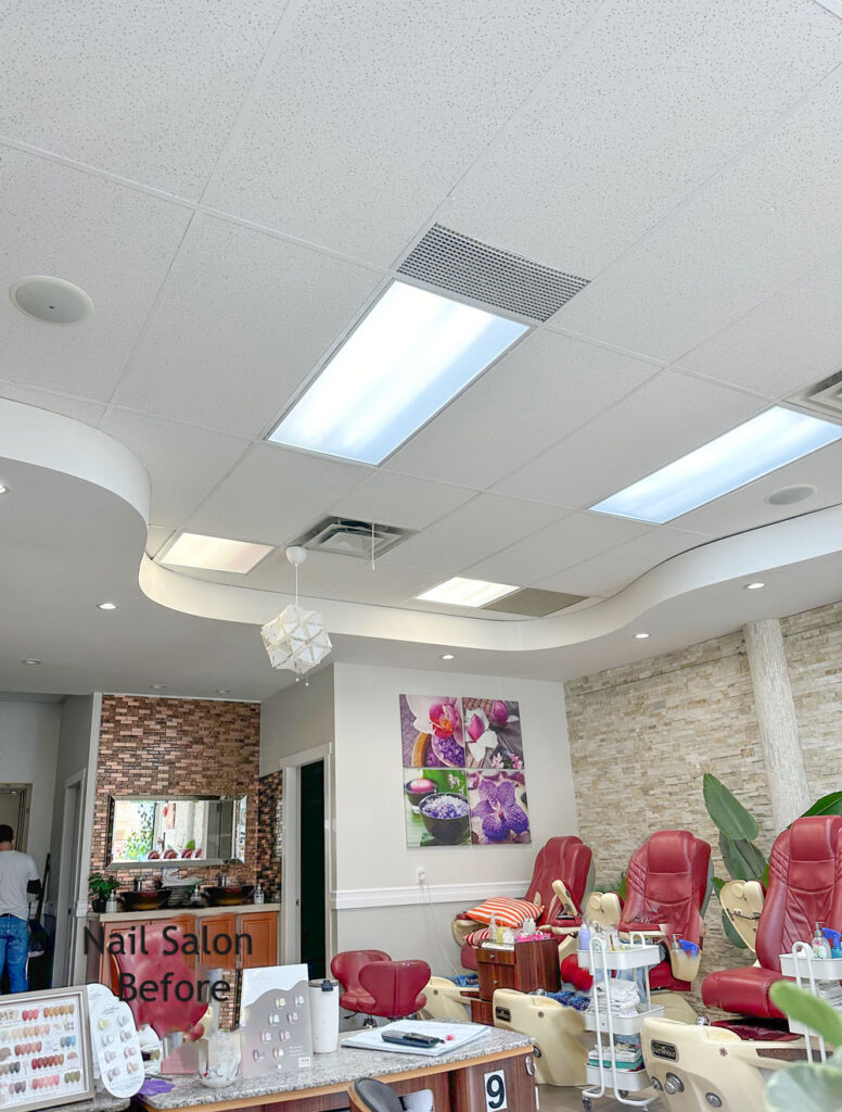
I was getting my nails done last week and the owner of the salon, who was doing them for me, casually mentioned that they were going to buy new pedicure chairs and how did I feel about black?

I looked around the salon and immediately said NO. The new black chairs they recently added for the manicure tables were already not the right colour choice.
But, in all fairness, they did not ask me about those.
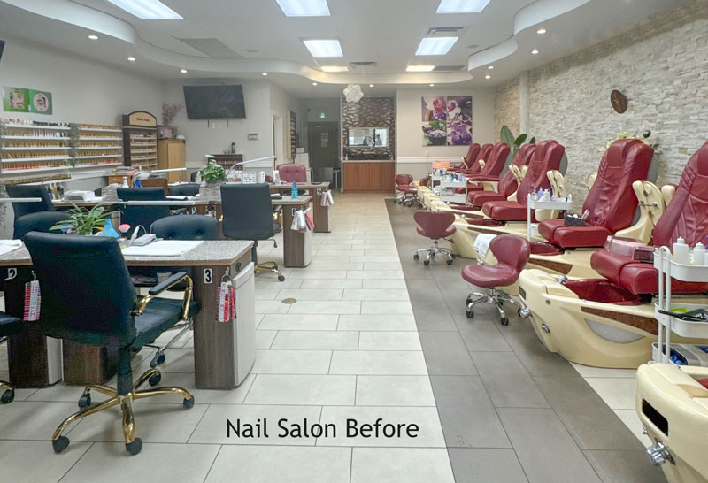
Then she said, how about grey?
Again, I responded “Immediately NO”.
She laughed and said, ‘Well that’s why I waited for you to come in so I could ask you!”
“We were also going to replace the tile floor”, she added.
But everything else is staying?
Yes.
Well, changing the floor makes no sense either because right now it does work with the long stone taupe and beige accent wall.
Read more: Is Hiring a Designer a Luxury or a Necessity?
“Give me the site for these pedicure chairs” I replied.
Looking at the big picture
So while I sat there, getting my nails done, I whipped up a mood board for her with the correct colours:
How to add colour
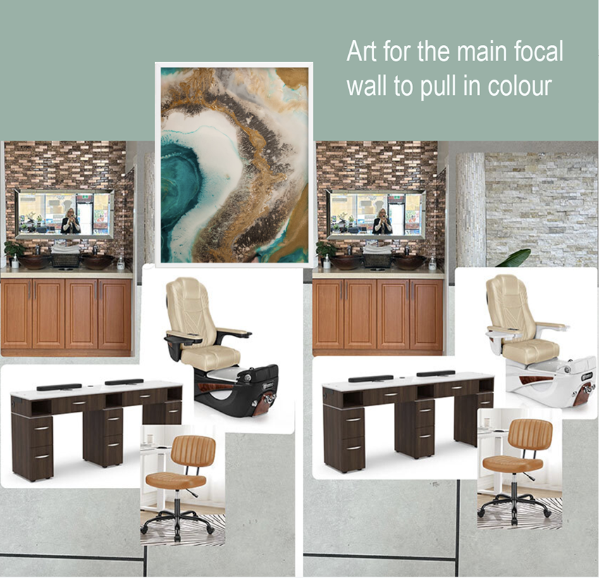
Then I looked up at the ceiling and said, we need a good piece of art for that wall and then we need to paint this curvy ceiling a colour!
And she replied “But we painted it white last year!”
I countered, “I’ve just saved you thousands of dollars on replacing the floor, so you can paint the ceiling”.
Then she got excited!
I found some art that is typically found in spas and nail salons and placed them on a mood board:
Here’s another colour way:
Notice that it becomes very easy to judge and choose now that we’re looking at a mood board. Without all the elements together on a board, you’re wildly guessing and that’s how you end up with renovations that are a big disappointment.
Out of all 3 which would you choose?
You can purchase my mood board course here.
It doesn’t work to focus on just one element
I’m telling you this long story because it illustrates 2 things so well:
- People ask us all the time, ‘Why can’t I just buy help to replace my countertop, or my backsplash, or my flooring’, and the reason we don’t sell individual item packages anymore, is because most people don’t know which one they need to replace. Just like this example today. Or how changing one thing will turn into a cascade of changes that need to be made. See our edesign packages here.
- If you are like the owner of this salon, convinced it’s the floor that has to go, which would cost thousands of dollars, of course, the idea of hiring a designer just seems like a luxury we cannot afford.
But not only did I save her thousands of dollars on the wrong tile. Left to her own devices she would likely have ended up with:
- A white, grey (or worse) black tile which would not have improved the space and in no way related to the stone.
- Black or grey pedicure chairs that would have looked unrelated.
This is the reason our kitchen refresh package is doing so well because if you aren’t ripping out the entire kitchen, I’m the best person to tell you what needs to be replaced so you get the best bang for your buck.
If you want to be the designer who can take one look at any space and give your client THE RIGHT advice, become a True Colour Expert here.
Check out the recent podcast I was in with Architectette here:
Is Hiring a Designer a Luxury or a Necessity?


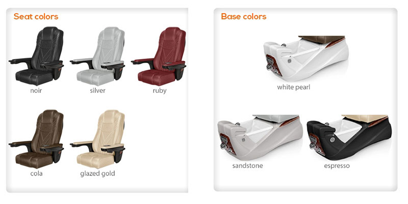
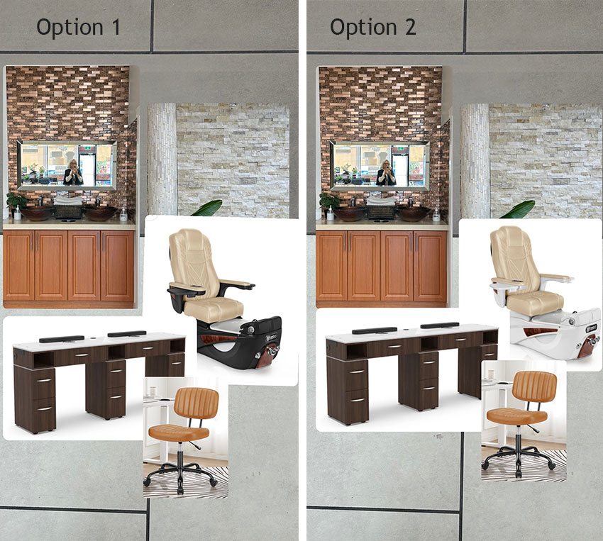
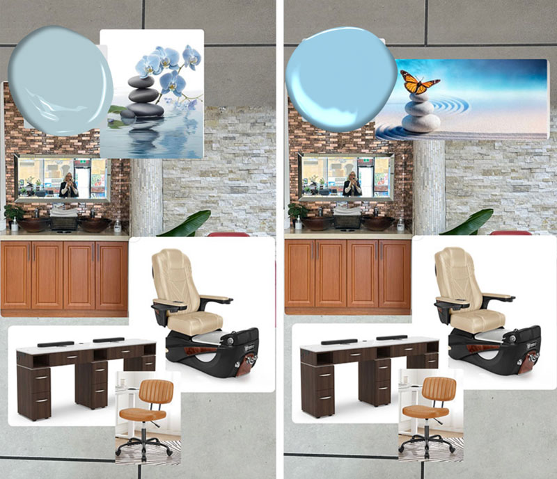











It will look great either way but I prefer option 2 with the light base on the chairs. It ties in better with the tile wall behind the chairs. I don’t feel the dark tables are prominent enough to use a dark base on the chairs. Is she replacing the blue chairs with camel like the one pictured? You featured it in the mood board as if it was more important than the blue chairs, so I wondered if all the chairs would be camel.
The current chairs are black and should be replaced yes. And off-the-shelf options are slim so I made the best choices using what is available.
Blue chairs? I think Maria is recommending replacing the black manicure chairs with the orange/cognac ones on her mood board, which will relate beautifully to the orange-y wood cabinetry at the far end of the salon.
The owner was smart to get Maria’s advice. I hope her manicure was on the house!
They looked more dark blue to me in the middle of the night! 🙂
Bravo! So clearly illustrated with your mood boards!
Im so glad the salon owner waited till you came in! Don’t forget to update us with an “after” shot.
Bringing more beauty into this world, one salon visit at a time. I love how this typically e-design ‘client’ unfolded naturally during your salon visit. More proof (as if we needed more!) that you are in the right profession Maria! Thank you for sharing this 🙂
I like the suggested changes, but the wall above the orange cabinet really bothers me. Those small rectangular tiles in brown/pink/cognac (?) are just too busy and don’t relate to the color of the stone wall behind the pedicure chairs. I would cover that wall from the cabinet countertop to the ceiling with a mirror if more light is needed or Sheetrock the wall and paint it a color that relates to the other walls.
I like your idea of a big mirror there!
Yes. That wall could use a larger mirror. Large enough so the tile then looks like a frame instead of a whole wall. It is a bit of a feng shui “no-no” for a mirror to be just opposite the front door, but a silk plant on each side wall, that is full and a bit bushy would smooth out that confusing energy hit.
I like the 3rd option with the sea glass ceiling and art that has both the sea glass and warm neutrals.
Haha! We have the same first name and we think alike! That’s my favorite, too 🙂
Ha! I’m getting smarter. I knew before looking what color chairs you would pick.
Very, very nice. Very warm and welcoming. Very spa-ish choices.
My big question before doing anything would be is it necessary to make the massive investment in new spa chairs? I’d love to see one version where they keep the red chairs and change other elements. I suppose there is a secondary market to sell the old chairs so they don’t go to waste, but I’m rather frugal. Capital investments aree priceey, so it would take a LOT for me to choose new chairs if I could use that money to give myself and all the nail techs bonuses instead. Just me?
ALSO — how many hands do you have? How did you create a mood board while your nails were being done?
THAT’s a new ebook right there.
ahahaha!
LOVE you!
It’s also interesting that this post arrives just after a post on how burgundy is the new red. So with burgundy chairs already in place, I’d love to see a version keeping the burgundy chairs and a color palette to blend with that. Perhaps the chairs are very worn and we can’t see the details? Or perhaps they are so dated they are irrelevant? Not sure. But I do know when my fave nail salon in LA changed out chairs it never felt like my home away from home again. Such is life.
There are lots of reasons businesses want to make a big change like that, so I won’t judge. I do love that one of the great things I’ve learned from Maria is to not waste money on updates you don’t really need if you can do update with colors and decor. So just over here wondering.
You nailed it. I like the dark base chair best because it grounds it, won’t show scuff marks, relates to the darker elements in the room, and art and is overall a richer look.