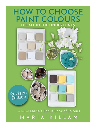
My ebook on How to Choose Paint Colours has been revised and today I’m answering some of the top questions I receive since launching my guide.
How to Choose Paint Colours – The Ultimate Guide
In the past year, my system of learning to see undertones continued to evolve with questions from readers and while teaching my system to the interior designers, decorators, architects, stagers and homeowners who attend my True Colour Expert Workshops from all around the world.
So, I’ve revised my eBook and added a new chapter with the most frequently asked questions I have received since this book has been available. These answers complete my step-by-step system of understanding undertones.
2020 Update: Both of my eBooks have been updated more recently to include new trends on white and cream paint colours.
How did you come up with the neutral undertones?
My system began with that first aha moment many years ago working in a Benjamin Moore paint store when I noticed that beige seemed to always fall into one of three undertones, red, yellow or green (above).
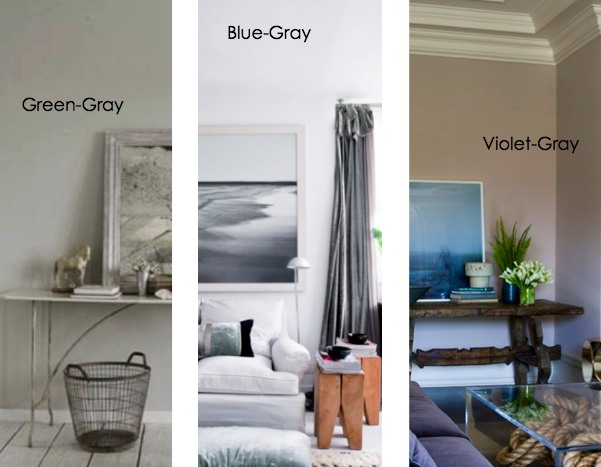
Then later I discovered the three undertones of grey (above).
Then I added taupe to the mix, because it is neither beige nor grey.
Then came the fourth undertone of beige, in the category of orange beige or butterscotch.
Then I realized that gold beige could also be considered a neutral because there were so many interiors where one of the three that I list in my ebook were ALWAYS right.
Last but not least, I added a blue/green grey category to round out my system of undertones.
What’s the difference between a colour vs. a neutral?
Well, if you look at a colour and the first thing that comes to mind is that it’s either grey or beige, that’s when you know the next step is to determine the undertone. That way you end up with a pleasing colour palette of undertones that relate, without a lot of clashing tones and colours.
What colour is greige and how many undertones is too many?
My new eBook answers those questions and so much more. It really is the ultimate guide in choosing paint colour.
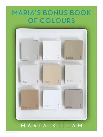
And here’s the best part about my Bonus Book of Colours (which is included in the price of the eBook): Once you have the list of colours categorized by undertone, you can use it to compare to any new neutrals you come across to make sure you don’t accidentally chose a pink beige or a purple grey unless that’s what you intended.
It’s available as a PDF, which means you can read the book on any computer or phone.
You can read the first chapter here. If you already bought my old book, you’re getting an email with directions on how to get the free revised one.
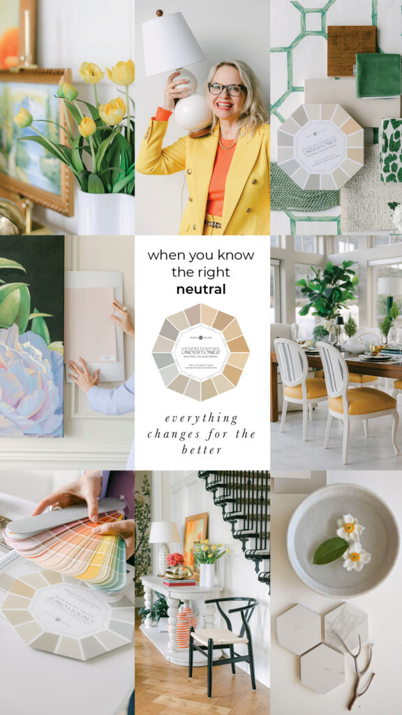
PS. By the way I updated my Large Painted Colour Boards and they are reflected in this book as well, so you can use this eBook to learn my system and grab my large painted colour boards to help you apply what you’ve learned when choosing colour.
Related posts:
What Nobody Tells you About Publishing eBooks
eBook Cover Photo Shoot: Sneak Peek!


Maria,
I just took advantage of your great offer to purchase your eBook How to Choose Your Paint Colours. I have the download code. I want to download this onto my daughter’s computer. How do I do this?
Thanks, Ann
HI Ann,
Here’s an FAQ that should help: https://mariakillam.com/ebook-faq, email [email protected] if you still have trouble! Thanks for buying my ebook. Maria
I purchased your e-book at the beginning of the year and really enjoyed it, however, I could not get the bonus book of colours to download on my computer. That is the reason I ordered the book, I really wanted the bonus book. Is there a hard copy you could send?
HI Linda,
The book is not available in hard copy. Email [email protected] with your confirmation email and she’ll send it to you no problem. Maria
Got your book when it first came out, it’s great! I totally recommend it.
Excellent book–well written and formatted with useful theory, and practical info you can put to use right away. Love the chart for doing an assessment of a home. After soaking up all the information, am I correct in thinking that 2 or more colors will harmonize with each other as long as they are both clean, or both dirty AND they have the basic undertones (cool or warm)? Or is that too simplistic an interpretation? Thank you.
There is no ‘formula’ that dictates that cool colours all live together or warm colours live together to create a colour palette that harmonize, it’s all about the context of clean vs. dirty.
Thanks for buying my book,
Hope this helps,
Maria
Maria, thank you so much for the additional information in your fabulous book. I printed out the first edition and in the interest on saving paper I am wondering if the changes are throughout the book or if they are an addition at the back. I was planning on comparing page by page(1st edition to 2nd edition) but thought I would ask you first.
HI Nancy,
The new chapter is the revised part of the book so you can just print that one.
Thanks for buying my book!
Maria
Thanks for the quick answer.
Have been trying to order your e-book, but have hit a snag. Will not let me complete the order without shipping method, but that box does not have anything to check (says not necessary with e-book) but I am not able to go to the final page, What should I do?? Thanks mm
Hi Marilyn, Just fill it all out, or click same as both. Sorry it’s the same for an ebook as it is for boards that do get shipped. Maria
Hi Maria, re Nancy’s question I was about to ask the same but now have my answer. -Brenda-
Thank you, Maria!
I will devour your additions. I appreciate your expertise and follow your blog with zeal. Your writing has encouraged me in my projects.
Keep up the good work ! I enjoy seeing and reading about your success!
Cheryl
Just finished reading your e-book. In the process of picking and painting colors for our pinky/beige home in Florida. That’s for pointing me in the right direction. I feel I am confident now to pick the right color and yes, I now see right and wrong colors all around me and why they are so. Thank you.
I have read your wonderful e-book from cover to cover more than once (although I missed the update for the revised version). It is so helpful and well done. I still struggle a lot with seeing undertones. I guess I’ll get better with practice. I’m looking for a nice off-white for a bedroom that doesn’t end up too pink or too yellow. Unfortunately, I keep picking pink undertones.
Hi Wendy, If you have a dark bedroom a white might not work. Try White Down or even White Dove or Cloud White if you strictly want an off-white. Maria
Hi Maria,
Thank you for your generosity and the paint suggestions. I am painting a room with a lot of natural light and I think White Down is going to work. I admire all of your work and I learn so much every time I visit your site.
Wendy
I downloaded your e-book this weekend and am really enjoying it along with your posts. We just purchased a very large, historic home and I am struggling. I would like to balance a pinky-beige linen sofa I have with Woodlawn Blue walls. The adjoining sitting room and dining room across the entry have fixed elements with orange/yellow undertones with blue and gray accessories based on existing decor and dark woodwork and floors. I was thinking of Monroe Bisque for those spaces. Any recommendations for a go-to color for the large central entry (with dark walnut woodwork) to marry the spaces?
Hi Nicole,
I would need to see photos to be able to give you accurate advice. Monroe Bisque would go with Woodlawn Blue walls for sure, you could maybe continue the same colour in the halls or a lighter version of your accent colour like I did in my hallway (it’s a lighter version of my Sunflower Yellow Sofa. Hope this helps, Maria