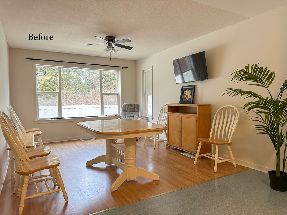
This weeks Colour Rescue™ is the reveal of the third suite I decorated for Wilma’s Transition Society.
This makeover combines the generosity of some donated decor and a little styling magic. But the result is anything but ordinary.
Here are the previous suites I decorated at the transition house for women and children… Here and Here and Here
This suite received a pair of donated navy and white checked chairs from one of my clients. I had specified them for her and now she’s moving. So I was thrilled to use them in this makeover (thanks Barbara!)
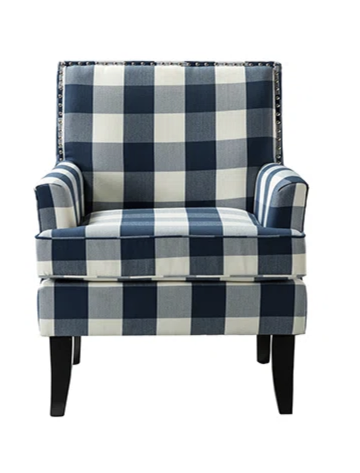
A bold pattern loves a strong colour
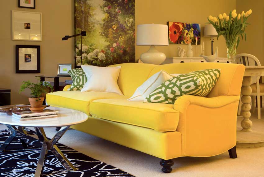
Because one lesson I learned way back when my yellow sofa arrived on the scene was a graphic black and white or navy and white pattern looks amazing with a strong bright colour.
This was the townhouse I lived in before moved to the bungalow.
It was 2010 when we moved into this home and the first rug I bought and placed in front of my new sunflower yellow sofa was a green and cream stripe.
And it totally died.
It looked so bad, I was embarrassed to call myself a colour expert at that moment.
So of course I didn’t document this memory with a photo.
Then I remembered I had seen this black and white floral rug at Pier 1, so I returned the green and cream stripe and brought this one in to see if it would look better and lo and behold, the yellow sofa came to life.
New place, new purpose
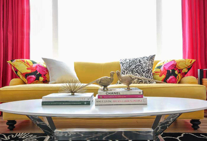
And it came to life again with the raspberry drapes I had custom made for this living room when we moved to the bungalow.
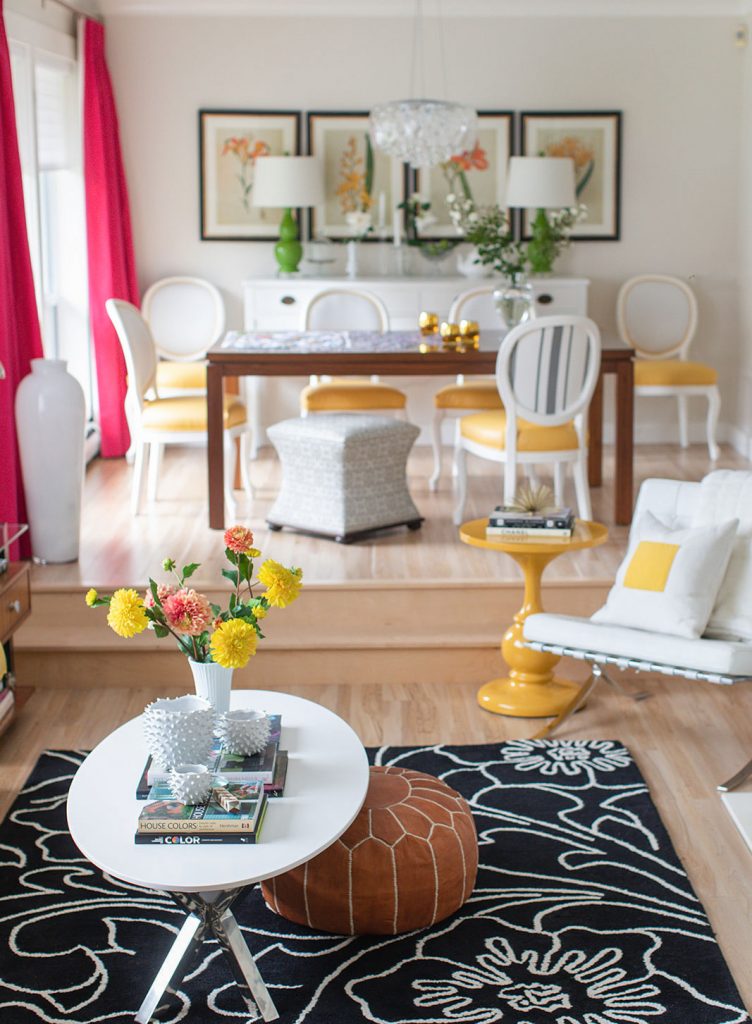
So after the navy and white chairs were donated, I realized the drapes from my previous dining room (below) would fit perfectly in this suite, so I dug them out of my crawl space. In case you’re new here, this is where my yellow sofa lives now.
This was one of the best transformations of the project!
And you’ll never believe how amazing they look in the after!
16 Expert Styling Tips for Any Budget – Watch now!
Click the video below to see how it turned out in this week’s Colour Rescue along with 16 expert styling tips that will make your home more beautiful – no matter the budget!
Related posts:
Stop buying the Neutral Sofa on the Showroom Floor
Got a High Wall? Thank of Art as Wallpaper
Colour Rescue Passion Project; Before & After









Hi Maria, Your generosity in decorating all these spaces is admirable. Your talent and treasures will be so appreciated by everyone who needs a place to call home. Very kind of you!
I’d love it if you’d show the pictures in the website–I don’t have time to watch videos! So I don’t know how this turned out!
YouTube lets you adjust your watch speed. Watch it at 2x and it goes by FAST! Maria has said this is the format that performs best because nobody reads blog posts anymore. You are missing out if you don’t watch it!
Agree. The videos are not long anyway and they serve their purpose as far as I’m concerned. I’m fairly new to following Maria and I love her work.
Not into the video either
Maria, I love seeing these videos. You are making such a difference in the lives of women and children in need. And I remember that you didn’t go to Europe so that you could purchase those drapes, and now, they live on to bring joy and beauty to others. God bless you.
Love the chairs and gorgeous raspberry drapes — what a mood-lifter for a family in transition.
Maria, You are incredible! Just a suggestion: Very few people have the time or patience to watch videos, unless they are very specific such as “how to change your water filter.” We are all missing your wonderful content that we used to read. Please listen to your readers and not marketing specialists. You have a very specific audience and it’s a busy one. Please add photos as well as the videos next time and compare clicks for each. Thanks
YouTube lets you adjust your watch speed. Watch it at 2x and it goes by FAST! Maria has said this is the format that performs best because nobody reads blog posts anymore. You are missing out if you don’t watch it!
Just a thought…one large art piece makes the space more cohesive.
Video is useless to me because with photos I can take my time, go back and forth between them, study the differences, compare the details, and actually learn why something is (or is not) working in a space. With video I can’t do that at all–it’s very jarring, too fast, constantly moving around, and I have to rewatch the same segment several times to pause at the exact right moments to see the before and after, which just creates a blurry and ugly still frame. Annoying, a waste of time, and not something I can save to my inspiration folder! It’s a shame–I used to really love this blog and took the True Color Expert course because of it. Now as I go through my blog list every day, I sometimes remind myself to skip Maria’s because there aren’t pictures anymore. Sometimes I check just to make sure, like today, and then I’m disappointed all over again. Jenna Sue, Emily Henderson, Sarah Sherman Samuel, and other designers still maintain beautiful and up-to-date blogs with lots of photos and a very active commentariat. People DO still read blogs when the photos are the most important part of the content, like they are in interior decor/design and other art forms. No one is stopping you from also posting on YouTube, but why not finish the blog post too, instead of leaving it at 3/4 finished plus a video embed? If you’re tired of blogging and don’t want to do it anymore, just make that announcement, shut it down, and move on.
I’m very sorry you don’t have the attention span to watch a video and grasp the meaning behind it. I love Maria’s videos. People complaining they don’t have time to watch a video are doing just that…complaining. The videos are short, sweet and to the point. Did you not know that these ARE blogs with video content included? Be kind ffs. No one is stopping you from moving on. And bring your “issues” with you.
This is adult learning site. Andragogy is the principle that facilitates the learning process for adults who are self-directed learners, have a higher sense of motivation and typically prefer to set their own learning plans. Adults learn by various methods and know what works best for them and their individual learning style.
I prefer having pictures of the finished product rather than a video in order to clearly visualize the changes in my own timeframe. My preferences have nothing to do my attention span or “issues” but rather reflect well-established adult learning principles. I understand Carly’s comment to be inappropriate (in general and specifically for this website) and lacking any education or insight into the adult learning experience.
I truly enjoy this website and appreciate Maria’s generosity with her time and her mad decorating skills.
I agree with the above comments. I will never click on the videos.
Wonderful! What a labour of love.