A while ago I received a comment from a reader who said
“Oh Maria, your aversion to pink beige is just silly.”
Valid comment if you have not seen what I’ve seen right?
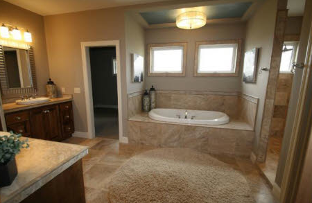
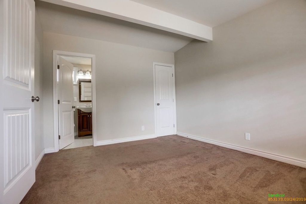
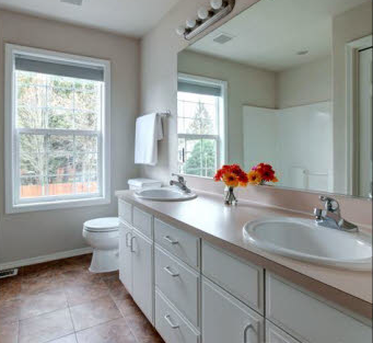
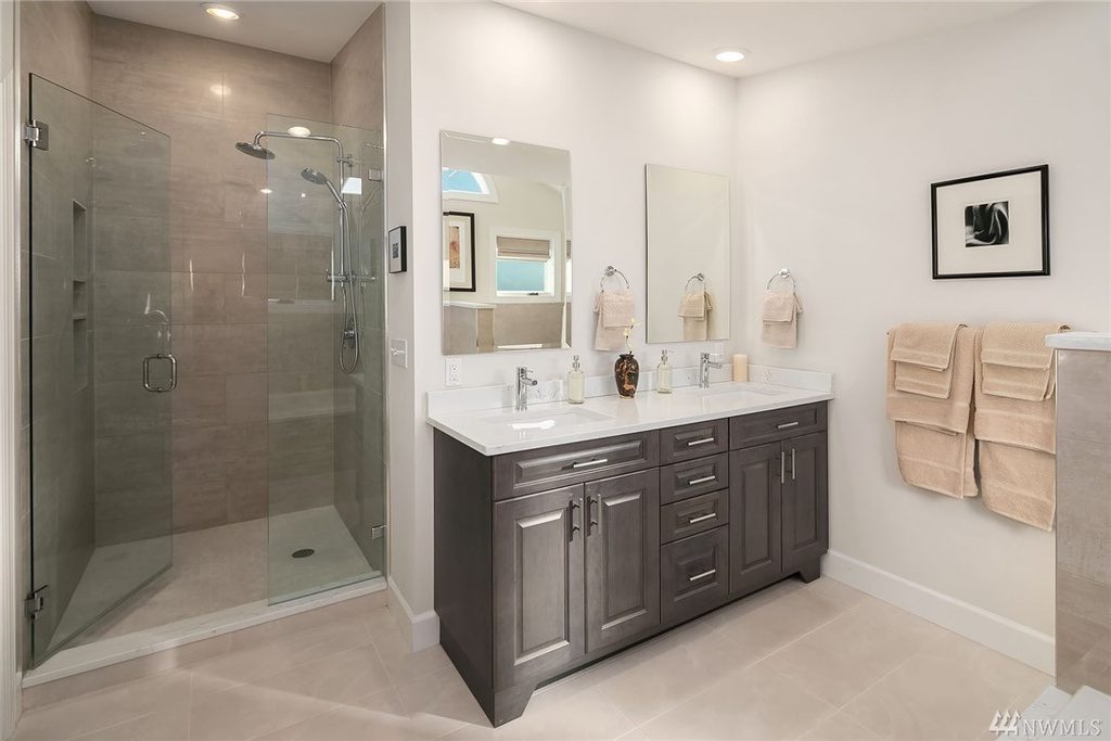
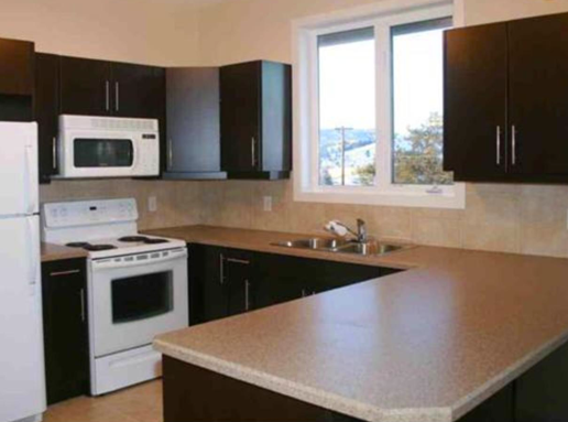
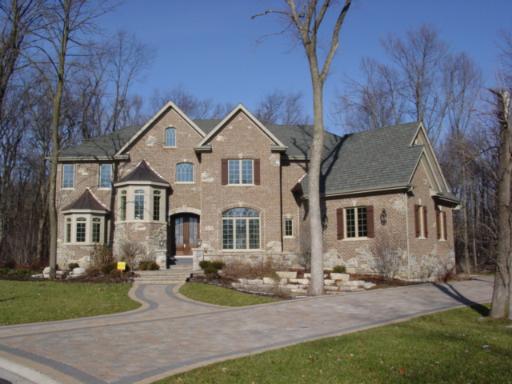
So for the record, these are random images I have found from real estate listings, so you’ll get just a glimpse of how easy it is to assume that light brown tile or countertops or carpet is the most neutral colour palette for your home. But instead, you end up with pink beige.
These photos will help you better understand why I think pink beige should be banished forever as a neutral in our homes, because there’s nothing neutral about pink beige in these images.
Wall Colour
Bathroom Tile
Carpet
Countertops
Bathroom Tile
Backsplash and Countertops
Stone Exterior
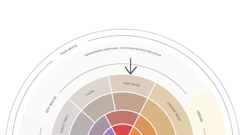
It’s why every paint company, tile, countertop and carpet store should have each section of colours divided by undertone.
In the meantime, until that happens, and to make sure that you don’t choose pink beige unless it’s completely intentional, download my ebook and get your undertones straight plus receive my 150 bonus colours with the undertones listed by category completely free!
If you are a decorator and designer, register for my Specify Colour with Confidence Workshop to learn how to choose the correct undertones for your clients.
Related posts:
What Everyone Should know About Beige
If you would like your home to fill you with happiness every time you walk in, contact me.
To make sure the undertones in your home are right, get some large samples!






Colors divided by undertones would be welcomed.
I certainly don’t think pinky beige should be banned forever because it can be beautiful when arranged and joined with other colors that show it off. However, I think that Builders should definitely stay away from it altogether because it’s really a nightmare to have to tie in a color scheme with pinky counter tops, yellow tiles and red cabinets – it keeps me in business but it doesn’t really do the home any justice. I think some builders just use ’tile of the week’ buy it and put it in the homes with out color consideration of the rest of the undertones. It does look like one big band aid when you see it on the walls – so fleshy and gross.
Aren’t those MLS photos great? I used them all the time, they are very inspirational for blog posts!
Marie,
You’re so good at pointing out the obvious. Thank you for using “what not to do” photos to make your point.
In my area, Silestone Beige Olimpo is used frequently as a neutral colour when people remodel from the big box stores. But it doesn’t always work, and often the rooms end up looking like your photos in the post.
What is the undertone of Silestone’s Beige Olimpo?
Becky
Becky I don’t have that sample, if you could match it to a BM paint chip I could let you know if it’s pink. Maria
Becky – it’s definitely on the pink side.
Would look good in the same color schemes as terra cotta or Saltillo tiles, or the peachy AZ sandstones.
Hi Maria
Sometimes it works, sometimes it doesn’t. And in the cases shown, pink beige definitely doesn’t (especially in that top picture – what were they thinking?)
Have a terrific weekend. Hope it’s sunny where you are.
Is this house exterior pinky beige? Does this house exterior work?
http://www.apartmentscanada.com/listings/Canada/Ontario/King/37-Bluff-Trail/154910/
I have the builder’s colour board for this exterior on a picture, but not sure how to post it…
P.S. if you click on the photo, you get a larger image.
My intire house had pinky beige carpet when we purchased it,I did not like it,a few people commented that the carpet was a nice neutral color,and couldn’t understand why I didn’t like it,it wasn’t neutral to me,
I tore it all out and put laminate thru out,
I had no idea how important the under tones are,why haven’t the stores?Have you thought about a special book for the stores,they need educated as much as the home owners,just a thought,but it would help thousands of people out with their painting if they had help with store clerks selling paint who don’t understand undertones,your book should be sold right along with the paint chips,I have wasted gallons of paint because I didn’t know anything about undertones,
Have a nice day,
Brenda
I’m working on the prep for staging a house to sell for a lady who told me her whole house was “neutral” and didn’t need to be painted. I went by to size it up, and had to explain to her that her beige walls, floors, counters were actually orange, pink, and yellow! It’s like the light switch went on – after it was pointed out, she got it. I did a color consultation on the spot and rescheduled the staging for after the painting was done 🙂
The pink-beige in your first photo was the color of our family room when we first purchased our house. In a south and west oriented room with a good amount of windows, it was like living in a clay oven in the summer. I’m sure you would have had a field day here, as the adjoining area was painted a manilla yellow-beige color and the difference was very noticeable because the two walls met at an obtuse angle (>90 degrees). We had the family room repainted SW Navaho White to help blend in with the manilla beige, and at least it really did help to cool things off. Maybe you could do a post sometime on what you should do when your house has a lot of walls that meet in obtuse angles. I guess one obvious answer would be to use the same color throughout…
I have been working with a client who loves LOVES taupe but wants everything light. Do you know how many paint swatches we have been through ll because she wanted Taupe with a pink undertone. It has been one of my most difficult jobs ever ( been doing this for 12 years) Now I would have here go with grays.
It has been a learning lesson and a tough one!!
Can I tell you I do hate I mean Hate light pinky beige!!
I greatly dislike pinky beige myself, however my mother has pinky beige walls in her house. Unfortunately it is a paint colour that changes with the light and doesn’t always look pinky beige so she may have chosen it in that lighting. However, as far as I know she is perfectly happy with it and although her colour scheme is a little off in my opinion, it is a happy and comfortable home with quality furnishings and lovely happy people inside it.
Maybe instead of banishing it, it should come with like an Adult Color Specialist rating so that only those old enough and experienced enough could buy it after providing proper ID 🙂
Sad story: I know someone who bought a house and redecorated herself. All browns and beiges, horridly mismatched undertones. The hallway was pinky-taupe, the adjoining rooms (ceilings and walls) were a mustardy/diaper shade brown, and then the wood cabinets and very expensive custom countertops were yet more heinously mismatched shades of taupes and honey browns. The brown palace was the most depressing place I’d ever spent time, and the remodel was done to the tune of over 200K. Oh, and I should mention that the carpets were GREEN. Maria, if you’d like a photo for your collection, I may have a couple.
Lol. I call that mustardy diaper color “goat vomit yellow” I can’t help but wonder if these types of people are legitimately color blind, but I love the “for adult use only” idea 🙂
HI Victoria, the stone is yes, it would probably look slightly better with it repeated somewhere on the house but it works with the grays they’ve chosen. I simply dislike stone in any shape or form on homes, it starts looking so busy but this one is way better than when people combine stone with brick, I need to write a post on that one! Maria
I personally detest ‘pinky beige’ with a passion…..one of the many reasons why I purchased your EBook. 🙂 -Brenda-
Maybe Irene could forward this to ALL of the major paint manufacturers! They need to see/read this….
especially the line about arranging their colors according to undertones!
Great pics and your blog is full of nice inspiration:)
If you want to see som swedish decor…check out my blog inredningsvis.se
LOVE Maria
(Sweden)
ALL beige should be banned forever! With all the beautiful colours in the world, why someone would invent a colour so dull and depressing is beyond my comprehension. Yuck!
Your depressing is my soothing. I can and do appreciate beautiful color, but in a world that feels like it is often blaring at me, retreating to my beige room feels quiet, peaceful, and restful:)
I say the same about white and gray. I use beige as a background to my decor which are bold colors as complement, actually. Beige is a nice blank canvas to put your colors on.
Believe it or not — some people DO have a beige personality. For them, the “beige thing” is perfect! Personally, I think that beige is “Blah” — and I know some people that are the same. So — perfect match! To each his/her own. I am definitely NOT beige! I live in an all beige rental apartment — and it is depressing! Yes, I plan to move. Beige — Be Gone!
I can see your point and I had read a lot about it but it is not accurate most of the time.
Good point but it’s like the Titantic hard to turn it around even if it helps more that it hurts.
For every colour there is a person who loves it. Enough on the pinky beige rant. It, like every other colour has its place. The trick is knowing when it is appropriate to use it. The right colour for the right place and moment can be heart stopping. PERIOD. I can show you institutional greens that would make you barf in one situation and make you swoon in another. It is all about context. Yellow can give you a headache or lift you into positive delight. Red can make you feel jittery and nervous or energized and happy. Blue can leave you cold and estranged or light and airy. Pinky beige is no different. It is simply a colour that needs to stop being misused and abused. You preach about understanding undertones. If you appreciate the intricacies of undertones you will understand when pinky beige is appropriate like any other colour. The real issue here is not pinky beige but the fact that there are people…. who do not understand colour…. who are slapping on any old beige thinking there is no difference as long as it isn’t white. And lets not get into white. a whole other discussion.
Hi Roz,
Hey when I interviewed Janice Lindsay she also said pink beige was the worst colour in her world. I can put any colour in the right context but I stand by my position on pink beige. It’s the most overused wrong beige because people think light brown is neutral when really it’s the least neutral of them all.
Thanks for your comment!
Maria
I will agree it is definitely over used in way too many situations. But thats what happens when you let people with no experience pick colour. The general public needs to be educated on the value of having a colour designer guide them through the myriad of choices. That is what is so great about your blog. Yes a good colour designer may have a natural talent for colour but a great colour designer has (what Malcolm Gladwell writes to make an expert)….well over ten thousand hours of choosing and looking at colour. Considering all that experience and the difference a colour designer can make in someone’s life everyday life…..you and I should always be busy. The world needs us because there are not many of us out there. Lots who talk but can’t do the walk. Then maybe poor pinky beige would be used in the proper place and not over used and abused. Love your Blog!
Ok I don’t believe I have any pink beige! I have warm gold walls through much of my condo. Tell tell you the truth it’s GREY that is getting to me! It’s everywhere! I give it a couple of years until everyone will be saying its dated! I’ve always been told I have a good eye for color but your putting doubts in my mind. I just look at something and it either clicks or it doesn’t. I can’t really be so exact explaining why. One thing I’ve learned is I truly beleive we don’t all see color the same way. I have a friend that swears her porch is little green, I see tan! This gives me a headache.
I’m sitting in a house with pinky-beige plush carpet, greenish-taupe painted woodwork and white walls … with cream/yellowish curtains.
AAARRRGGGHH!!!!
Interesting post and comments. It’s often a bit frustrating when working with a client who thinks they want a neutral…ie: Beige of some kind. Yes, it’s often the pink variety because the perception (thought perception) is that it is “Warm” and thus, “Good.” Period.
But that can be when they realize professional help will actually Free them from the colors they already have used by default, and found unpleasant. (Changing light bulbs can help, also.)
Hello,
I have a five gallon container of paint that I received as a housewarming gift. I picked out the paint color, Brilliant Beige (Olympic). My friends painted my living room and family room, (a part of the gift). The beige is PINK in some lighting!! I can’t take the paint back… is there a way to darken it to a warm brown or darker beige?
You can make it darker but it probably won’t be anywhere near brown because you need to start with a deeper base in order to get to brown. I would bite the bullet and buy a new paint colour, you’ll be looking at it for a long time! Maria
Sorry, but I’m going to have to defend pinky beige. When I first painted the walls of my new home 15 years ago, I had to find a color that looked good with my taupe carpet. I picked out a beige (didn’t know about undertone at that time) and was shocked to find that my walls were pink. But over the years I came to love my color. I’m now looking for a new color for my walls (still have the same taupe carpet and won’t be replacing it any time soon), and guess what. I still like pinky beige best. This time I’m probably going with BM Bradstreet Beige. Any suggestions on the best BM “white” to use for my ceilings and trim? It also has to go with the other colors in my house – warm green, yellow, and blue – because all my trim and doors will be repainted with that color. Now, Duron Antique White is NOT a color that I will be sad to see go!
Beige of any shade is like people saying, “I’m a minimalist”. It’s just a nice way of not admitting that they have NO taste!
Yeah ok. Whatever.
I just redid my floors, walls, trim and ceilings. It actually worked! Floors: wide plank lighter white oak in a light taupe (almost looks beige/blonde but with a very slight greyish undertone as opposed to yellow/orange/red undertones. It goes with all kinds of furniture). All walls are BM White Dove. All trim and ceilings are BM Decorator’s White. It looks lovely, flows together, and yet the wall colour looks a little different from room to room depending on the light of day and the shadows cast. I absolutely love it. No pinky beige anywhere and yet soft, pretty, and happy looking, Thanks for your ongoing advice, Maria, to avoid pinky-beige.
I would not call that a pink beige. Your color is much darker so it is more like a mauvey beige certainly not pink beige. Pink beige is a light color.
Hi,
Is BM Wheeling Neutral considered pink beige?
I have it on my family room walls- and while I’m very tired of it, I’m frustrated that I can’t pinpoint the undertone of it so that I can learn from it! It plays nicely with the tile and furniture in the room- so i figure I should know the undertone so I can make my next paint choice an educated one! Thank you!!!
No it’s a green beige. Hope that helps, Maria
Hi Maria. Help. Ive just had wool carpeting installed. I love the color. Yes, it’s a mid tone pink beige. I also had the walls painted in a color that I also love. It’s a yellow beige. Guess what? They don’t go well together, especially at night in incandescent light. The walls go yellower, the carpet goes pinker. I’ll start repainting myself, one room at a time. What should I be looking for? Thanks!
I bought my new and expensive couch about 3 years ago. I thought I was so smart. I’d already read over your White is Complicated and Understanding Undertones e-books millions of times. I consulted color-savy friends who also have read your e-books. I chose what I thought was a safe light “greige” neutral in a family-friendly Sunbrella fabric. I struggled to then know what to do with it, decor-wise. Especially because my husband chose a very specific chair that I ordered in teal. Why teal you say? Because the brand didn’t offer leather and I wasn’t loving all of the ugly earth-toned and chunky fabric choices. And teal seemed to “go” with the Sunbrella fabric sample. Yet – here I am 3 years later with an undecorated space. I think I’ve struggled because 1) my couch is actually PINK BEIGE! Ugh! and 2) Teal is a tough color to coordinate with if you don’t want to embrace mustard and salmon into your life. I don’t know what to do.
Here is the state of affairs:
Pre Existing Wall color: Oakwood Manor (which coordinated with the old, long gone green-yellow beige furniture)
Couch: Sunbrella fabric in a light pink beige,
Side chair: slightly green-leaning vibrant teal
Wool 8X10 rug: seems to be pink beige too
Coffee table/End table: 1960s era old hand me downs lean toward a rich reddish brown;
Window treatments: White plantation shutters
Wood Floor Stain: medium brown
Wall Art: None
Lighting: black metal floor lamp with light greige drum shade & mercury glass lamp with white drum shade.
*I’m trying to repaint, and find throw pillows and art.
I’ve tried Edgecomb Grey and Classic Grey and neither seems right.
Argh.
Hello,
I am not a decorator or color specialist, but am trying to dabble and learn.
Just moved into a house with the same tile throughout. We have to keep it for many years. I thought when we purchased the house a sand color tile would be easy to work with.
The tile appears like a beige tan beachy sand color and after researching SHAW the tile manufacturer has it listed as having a green undertone.
Just moving to Florida I wanted an airy open feel to my home and started looking and trying to figure out what colors will go in my home with this sandy color tile but when I bring items home they just do not seem to look right.
Been having a hard time deciding what to do.
The previous owner had just painted the walls a light gray color and Behr has it list as having a green undertone, but the walls look light blue.
I have been reading your blog long enough to learn pink beiges are the hardest to work with. I have purchased your ebooks and I am reading up.
I ordered your neutral undertone color wheel and received it today. I was so excited I opened it and placed it on the floor to only be deeply disappointed to find I have PINK BEIGE tile floors! I thought I was safe and had green undertone beige tile 🙁
Do I now have to choose pink /red undertone paint, fabric ect…?
Not sure what undertones play well with pink beige.
I was going to call in a color specialist for help and am thinking of an e-consult with you but have read I need to have my furniture, decor items in place first before a color specialist can help. I do need some furniture….have a few items. But don’t want to choose the wrong colors.
I am totally confused what to do or choose first.
Any suggestions, Maria?
I am deeply appreciative of any suggestions or what direction I should go first.
Thank you
Judy Gronowski
Hello, stone fireplace is pinkish , purple , how to neutralize the undertones in living room. East facing room, lots of light. Would neutral gray work with green undertone. I have purchased your colour wheels on neutrals and e book. Still struggling. Help