Recently, I had lunch with the Design Director of Maxwell Fabrics, Jennifer Apple. We had a very interesting conversation about trends based on the experience she had while attending the Color Marketing Group conference three years ago.
Jennifer found that while knowing colour trends two to three years ahead is important, adopting the trends as soon as they arrive can be too early for her business. When a new colour trend arrives, it still takes a few years for the majority of homeowners to decide they love it enough to commit to buying designer fabric for their home.
It’s tricky. Since it takes about 18 months to design and develop a fabric collection, she needs to not only be aware of colour trends, but she must also try to predict which colours will actually have staying power.
Maxwell Fabrics have just had a huge run on red fabrics. Teals and turquoise have become almost a staple colour in their drapery and upholstery fabrics. These colours pair so well with so many other colours like coral, yellow and orange. But of course, Maxwell’s biggest sales come from all shades of gray.
Jennifer says, “The conversation [about colour and trends forecasting] definitely keeps me up at night.”
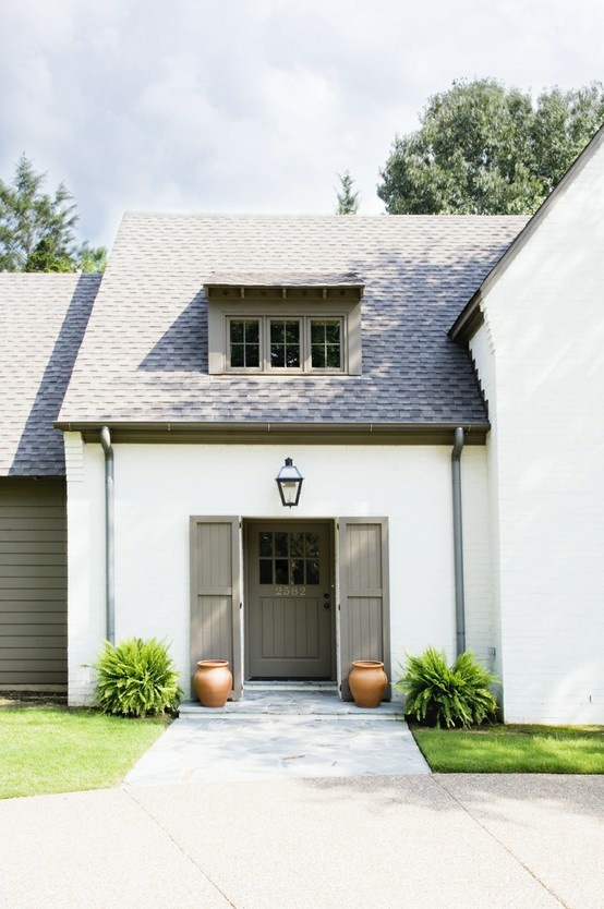
And what about companies that sell building products like siding and roofing? As it costs approximately $100,000 to develop a new colour in these types of products, they need to sell palettes that are timeless not trendy.
Since dark neutrals date much faster than light neutrals it would not make sense to jump on the trendy neutral of the moment no matter when it arrives since the siding on your house will not change with new colour trends.
I’ve been writing this blog (almost five years) and the trends in backsplash tile have already changed three times. This actually makes accent tile more of a fad then a trend since trends generally have a lifespan of approximately 10 years. It’s why when I get yet another email asking me which backsplash tile I would choose to coordinate with any particular countertop, my response is never creative and groundbreaking.
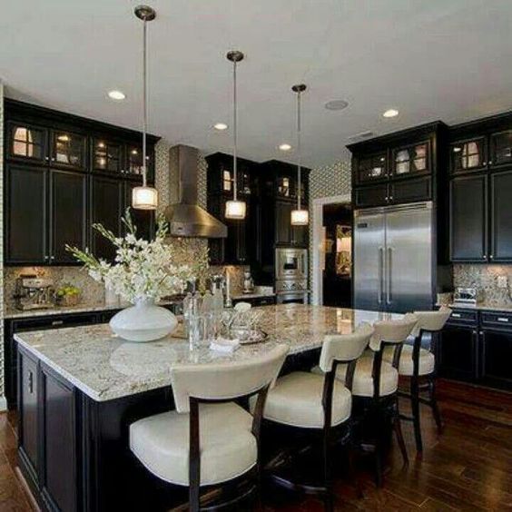
What about builders who are STILL installing espresso kitchens all over the country because most of them are men and they perceive a wood stain to be higher quality than a paint grade [white] cabinet. Clearly, they are the ones that desperately need to attend a colour forecasting conference. I’m just sayin’.
I’m constantly surprised, even here in Vancouver, at how many brand new developments are being filled with finishes that are so clearly dated.
I’ve talked to developmental designers about this and they tell me it’s for a couple of reasons. The first is that the developer can get huge savings on product that is not the current, cutting-edge colour.
The second is because most developers are hoping to sell their project within several months or a year.
They’re counting on the fact that new home buyers will be so happy to get a new build they won’t necessarily notice that the granite installed in the kitchen is the tail end of the trend, if not already past its sell-by date in terms of trends.
They’ll just be in love with the idea of granite. And by the time they move in and realize that the finishes in their new house are already dated, it’s too late.
On the West Coast when the brown trend was over (approximately four years ago) I started seeing brown cars on the road. Brand new. I was surprised, because at the trend forecasting conferences I was told that automotive companies need to really be able to see colour trends years out because of how long it takes to develop their colours.
It’s obviously a balancing act – knowing enough about colour forecasting to make these huge colour decisions years in advance, as well as having the guts to set up all your colour dyes to make products that will be in your line-up for a good amount of time. It’s not like changing the paint on your walls when you get tired of it as soon as a trend or fad changes.
So, when is colour forecasting helpful and useful? How does it make your world better?
Well, it’s like this. I was consulting with a client today who had earthy, sage green drapes along with taupes and creams in her living room. She needed a new area rug and I helped her find one. However, her options were much slimmer because those colours are more dated than what’s happening right now.
Have you ever noticed that if you choose a trend colour like turquoise and orange for example and then you find lamps in those colours and you can turn around and find some cushions to match!
You walk down the street to another store and find placemats and some accessories in the exact same colours?
Well, there’s an entire process that leads up to that placemat being the exact colour of everything else. That’s colour forecasting at work.
Or, how about this scene about the Cerulean sweater from the Devil Wears Prada?
It’s one of the best conversations that captures colour trends in action!
I’ll be at the Westin Mission Hills at the CMG Conference, if you are in the business of choosing colours for a product, you should be there too!
Tomorrow the early bird rate for my October workshop in Toronto expires, here’s what Becky Noelker from Inspired Spaces said about her experience last week:
“I’d like to say again that last week’s workshop was an amazing experience. Thank you, Maria, for sharing not only your expertise but just as importantly – sharing yourself with all of us! It was very touching. Your heart and passion for what you do are evident and amazing.
I never expected my confidence to increase so dramatically from attending just one workshop. You provided an experience and the tools that will help my skill level continue to grow.
Although I look forward to more webinars, the interaction and experience in a small group like this can’t ever be underestimated!!
The hands on exercises really helped validate my choices or highlighted my mistakes and how to make better decisions. The discussions about why certain choices are either right, wrong or could just be better is where confidence is built.”
Related posts:
Danger: How you Know you’ve Fallen for a Trend
Here’s how Colour Trend Forecasting Works
Colour Trends in San Antonio 2011
If you would like your home to fill you with happiness every time you walk up to the front door, become a client. On-line or In-person.
Download my eBook, How to Choose Paint Colours – It’s All in the Undertones to get my complete step-by-step system on how to get colour to do what you want.
To make sure the undertones in your home are right, get some large samples!
If you would like to learn how to choose colour with confidence, become a True Colour Expert.





I find color trends fascinating, but I find myself trying to avoid them–especially in my home. But I’m also learning that there really isn’t anything that’s truly ‘timeless’. Everything can be placed in a time frame. However, that doesn’t mean things can’t be classics. I think the hardest thing about color trends is too many people think they’re doing something timeless and classic with their color choices. If you think of a trend as something fun instead of something classic, then the trends can work for your rather than against you no matter whether the trend is on it’s way in or on it’s way out. Have fun with it, but don’t commit to it with something that can’t be changed easily.
I guess I just do what I like and then don’t have to worry about the next trend or fad. The problem occurs when I want, for example, purple, but it’s not “in” right now, so can’t find it anywhere….as far as “hard” elements in a home, like tile, countertops, etc, I guess do what you love, but then know you have to change it when it’s time to sell your home, however many years down the road…
I’m in the same boat as Kathy; I use the colors that move me regardless of trends. Fortunately, there is always a wide range of paint colors available regardless of which ones are on-trend. Personal attire is not as easy — there I’ve often had the problem of wanting an article of clothing or shoes in a certain color and if that’s not in that year, it can be a futile search.
Interesting comments about the rapid changes in backsplash tile, Maria. I’m 100% with you on going for the subway tiles for the looks and the longevity. I love looking at all of the fancy and fad tiles but am not easily seduced by “of the moment” here; it is good to see that the multicolored random mosaic installations and those tumbled stone 1″ squares seem to be getting less prevalent (as you’ve noted, these usually fight with the countertop material and/or cabinets).
>> This actually makes accent tile more of a fad then a trend since trends generally have a lifespan of approximately 10 years. <<
These have always been my thoughts. I believe that tile, like clothes, dates so quickly using and wearing the classics is the way to go.
Maybe a post entitled "Everything Classic" would help some readers for years to come!
I not a color savant or a particularly trendy person, but I read a lot of magazines and blogs so I find myself interested in the newest color trends before the market has really responded to them, and now I know why! Several years ago I damn near killed myself looking for a turquoise ceramic lamp. Today you can practically pick one up at the grocery store. It is so frustrating at the time. Right now I’m in the “sweet spot” for a lot of my favorites: gray, turquoise, orange/coral and navy but I know in a few years I’ll be frustrated when I can’t find something in a color I’m craving.
Now I get why it takes so long for the colors I’m interested in to show up at the places I shop at, which tend to be “trickle down” places like Target or Home Goods and maybe to a lessor extent Crate and Barrel. By the way, I’d hate to be responsible for forecasting color when there’s that kind of money on the line.
So now we need the siding and auto manufacturers to jus tell us what they are working on so we can plan ahead!
But I bet that companies don’t just forecast the color trends … they also work HARD to create the demand for the colors they selected.
Maria, I can see that you put a great deal of thought into this piece! Thank you! That scene (from the film) gave me an insight to the complexity of the world in which you deal. How in the world do you ever decide what to wear to a conference such as that you are about to attend in November? I’d would probably be freezing in my closet with some sort of stupid intimidation! (hate to admit that)….This whole subject is like figuring out why babies cry. But I love babies and I love color…. God is so amazingly patient with us!
I am probably in the minority of your readers, who generally agree with your white and more white in the kitchen and home. I do have to ask, do you not see subway tile as a trend? I absolutely do. Yes, it is used a lot, but I hate it. It is so institutional looking to me, and boring. If a client chooses colorful tile and it fits their personality, they should choose it, otherwise they are not living authentically. In ten years, most people are ready for a change, and changing tile out is not that difficult. Trends are just that….trends. A trend, especially in the building industry is determined a lot at the moment by ecology, green building and designing. One is never obligated to follow trends, but one should follow their heart in design choices. If we always make choices based on resale, we will live in our homes miserably. IF we know we will sell in a few years, then of course we might want to exercise some restraint. But the key is to “live” and live happily in our homes.
Thank you Charisse for your comments…makes perfect sense to me:)
I’m on board with your comments too Charisse and Angela.
I do a lot of redesigning and sometimes I’m fortunate to work with a client from ‘square one’. One of the first questions I ask is “Are you planning to sell in the next 5 years or so?” If they say “no” I tell them to put in colors, tiles, flooring, countertops, etc. that THEY love! Why put in anything that you don’t really like just for resale value? I once got a phone call with just one question. She said “I LOVE red! I want red sheers in my living room. My friends think I’m crazy. What do you think?” I asked her “Who’s going to live in that house?” When she told me she lives alone, I answered “Get your red sheers.” 🙂 She was extremely happy! My business motto is “LOVE THE HOME YOU’RE IN … AGAIN!” but along with that I tell clients “Don’t decorate for your neighbors, your relatives or your friends. THEY don’t live here–YOU do!” Make your home happy for yourself … even if that means being way off trend. Eventually if you sell/move, the next family will re-do it to their likes anyway 😉 (Of course if you’ve got a bright red bedroom, for example, you may want to repaint it into a neutral before listing it. 😉 )
When I started my business I tried to get people to get more on trend with styles. Didn’t take me long to realize there are people out there who’ll never be ‘trendy’, never like what’s ‘new’, always want something rather ‘dated’ because they loved it then and they love it still. Interior decorating is one of THE most personal businesses. We’re often helping people ‘update’ while not offending them with our own personal opinions or what the market tells us we should like. (For the record, I’m a white kitchen lover and have one 😉 )
That is exactly how I approach my design work as well.Too often people are not “happy” in their homes, and without realizing it, it is because it does not reflect them. I have yet to meet anyone who hasn’t changed their refined their style as they moved from young adult to mature adult, as they discover more about who they are as people. I don’t want anyone to think I don’t like white, or white kitchens and surrounding…..I do. But my enthusiasm is about people making the right color choice based on living happily in their surroundings.
Hi Maria,
My husband is in FL now, wanting to change roof on house, to bring up to code. Would you consider the roof in your picture to be dark neutral? Want to keep blue grey color of our house, and you’re SO right; we won’t be changing the roof again anytime soon!!
Love reading your blog, and your home and garden looks beautiful:).
Thanks,
Jeanette L.
The context for a dark neutral is regarding painting exeriors dark brown or charcoal. Your roof should be dark. I would not consider the above roof to be ‘neutral’ it has a green undertone that coordinates with the green on the house.
Maria
Hi Maria,
It is hard to ignore color trends but I try! They are helpful for inspiring new ideas but it is certainly too expensive for me to change things up every time a new color trend comes around.
Thanks for always writing thought provoking posts- I so enjoy them!
Best,
Mimi @ A Home Romance
You are so correct! I am building a house right now and the selection of materials available through my builder has been limited to browns and “bossy” granite.
http://mittenhouse.com/2013/09/29/materials-selection/
the movie excerpt was right on, Maria…
Sigh… despite showing my husband SEVERAL of your articles about kitchens, painted vs. stained, no accent tile, etc., he refuses to acknowledge that there is a “builder’s look” or that stained wood is dated, or that color trends exist (!). I dread to think of the fights we will have when we remodel our kitchen in a few years.
The concept that stained wood can look dated is not something the average husband understands. Most think stained=quality and painted=cheap. It wasn’t until I compromised with my husband that he saw what a huge difference painting the cabinets made. Our compromise was painting the upper cabinets and leaving the lower cabinets stained. Now we’re getting ready to renovate the kitchen, and he’s cool with painting the lower cabinets too.
The secret to getting the husband on board with your remodeling ideas in the future is to start planting ideas in his head now about how nice changes would be…not all at once, but just little hints here and there. It might not work for all husbands, but it did for mine.
Good luck!
Maria I just toured a new model home last weekend, put up by a Southern homebuilder.
Walked into the kitchen and BAM – espresso cabinets, swirly granite, and “tumbled” looking backsplash tile.
The floors were also an espresso brown wood.
I said to my friend (the realtor who let me see the place) – Dang this is so outdated. And she was surprised. She said she loved it. She doesn’t like white cabinets. I’m thinking it’s because all the “expensive” builder homes install this dark stuff, so anything white reads “cheap” to her.
blah
With my daughter in university, she brings home many articles to read, a recent one being on colour…I was fascinated to learn that colour has helped codify language from one to another! in other words if an item is black, what is it in your language! Colour is the universal Rosetta Stone!
In terms of forecasting, boy you really have to follow the trends but also allow instinct and knowledge of your client base to help. Even then we don’t 100% of the time, get on the right wagon!
Yes! You can hold the same color chip to people from different cultures/languages and they will often name it differently from you — especially the blues/greens. When learning another language fluently, I take color chips and ask about 20 people their name for that color in their language, so I can converse competently. (Patterns, too)
It is a fun exercise and if a wonderful way to learn to see the world through different eyes.
Just as learning to see undertones with Maria is a passport to seeing the world differently. :-)!!!!
I love that movie and especially that scene! But what an awful ugly colour that sweater is…(not a fan of blue).
The thing to remember with colour trends, as a couple of others have pointed out, is that you need to buy all your stuff right away. Get all your matching done and stock up–like enough towels/sheets to last you a long time. Cause you might not be able to find them in the right colour the next time you are shopping.
All of my gray towels from the LAST time grey was big are in my mudroom and used to dry off my dog. I still have the grey towel holder which was never put up in our grey bathroom—kept it so long that grey came back in again, but we certainly won’t be going that route again.
After eight years of living in my new home and thinking and thinking about the right colour for our open plan main floor, I finally decided on orange two years ago. It was a similar colour to what I did with my very first apartment back in the 1970s. I love orange.
To my surprise, this colour is everywhere now….last week I bought tea towels at Winners, a pack of three and the colours are the exact shades used in my home. I don’t want it to be trendy, I just used it because I love it.
Such an interesting a thoughtful post, Maria. And I loved the clip from Devil Wears Prada with the amazing performance by Meryl Streep.
I think with Houzz, Pinterest, Instagram, and design blogs such as yours, the gap of time that it takes for a colour trend (or other design trends) to reach a certain level of mainstream is shortening. But, in the past, I myself have had to wait for a fabric colour to appear on the market in order to accomplish an interior project only to find it in abundance a few years later or so. I personally waited two years to purchase a sofa simply because it did not exist in the mainstream market and now, six years later, I see the style/colour everywhere (and cheaper too). I have asked builders why they choose the particular wood cabinets that they do, along with the tile choices and such. They really believe they are catering to the appeal of the masses and maybe they are for the region in which I reside. I can only hope that they are now connected to some of these sites so that they may be able to understand why we prefer what we are specifying instead of getting quizzical looks from them as though we are the ones out of date (or from outer-space, haha).
Lol!!! When I read your blog when it relates to color trends I always think of that exact scene from The Devil Wears Prada! Look forward to using what I have learned in your blog in my new home. Thank you for all that you share and give your readers.
DWP (Devil Wears Prada) is the perfect example of a trend that becomes a classic. Could watch this movie anytime, anywhere.
Tell me quick, what is the up and coming trendy color. I’m a kitchen designer recently returning to work after a couple of years at home with kids. I need to know.
Great article Maria! It was great speaking with you. We could talk colour for hours! Let’s do it again soon.
Jen
Trends are great, and it’s fun to go out a buy a sweater in the hot new color but it can honestly be a pain for interior design. For years I have clients wanting to use blue in their houses. I’m talking blue, not robins egg, not aqua, not teal. I true blue without green in it and it’s very hard to find. Clients think that anything they want is available when they work with an interior designer and it’s not always true, Especially in the past few years when fabric houses are cutting down the number of fabrics they offer because of price of production, warehousing, etc. And like you said they have to be very careful with their forecasting. Remember a few years ago when purple/lavender/mauve was popular in the showrooms. In 15 years as an interior designer I’ve had two clients who wanted purple and they were a 9 year and 6 year old girl. Trends can be fun but they very often take over and leave consumers out in the cold.
Great article and film clip! But I’m on the not trendy, use what you love side.
I’m re-reading this Maria and sometime you might want to talk with my husband as he worked for DuPont in the automotive and oem finishes paint industry for many years – re colour forcasting – how they determine colours and how quick the turnaround really is