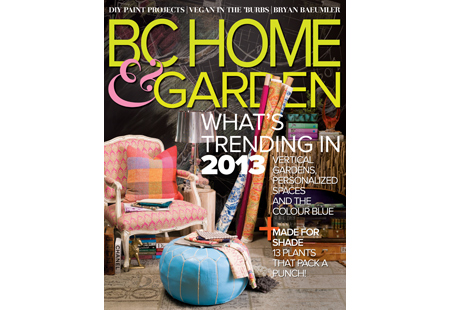
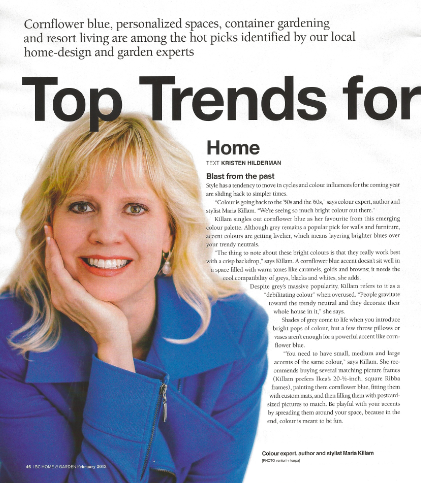
In case you were wondering (I’m sure you weren’t), I changed about 5 times before we got this photo for this article in BC Home & Garden about trends. And because you can’t see it, here’s what I said:
“Colour is going back to the 50s and the 60s,” says colour expert, author and stylist Maria Killam. “We’re seeing so much bright colour out there”.
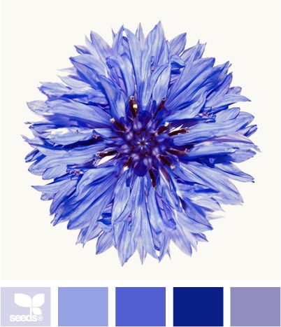
Killam singles out cornflower blue has her favourite from this emerging colour palette. Although gray remains a popular pick for walls and furniture, accent colours are getting livelier, which means layering brighter blues over your trendy neutrals.
“The thing to note about these bright colours is that they really work best with a crisp backdrop”, says Killam. A cornflower blue, tangerine orange or raspberry accent doesn’t sit well in a space filled with warm tones like caramels, golds and browns; it needs the cool compatibility of greys, blacks and whites, she adds.
Despite grey’s massive popularity, Killam refers to it as a “debilitating colour” when overused. “People gravitate toward the trendy neutral and they decorate their whole house in it”, she says.
Shades of grey come to life when you introduce bright pops of colour, but a few throw pillows or vases aren’t enough for a powerful accent like cornflower blue.
“You need to have small, medium and large accents of the same colour”, says Killam. She recommends buying several matching picture frames, for example, IKEA’s 20 inch square Ribba frames, painting them an accent colour, fitting them with custom mats and then filling them with postcard sized pictures to match. Be playful with your accents by spreading them around your space, because in the end, colour is meant to be fun.
Story by Kristen Hilderman, BC Home & Garden Magazine
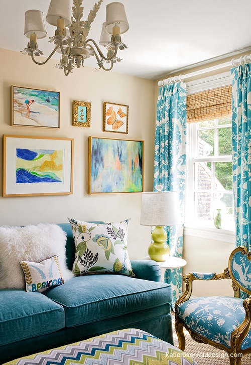
Blues are definitely hot! Peacock blue is currently everywhere and every time I suggest it, my clients get excited.
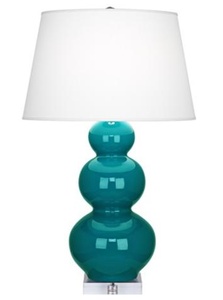
I recently specified this lamp for a clients sitting area in a master bedroom and it was beautiful with toss cushions to match.
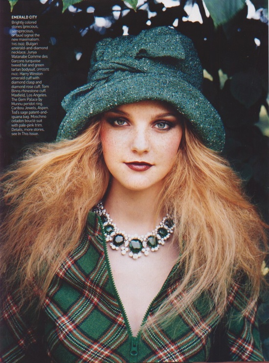
Emerald Green, which is a blue based green was Pantone’s pick for 2013. I am loving it in this image paired with a bright apple green shade.
Which blue is for you?
ps. If you are a regular subscriber to my blog you may have noticed the new subscribe button at the top of each post. It’s because I’m moving everyone away from Feedburner to my new email provider. This way I can customize the email you get in your inbox and it looks much more colourful. So if you haven’t already, you can register here and then just unsubscribe from the old one.
Related posts:
My Take on Pantone’s Colour of the Year: Emerald
Renovating around Bossy Colour Trends
The Hottest Colour Trend for Countertops
If you would like your home to fill you with happiness every time you walk in, become a client
Download my eBook, How to Choose Paint Colours – It’s All in the Undertones to get my complete step-by-step system on how to get colour to do what you want.
To make sure the undertones in your home are right, get some large samples!
If you would like to learn how to choose colour with confidence, become a True Colour Expert. April in Toronto and Vancouver in May.

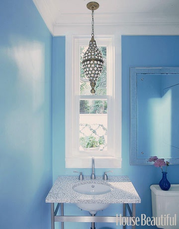


I love all those blues, and I love how easy it is combine different shades of blue.
Although the blues featured here are gorgeous, I haven’t used any blue in our home. I’m planning a very soft pale gray walls/white trim laundry room with pops of orange or yellow! The room has an east and south window so I think it’ll be able to take those bright colors for pops…and the gray will be on-trend and classic. Should all work nicely with my white appliances too 🙂
Aqua all the way. Always since I was young – favorite all around color. I have a pear shaped aquamarine wedding set. It’s the color of the water at the beach I long to visit. Probably why blues and greens are also favorite color combo.
I just love the peacock blue, espec. on the sofa – it’s to die for & very 60’s. I agree with your comment about cornflower blue, tangerine & raspberry needing cool colours for compatability as a general rule, but I’ve also seen some interesting rooms featuring choc brown and raspberry. Also your pic. of the peacock blue room has pale caramel walls as a backdrop. But I think these combos only work when there is plenty of white used (eg in soft furnishing & other decor). What do you think? P.S. your jacket is the perfect colour for the story.
I’ve paired raspberry with a pale yellow (BM’s Philadelphia Cream) and various shades of green. I really enjoy the look, particularly since I’m a warm-colored person. Even though I think the cooler colors can look really awesome, it just doesn’t work for me.
The blues continue to be #1 and in South Charlotte. Both blue teal and navy are very strong here. Greens are very pale, like beach glass. And of course gray is viral.
The blues are beautiful!
I found your blog via (one of these images) via another designer via Pinterest. : )
The Peacock Blue (in that fabulous picture) and the pops of periwinkle are just wonderful!
I am such a big fan, if not addicted, to most all shades of blue. As well as green. I use it in all of my paintings. I also love using and seeing the grays with the “pops” of color. One one my very favorite “pops” to use in these cases are Bright Teals, Periwinkle Violet and Chartreuse Green. It honestly brings live and even adds an element of unexpected depth to most all naturals.
Yay! for creating this specific blog post!!
I am now living with an expansive water view and did my spaces with toned down neutrals as to not compete with the view, but I have punches of various blues, seafoams, and mustardy oranges…still a bit toned down for me. My last house was very saturated bolder colors with black accents so this is really taking me out of my comfort zone.
Love it, Maria–these colors simply make me feel happy!
Not a fan of blue and quite over the turquoise/peach/coral colors from my Southwest Native American period. However, have decided to embrace the antique blue (bluish-green) of my little secretary in the guest room (not an antique but a sort of “looks like”) and go with the bold colors in the highback chair cushion I found to go in the cheap Adirondack chair I found to use in the room until I find and can afford the perfect reading chair. And I’m liking the way it’s coming together. Fun post and neat pix, and Linda’s right – your jack is perfect. Your comment about white walls as a backdrop for bolder colors is particularly significant fo me as the previous owners of my new “old” house repainted everything except the bedrooms/baths in a custom color that was probably meant to be a beige but in most light looks to me like a very soft golden yellow with even a hint of peach (not ugly, but only the barest hint of beige in the shadows – can’t imagine why or how they chose it). Been debating whether to paint bedrooms the same color as they definitely need painting, but since I’m going to have bolder colors in both bedrooms, possibly best to stick with white as you suggested. Also, with my east/west exposures from big windows (except for a corner south/west windows in the kitchen), need to hang here for a while and watch the effect of the sunlight as it moves overhead from all the way south (in December) to all the way north (in June) before I make major decisions and then possbily regret them later.
We can always count on you Maria to keep us in touch with the hottest color trends! I loved the bachelor’s button flower you used for the blues. I’m happy with the greys/blues/greens that are trending right now – it seems one year we are in the hot tones and the next, the pedulum swings back to the cool tones. Never a dull moment in the color world!
Blue is back..big time! It was “all over” the runways a year ago in Europe and it’s making waves here in the USA! You look fantastic in..cornflower blue! franki
I have noticed a heavy dose of Sapphire starting to show up in the fashion catwalks and have begun to expect to see it in interiors soon. Cornflower – oh my, we had a bathroom in this years ago and LOVED it. Absolutely in love with Emerald and happy to see it this year – both in my homes and my closet!
the green in the last picture is what I want – so I can pair it with any color . I was talking about clothese
I love the color combination in the living room setting. Will you share the wall color. It is perfect!