


I arrived in Atlanta on Monday night and Tuesday, during set-up for my True Colour Expert Workshop, I popped over to Chadwick Lakes for a consultation. Fran has a gorgeous home in this gated community and you’ll see more of it in my next post. This one is about her master bathroom.
She had recently renovated it and installed Crema Marfil Tile and slab for the countertop. The walls were currently HC-92 Wheeling Neutral and she could see that there was something not quite right about the undertone but wasn’t quite sure which colour would be right.
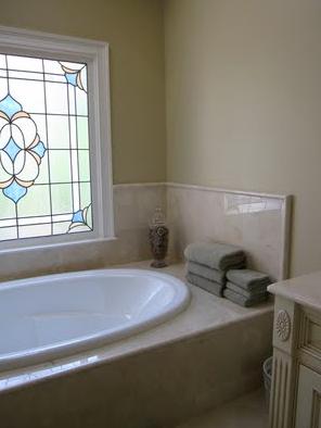
Hopefully you can see on your screen that the Crema Marfil was slightly more pink than the wall colour (above). Not screaming pink, I would say Travertine is pinker in general, but pink nevertheless.
Here is another view which includes her new glazed cabinets. Her kitchen and adjoining family room had the same glazed cabinets and they were wonderful. In her master bathroom though, the undertones were fighting and she knew something had to be done. I suggested that the cabinets go back to white. Then they would tie in better with the existing woodwork, bathtub and sink colour and the white in the stone.
This will be hard to distinguish on-line so you’ll just have to trust me, however, we basically tweaked the colour to HC-45 Shaker Beige. It has just enough pink in it to tie in much better with the marble but as you can see it is the exact intensity of the existing HC-92 Wheeling Neutral. She could see the difference immediately.
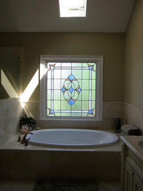
Fran’s bathroom had a lot of natural light. The stained glass window (above) and the skylight which made this colour just right. However, she had some Crema Marfil left over when this bathroom was finished so she had it installed in her guest room bath with no natural light. When we tried the Shaker Beige in there with just regular incandescent lighting, it was way too yellow, not right at all. Artificial light takes the warmth out of the colour and makes it cooler which was why the pink beige suddenly went yellow beige with the exact same marble. To make the colour work in here, it had to be in the realm of Brandy Cream so that it coordinated.
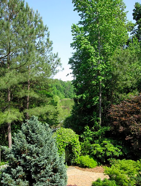
This was the view from Fran’s kitchen. There are about 100 homes in this gated community and she said 50 of them are around this lake. Just beautiful.
It’s HOT here in John’s Creek. I’m loving it! And don’t have clothes quite cool enough—eeeeeek! And I’m totally enjoying my 17 participants/designers in my True Colour Expert Workshop this week.
Hope it’s at least Spring (not in Vancouver) or Summer (like here) where you are!
xoxo Maria
If you would like to gain more colour confidence in your consultations, become a True Colour Expert.
Related Posts:
What Everyone Should know about Beige
Does your Colour Consultant Understand Beige?
New to this Blog? Click here ; Subscribe to my free Monthly Newsletter; Become a True Colour Expert

Great example of how beiges vary tremendously. She is lucky to have you on board to help her choose the right undertones!!! Kathysue
I am always so interested in your posts. They really are so informative and have soooo much info !
thanks so much Maria!
kelley
Hi Maria,
My parents and sister live very close to your client… it is beautiful isn't it?! I do wish I could be back for a visit and attend your workshop at the same time!
Thanks for the post (Shaker Beige in my bath!),
Traci
The paint will have changed its apparent color in the different lighting, not just the stone.
You could have tried installing a few light bulbs that are closer to natural light than the common tungsten to bring out the undertones you wanted in the paint and stone.
"Warming up" or "cooling off" lighting by adding some incandescent or flourescent bulbs is a common practice.
Also, not all Crema Marfil comes from the same quarry – they label it by what it looks like, not where it comes from, unless the quarry has trademarked the name (like Danby marble).
Different spots in the same quarry will vary. You have to make sure your supplier has color-matched the slabs or that you have sequential cuts, numbered at the quarry.
Maria, I love this bathroom..the marble, the paint, and the beautiful stained glass window.
You did a great job–as usual! :o) I'll be visiting this afternoon to catch up on your posts, but I wanted to let you know that I linked three times in today's post to you.
One was to 'my friend, Maria'–you are such a good one! Two was to your color blocking which I used to decided on the fabrics for my new wall art.
And three was to your great Creative Wall Art linky parties from last year. They are what inspired today's project. I'll be posting the 'how to's later, but I just found out the grandkids are arriving on Friday!
Sounds like you are having a super time. I know it's been cold and wet at your house as my kids don't live far away. They are looking forward to the warmer weather too. :o)
Happy designers who get to spend the weekend with you! I don't have to tell you how jealous I am. LoL!
xo
Donna
We just finished a large master bath in Connecticut in which the tile was a combination of Crema, Thasso White, and Emperador Light and we used Farrow & Ball Joa's White and it looks fantastic.
So discouraging when people post as Anonymous. The first one made an excellent point. Sounds like you know your beans. Who are you? LoL
Good point about “coming from the same quarry”. Dye lots, so to speak, hold the same for everything from wallpaper, tile, carpeting, all granite and each gallon of paint we buy. Lighting will make the world of a difference as well.
So just about any color would look good with the neutral Crema Marfil but it's the total package of the room that will determine which color looks best!
Nice post Maria.
bathroom with a natural light and such a location…perfect!
I have Crema Marfil in my kitchen and my living room. The tiles look great with my blue curtains. I'm not sure about pairing it with pink or other hue of that type.
In the photo, the bathtub and the wall are perfect mix and match. They complement with each other.
Wow-Maria! You are right..all your comments are gone including mine telling you all about my post with the wall art and the three links I made to posts of yours. I remember there being at least eight comments on here.
Sadly, I lost all my comments on the wall art post too. I'm so glad you left yours after Blogger got back up as I wasn't sure if you had seen my post. :o)
I love the tile in the bathroom and especially the stained glass window!
xo
Donna
Okay, this is what I don't understand. Maria, you talk about how the artificial light changed the way Shaker Beige looked in the windowless bathroom and the bathroom with no windows. But what about at night when ALL rooms must rely on artificial light? I am usually home mostly at night anyway since I work all day during the week. How do we compensate for that? Did the Shaker Beige in the master bath not work with the Crema at night?
Hi John,
Most colours do not 'coordinate' with their interiors at night (and people understand that so as long as it's perfect during the day–it's okay) so I would colours during the day. In a windowless bathroom obviously it doesn't matter when you choose the colour as it will look the same if it's chosen day or night.
If you are only in your space at night and want the colours to look good at night then yes, choose them at night so that you like them.
Maria
Maria, is there a way to find colors that work both day and night? I have a color in my living room which is SW Ramie (almost identical to BM Crown Point Sand). It looks great in the daytime and looks OK at night on the side of the wall with the lamps. However on the side of the room where there is no place to put lamps, it goes too dark and greeny. I am thinking of installing sconces on that side to compensate.
I find that I am gravitating more and more to lighter colors. I used to like autumnal "Tuscan" colors, which I cannot stand at all now. I now love blues, aquas, creams, and grays. For some reason, I find dark colors can come off as tacky and cheap unless you are working with a really nice house with good bones and nice furniture.
Colours that look good at night too need to be lighter and more neutral or dark I think but that is such a general answer and not the right one if you need a colour to pull your space together which is way more important in my opinion than just finding a colour that 'looks good' at night.
Get some more lighting, you can't have enough!
Maria