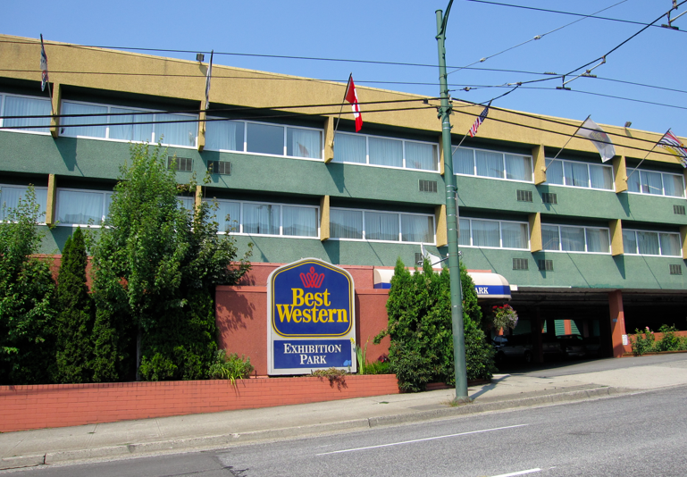
Occasionally, when I’m driving by a building, if I think it’s interesting in some way, I’ll snap a photo of it. I took this picture over a year ago because I actually thought the way the “colour blocking” on this particular building actually looked good, especially because there’s not a lot of great architectural detail here. And the fixed element of the orange brick was also incorporated into the scheme. I thought they had done a good job.

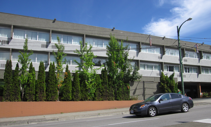
I drove by the same motel a few weeks ago and noticed it had recently been painted.

A few years from now, anyone in the colour business will be able to determine when this was re-painted just by looking at the obvious trendy colours.
So, over to you, which colour scheme do you prefer? I did not choose them so it won’t bother me which one you vote for, you obviously know which one I like.
When I posted these commercial buildings months ago, no one was really all that impressed. Do you vote for colour or for the gray?
Related posts:
Gray for Commercial Buildings: Yay or Nay?
Danger: How you Know you’ve Fallen for a Trend
What Everyone Should Know about Gray
Download my eBook, It’s All in the Undertones. If you have a computer, you can download my book!
If you would like your home to fill you with happiness every time you walk in, contact me.
To make sure the undertones in your home are right, get some large samples!
If you would like to learn to how choose the right colours for your home or for your clients, become a True Colour Expert.


I like the blue and orange. I also like motels to be well marked, so I like the big sign, too.
The gray with more gray is just blah. How about a combination of the original gold and terra cotta with gray where the green was?
Had to respond to this one because I do the same thing and I’m not even a colour pro.
The gray makes it look like a prison! How UNinviting! I really liked the first one as the colours really complemented one another so well and achieved a sort of Post-modern feel. It looks like there’s a new owner that wanted to create their “own” statement even if the prior one was better.
CTD
Um…drab and sad now with all gray. Well they should have consulted you Maria!
color is much more appealing. looks extra cheap now, as they didn’t even do the correct tones of gray. Way too cold.
It looks drab.
The colors of the original sign clashed with the colors of the building, but it stood out much more than it does now. Ugh. Cold and grey in VANCOUVER!
Uhh.. are we sure it is still a hotel? Looks like some sort of housing, but very cold, institutional. Not welcoming at all. Wrong grays.
I vote for the color.
Mary in Cincinnati
Don’t like the gray at all, but then I usually don’t like gray. The last thing you want to do when you are travelling on business is drive up to a dull looking hotel. I wouldn’t want to stay there.
The gray is definitely Soviet bureaucracy coloring – “like a prison” is a good description. The colors, however, are too drab for me also and are only slightly better. The orange of the original bricks, while muted, has some punch and integrity. I’d tweak the ochre and green to give them a bit more punch while still keeping them muted. Just a thought.
I vote for color…all the way. The human body needs color to feel balanced. All this grey…sigh…
At first glance, I prefer the gray, but the psychology behind the color for a HOTEL may not fit the color scheme. I LOVE color and could also recognize that it may need to stand out on the road, in the snow, and add warmth to the day. Color is usually my “angle” more so than neutrals but the gray does make it look much larger and easier to tolerate the lack of architecture. So, I have a mixed opinion. Where did the sign go? Interesting commentary on this post….
The gray is very cold and uninviting. Although the building with color is not great, it’s better than cold! xo marlis
as you say Maria, grey only works in the presence of other colors! I agree with Katkins, they should have left the gold, and terra cotta in place. Then the grey would have worked.
If you wanted people to drive right by your hotel and not even notice it, I would choose the gray. At least it would not be appealing to me in anyway, and I would probably never even notice this building. Of course I am not fond of gray anyway.
The windows of the motel surrounded by the green appear so much more inviting – they’re softer; more appealing/inviting than that lonesome prison grey!!
I vote for the color on a hotel; leads me to believe the rooms will have happy colors and I will enjoy staying there. Actually, I like the gray, too, for an office building of a company that does not want to attract attention. I live in sunny Texas so the coldness of the gray could be welcomed during the six months of heat.
The gray makes it look like a big slab of concrete. Yuck! The colour is definitely better, it has a definitely 70s vibe which is coming back in style, so they should have left it alone.
Hi Cumby,
It’s now a Ramada I think so they took that sign off and just did a tall sign by the hotel which you can’t see in the photo!
Great comments everyone!
Maria
The prison comparison was apt–especially since they chose to put the heavier darker gray on top. The verticals in that gray reinforce the cell atmosphere.
Who makes these decisions anyway??
Even though it’s “only paint”, it’s usually for a long time & at no small cost. Good illustration of the need for a colorist for retail and public buildings!!! Don’t you wish you could somehow post this on the evening news?
Great illustration, Maria!
Even tho I see I am in the minority, I really do like the gray. I think it is crisp and clean looking. The other colors look gaudy and dated to me.
Mmmh! The first image is a bit too colored for me, the second one is too boring. I would have loved the grey with a hint of another color.
I agree that the grey looks prison like – maybe if they added some black or another accent colour. Also they didn’t bother to paint the terra cotta on the planter? – odd
I think the first one is better because it contrasts nicely with the green in the plants. It makes the building more noticeable
Uh Oh.
Can I say neither?
I agree that the gray looks uniniviting and institutional – however I don’t like the bright colors either. It says Exhibition Park….guess the color scheme suits the location?
I agree, color has to be used, but less intense, please.