Remember this post when I showed you the fabrics I had chosen for a guest bedroom I was designing for a client?
Well here it is, almost done! The carpet will be replaced next (throughout the entire floor) so don’t look too closely at it.
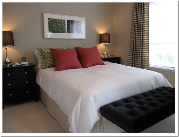
The tufted velvet ottoman is on Lucite legs so that’s why it appears to be floating.
Here’s the before photo. My client’s daughter had just moved out and she was turning it into a guest room!
Photos by Maria Killam
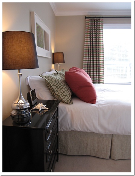
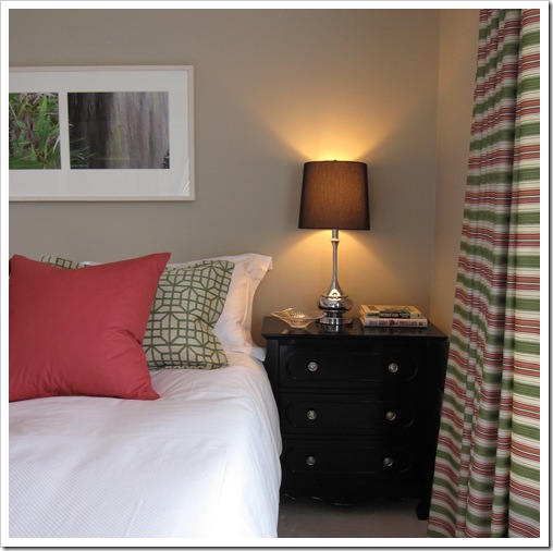
The custom bedskirt is linen and the shams and drapery fabric are from Robert Allen Fabrics.
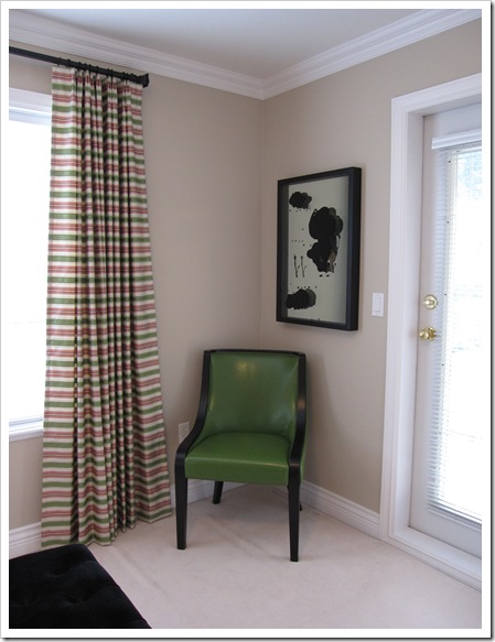
I’m a big fan of the ‘hotel chic’ look, thus the store-bought-high-thread-count white cotton duvet cover (it has tiny squares in it but you can’t see them in the photos). I also love it when the stripes are railroaded so that they are horizontal instead of vertical!!
The wall colour was chosen first (the painter was coming) and she had just bought the art from a gallery so we chose a warm taupe to pick up the soft grays in the photography.
Then I found the chair and decided to combine it with the hot pink for a hit of colour and drama!
And the photos are taken by me (not a photographer) but I picked up one tip so far and that is, shoot from an angle–not the way I shot the before picture!
And I am missing a flower in these photos but the ones I brought ended up looking too traditional so I nixed them at the last minute.
I have another big installation tomorrow! Should be fun, I always love installation day!
If you haven’t read Vicente Wolf’s blog, click here to read a great post about what his installations look like. I love his blog because he talks straight (like me), my favourite kind of person!
We would love to help you choose colours or create a plan to pull your room together. You can find our fabulous email consultation packages here.
Need help choosing the right neutral or colour? My How to Choose Paint Colours: It’s all in the Undertones ebook takes the hundreds of choices down to 9 neutral undertones along with list of all my other go-to best grays, broken down into 3 undertones, green, blue and purple. The beige undertones of pink, yellow, green, gold, orange and taupe along with the best greens and blues.
My bonus book of colours is worth the price of the ebook alone but you will also get my system of understanding undertones so you can stop making mistakes when sourcing tile, carpet, countertops, etc.
If you would like to transform the way you see colour, become a True Colour Expert.
Related posts:
New to this Blog? Click here ; Subscribe to my Monthly Newsletter.
While you’re here, subscribe to this feed so you don’t miss out!














It does look just like a chic hotel room! Very nice!
Maria, it is so hard to appreciate the magic you worked unless you see the before picture. AMAZING transformation! Your ability to envision change is just amazing!
I love Robert Allen, too – and customer service is a big reason why. Broad fan base!
Thanks for sharing the great project, Maria. So satisfying!
Major improvement! I love the green chair
Beautiful! I love it all and I especially love the wall colour, green chair and bright pink cushions.
Wow, I would be very happy to stay in a hotel that looked like that! I especially love the drapes and that sweet tufted bench!
Very appropriately titled, Maria; it definitely does look hotel chic compared to the before! Lovely job! I'm off to read Vicente's post.
I really like the paint color – inukshu – meaning "likeness of person" and this person likes it!
So pretty!
I am in love with that tufted bench and green chair. Fabulous job!
What a fabulous transformation!
The feels both calm and happy.
The room is just beautiful; everything flows so nicely and I adore the green chair and the unique piece of art hanging above it.
What a big difference custom drapery makes to a room. I agree with you on the horizontal stripes – they look colourful and tailored and just skim the floor-love them!
Your client must be thrilled and doesn't that just colour you happy? 🙂
What a sophisticated but fun space! Yeah for the lucite-I can never get enough of that. Job well done!
The greatest thing about having the additional room in your home that serves as a great room, is that, as the homeowner you can stay in it as your own guest as well.
Your client must be so pleased. Their holiday guests will be in a luxury that they may not want to leave. The great thing about luxury chic is that it's pleasing to all different design tastes.
I agree installation day is just like Christmas all year long!
Bette
just beautiful!!! love the colors – as expected from you!
Great job Maria
Love the color combination
Fantastic transformation!
Love the colors. That green chair is just beautiful.
Great job Maria. Your clients must be thrilled.
xo
Brooke
LOVE the room Maria. The bedskirt is divine.
Ruthie
I love "hotel chic" and this room is a beautiful example. And that green chair, I saw it last year at the buying show and have been dying to use it in one of our projects. Nice choice, great work.
Susan
Absolutely perfect M, I love it!
Beautiful, serene and hip!
very very elegant. colours are perfect, like the touch of black and those bedside tables are great. lamps are so elegant too. love this eclectic vibe!
I would love that bedroom. It's gorgeous.
Looks great! I love how you mixed 2 bold patterns with the window treatments and shams. I would love to stay in that room.
My first thought about someone hiring you to decorate a guest room was: 'how decadent, a professionaly decorated guest room.' Yum
Even though everyone has already said what I want to say I'm leaving a comment anyway… 'cause a blogger can never get too many comments!! Really, Maria… the room looks fresh, inviting and FAB! Great job!!
Victoria @ DesignTies
I'm glad you included the before pic too ! It looks so pretty.
Love it! If I hadn't read it, I would have thought it was a hotel pic…awesome. :))))
Jen Ramos
'Cards & Prints You'll Love…'
http://www.madebygirl.com
madebygirl.blogspot.com
totally hotel chic maria!!! love it!!! the lucite ottoman is amazing & of course I'm wild about the chair you found!!! the custom linen bedskirt & pillows just pull it all together beautifully!!! and the lamps- ahh love it!!! she must be thrilled!!
Where are the bedside tables from. I think I love those.
I love it – you'd never guess it was the same room! Looks great!
I adore seeing the before and afters!! Beautiful work Maria!!
P.S. I love the brown lamp shades and wouldn't have thought to use brown. How did you decide on this colour?
So nice! I love the the way the black elements punctuate the space. I think darks are really important, just like bass notes in a musical compostion. Pat yourself on the back!
I love those side tables, so chic!
Lovely room to please both the sexes! Have you considered a floor lamp in a slim style for the chair?
I'm a big fan… love your posts!
SherylCanadianGirl
Dear anonymous,
The end tables were from Homesense (Homegoods) I found them for $199 each.
Dear Marlo,
The lampshades are actually black but maybe look brown because of the light.
Maria
This room looks great! I love the wall color and the window treatments.
beautifully done, Maria! I LOVE that green chair. and where did you get those table lamps? they are gorgeous!
Well done Maria….love that green chair. Hope you are having fun in NY!
xx
Maria, what a perfect blend of colors. I have learned so much from your blog. Thank you for sharing your talent and efforts.
One question: Who makes that wonderful color: inukshuk?
Looking forward to more wonderful pics.
Mellow1