Why is yellow so hard to choose? Because all colours get twice as bright when they get bigger [all over the walls] and it is well known in colour theory that yellow is the first colour the eye sees, it’s simply the brightest. Which is why it has to be toned down (or muddied) even more than the other colours, before it becomes a ‘designer’ yellow on the walls.
Flickr
The reason why I’m calling it ‘designer yellow’ is because a professional colour consultant spends a lot of time ‘toning down’ colours that their clients choose in addition to helping the client pick colours that create flow in their home.
A pretty paint chip does not necessarily make a pretty wall colour and it’s also why one client said to me “I am ALWAYS surprised when I see the little 2″ x 2″ chip all over the walls, it’s never what I thought I would be”.
When I first did my colour training in San Francisco with the Daystudio, I came home and bought all the colourant so that I too could shift the colour on site [like I had been trained to do].
In the end though, the only colour I was able to change reliably [on-site] was YELLOW. For example, the way you actually get to ‘beige’ is by adding the ‘complement’ to the colour you are working with. So if you want pinky beige you start adding ‘green to red’ if you want a nice yellowy-beige, add ‘purple to yellow’.
My students spend 2 classes, right at the start, painting with colourant, toning down the colours, etc so that they can start to understand how colours are created.
Therefore, if you want to tone down a bright screaming ‘laundry room’ yellow, add some purple to it. Or better yet, take your gallon back to the paint store and ask that they ‘tone it down’ for you. So don’t worry, if you’ve picked the wrong yellow, you can always muddy it and add some orange if it’s too green. It’s going backwards that you cannot do without adding a lot of white paint to an existing colour–which I don’t recommend, cause who knows what you’ll end up with, at that point, it’s better to start with a fresh gallon of paint.
Ford actually called this colour ‘Screaming Yellow”
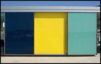
Remember the post I did on colour consulting in a house with a ‘screaming yellow’ bedroom? Well, this is what it looked like (I know I’m showing an exterior wall but you get the picture)
Image from flickr
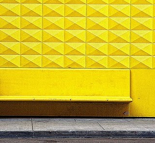
You certainly don’t need a ‘light’ with this kind of yellow. When the yellow above gets toned down, it would then work on an exterior wall like the one below:
Image from flickr
There are painters and colour consultants that arrive on site with their colourant kit and ‘shift the colour’ on-the-spot if it’s not right.
It was working with my big samples that saved me (from having to learn how to mix paint colour at the job site). An 11″ x 14″ paint sample is a perfect size for you and your client to see that the perfect, toned down yellow you have just specified is exactly right.
While you’re here, subscribe to this feed so you don’t miss out!
Need help choosing the right neutral or colour? My How to Choose Paint Colours: It’s all in the Undertones ebook takes the hundreds of choices down to 9 neutral undertones along with list of all my other go-to best grays, broken down into 3 undertones, green, blue and purple. The beige undertones of pink, yellow, green, gold, orange and taupe along with the best greens and blues.
My bonus book of colours is worth the price of the ebook alone but you will also get my system of understanding undertones so you can stop making mistakes when sourcing tile, carpet, countertops, etc.
The only way to choose the right colour every time is to combine my system of understanding undertones with the most indispensable colour tool available. You can purchase your own set of my curated large colour board collections here.
If you would like to transform the way you see colour, become a True Colour Expert.


Great question and how appropriate that you posted this just a week before Pantone named Mimosa their Color of the Year.
Mimosa is a strong yellow and we have a couple of post about the color if you want to see the actual color.
http://www.sensationalcolor.com/colorpro/pantone-color-of-the-year-for-2009/
When Pantone does this it usually spurs many homeowners to purchase paint in the color named….yup, the dreaded yellow. I guess we can get ready for even more question on yellow.
My husband and I are in the midst of remodeling and redecorating a small hall bath. I wanted to use a candlelight effect on the walls and tested what we thought would be a soft yellow, but when applied to the test board looked a lot darker and brighter then we imagined. We also tested a shade of white, but aren’t exactly happy with that either. Now we are stumped as to what color to paint this small bath with 10 foot ceiling and no window. Color choices are my most difficult decisions as a do-it-myself home decorator. Wish I lived in your area and could take your class. Enjoying your wonderful blog.
I have a fave soft pale creamy yellow called Jersey Cream by Sherwin Williams
We are turning a large basement area into a casual space for yoga and relaxation. Furnishings will be limited to large floor pillows, a couple of light wool rugs and a long bench along one wall. The room faces east and its only source of daylight comes from a very tiny window and double french patio doors, mainly in the morning. One wall has natural/light ochre colored stone and a fireplace. The floors are light oak wood. Ideally, I would like to have white walls with colorful textiles (such as Marimekko), but I’m afraid of white walls looking too dingy. Do you have any suggestions for lighting or other wall color options.
You are absolutely right, white walls in a dark room will make the room look dingy. See my post on ‘Effect of Natural Light Exposures on Colour’ for some tips on what to do and some colour options. Thanks for reading my blog!
i wish i could call the guys in the paint stores “experts” at mixing color. but in my experience it’s rare to find someone working in a shop that knows how to match or repair a color. half the time i am adjusting colors it’s because of a glaring error on the part of the paint shop.
Oh you are so fabulous.
I love yellow walls but I favour a warmer butterscotchy hue. The yellow of a sunlight dish soap bottle makes be want to scream so I laughed when I saw the car colour was called screaming yellow.
I did my basement family room with a BM colour called roasted sesame. It is gorgeous and makes the room feel warm and sunny-sort of Tuscan. The majority of my home is done in Cloverdale paint and I can't remember the colour name but I was aiming for a chamois sort of yellow beige. It looks creamier in daylight and more yellow in incandescent light.
And I found a wonderful not too brown beige, with more yellow/gold undertone, called Buckram Binding from Sherwin Williams; will use again in the new house
hi! i just found your blog the other day and i love it! im obsessed with color. im a graphic designer and first year art teacher.
i just visited my "new" classroom and it is painted caution tape yellow!!! with black accents and all. and i mean yellow from floor to high ceiling. how appropriate for me to stumble upon this post.
forget coming up with a curriculum, i have to fix that yellow!
I have had about 20 different swatches painted on my living room walls over the last year. I know I want the lightest possible cool yellow…the kind that reminds you of a cottage…but all the colors seem too bright, too brown, too green, or too white. So far I’ve settled with Valspar Gilded Endive…but every now and then it scares me…
I lived in a cave once (long dark apt with only large windows on one end — VERY dark LOL. I had read that ‘yellow is its own light source” and decided immediately that I was going to paint the walls yellow.
I brought home paint chip after paint chip and they all turned to sludge.
Out of exasperation, to be flippant, I brought home paint chip of McDonald Brightest Ever Really I Mean It Yellow. it was fabulous, The lighting that was horrible to other yellows turned this one a soft, warm color. It was stunning.
To this day, I laugh in disbelief at the power of lighing in a space to change the color.
P.S. it worked, the yellow did in fact act as its own light source.
p.s. in Father of the Bride, the yellow walls are the prettiest I have ever seen. One day, I’ll have those in my house!!!
p.s. hard to imagine yellow as a neutral, but it is in fact a terrific neutral. thanks for the fun post, Maria! You Rock!
I have found through much trial, error and reading of blogs that when a pale ,soft yellow is desired, what works best is a very light yellow with a very peachy undertone. Or a very brown yellow. Hope this helps someone!
I have BM Ferncliff in my rather dark living room and love it. Very mellow and cozy.
Oops that should have been KM Ferncliff.
I recently painted the open plan downstairs of my house in the woods all in Jersey cream with a creamy trim. The color looks good in all lights
throughout the day. Not too yellow and not
too beige-warmed everything up. I saw it in
a B&B with more natural light and it also looked
stunning.
Personally, I’ve had pale yellow kitchen walls which I loved in a north-facing room. Had a pale yellow bedroom that was bright and sunny. Yellow can work both ways. Have used more gold yellow for client’s dining room. They loved it, looks great in candlelight. Best friend has yellow bedroom, brighter than I recommended, but she loves it, has northwest exposure. I now have deep gold north-facing living room that feels warm and cozy. But, I think yellow is gross in bathrooms, makes everybody look sickly. Otherwise, being careful to not go too bright, I think yellows are yummy!
i used Behr Carribean Yellow in our basement along with a soft grey and white trim. Our cabinets are a dark wood colour and it looks fabulous – warm and clean – just what I was looking for in the basement of a 75 yr old house with low ceilings.
Only in small doses-accents. Otherwise, sensory overload!