One of the biggest mistakes designers and homeowners make when choosing colours is definitely around the world of undertones but next up is mixing clean and dirty colours. Yes you can break any rule but most of the time the combination of clean and dirty will make perfectly good tile or fabric look bad together.
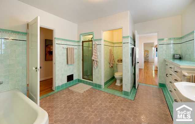
This bathroom was inherited by a recent client. It will be coming out in their renovation.
See the pink beige floor? Well it’s dirty next to all the fresh minty tile in this bathroom. It would have been ten times better in white, or it should have simply been a continuation of the darker green tile.
So here’s the rule, earth tones go with dirty and muted colours, browns and creams because earth tones are dirty. Fresh and clean colours go with white, black and gray. It’s the reason why all the pops of colour combined with gray are so hot right now.
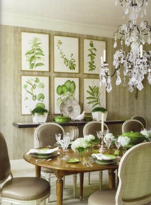
See the combination of fresh greens with green-gray walls and taupe chairs (above)? All greens seem to go together, probably because it’s everywhere in nature and any room with a hit of fresh green in plants, leaves or botanical prints like in this photo bring that room to life! It’s about the only combination of clean and dirty that work in my opinion.
A brand new sofa can look dirty and old if you chose a colour for the walls that is too clean. And as we’ve just seen by the first example, brand new tile will also look bad if the combinations are clean and dirty.
It’s also the other reason I’m so happy the brown trend is over. So many people installed murky, slate, earthy tile from floor to ceiling in the bathroom without a stitch of white in it which didn’t look good with all the screaming white tubs and sinks in that same bathroom.
So if you can’t sleep because you know there’s something wrong with the combination of colours in your house? This might be one reason to consider.
Learn how to test colours properly so you don’t make this mistake, download my eBook, How to Choose Paint Colours: It’s All in the Undertones.
If you would like your home to fill you with happiness every time you walk in, contact me.
To make sure the undertones in your home are right, get some large samples!
If you would like to learn to how choose the right colours for your home or for your clients, become a True Colour Expert.
Related posts:
Bright Colour needs a Healthy Dose of White
Don’t make this Dirty Mistake with your Exterior Colour
An Exception to Mixing Clean and Dirty Colour


Another great tip, Maria. I must say that I’m glad your clients are ripping out that bathroom. Can’t wait to see what you would do with it.
Yours is the only design blog where I actually take notes! Thanks again for another great post!
Really great post!
I agree with Heather. Please show us your results. A nice big space for a bathroom! Have fun with it.
Hi Heather & Marcy,
That would be difficult as this house is in California and I am not a renovator so I would not manage a job like this even if it was local.
This photo was simply posted with permission so that everyone could learn from it.
Thanks for your comments,
Maria
The picture is a perfect example for those of us still training our eye to discern ‘dirty and clean’. As always, thanks for sharing.
Good morning, Maria! I’m with Vesna. I take notes and pix from every blog because I always find something useful to me “right now”. Today’s serendipities are “green” in the dining room pix and the combo of the lovely dining room chairs and a totally different table which is what I’m working on in my new place (never liked matchy-matchy anyway). The favorite part of my day has become early monring after my cat people have their breakfast and I sit down at my computer with a cup of coffee and look for a blog from Maria.
You explain things so well and your pictures make it clear. The “clean and dirty” concept has helped me so much. When we were first married we bought a sofa in rust that looked so great in the store. When it arrived, I actually THOUGHT it was “dirty” or “faded”. We had off white walls in those days. If I had only known it was the wall color that made it look that way! Reading your posts is like a lightbulb going off in my head every TIME! I can literally look at them ALL DAY! THANK YOU!
I made this exact mistake unfortunately through most of my house! I have an open floor plan so I put a taupe berber throughout. It worked with my cashmere walls fine until my hubby moved in and wanted color. I painted the walls a fresh deep yellow gold not even thinking about the carpeting. Next thing you know my carpet looks dirty and old even though its not in bad shape. I was only thinking about the new red couch which looked great against the yellow wall but now the couch is gone and the ugly wall to wall remains!
Hi Maria,
Thanks for the reminder! I have your eBook, and I need to remember to use the clean/dirty concept. The bathroom photo above does an amazing job of illustrating the point!!
Do you explain this concept to your clients as you’re helping them to see why a color is the right color for a space? Just curious.
Great post!
Jill
Very good information Maria. Just so I am clear on the not so obvious colours of dirty vs clean, and particularly the browns you mention, can certain browns ever be ‘clean’ shades? For example a lot of the French Country style blogs show white walls with cognac coloured vintage leather furniture (maple syrup colour) and it looks fabulous, especially with a little bright colour here and there. So are there browns with clear undertones? That would be a great topic for an indepth review. Thanks….
That floor definitely isn’t original to that pristinely kept 1930s bathroom. It would have had tiny marble tile in a small hexagonal, circular or herringbone pattern…maybe even a basketweave and probaly in white although it may have had a border. Exactly what so many people are going for today as it’s classic. I’m the lone dissenter, having seen too many beautiful original and fully functional bathrooms ripped out and replaced with the current flavour. .. Tuscan, etc. They all look horrible now and rarely correspond to the rest of the house. How sweet that room would look with the right floor, wall colour and decor. Oh well, someone had to defend its integrity. It’s one thing with a dated replacement or ugly 70, 80,90s style. That said I can read the rest of the article, because it was a perfect example of clean mixed with dirty!
CTD
ctd
Teresa, I agree with you that it would be a shame to rip out that marvelous 1920’s (or 30’s) bathroom. It is totally cool and looks to be in great condition. A great original bathroom like that is a great asset to a house. I would do what I could to play it up.
I disagree, though, that that is not the original floor. My sister lives in a 1928 house with original bathrooms and one of them has that same floor in the same color. Her SIX (count’em) bathrooms are each a marvel to behold, although some of them have tile color choices that seem a bit odd. I guess even very wealthy people (I refer to the original owners) didn’t always make the best choices.
Hi Teresa –
Crazily enough, that is the original floor – It was my bathroom until January! I actually have the original photos from the ’20s.
Jen
P.S. No Tuscan will be happening here!
Hi Maria,
This post is so timely! Just moved into a new rental with an earth-tone carpet, dark stained wood trim, and white walls (SW Swiss Coffee). We’re shopping for a new sofa, and I was thinking a clean color would pop nicely against the walls and trim, but now I’m worried it will make the carpet look dirty. I went and looked back at your newsletter about dealing with carpet you hate. I don’t actually hate this carpet, but will I need to get area rugs to make it all work?
Thanks…
Abbie
Maria-I appreciate that you keep reminding me about clean vs dirty colors and what they go with. For some reason I have a hard time wrapping my brain around this concept.
Taking it out? I hope you mean just the floor. I love the green tile!!!
Hi Maria,
I downloaded your book yesterday. I read it cover to cover with my fan deck at the ready. I love it. Thanks and thanks and ever thanks!
Great post, as usual! I’m with you on brown, so glad it is over.
That is *quite* a bathroom — and a perfect example! Thank you, and your client, for sharing!!
One of my clients re-did his bathroom with all that dark, murky tile plus pinky beige tile! He wanted me to help him choose wallpaper, and was surprised that it took us hours to find something that would work. Luckily, I found the perfect dirty wallpaper that tied it all together, but we must have looked at a hundred wallpaper books.
Yes, thanks for much for sharing this as an example. I’ve slowly (very slowly) gotten the grasp of this concept, and now when I see “dirty” it really bothers me. But of course I’m going to be inspecting all of the color combos around my house this weekend. Thanks so much for the tip.
Hi Maria,
I have enjoyed your blog and I was surprised to see our dining room on this post! The walls are not green but rather a driftwood gray and the chairs are a taupe-gray that pick up one of the colors of the wall. The room is stunning in real life-there are beautiful french doors that lead to a private garden. We usually keep the doors open during dinner parties because of the wonderful California weather. Thank you for the nice surprise!
Hi Kara,
That’s fun, in my colour system, grays always have either a blue, purple or green undertone. As your walls are neither blue or purple, that is why I called them a green gray, and driftwood gray is another way of saying it as well.
It’s a beautiful dining room!
Maria
Maria,
Would BM Driftwood Gray go with BM Alpaca? The walls are Alpaca and would Driftwwod gray be OK as an accent wall (maybe wallpaper)?
Also: Does Alpaca have yellow, pink or green undertones? I’m still learning. 🙂
Very insightful. 🙂 Thank you for sharing!
Hi Maria,
I love clean colors. How do I keep from going to “bright” when using clean colors? I am drawn to clean bright color but do not want to end up so bright it is uncomfortable to be in the rooms. Won’t adding gray to the colors dirty them?
Yes it will but clean and dirty have context just like anything else. If you compare Stem Green, Pale Avocado and Fernwood green in addition to an even dirtier green like Clarksville Gray you will see that each one gets muddier and the green that’s right for you is the one that coordinates with the rest of the colours in your house. Maria
Hi Maria,
Thank you for the quick response. The fixed elements in the house are white. So do I even need to be worried about going too bright? Should I be keeping them in lighter versions of the colors (like the first color or second color on the fan deck leaf vs the deeper colors), since graying(muting) them may make them come off as dirtier than the white. I like bright an happy, but do not want the house to look like it is decorated for a child.
Hi Maria,
Not sure if you saw this response in reply to your response. So I thought I would post it in another format. The fixed elements in the house are white. So do I even need to be worried about going too bright? Should I be keeping them in lighter versions of the colors (like the first color or second color on the fan deck leaf vs the deeper colors), since graying(muting) them may make them come off as dirtier than the white. I like bright and happy, but do not want the house to look like it is decorated for a child.
All bright colours go with white, and colours on an exterior should always be somewhat muted so it doesn’t look like disney. If you need help my rates are posted here:
https://mariakillam.com/consulting/interior-colour-coordination
Maria
Great article. You just prevented me from making this exact mistake. I am re-painting, like the fresh clean grays, greens, but can’t afford to replace the flooring,which is slate gray with some coral..looks coral in daylight, but dingy gray in the my small dark bathroom. Anyway..back to the drawing board. I was wondering why the light grays I was choosing didn’t work!
finally, someone put this into words / theory for me! i do think people overrely on neutrals, like taupe and beige, too. neutrals aren’t completely neutral, duh!