Have you noticed that you can listen to a salesperson list all the features and benefits of a product all day and all night, but if you don’t know what colour to buy. . . ?
You hesitate.
You fret.
You lose sleep at night.
And unless you are in a position where you’re forced to make decisions, like choosing finishes for a new build, you’ll quite often, just walk away without buying anything.
Recently, I was helping a client choose the right flooring colour for her new renovation. In order to make her flooring consistent through the kitchen, great room and hallways her budget was limited to a vinyl look wood floor.
The only item that was already a given, was the wood stained cabinet she had chosen.
After we eliminated most of them we got to the one that resembled a medium brown shade. Not only did it look bad with her cabinet choice, because the undertones did not coordinate, it was not the prettiest sample in the collection. So we chose the second best floor which happened to have grey tones.
Yesterday, I received this email from a reader:
My heart sank while reading your blog “Should you install gray wood floors”
We just bought a townhouse which is in the process of being built. We had two options when it came to picking the flooring, tiles and counter tops; light or dark. Since I’ve been reading your blog I know how you feel about white cabinets so we chose the light option.
The dark option wasn’t really that dark it was more of a dark medium brown. The counters, tile and carpet are pretty much the same colour but the counters and floor seemed a flat, dirty brown.
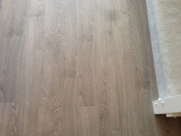
So we chose the white cupboard option which includes; you guessed it GRAY FLOORS. The gray floors picture enclosed have a purple undertone (I think). After reading your blog I feel like I will hate them already. I could try and ask the contractor if he could install the brown floors but he has already explained to me “these are not custom homes”.
Picture of her floors
Here was my response:
“Let me give you some freedom right now, if you only have two options and the one that’s not totally classic is prettier then the other one, then that’s the right choice.”
Her floor has some yellow (and pink) tones in it and it’s light enough to still read neutral, just like denim. It’s a pretty floor with nice movement, I’m personally not a fan of really flat looking floors with barely any wood grain.”
It’s the dark charcoal ones that are the equivalent of painting your floors charcoal that are trendy.
So here’s the thing,
When you have a budget or you’re working with a builder and you have STANDARD colour choices and finishes to choose from? This will shift your colour choices and may force you to bend the rules of classic and timeless in order to get a coordinated and beautiful colour scheme.
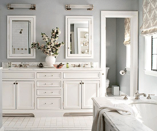
If you are building a home and you have chosen a white kitchen and then you shop for white tiles for bathrooms but the one that you like the best and fits within your budget is cream?
What do you do?
You go with the cream option. And you paint the trim cream in that bathroom, even though it’s white everywhere else.
Maybe It’s not perfect flow, but better to have something that you love that also fits inside your budget, rather than the second best choice.
When have you bent the rules to get what you want?
Related posts:
If you would like help creating a palette for your home, become a client. Online or In-person.
To get your exterior colours right, download my How to Choose Exterior Colours with Confidence webinar and get my go-to list of colours.
Download my eBook, How to Choose Paint Colours – It’s All in the Undertones to get my complete step-by-step system on how to get colour to do what you want.
To make sure the undertones in your home are right, get some large samples!
And, if you would like to learn how to choose colour with confidence, become a True Colour Expert.


Maria,
Thought-provoking article, very nice! Sometimes I’ll have a client who is so stressed out about making a decision, not because there are too many options, but because there are too few (many just 2-3).
I always say that design (as in life) is not always about making the “perfect” choice, and is more often about choosing between the lesser of two evils – what works best given the situational parameters.
Kristie
Good article, and comforting to many!
I can sympathize with your reader. I was in her situation 15 years ago when our townhome was being built. Since then, I have replaced everything the builder installed. It’s taken a long time but I finally have a home I love.
I learned a valuable lesson in the process. I never should have paid extra for the upgrades because they have all been replaced. Yes, experience can be costly.
To the stressed reader who e-mailed you: I LOVE your floor choice! The gray tone looks coastal to me — a bit driftwood-like — and to me, that is timeless. (Others might see the look of Belgian oak — and that is old world timeless). If you search images online for coastal design or Scandinavian design, I think you will be pleased with your choice.
Enjoyed the article! Sound advice, Maria.
Great article, Maria! Have been in her position many times but the hardest decision was when I moved in my current home. It is a rental so I,luckily can paint the walls. (Just give up my deposit when I vacate.) But, there is pink-y beige (new) carpet and orange-y oak woodwork. (This, after living in CA with beautiful white woodwork.) And I absolutely could not stand the bright white walls with my primitive/look furnishings. I had to choose a color that went with or minimized the oak woodwork & still didn’t conflict with the carpet. WOW! It probably took me 3 weeks and to make matters worse I have a LOT of RED furniture & accessories. I did it, but there are days…
Hugs,
Joy
aMaria, this post needs to be required reading for those in the Renovate With Confidence Summer School. This is way beyond comforting to those of us in this situation, and how brilliant of you to take the concept of “lesser of two evils” and turn it into “happy” and “sad”. The Arizona retirement community I live in features homes built mostly in the 1980s and 1990s with open floorplans that were never designed for hardwood floors (concrete subfloors meant for tile and the ubiquitous carpet). The 1980s homes are quite shaded and the 1990s homes are very light and open homes with high ceilings, large windows and everything white (walls, tile and carpet) with pickled oak/whitewashed pinky beige cabinets). “Classic and timeless medium brown hardwood floors” or any version thereof (mostly very bad that I’ve seen) don’t look right. In fact they look very trendy (installed in the 2010s) and often scream “new floors, old house”. I haven’t found any inspiration here.
Your reader’s floors remind of Kate at CentsationalGirl.com who just did a post this week (Finished Floors, 08/18/14) on the wood-look porcelain tile floors they installed throughout the summer home they recently purchased in Nevada (the home looks very similar to our 1990s-built homes here in Sun City West). Her results and your pictures above and your teaching and guidance give much hope and inspiration for us budget- and choice-limited renovators. Thanks muy mucho!
I would do anything to avoid decision-making, which actually means I do nothing. There are things ab my mid-70’s townhome I detest and should have insisted on changing from day 1…
The things I DID insist on were absolute deal breakers…I replaced the hideous kitchen floor w attractive wood, had the squatty cabinets raised to the ceiling and put glass in some of the doors. But I’ve lived w the other builder ‘goofs’ for 10 years….cheap fixtures, ugly, blah carpet all over the 2nd and 3rd floors…weirdly half-carpeted baths, vents put in the most obviously wrong spots…blah paint, Saltillo tile and a black and white marble fireplace surround…these are Georgian, BTW….I don’t know where to start and my husband could not care less…so I mostly try to make the outdoor area attractive.
Excellent article Maria!!!
I am the person with the cream subway tile in the bathroom when I really wanted white. It was like the clouds parted when you said use Cream for the trim in that room. I have been so against using multiple trim colors that that idea could not not have been an option. You just gave me a free pass to move on. Thank you Maria.
Now when is that book on white going to be released.
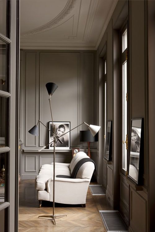
Would love love to know the color of the walls in the picture at top of this article/post. It looks a green-gray perhaps? It’s almost edible it’s so pretty. Wish I could source it.
🙂 Suggestions? K
Hi everyone,
I’m near the end of a new build. Extremely lucky for me I found Maria’s blog before I had to finalize paint choices. The architect was absolutely great, but his suggestion for trim throughout the house was BM White Dove. We have carrera mosaic floors and statuary marble for all bath counters. After studying Maria’s posts, I understood that a cleaner white was needed for bath cabinets and trim. I love how the White Dove looks in the rest of the house, but the switch to Chantilly Lace white for the bathrooms’ cabs and trim really complements the marble so much better. I agonized over it and am ecstatic with the result. A big thank you to Maria for educating me about white paint and marble. BTW I bought her set of BM Neutral paint chips. What a god send. No one paid me to say this! Thanks again Maria!
Great post! Always interesting and learning something, love that. I really like the reader’s gray floors. Love the pictures you add Maria.
I like the floor choice, too. I think she will be really happy with her white kitchen and that floor.
It’s a fine balance between “desire to get it right” and “design paralysis”. Sometimes you need to let go of “perfect” and embrace “this will do”. We all have limied resources: time, money, desire, etc…
“limited” of course, not limied 🙂
Great advice as always Maria! Love the flooring with the picture of the millwork on the walls, adore the wall frames! What colour would you say the walls are painted,
what similar colour would you suggest from BM?
Hi Maria,
I would like to order your books however I prefer to get paper books not e-books. Would you please let me know if ordering paper books from you is still viable. Thank you.
Best Regards,
Ellen Racette
HI Ellen,
currently my books are not available in paperback. You are welcome to print them however, Maria
Maria – will you do a post on non-white trim? I think white trim is on its way out, and in any event, how should one go about picking a trim color that’s not white….seems like a much tougher job, given that the trim will be adjacent to both the floor and the walls, and needs to run continuously through the house. Your thoughts would be welcome!
My ebook White is Complicated covers that, you can download it here: https://mariakillam.com/product/white-is-complicated/