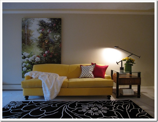
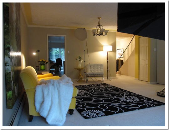
This week I completely re-arranged my living room for a photo shoot. My Web Designer/Brand Manager recommended that I get more ‘lifestyle’ feeling photos that say more about me than just a ‘head shot’ for my new website. So since my dining room is not yet finished, I couldn’t be photographed sitting on my sofa in the middle of the room (where it is now), so I pushed it up against the wall. . . and left the right side blank for copy since these photos will be on my new website.
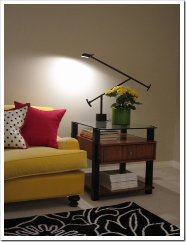
I didn’t know if he would want me sitting on the Barcelona, so I moved it into the dining room too. Here it is set up with lights from another angle.
Here is my awesome team, Marvin Magallanes at Cielo Brand Associates, Jennifer Houghton, my photographer and my friend Jill McDonald from Reflections Interior Designs who came to spend the day with me to help out!
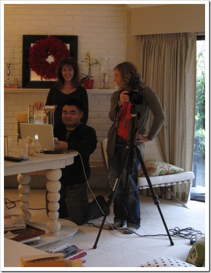 Above photos by Maria Killam
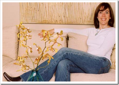
You can see I left my raspberry wreath up on the mantle, until I do something spring like with it, I like the hit of colour. Can you believe just one photo took 3 hours? This is a sneak peek of the process. My idea, and it was bad (but that’s why I have a stylist now) was to do something casual like this photo of Sarah Richardson:
This dress looked really awful as well because your eye goes straight to the big pattern on my chest. Definitely NO.
Here are two of the final photos. Marvin ended up picking the outfit that worked the best in the end. An excellent art director as well as web designer!
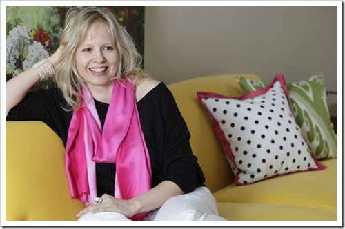 Photography by Jennifer Houghton


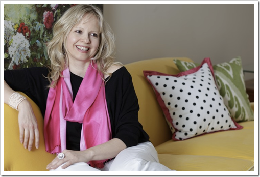


Of the pink scarf pics, I love the first one!
Dear Maria, I enjoyed spending the day with you for the shoot. Love the process and your share. I love the last two photos and the last one is my favorite. Cant wait to see the big reveal.
Jennifer Duchene
Home Makeover Mixtress blending lifestyle and laughter
http://LYShome.com
Loving the last picture and the second last! The pink scarf makes you look so young, so beautiful! You hair looks very natural… super!
I'm excited for you! It seems that it was a lot of work but the results are great!
Have a wonderful week, Maria.
Drop by to see the the new look of HomeBunch.com and a very peaceful home in Malibu. 🙂
xo
Luciane at HomeBunch.com
Oh, definitely the first one of you in the pink scarf. You look more relaxed. The second one looks staged, and I don't think that's what you're going for. You look great in both!
Thank you for posting the process. The three hours were worth it – the last two shots are fabulous of you. And I am falling in love with your yellow sofa all over again.
Maria, love, love the last photo. You looked so relaxed and comfortable and ready to talk or listen to a friend in a great conversation. I would pick that one for sure!!! I am also in love with your sofa!!! Kathysue
Ooh Maria how exciting They are both great I think the last I like the last best!You home has really come together…
I have a fabulous giveaway from Splenderosa, do come and join in!
xoxo
Karena
Art by Karena
1st pink scarf photo!
I'm just glad you put on color…. you are the color goddess, it was meant to be!
Cheers~Ivy
I loved seeing the behind the scenes shots. Your advisors were so right in having you wear the pink scarf outfit. It is a perfect combination of relaxed, pretty, and colourful. I like the first of the scarf photos best.
I really like the first one!! You look great…see you on Thursday.
Jennifer
The first looks more self assured, but I actually like the vulnerability that shows through in the second…so it depends on what you want portrayed.
1st pink scarf photo is amazing…
Definitely the first of the two pix. The longer sleeves are better for us paler skin tones, and your posture is casual friendly. The second pic is a little too casual and disorganized with your hand in your hair, like someone took a pic when you weren't looking.
Great call on the last outfit. You look great! I like the second last one.
Carol
I like the forst of the pink scarf photos. Your shoulder looks nicely relaxed and casual.
Very pretty you look and approachable.
Yes, that outfit is PERFECT and goes so well with your beautiful blond hair! 🙂 either one of these two photos will work great.
And can I just say I really love your side table?? Very cool!!
I LOVE the second (last) of the pink scarf. Great picture!
Good luck with everything, Maria. Seems to be moving along great.
Teresa
xoxo
Oh gosh, Maria, I love both of them! I don't think you can go wrong with either one.
Maria,
Love the first pic – (with pink scarf). You appear very confident and relaxed in this photo.
PS. Finally making my first comment. It was great to see you again – (HomeSense, on Robson Street).
Tracy
The first of the pink scarf photos is IT! It's so fun to watch your progress and success, it's amazing. I get inspired, as I've said seventeen hundred times, every single time I read this blog. You go girl, great things are coming.
You look so relaxed and happy in the first photo. It's a keeper! Thanks for all that you do to keep us 'in the know' on color. Your blog is fabulous!
The first of the pink scarves is my favorite … you look beautiful, happy 😉 and sparkling. I would hire that girl! xo
On first glance I love the first one with the pink scarf. The second one looks amazing but it's more a look you would have if you were chatting with girlfriends. The first one looks more professional. I love them both and you look amazing! Can't wait to see which one you choose. Pink is definetely your color!
The first of the pink scarf set is a winner, I'd say. You look like someone that will listen to their clients and someone that a client could spill all to. A woman to be trusted with a client's personal space. I'm sure that's what you want to portray.
Why do we all hate having our photos taken?
Jennifer xx
The first of the scarf photos is the best in my opinion. It just has more life to it!
Oh Maria,
you look beautiful in all of the photos. Can't wait to see the ones we took in your office!
It was an absolute joy helping you, thanks for the invite, call anytime.
Looking forward to seeing your new website, etc. Big hugs, xoxoxo
I loved the second to the last one . . . a lot. I want a stylist.
Fondly,
Glenda
Of the two final ones, I like the first one better. You looked more relaxed.
Love the first one in the pink scarf, you look so beautiful !
Of the pink scarf pics, I like the second one. You look happy and relaxed in both but quite tense in the other photos.
The first of the pink scarff pictures has better color quality it seems and is just absolutely perfect, you are adorable
Thanks for the neat behind the scenes shots! So interesting. I love the very last photo. The outfit looks great on you.
Definitely the first of the pink scarf photos. You look better overall, plus there is a nice balance of color — the artwork over your left shoulder balances the bold polka dot pillow – though neither takes over. In the second pic you're covering the left shoulder pic more.
Maria, you look GORGEOUS! I love BOTH of the last two. And as one of your online clients, I agree with your Web Designer/Brand Manager that a shot of you relaxed in your space is a GREAT idea. I was like "THAT'S Maria", because it totally matches who I was talking to on the phone!
I knew you were talented from reading your blog, but when I looked at your "head shot" I was a little intimidated. Not sure why.
Again, beautifully YOU 🙂
~Annette in Cali
Maria, I like one of the last. Your photos of you smiling will always be your best. I kept reading the photo advice of a very popular sewing blogger and she said that when you are being yourself..laughing..and smiling..then you can get good photos and not before. That's how I finally got decent photos for my profile photos. Rebekah just kept taking shots even after I'd posed. Ha! We are just too quick to 'pose'.
Love the last ones of you. :o) and I love your living room!! Super awesome including the pink wreath. ..(aka. raspberry)Ha!
xo
Donna
Maria -Love the pink scarf photos. This look is definitely more in keeping with the attitude you convey in your blog and newsletters. The first photo is friendly, yet a bit "professional". The second reminds me of talking with a friend…you seem very approachable (I know you are!).
Jane (artfully graced)
Maria, this post was so enjoyable! Loved the 2nd last photo with the pink scarf! You looked fab and so did your room. 🙂 … Please check out the Mikassa mugs (white with black polka dot circled with platinum) in this blog… they might look good in your dining room. 🙂
http://marlisbennett.blogspot.com/search/label/Mikasa
Sheryl aka
[email protected]
The last two pics are really wonderful…art director extraordinaire indeed! They're both very natural. You look comfortable and relaxed which I imagine is how you'd like to make clients feel as well.
Maria,
Thanks for sharing the process. I know it well and the results are always worth the time spent.
Scarf snap #1 it communicates a conversation. Which is designers, design, blogging and clients in continuous conversations.
Bette
Very interesting blog. I really like the first of the two photos of you. You look so happy and natural. I noticed they removed the raspberry cushion. Was it the colour or were they thinking it would be distracting?
I liked the first outfit. It didn't compete with the furniture and had you been more relaxed, it would have been perfect. It usually takes a little time to warm up to being photographed..
Looking forward to seeing your new website.
Go with the first one in the pink scarf. you look vibrant and engaged. I'd hire you!
I loved everything ,you look great ,I especially love the painting,can you tell me what is called?
~Sharon~
How fun…..I love the feel of the 1st photo with the pink scarf. It seems relaxed, natural, and conveys a feeling that you are keeping it real, because, well…..you are. 🙂 xo
I could see you a big bowl full of those colorful playful balls…or a bowl full of paint chips for your photo!
pve
What a fun post! I love all of the images of you! But if I had to choose my favorite, I'd have to pick the last one. The bright pink scarf is beautiful on you!
You and your team did a fantastic job!
xo
Brooke
I like the second pic Maria. Gosh three hours for one photo!? ugh.
PS I picked the second one, of the last two…so its the LAST one.
I love the second to last- love the smile- love the hair- and perfect outfit- beautiful!
Maria,
I really like the last photo – you look darling! It's so exciting to take things to the next level,isn't it?
As soon as I saw the last 2 photos I thought, "color blocking"! 🙂 Both are great!
The first pink scarf pic should be the winner: looks like you are listening to a good friend tell a story or a client's raves! The second looks as if you're about to get up off the couch.
You look relaxed and beautiful in both of the last two shots. I can just see you sitting there chatting confidently with a new client. Can't wait to see the big reveal.
I like the first pink scarf pic better.
Wow, adding the pink scarf made such a difference! I like the 1st pic slightly better.
Maria: After reading most of these comments and going back and forth between the photos, my vote is pink scarf #1. I think you are right about yellow, too. There's alot of buzz on that sunny color, especially under all this snow.
Best,
Liz
The second from the bottom is my favorite. You look great!
Your story is so inspiring Maria. I need a living room that is picture perfect too but I'm not there yet. I think I need your help!!! 🙂
The pink scarf photo with the head tilt is the best. It's amazing what a little pink does to the whole photo. Love it.
Hi Maria! What a great post – I was torn between your last two shots, but in the end I like the smile on your face in the 1st of the pink scarf shots. Can't wait to see the outcome 🙂
I love the second one from the bottom. Sweet…and you look great in bright pink!
Hi Maria! I LOVE the second shot. It really captures your energy and personality!
Love the story, Maria! You look beautiful, and I vote for the 1st of the pink scarf photos.
Maria … you look radiant in your pink scarf on your beautiful yellow couch. Perfection!
I like the second picture because – for whatever reason when I see a picture of a person with their head tilted to the side I feel like it looks less professional. And the scarf is too much, jewelry would be better.
Boy oh Boy – that and 25 cents!
I like the first of the pink scarf photos… but wish you had looked at the camera for a more powerful "first impression". The eyes need catchlights which I feel draws people in – nothing a PP software can't fix. –Rebecca
P.S. – Did a quick google search on catchlights so you can see the difference they can make. http://www.digital-photography-school.com/an-introduction-to-catchlights
Both photos in the pink scarf are great! I never noticed the yellow border-stripe on the ceiling before. Love it!
First one of the pink scarf photos for sure — natural expression, warmth, ease. the other one looks 'staged' in comparison. my humble opinion.
I love those colors – the yellow and black really pop, especially the one which has you with the pink scarf!
The very last picture is my favorite. You look effortless and charming as well as stylish! I hope you use that one!
xoxo
Lila Ferraro
You are very well in the last two pictures. But I love the first one. The look is more direct and cheerful.
Great to see you at home!
It's amazing what a difference the outfit made! The 2nd two pics are fabulous. Thanks for the behind-the-scenes sneak peek, I love seeing everything that goes into a photo shoot!
Definitely the first of the pink scarf photos. Great shot!
Maria, there is no question:
the first pink scarf photo is it! Why? (I've been reading you, here goes):
BECAUSE the pink scarf speaks to the pink flower visible in the painting (not viewed in the second PSP–pink scarf photo) and also
BECAUSE your lovely hands are shown. The second PSP does not show your hands. The first PSP gives someone the thought of you reaching and pulling the perfect color out of your fan deck!
Hello Maria: I've just recently started reading your blog…and it makes me happy. Like you, I just recently went through a photo shoot, so I've spent more time than I care to thinking about these things. Of the two last photos…I prefer the first of the two. I wish though, that you were looking at us rather than away (see Sarah Richardson…) – although your photo on your site certainly does that – which is part of the appeal of your whole site…you seem happy to be happy about colour!!! So, always choose "happy" expressions whenever in doubt. For my own photo debut my regular hairdresser was busy…and i thought…how hard can it be? Wrong call on my part!!! Thankfully there was someone there to put my hair up…or all would have been lost!!!
Have fun with all this…each time we learn something more…and I have notes made for my next photo session…whenever that may be…
Best wishes! Love what you do!
Marion
I vote for the last photo, but you won't go wrong with either one of them.
My favourite picture is the last one. You look even more natural and pretty in that one. Not that you don't look natural and pretty in the one above, but for some reason the way you have your hand in your hair seems to make the shot more expressive 🙂
Love this post! The last two pics are great! If I had to choose, I would pic the last one. I think you look super glamorous there. xoxo
Maria…I made it to the bottom of the comments…to say that I love the last one (I would personally do a little cropping on the right side)but I would have preferred you looking into the camera (into your clients eyes). Beautiful job anyway. Looking forward to your new website!
I'll vote for the second last photo; I agree with previous commenters that it looks less staged.
I bet you learned lots during the whole process! Looking forward to seeing the outcome.
-Ann
They are both great, but I think I like the 1st on just a tad better.
Maria, I love your blog and your wonderful advice!!!
1st pink scarf photos works best, crop a little maybe. The 2nd one looks little too staged and maybe even a little on the "I'm sexy" side, not that there is anything wrong with that!LOL but I don't think that's what you are going for!
I love seeing your updated in my mailbox!!
Definitely the first pink scarf photo. You seem more self assured in that one, and more professional.
Lovely photos.
Definitely the first one: you look confident and authoritative yet approachable. Second one with your hand on your hair looks too "little girlish" or "hair color commercialish". And, this is going to sound rude, I don't think solid white is a flattering color on you at all. It looks good on Sarah because she has dark hair and a more robust skin tone.
The last picture is the best. In the first one you look relaxed but having your hand in your hair in the second one, you seem more approachable. Amazing what body language says to a potential client. Love your hair.
Ruthie
Very generous of you to share this process. Love both those last 2 pics, but with a preference for the top one.
Maria, you look absolutely stunning and radiant in those last two photos. WOW!!! Your crew did a superb job 🙂
Love your hair and choice of colours!
Angie
xoxo
you look fab, Maria.
i like the one with the first photo with the pink scarf the most.
Hi Maria,
The last photo is the best, more stylish, and looks like Colour me Happy, its you I am sure.
All the best thanks for the great posts.
decogirlmontreal
Love the last photo. The pink scarf looks amazing!
Maria– What a gorgeous yellow sofa! And I really enjoyed those "behind the scenes" shots!
I adore the second photo. You look just beautiful, composed and happy!
Loretta
You couldn't go wrong with either the second or third photo, however, I keep going back to the second photo….maybe the intensity of the smile in the eyes! And thank you for sticking with the blogging all these years and giving us so much to learn from and live up to!
definitly the last one !
Without a doubt, the very last one! You look great.
I keep changing my mind! I think the first one, because your smile is bigger. Beautiful! Love your blog and all the insights.
Hi Maria~ ~
What a great website this is my first time here. I have been to your blog and am devouring it page by page.
Love the yellow sofa!! Way back in the late 70's i wanted to do my livingroom in yellow and there was none to be found. No wallpapers or furniture. Remember the browns and earthy tones? I am lovin' your sofa so if you ever get tired of it. ..
~Ahrisha~ ~
Maria,
The second photo is great.
Casual,easy-going,friendly, yet very elegant.
jo