Rachel Perls has a blog called Hue. She is also a member (along with me) of the International Association of Colour Consultants/Designers. The most fascinating thing about the colour profession, is that each colour designer looks at colour from a slightly different view allowing us all to learn something new from each professional!
Rachel’s blog is no exception. I never know what she’s going to be talking about when I get there, but her blog always grabs my attention! Thanks Rachel for the interview!
[MK] What’s your favourite color?
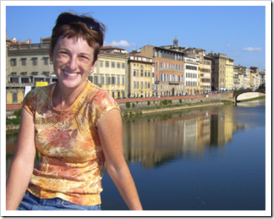
[RP] My favorite colors change all the time, based on my mood, the weather outside, etc. At this very moment, I am loving the combination of turquoise and orange. I love the balance of warm and cool in such vibrant, happy hues.
flickr
[MK] What colour would you like to see banished from all paint decks?
[RP] That’s a hard one to answer, because as a color consultant, I have to become a chameleon, stepping into the shoes of each client and taking on their individual aesthetics. So to me, a color might appear muddy or depressing, but my client might really identify with it. Besides, any color can look beautiful in the correct and appropriate scenario.
[MK] What was your biggest colour/design mistake?
[RP] I actually made my worst mistake in my own home, thankfully not a client’s house. We wanted a warm, middle-range beige for our stairway, and chose Benjamin Moore’s Roxbury Caramel. Unfortunately, the undertone was way too pinky in the lighting of our hallway and I couldn’t stand living with it.
Just my luck, it was the hardest room in the house to paint, with a challenging ceiling to reach in the stairway. The acrobatics I achieved to reach that space- hanging off the side of a ladder perched precariously on the stairs, must have been pretty comical to watch. To correct this color, I opted for a much less orangy brown, Wilmington Tan, and was much happier with the results. Click here to read entire story.
[MK] What is the most important colour lesson you’ve learned?
[RP] Color is all about context. Context, context, context. Your friend can have the most gorgeous color painted in her house, but if you try and use that same color in yours, chances are, it will appear quite different. By context, I mean that color is nothing without context- what color is next to it? What value is it up against? What is the lighting like? What are the desired goals for the space, and does that color satisfy those goals? Is the palette balanced? Without context, color is nothing.
[MK] When it comes to colour, what’s hot? Which one do you think it timeless and which colour trend would you love to see disappear?
[RP] While I try to keep appraised of color trends, (how can you avoid them when consumers are bombarded with them virtually everywhere?) I try not to let them influence how I use them in design work. I understand the need for trends to market goods, but honestly, I don’t think they belong in architectural color design. Every space has it’s own criteria, and this formulaic approach does not take into consideration how to create user-supportive environments. Read my rant here.
[MK] What do you think is one of the biggest mistakes homeowners make with color?
[RP] The biggest mistake a homeowner can make is to rush with their color selection. People should not expect to hit the paint store, select a room color from a tiny 1” color chip under fluorescent store lights, and just throw it up on the wall with any amount of success.
First of all, the bigger your color sample, the better. But not to be painted directly on the wall. I repeat, not on the wall! Imagine painting a red square on a white wall, and the same red square on a black wall. The red will look dark against the white, but pale against the black. Use a 2×2’ board- then you can move it around the room, check it out during different times of day, etc. Rushing causes a disastrous domino effect in your design goals.
[MK] What are the 5 things in life you cannot live without?
[RP] Well, there are the obvious ones like family, my husband and dog. Other than that, I would say sunshine (I get really blue when it’s too dreary out), color (I could never ever live in a black and white world), and music (it’s the very first thing I do when I enter a room- I turn on music). If I had 6, I’d add chocolate. Specifically, milk chocolate. My biggest weakness.
flickr
[MK] Why do you think people are so afraid of color?
[RP] Ah, the million-dollar question. I’ve heard that Europeans are much more comfortable embracing color in their personal spaces. Seaside communities, like Bermuda, also tend to use stronger colors- perhaps because the sun would wash out otherwise weak or pale hues. I chalk it up to fear of the unknown- it’s out of their comfort zone because they don’t feel knowledgeable enough to take on the challenge.
Just as you wouldn’t attempt a complicated electrical rewiring project by yourself, by bringing in a professional color consultant like you or me, the guesswork is taken out of color selections.
Click here to read more about color in Rachel Perls Blog!
Need help choosing the right neutral or colour? My How to Choose Paint Colours: It’s all in the Undertones ebook takes the hundreds of choices down to 9 neutral undertones along with list of all my other go-to best grays, broken down into 3 undertones, green, blue and purple. The beige undertones of pink, yellow, green, gold, orange and taupe along with the best greens and blues.
My bonus book of colours is worth the price of the ebook alone but you will also get my system of understanding undertones so you can stop making mistakes when sourcing tile, carpet, countertops, etc.
The only way to choose the right colour every time is to combine my system of understanding undertones with the most indispensable colour tool available. You can purchase your own set of my curated large colour board collections here.
If you would like to transform the way you see colour, become a True Colour Expert.
I love your blog and I especially love this interview with Rachel she gave lot's of great tips. As a designer myself, I love being inspired and these pics have certainly done that, thank you! Sakinah http://www.sajinteriors.blogspot.com
My favorite point in Rachel's interview is about not rushing to color decisions. Most excellent advice about not sampling on walls too. Whole interview is just choc-full of good color mojo!
A woman after my own heart ~ I would have said those 5 things I couldn't live without either! I like how she said color is about context. I can't tell you how many times I have someone who wants to use a specific color because their best friend did. Lovely interview, Maria! The pictures were great.
I painted my stairway/side entry wilmington tan too. The rest of the house is Benjamin Moore's "richmond gold", a caramel color, but the hallway being darker needed to be lighter. I liked it so much that I used it in a powder room and then when I updated my laundry room/office I used it again……I can't get enough of it. I have white millwork but like the way it looks with black accents. It was fun to see it in her place too. Yaaayyy, the right choice in paint makes you happy!
Wonderful information! I so agree with choosing a color in context. I have tried several colors that I have seen in show houses only to find out they don't look the same in my house.
That was a great interview! And Rachel, from some of your responses, you're obviously not only a great color consultant, but would also make a good polititian. 🙂
I absolutely agree with Rachel…trends should be followed very carefully and context is key. I learn so much from your blog and I am looking forward to read more (in a book perhaps?)
Oooh, another colour blog to check out!! 🙂 Thanks for introducing us to Rachel — your questions and her answers are really interesting and informative 🙂
Totally agree about context.
BTW, my friend doesn't want the same sink that's on the vanity in the picture I posted. She just likes the style of the vanity and the glass countertop. She wants a small sink 🙂
Great answers to great questions! First – a big thank you to Maria for featuring such fascinating EXPERTS on this blog. It's truly a joy to read…and always a learning experience seeing color through others' eyes.
Rachel, I love your answer to the "what color should be banished" question. It is so important yet so difficult to remove yourself from color decisions. And I agree with you that any color can look beautiful "in the correct and appropriate scenario." When we start to call colors ugly is when our personal aesthetics start to get in the way.
Thanks for such thoughtful, honest answers! Well done. 🙂
What an enjoyable interview. I agree with much of what she said, not because I am an expert but just because I love colour and share some of her opinions. I often fall for colours in combinations and it would be easier for me to tell you some of my favourite combinations than to list favourite colours. I love to be surprised by combinations too. She mentioned not being able to live with all black and white and that people are often afraid of colour. I am afraid of white. I sometimes admire it in photos but I'm sure I couldn't live in a white space, nor a tone on tone beige.
 Rachel Perls from Hue
 Dogs gone Wild by Hue
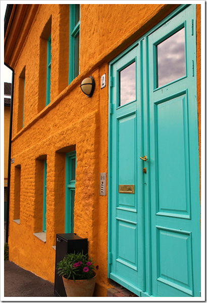 flickr
 Image source
 Image from Hue
 Image from Hue
 Image from Hue
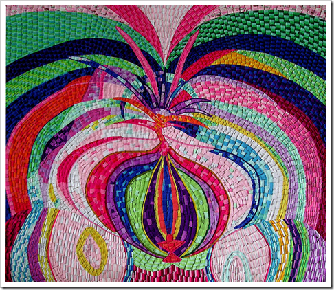 These could be baby colour chips (from flickr)
 flickr
 Click here to read more about color in Rachel Perls Blog!


I love your blog and I especially love this interview with Rachel she gave lot's of great tips. As a designer myself, I love being inspired and these pics have certainly done that, thank you!
Sakinah
http://www.sajinteriors.blogspot.com
Wow, Loved the interview…. and the pictures are an explosion of fun…. amazing… Love your blog…
xoxo,
Cathleen
Great interview! So, does the fact that I combined orange and turquoise in my bedroom make me sort of a color expert?? haha
Excellent interview Maria, very interesting thoughts by Rachel!
Inspiration everywhere, and sometimes the subtleties of color changes and their effect can be very elusive.
Long time fan of Hue Blog and Rachel P. here too.
I love your color expert interviews, MK!
My favorite point in Rachel's interview is about not rushing to color decisions. Most excellent advice about not sampling on walls too. Whole interview is just choc-full of good color mojo!
Thanks for sharing.
Lori
(funcolors)
A woman after my own heart ~ I would have said those 5 things I couldn't live without either! I like how she said color is about context. I can't tell you how many times I have someone who wants to use a specific color because their best friend did. Lovely interview, Maria! The pictures were great.
I painted my stairway/side entry wilmington tan too. The rest of the house is Benjamin Moore's "richmond gold", a caramel color, but the hallway being darker needed to be lighter. I liked it so much that I used it in a powder room and then when I updated my laundry room/office I used it again……I can't get enough of it. I have white millwork but like the way it looks with black accents. It was fun to see it in her place too. Yaaayyy, the right choice in paint makes you happy!
Wonderful information! I so agree with choosing a color in context. I have tried several colors that I have seen in show houses only to find out they don't look the same in my house.
Ha! That was FUN!
But…aside from the groovy colored pups…I am sooo stuck on that riveting turquoise door and orange building. Oh my. Who knew!
It seems that a lot of color mistakes have to do with too much pink in the hue! Loved the interview, thanks for introducing us to Rachel!
Great interview! Will promise never to paint large color samples on my wall ever again! 🙂
That was a great interview! And Rachel, from some of your responses, you're obviously not only a great color consultant, but would also make a good polititian. 🙂
I absolutely agree with Rachel…trends should be followed very carefully and context is key.
I learn so much from your blog and I am looking forward to read more (in a book perhaps?)
Great interview…absolutely agree on "context"…smiles.
I LoVED this post! What an eye-catching collection of images! Very nice. I'll be back!
Oooh, another colour blog to check out!! 🙂 Thanks for introducing us to Rachel — your questions and her answers are really interesting and informative 🙂
Totally agree about context.
BTW, my friend doesn't want the same sink that's on the vanity in the picture I posted. She just likes the style of the vanity and the glass countertop. She wants a small sink 🙂
Kelly
Great answers to great questions! First – a big thank you to Maria for featuring such fascinating EXPERTS on this blog. It's truly a joy to read…and always a learning experience seeing color through others' eyes.
Rachel, I love your answer to the "what color should be banished" question. It is so important yet so difficult to remove yourself from color decisions. And I agree with you that any color can look beautiful "in the correct and appropriate scenario." When we start to call colors ugly is when our personal aesthetics start to get in the way.
Thanks for such thoughtful, honest answers! Well done. 🙂
What an enjoyable interview. I agree with much of what she said, not because I am an expert but just because I love colour and share some of her opinions. I often fall for colours in combinations and it would be easier for me to tell you some of my favourite combinations than to list favourite colours. I love to be surprised by combinations too. She mentioned not being able to live with all black and white and that people are often afraid of colour. I am afraid of white. I sometimes admire it in photos but I'm sure I couldn't live in a white space, nor a tone on tone beige.
I liked this interview! She sounds like a lady just like us! Good tips and glad to hear she makes mistakes too in her own home. :>)
xx
she seems to have a great philosophy & to think outside the box.. i like that. another great interview maria!!!
xoxoxo
maria i f-ing missed u and ur blog!!!!! i swear im not neglecting u on purpose, i just found myself a brazilian man and whoop whoop!
Great Questions Maria! And please tell me the Dogs Gone Wild was just a photoshop experiment!!!
That what makes color so fun and fexible. It becomes a transformer in every situation. Great interview post!
Bette
I'm blushing from all the compliments. thank you Maria for introducing me to all your fabulous readers- I'm thrilled to be included!
P.S. Dale- those are truly dyed dogs- no photoshop!
Really a great interview and interesting read. There's much that anyone can take from it, no matter their profession or skill level.