10 years ago when I started my design business I placed an ad in the Yellow Pages that included the words “Expert Colour Consultation”.
Then as I looked at those words I thought, ‘I better become an expert’, and that is when I found Joanne Day at The Daystudio in San Francisco.
Joanne Day has trained many colour consultants, designers and faux finishers all over the world and it was her colour course that inspired the years of colour training that followed, in addition to discovering that it was going to be my niche in Interior Design.
I am honoured and delighted that she agreed to be interviewed on my blog!
[MK] What’s your favourite colour? What colour would you like to see banished from all paint decks?
[JD] Before I was so involved in color I used to think color choice was infinite – it was too many choices. Which blue was the right blue? Now I visualize color as only 6 choices, ROY G BP.
Each parent color with all its derivative color children being enclosed inside a back yard fence and on the other side of the fence is another parent color backyard and all their children. It makes choosing combinations of colors much easier.
I always like to add blue as an accent. It is interesting to follow trends and favorite colors and the psychology behind them. Trends are often unconscious reflections of what is coming into everyone’s consciousness.
10 years ago when green came in like gangbusters we were starting to individually perceive Nature, ecology and the food chain, how trees take in our CO2 and we take in their oxygen. Now we perceive that behind green (which is considered a neutral now) is blue, water, and how important it is. These show up as color trends and changing favorites.
Banish the white strips between colors on a chip deck, they keep you from seeing the difference between adjacent colors. Place your finger over it and the brain thinks they are connected and can see the subtle differences between them.
And banish the distracting black lettering too (put it on the back as they do in Europe). Letters and lines put us in the analytical left brain and overpowers the intuitive/visual/feeling right brain where color is decided.
[MK] What was your biggest colour/design mistake?
[JD] A warm/cool mistake. Today we often use multiple fabrics, carpet, old and new furnishings in one room, and several paint colors. When we choose a room color we need to bridge those many existing colors. The more objects and colors in a room the more difficult it can be to make sure everyone is sharing something in common and when a color doesn’t, it shifts cooler or warmer than the rest and sticks out like a sore thumb. A good colorist chooses colors that won’t make the client have to change everything in the room.
[MK] What is the most important colour lesson you’ve learned?
[JD] The quickest way to change your life is a coat of paint. We all go through transitions and color helps us get there faster.And there is no wrong color, only wrong color combinations.
[MK] When it comes to colour, what’s hot? Which one do you think is timeless and which colour trend would you love to see disappear?
[JD] Chameleon colors are hot. Chosen because they take advantage of natural and artificial light-shift and morph a color into different hues at different times. Without light there is no color, they go hand in hand.
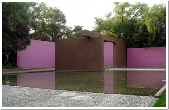
Colors that take advantage of changing light are timeless, they enchant us. It’s kind of like getting three colors for the price of one, a bargain. Google Luis Barragán, an architect who decades ago started adding color pigments on a large scale to exterior stucco taking advantage of and playing with light in locations all over the world.
I still see that awful dusty blue and pink on kitchenware and wall art, someone must still be buying it, but I would love to see it disappear for at least the rest of my lifetime.
[MK] What do you think is one of the biggest mistakes homeowners make with colour?
[JD] Following a trend that doesn’t agree with a clients genetically hardwired color bias. When a perfect color outfit makes you feel beautiful, it empowers you. It follows that the colors in your home should be chosen in a similar way.[MK]How do you get clients to take a confident leap into color?
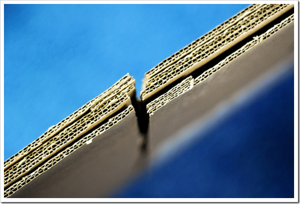
[JD] I’ve learned that patches on a wall don’t help the client. They are still just as confused and unsure. So I paint a cardboard file box the color I recommend and put it somewhere in the room. Let them move it around for a few days. A 3D object will test the color in all light situations unlike a 2D patch on a wall. It will get a definitive yes or no. I also hold the box top under the clients chin, if she or he can’t wear it with their coloring, the environment will not empower them. It’s a no.
[MK] What are the 5 things in life you cannot live without?
1. [JD] Beauty, because it inspires us and sometimes brings us to our knees.
2. Nature, because it is our mother, it rejuvenates us, it soothes us, it supports us.
3. Friends, because they make the uncertainties of this world less scary. Friends are members of a tribe that share common interests. Like color combinations that share a common pigment ingredient are harmonious and embrace each other. Colors that don’t, push away from each other.
4. Doing Art, because it calms and balances my life, and of course, art is about color.
It’s kind of like yoga, you do art and art does you. Some people garden, some play music or dance to get into the “zone”. It’s a right brain (visual-emotional) activity that balances out a very left brain (analytical) world. So is color. That is why recessions bring out brighter colors, to balance our uncertainty.
5. Teaching/Consulting, because it’s a way of sharing what I love most, it gives people a tool and a skill that changes lives.




Fantastic interview, Maria – thank you! My favorite point is to acknowledge people's "hard wiring." You gravitate toward colors that suit you (physically and emotionally), and you have to go with that.
I love the suggestion of putting samples colors on cardboard boxes, also. Genius.
Another fabulous interview! I love her advice that paint is a way to change your life, and that it helps you transition faster. I also like the "hard wiring" toward certain colors. Just a great interview with so many good points. Thanks again, Maria!
What a great interview. I like the idea of using a box for sampling color. One could have described our last house as an outit – khaki's and a blue oxford. Now we are in a builder's beige townhouse and I think we find it depressing without our colorful walls.
What a brilliant interview! I've learned so much in this post and it answers so many questions for me as many posts on your extraordinary blog have done, Maria. Now I know why I keep gravitating to want the same colors in my home that I love to wear. They make me happy — just like your colorful and insightful blog. I finally feel like I can give myself permission to use more color of those colors in my dreadfully color boring family room.
~ Victoria
I really like the five things that she can't live without. Beautifully said.
Maria,
Thanks for introducing us to Joanne Day. Great interview and I ditto her list and the effects of color on our lives. Color is a multi-facet advantage for all who embrace it.
Bette
Thank you for introducing us to Joanne Day – what an interesting woman! I love her idea with the colour box. I took a look at her website and was fascinated with the comment that "the rules of art are the rules of Fractal Geometry".
I learn something new with each of your posts Maria…thank you!
Great post, as always! I think we are all inspired by nature and the colors in nature! I love the idea of putting the proposed room color on the box in a room. This is great! Oh, how I wish I lived closer to you!
Maria, I am so glad you could make it for lunch with Tobi Farley the other day!
A painted cardboard box? what a splendid idea,just that is worth reading your blog and it is true that letters and numbers trigger the brain (same in photography, we try to avoid words, signs etc. unless they are the subject, otherwise you first see only those)
I love your interviews – this is another great one! Interesting point re: what we wear – very true!
I truly beleave that Joanne Day made Faux finish in America as popular as it is today.
Roderick Treece
http://www.customglasssigns.com
Maria,
I love this interview, so fun to hear others opinions on this subject of colour!
Wonderful interview and absolutely stunning images to go with it. Light definitely plays an important role in regards to colour.
Maria,
What a wonderful interview. Very interesting ways of determining what works for clients. I just learned a few new tricks…but then I always learn something new when I visit you!
Lisa
I really didn't learn anything new here but appreciate the wisdom required to really understand colour. I would like to know more about how you choose a colour to work in a room, like was mentioned, of many coloured things. Is it instinctive, this choosing, or is there a real method, a science?
Dear Anonymous,
What it takes to be able to walk into a room and know what colour it should be? First, takes years of colour experience and frankly just seeing a lot of colour actually on the walls and second you must be a good decorator. To just pick a colour for a client when they don't have anything pulled together yet for inspiration is not what gets them excited. It's when you can draw a picture in their head about what colours their furniture should be and then pick the wall colour?? That's what has my fee be worth every penny, and that's when the client gets excited and can hardly wait to rush out and buy the paint and start painting!
Great question!
Maria
Took her class in 1996 – she was the world’s expert on color.
I love the box idea!
Thanks for a great post Maria, what an interesting woman she sounds like. I love the language she uses to describe the relationship of one colour to another.
I recently attended Joanne Day's workshop in Oakland, California and agree wholeheartedly with Maria's assessment of how valuable the education was. I chose this workshop after deciding I wanted to emphasize color consultation in my Interior Design business and didn't feel the background I had in color theory and consultation was sufficient. The workshop was everything I had hoped it would be and more. Joanne is wonderful to work with and her knowledge of color is remarkable. I am excited about taking what I have learned and the confidence I have gained and finding my own niche in the Interior Design industy. Thank you, Maria, for recommending the Day Studio!
I purchased one of Joanne’s videos back in 1990, and must say it was the best material i’ve seen, because she turned what other books describe as art into a repeatable process that delivered great results. Now 25 years later i wanted to use these videos to renovate my own house in Germany. Unfortunately the day studio phone numbers are disconnected and i receive no answer to the email. Is it still possible to acquire these videos somewhere? Their loss would be sad.
I think she’s retired. She had already been teaching for 30 years when I did her course 15 years ago.
If you’re still looking 10 years later- I’m selling her videos on eBay.