 Photo by Maria Killam
There was a huge overgrown cedar hedge that they recently had taken down, it was right in front of the oversize sandbox where my two nephews play. Here’s Markus (below). Not sure if it gets much cuter than him. . .

Anyway, the drywall will be up this week and the first coat of paint will be going up, so this weekend my mom and I drove around to sit on furniture and we chose fabrics so that we could then choose colours.
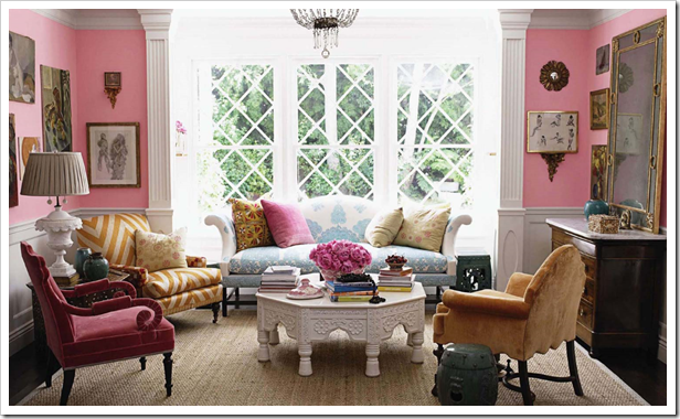
In February when I posted about pink for Valentines Day I included this photo (below) of Windsor Smith’s living room. My mother called me the instant she read my post that day and said “That’s how I want my new living room to feel when we decorate”
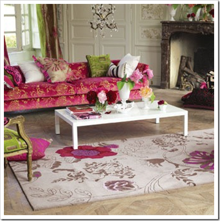
A few weeks ago I saw this framed print at Homesense, I immediately thought of my mother so I bought it. I thought if she liked it, we could use it as inspiration for the living room colour scheme. It had the required pinks in it!
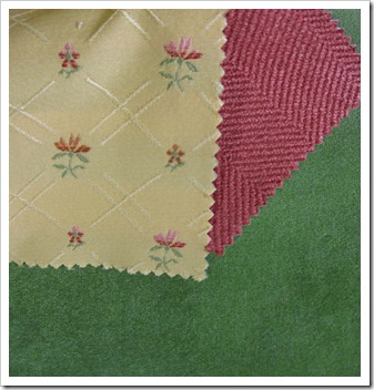
I loved it because it reminded me of Boggie Burgers and I haven’t stopped coveting a $12,000 piece for my living room. Sigh. Not in the budget quite yet. Anyway, my mom loved the colours so I set about choosing fabrics for her. And she loves, fresh, happy colours, her houses have always been full of colour. Remember that story I told you here about the last living room I decorated for my mom? Well we are not making the same mistake this time. Here’s what we chose:
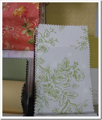
The fresh green fabric (Sunbrella–because my nephews are 2 and 4 and will be over a lot) is for her sofa. The chevron texture in the strawberry shade is for an upholstered chair and the yellow one is for a smaller scale chair.
The fabric on the upper left (strawberry, yellow and green) will be two toss cushions on the green sofa with a yellow flange. The yellow fabric on the right will be an additional two toss cushions on the sofa piped in white. The white and green fabric is drapery which we might switch out to a solid yellow (the one on the lower left). Then we will do two more colour blocking cushions for the other two chairs using the solid yellow/green and white. And the colours we chose? Here they are:
BM 2011-40 Old World will be the living room colour, and the entry/stairway which leads up to the living room will be BM 544 Kiwi. The kitchen downstairs will be a muted turquoise because she wanted two recliners down there and trust me, the colour selection was limited. Still the colour we chose will still be happy and will look awesome with her white cabinetry.
So here is the point of my post. There is no way we would have ever chosen these colours in a million years if I was just standing in her empty house. With nothing. Zero inspiration. And there isn’t a single room in my house that I have painted without knowing exactly which fabrics are going into them first.
So here are 3 rules/guidelines to follow when picking paint colours for your home:
Get the Undertones Right
Distinguish the undertone in your fixed finishes in the bathrooms and kitchen as well as entry tiles and wall-to-wall carpeting. This will heavily dictate which ‘neutral’ will look the best in your home.
If you are building and are currently selecting all your finishes, read these two past newsletter articles, here and here to make sure you have chosen the correct undertone in the first place. Bathrooms where multiple tiles are required, is where this mistake is most commonly made.
Choose your Furniture or Bedding first
If you are building, this is usually difficult for most homeowners as they are too obsessed with ‘which flooring, granite or backsplash tiles am I selecting’. Just know you are technically doing it backwards to choose paint colours first. It’s way easier to find a colour to go with a duvet cover or sofa than it is to find a $3000 sofa to go with a $50 gallon of paint.
When working with my clients on a new build, sometimes I get hired to choose a preliminary palette of colours so that they know which direction to go in selecting tiles and granite in the first place. Just know that the more decisions you have made (even a piece of art) the more interesting and accurate your colour choices will be.
It’s very difficult to get excited about a pile of paint colours that don’t relate to anything.
Create Flow
Creating flow can done in a few different ways. Take one colour throughout the house (easy). Take one colour and go from light to dark (second easiest), chose different colours that work harmoniously together and yet pick up on the varying colour palette you have created in your house (most difficult).
Test the Colour
As painful as this step is, testing colours are necessary to make sure they work in your light. And (as I’ve said in this post), if you choose not to test every single paint colour in your new house as this can be just as expensive as re-painting a room or two, just understand that when you introduce colour (over the palest neutral which makes it hard to get offended), it sometimes needs tweaking even when a professional (like me or anyone else) has helped you choose. This post outlines how to paint up a sample.
And here is my first official video blog to highlight the basic point I’m making here. It’s rough so don’t be too judgmental, I’m sure I’ll get better at it.
If you would like your home to fill you with happiness every time you walk in, contact me.
To make sure the undertones in your space are correct, download my ebook
Related posts:
Does your Home have Colour Flow? Take the Toss Cushion Test
Does your Colour Consultant understand Beige?
Should you Pay for a Room to be Re-painted if you Chose the Colour?
Download my eBook, How to Choose Paint Colours: It’s All in the Undertones, to get colour to do what you want.
If you would like your home to fill you with happiness every time you walk in, contact me.
To make sure the undertones in your home are right, get some large samples!
If you would like to learn to how choose the right colours for your home or for your clients, become a True Colour Expert.
While you’re here, subscribe to this feed so you don’t miss out!


Video blogging . . . clever girl.
Fondly,
Glenda
You're great on video! It's always interesting to put a voice to the face! Nice job! Oh, and I like the little table behind you with the beautifully stacked swatch books and bowl of cherries… a nice touch. 🙂
I love the video blog… Thanks for doing it!!
You're just so great on video! I must get my daughter to look at it as she wants to redecorate her flat which is painted "landlord cream". However, she has no idea where to start and this post gives the answer.
Ahhh…it's like I'm back in BC again! 🙂
Great video!
Coley
Great job on your first video blog! Just like picking colours, it's a lot harder than it looks!
When we had own home built, we were expected to choose our flooring, tiles, countertops, trim and door styles, and our paint colours all in one sitting. What a stressful day that was! Even though I had a plan and colour scheme formulated in my head beforehand, it was too much, too soon. We had to choose our colours before the basement was even poured!
Anyway, thanks for another great post!
Sooo nice to see you and hear your voice, I hope this is a test for a long educational documentary on color, that is what we want! Ciao.
Good for you, a video! How many takes did you go through before you had "the one?" It's perfect!
Choosing paint color using fabric as a guide is an excellent way to tie in the look of a room.
Maria, this is GREAT! What a fab job on the video too… you'll be able to give us some tips on that soon (I need them, I'm going to try it myself one day when I get up enough gumption).
Thank you for this very concise roundup of how to pick colour! I suspect I may be linking to it in a future post.
Linda. 🙂
Great job Maria!! You're a natural…love the video!
Jen
The Yarrow house your family purchased is a treasure. Absolutely beautiful! I too have fallen in love with that first picture of the living room. The details are exquisite, the colors inviting and warm and that window, I love it! You did great in your video. I have been reading your blog for some time now and I have got to tell you, it was nice to see and hear you!
Adriana
[email protected]
Love the fabrics and colours you and your Mum picked. I could live with them so easily.
Your video supports your expertise — detailed, straight forward, fresh, and genuine. Beautiful choices for your mom's new home — sunbrella fabric is great and holds up to high traffic and can look like linen!
Great information Maria and perfect timing! We are currently planning to repaint our great room. I know I'm replacing my sofa within the year and I've been quite unhappy with my paint choices so far. I'll get the sofa first!
You're a movie star! Great job!
Here's a tough question, probably… If you were to do one color throughout a house, that hD to go with everything, what would the best choice be? Is that possible?
When Hollywood calls, come visit me in California! I'll roll out the red carpet for you!
Best,
[email protected]
After hearing your advice on choosing paint colors AFTER we know what is going into the space sounds so OBVIOUS, and these are the kinds of things I need to be taught 🙂 Thanks, Maria!
Great advice, Maria! I've been obsessing over trying to find the right color for one of the massive walls (14-ft high x 41-ft long) that runs the length of our urban loft. But you've helped me realize that it would much wiser to make do with the white walls for now, until we're ready to pick out a new sofa next year. It'll be expensive enough to paint that 574-square-foot wall once!!! I'd hate to have to repaint it if the color we picked didn't work with our new sofa… Yikes! Thanks for saving me that costly mistake!
P.S. This is a great first video blog! Keep them coming!
Absolutely love this!! I have recently admitted (after YEARS of denial) that I love, love, LOVE pink!!! I use it now as an accent color and will hopefully one day be able to convince my husband that we need a pink sofa. He's "OK" with having a chair…almost there! LOL
Love your advice and love how you are now video blogging…you look "Mauvelous".
I love the print you found for your mom. I've always wanted a pretty pink room. The fabrics and colors you've choosen are great.
Tammy
Excellent video ! Nice dress, your hair looks great . . . really, really good.
Maria, I adore the colors you chose for your mom. I have always loved the pink and green combination. Too bad the hubby doesn't Oh well, I will dream about your mother's beautiful new room. Job well done!
Tips on video production:
1 – Check your backdrops! You have way too much going on in the background. People are paying attention to the pile of books with the power cords (what are those things?) and left-over fruit, the half-open drapes, etc. You want them to focus on your information.
2 – Soften the lighting and wear a paler color, OR use enough makeup to fight back to the lights. It's washing you out compared to the blouse, which in person may be fabulous on you.
Make some lighting trials until you learn what lighting set-up works best for your coloring.
3 – Don't be a talking head. We already know what you look like. Learn to cut and insert still photos for examples of what you are talking about.
4 – Write a script, learn the script until you can repeat it in your sleep. Film yourself a dozen or so times until the newness wears off.
5 – Don't just repeat the text of the blog. Add value, or do something that you can't convey with text and still images.
Thank you for the great advice…..currently redoing living room in pinks and greens.
DARLING video, Maria!! I couldn't agree more about finding the inspiration pce… and building everything out from there. It is my dream to have someone build a room around one of my paintings. (:
You know Maria… of all your posts I find this one to be the quintessential lesson on chosing paint ~ it focuses on exactly what most people struggle with and/or want to know. Perfect! And the video is terrific too… you not only relay need-to-know info, you look and sound fabulous doing it!!
Hope you're doing well!
Victoria
Look at that huge sand box!! My kids are jealous LOL!
Great video!!
Your Mum's place is going to be perfect for her.
I wish I hadn't clicked through on one of your links which led me to the perfect colour for my house. Stonington Gray. Problem is, I live in Australia! Anyone know how to get the tint break-down for it?
Judie
Maria, I LOVE your video!! How wonderful! I've been hesitating because I wanted to lose a little weight first before I do it, but really, I think I just need to get started and DO it. :o) You know my motto.
I DO enjoy the photos and the pink is scrumptious! Your advice is super. You told me the same thing and I think it is so smart. When I quilt, we have to do the same thing. FIRST you pick out the big print..or the print first. It will have several colors in it. These colors will perfectly coordinate with the print and give you a great palette to work with. But you have to start with SOMETHING.
The print you choose sets the whole tone for the quilt..it's theme …everything!
The toughest thing I've done is design a quilt where the people who hired me wouldn't give me even the slightest idea of what colors to use.
So I picked a palette based on the woman's clothing colors and hair color. :o) She loved it. But wow-it was really tough!
I totally understand your rules here.
And I LOVE the VIDEO! It does take some getting used to doesn't it? I've done a few and I find myself getting a little tongue tied. :o)
Great job Maria.
xo
Donna
I love your video blog (is it really your first!?)
You're gorgeous
You got the point across
And I love your lipstick
🙂
Wonderful video! Love, love, love what you say about picking furniture, art, bedding or whatever FIRST before picking the paint color! I've been telling my clients this for years and still they wonder why "nothing works!" cuz they picked a paint color and then can't find anything to "match"…Ugh! Still, I keep educating them 🙂
You are a girl after my own heart! I find that most people don't understand that you select furniture or bedding or art FIRST and paint color LAST. Difficult and expensive decisions come before easy ones like wall color where there are at least a gozillion-and-one shades of paint from which to choose. Love your blog, Maria. I mentioned it in my post yesterday and plan to refer people to you as much as possible.
So true!! I have been agonizing over the paint color for my living room for months! And waffling back and forth… And fretting over the color of our sofa because it's not my ideal wish, but it's the most practical for this time of life……
Then the other day, I was finally able to go to a fabulous fabric warehouse and REALLY look for fabric – with hundreds of choices! (So fun for me!!!)
I took along the couch pillow and found IT! Just the look I was going for! 🙂 Came home and laid it all out together in the room – still loved it!
Can I tell you how easy it was THEN to look at the paint samples I had painted up and KNOW which one (or two) would work!?! I told my husband I NEEDED to find that fabric. It gave me such a sense of relief to be able to pull it all together in my mind.
Not only does it help me know what I need to do to finish off that room, but it sets the tone for the whole rest of the house – color flow, you know. 🙂 I am so excited to be able to picture it all now in my mind.
All this to say: You are right! Go with your fabric / furniture choices FIRST, then pick your paint color. Soooo much easier this way!
What a great post! I am just a beginner in community management/marketing media and trying to learn how to do it well – resources like this blog are quite helpful. As our company is based in the U.S., it's all a little bit new to us. The example above is something that I worry about as well, how to show your own real enthusiasm and share the fact that your product is beneficial in that case.
I want a white apartment I chose white gloss slab cabinets for kitchen and 24x 24 white porcelain tiles throughout the apartment . I plan on painting my walls white ( Chantilly lace by BM) with semi gloss on woodwork . Do you think Chantilly lace is a good choice ? I have light in the apt and it is a winter home in Florida by the water .
If your cabinets and tiles are a bright, true white then yes. . .If that doesn’t seem right, we can help you in our eDesign department here:
https://mariakillam.com/shop-landing-page/#interior-solutions
Maria