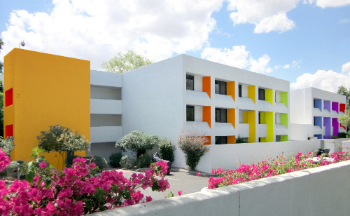
Remember that hotel in Cabo I stayed in last November? Well this one is in Scottsdale, Arizona reminds me of that hotel. The design pays homage to the Sonoran Desert’s landscape by blending the original building’s international style architecture with the colors of 12 indigenous flowers.
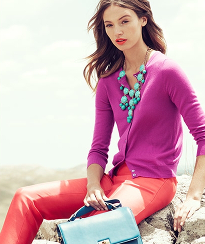
I’ve been seeing this combination a lot in fashion lately!
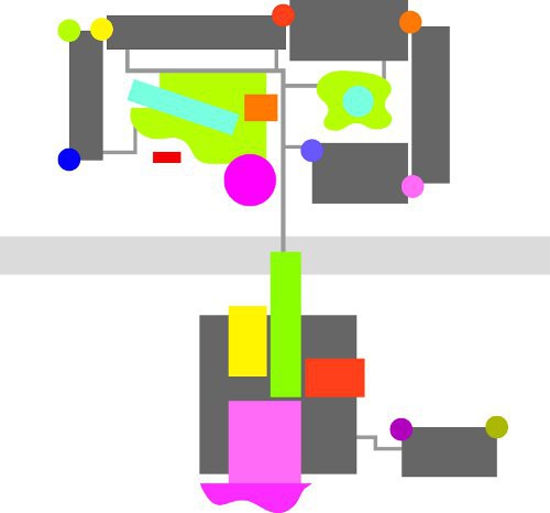
The floor plan of the hotel outlined in colour is their logo.
The colours in this hotel are on trend with where colour is going in general but I think there are way too many beige on beige exteriors in this world. Wouldn’t you want to stay in this hotel just from the way it looks?
This hotel was featured in Metropolis Magazine this month, for more details click here. Thanks again to Stu Stiller for sending this link to me!
If you would like your home to fill you with happiness every time you walk in, contact me.
Related posts:
10 Things I’m taking to the Bloggers Conference in LA
7 Hot Blogging Tips from Los Angeles
Top 5 Fashion Tips from my Stylist
It’s All in the Undertones, download my eBook here. (if you have a computer you can download my book).

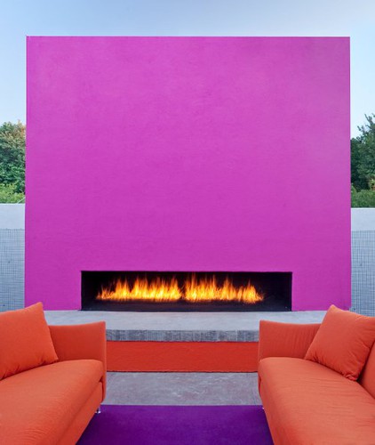
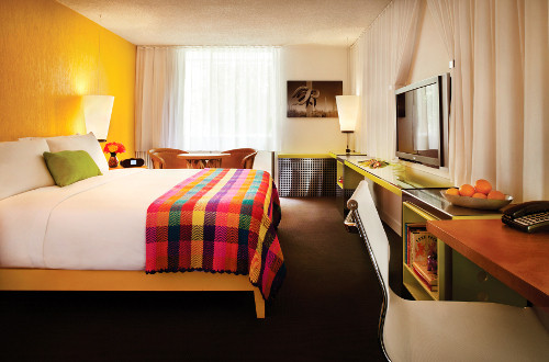
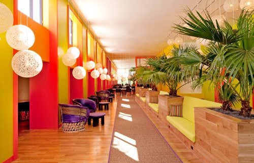
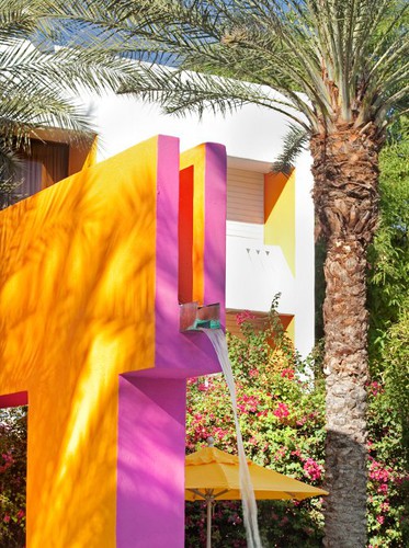
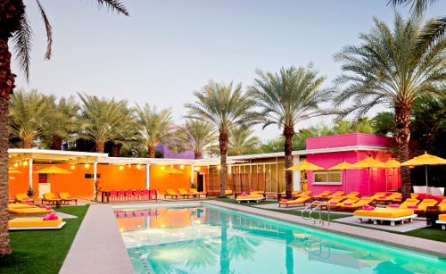


Wow! You’re signing up to have fun as soon you book this hotel. How happy!!! I know I can’t live with this much of color, but i’d love to spend a couple of days.
Fun post, Maria.
Have a blessed week.
xo
Luciane at HomeBunch.com
That looks like a hotel ready to host some fun people. :0) just looking at you photos. LOVE the lobby and pool area.
I’m adoring this and the homage it pays to the local flora. I also think it plays on the colours of the painted desert and Southwestern skies, in general.
I will say, however, that I feel the intensity of these colors is best in certain lights. The hotels and houses in Mexico often use this palette. to spectacular effect. It is also used on doors in Britain and all over the house in Scandinavia and looks great. Yet, when I see it here in the Midwest, it often falls flat or looks just plain wrong.
Maybe you could address the affect of sulight and its intensity on exterior colours in a post sometime.
Beautiful post, as always.
Teresa
I am the opposite. I live with colour, I can’t live without it, yet I often admire serene monochromatic spaces on blogs and in magazines. I once stayed in a boutique hotel that was black tan and cream in it’s decor and I found it so relaxing. If I lived there colour would sneak in, but as a short term retreat it was lovely. It inspired me to keep my bedroom a little more neutral than the rest of my home.
Okay, so I’m going to go against the bandwagon and tell you that I think it looks too cartoony for my taste. It’s beautiful, but not for me. I prefer something a little more earthy.
count me in…my bags are packed. I love it!
I agree with Heather. It’s a little jarring. Punches of color are great, but a total landscape of vivid colors is not my taste at all. Having said that, I can very much appreciate the wonderful colors of India, but not in my personal decor.
I like it. It has a sense of humor!, and a “not taking ourselves too seriously” look, which I bet makes the guests smile when they enter the hotel.
Also, don’t we all need some vacation from our beigy houses and our beigy offices?
I would love to stay here. It look like so much fun! enjoy your conference!
As an Arizona native, I’ve driven by the Scottsdale hotel many, many times. It’s had several owners, and seen several renditions of color (and no color). I have to say, my favorite was when it was all white. It did the most to complement the clean, contemporary architecture and provided a very serene feel. The bougainvillea and green foliage surrounding it adding plenty of color. The truth about the bright warm sunlight and natural beauty of the desert colors in Arizona, is that neutral tones on the architecture work very well. A little pop of color, i.e. door, shutters, goes a long way.
Enjoy your blog conference. Still a fairly new blogger; I hope to go next year.
Safe travels!
As my husband would say, when he saw a multicolored kitchen, “It makes me Happy”. For a vacation here, you get a sense of feeling alive-like when you see a tropical island with bright blue water and green foliage.
I love it! The energy is great it’s so vibrant you can feel coming off the photo!
I would go here just for the COLOR! But of course that’s the idea…ha.
New hotel/resort here in Disney being built and as I watch the colors on the exterior I can’t wait for the public to be allowed inside! It’s the “Art of Animation” resort and talk about COLOR. wow.