One of the things I really love about teaching is that I’m always looking for better ways to communicate what I know to my students.
Last week when I received the second assignment back from my students I noticed that most had chosen a pale gray shade for the living room of a colour chart that was their homework (I found out later it was because I had talked about how gray was the new brown). The only gray that existed in this room was mixed in with the yellows and blues that were in the drapery.
Majority rules when picking wall colours, so choosing a colour in a fabric that you have to be right up close to even see, would not achieve the result that we all want when we paint our walls and that is, your colour needs to pull your space together, if it’s not doing that, it’s probably not the right colour.
So, in the middle of the night (which is when a lot of my best ideas come to me) I thought of an even easier way to determine if you have achieved ‘colour flow’ in your home.
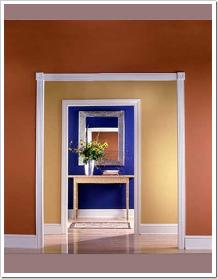
Creating flow and transitioning the colours from one room to another without just taking one colour and going from light to dark is the biggest reason I am hired to choose colour, and ‘colour flow’ generally starts in your living room. Just like I explained in this post, the strongest accent colour in your living room could potentially be the dining or powder room colour, the next 2 or 3 shades could be used in your kitchen/great room and so on.
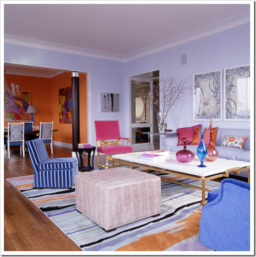
In this dining room (above), the orange in the living room has been repeated on the walls and the blue has been repeated in the dining chairs. If you pulled the dining chair into the living room because you needed extra seating, it would look right at home!
When you are selecting colours for your home, take all the colour chips and put them together on a piece of white paper. That’s one way to see if you have one that ‘jumps out visually’ as being too clean, or maybe it’s too murky and muddy. But the best way to know if you have flow is this:
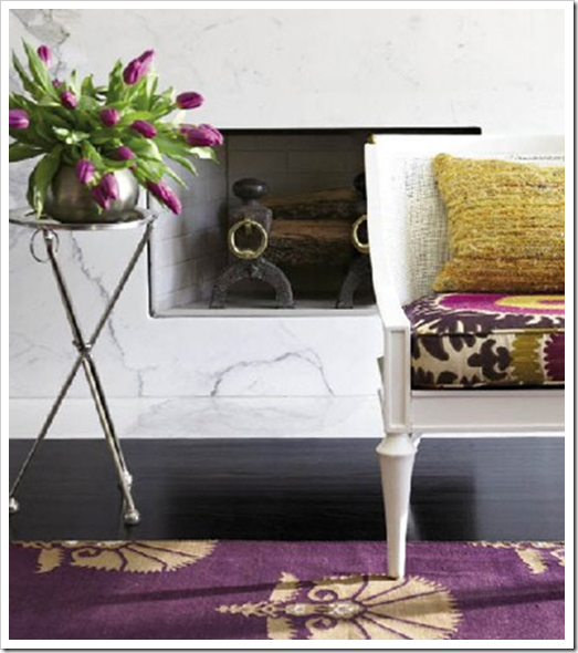
 Image from Simplified Bee
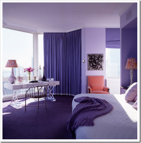
Take the colour chip you have chosen for your kitchen or bathroom and if you could make it into a toss cushion and it would happily sit in your living room without looking completely bad or wrong, it’s probably a good colour for your kitchen. Whether it actually works with the finishes in your kitchen is another story of course and you might still want some help from a professional but it’s a good guideline to take into consideration.
Of course, this is a ‘perfect world’ scenario. If your 12 year old daughter wants a pink room, she should have one because it’s her personal space—just like your home is your space. If you have a dated (on the list to be renovated) bathroom (or any other room) that does not work at all with the rest of your home, I like to choose a colour that actually works with the finishes and makes that bathroom look as good as possible in the interim.
Related posts:
The Right way to Create flow using Colour
Clean vs. Dirty Colours
Hiring a Designer; Luxury or Necessity





Love this post. It's made me feel a lot more comfortable w/my dining room color choice.
My own rule of thumb when I'm using several paint colors in a home is to look at all the samples together and see if I could imagine them all being used in a printed fabric.
@designjunkie – I like that idea.
With my clients I use the term-line-of-sight. I take all samples into each room/section and check them with the line-of-sight again.
Works every time and is vital for color capture in 2 story homes with an open stair way that can be seem from downstairs.
All color admirers will love this post it's full of color!
Bette
What textbook are you using in your Color class?
I think color flow is even more important in today's open floor plan designs. I am a big believer in being able to move things from one room to the next. Not only does it provide continuity in your house, it also gives you flexibility to use what you have in new and interesting ways.
I am drooling over the white tufted bed! So plush! Also, I just love Donghia's Suzani and have a few toss pillows in the same colorway in my own home! Thank you for a beautiful post!
-Vanessa
http://www.vanessaandvalentine.blogspot.com
I'd love to sit on one of your classes. I'm sure it's a lot of fun!
Ruthie
Oh Maria,
You're killing me! I just painted our bedroom…which can be seen from the kitchen, living rm, & dining rm. It has thrown my whole flow off & now I must paint those spaces. My work is never done.
Another great idea. You know, being a professional does not mean I am without fears of making big mistakes… I went through all my rooms in my house and checked for the color sequence… I am happy to report, that apart from the rather rotten basement all seems to flow nicely…and no leaks!
Now for my clients…
Have a colorful weekend!
XX
Victoria
Another great post – I'm always learning something new on your blog. I've been carrying around the paint chips of my living room and dining room so that I could find a wallpaper for the kitchen. Nice to know that was probably the right thing to do.
I really like this post. How to tie colours together. Brilliant. Putting all the colour chips on paper the throw pillow. Really clear, good tips. Thank you. I'll still be calling you when I paint but. If I was a diy'er this would be one helpful post.
Thank you for teaching me so much through your blog. I have around 150 blogs in google reader and yours is one of 3-5 that I read word for word. Please keep up the thoughtful teaching posts my home thanks you!
Maria…it is such treat to receive your posts. I know it's a lot of hard work and I thank you for sharing your energy and talents.
Maria, Can I take your course online?? That would be a great experience!
Oh, and I love the lavender/purples, and golds and have a perfect painting for those tones! I will shoot it shortly, in the meantime check out my latest.
Well, I'm a bit of a rebel when it comes to colour flow 🙂 We don't have extreme colour variations in our home, but every room is a different colour. But the hallway is light grey that all the colours in the rooms off of the hallway work with, so that creates a sort of flow, I think 🙂
More great tips about colour — thanks Maria 🙂
Kelly
I second Elizabeth's comment- these posts certainly take time and energy, and we appreciate the care you take to share with us your knowledge!
Maria, Thank you for this post. I actually am a bit excited…I think I just may have acheived good color flow in my home!
Flow is an unfortunate word choice.
xo xo
Excellent post Maria. 🙂
I wish I lived in Vancouver so that I can take your advanced Colour Theory class. Your students are lucky to have you.
I love your analogy of the pillow -what a great idea!
Thanks for another useful (horribly dry word, but apt) post. I always ask (beg) an artist friend to choose colors for me, and I'm happy to say, she's given me good flow.
The one room in which she didn't choose the color, I've always hated. At least, now I know why.
Time to beg.
Design Junkie,
Excellent idea, even better to imagine them combined in a fabric!
Thanks everyone for your comments!
Maria
Ah, you used to could walk into any room in my home with a pillow from any other room and it would work. Now I'm in process of making my home lighters and airier and the pillow test would be ugly around here now!! 🙂 At least for now the transition rooms have doors that can be shut!
such a great idea… I usually try to make spaces flow throughout a home but must admit that I went insanely off that in my basement. I pretty much treated my house as 2 separate one- upstairs & downstairs because I just couldn't choose a palette to keep throughout the house. (i love greens & whites but also loves aquas & blues & couldn't give either up, so I went like a crazy ADD painter & went up with one & down with the other! haha or now that I think of it, like the little girl who wants a pink room!! 🙂
But it's such great advice & houses have this great "identity" when the colors flow nicely. one day when i grow up maybe ;);) hahaha
xoxo
Love this! I’ve been working on this for a week! Ever since we opened up a wall and have the den open to the living room, I realized the dining room chairs and throw pillows in den would help me pick living room fabric. Voila! It worked! I also was trying to pick outdoor patio pillows too. I’ve been carrying pillows and fabric swatches in and out of a 9 stores. I did it! They all relate to each other and look good from room to room and inside to out. Ahhhh. I looked out from the kitchen and said to my husband, “I love our house.” 🙂 “Finally” he said with a big smile!